“You have to flirt with it”: Ryan Haskins on how to have fun when branding
The former Sagmeister & Walsh designer looks to Paris Hilton vibes, Stranger Things and pre-internet newspaper ads in his latest branding project for an internet food court.
Share
At the end of September last year, the It’s Nice That crowds went wild with excitement at a “borderline annoying” sushi rebrand by the LA-based Ryan Haskins. Long story short, the former Sagmeister & Walsh designer went from studying dentistry to somehow becoming a graphic designer. Along the way, he developed his unique style on the right side of kitsch as bright neon colours and busy fonts fill his jovial-feeling canvases.
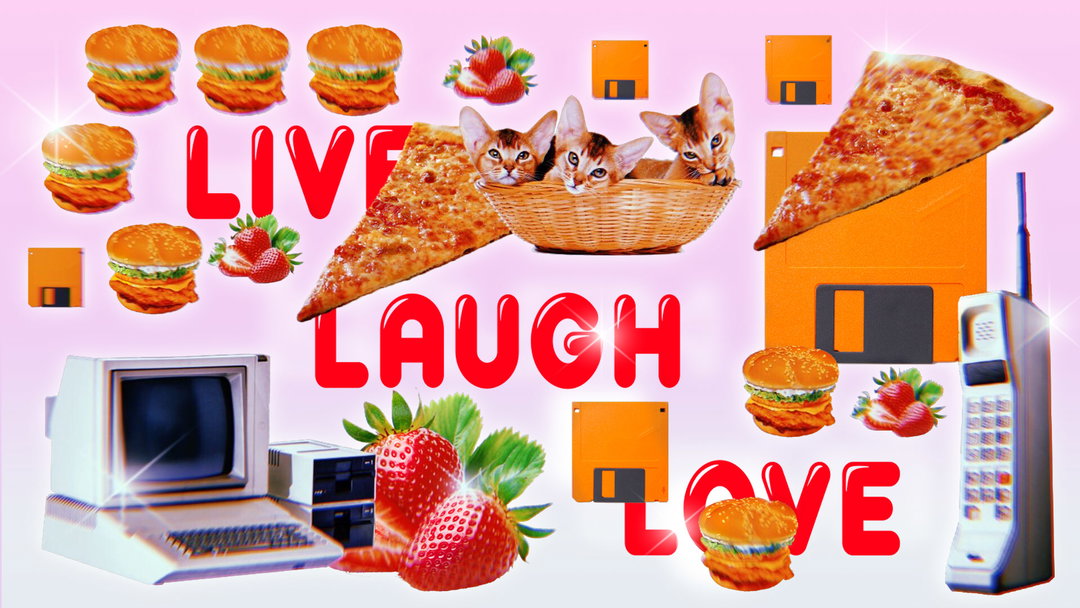
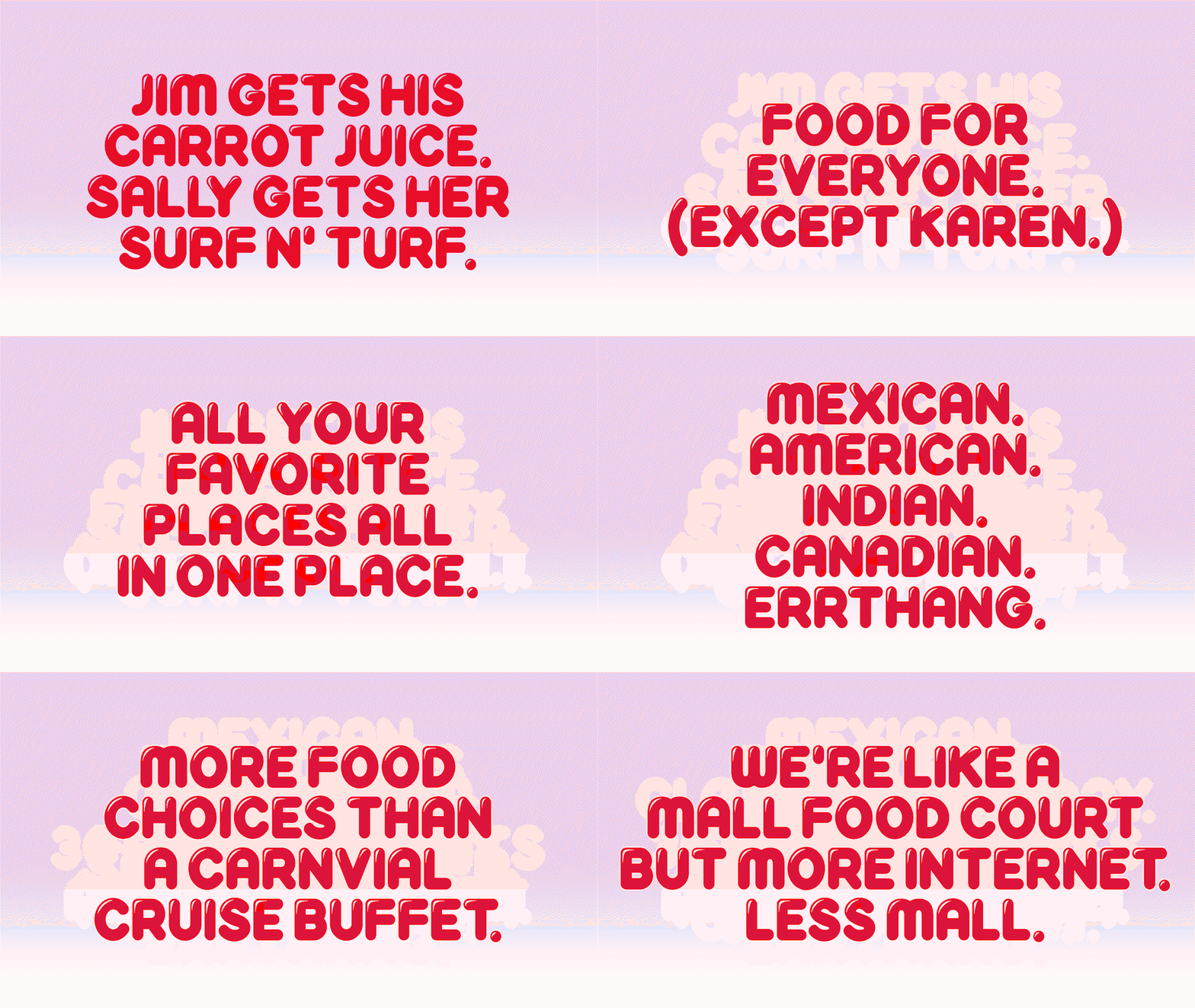
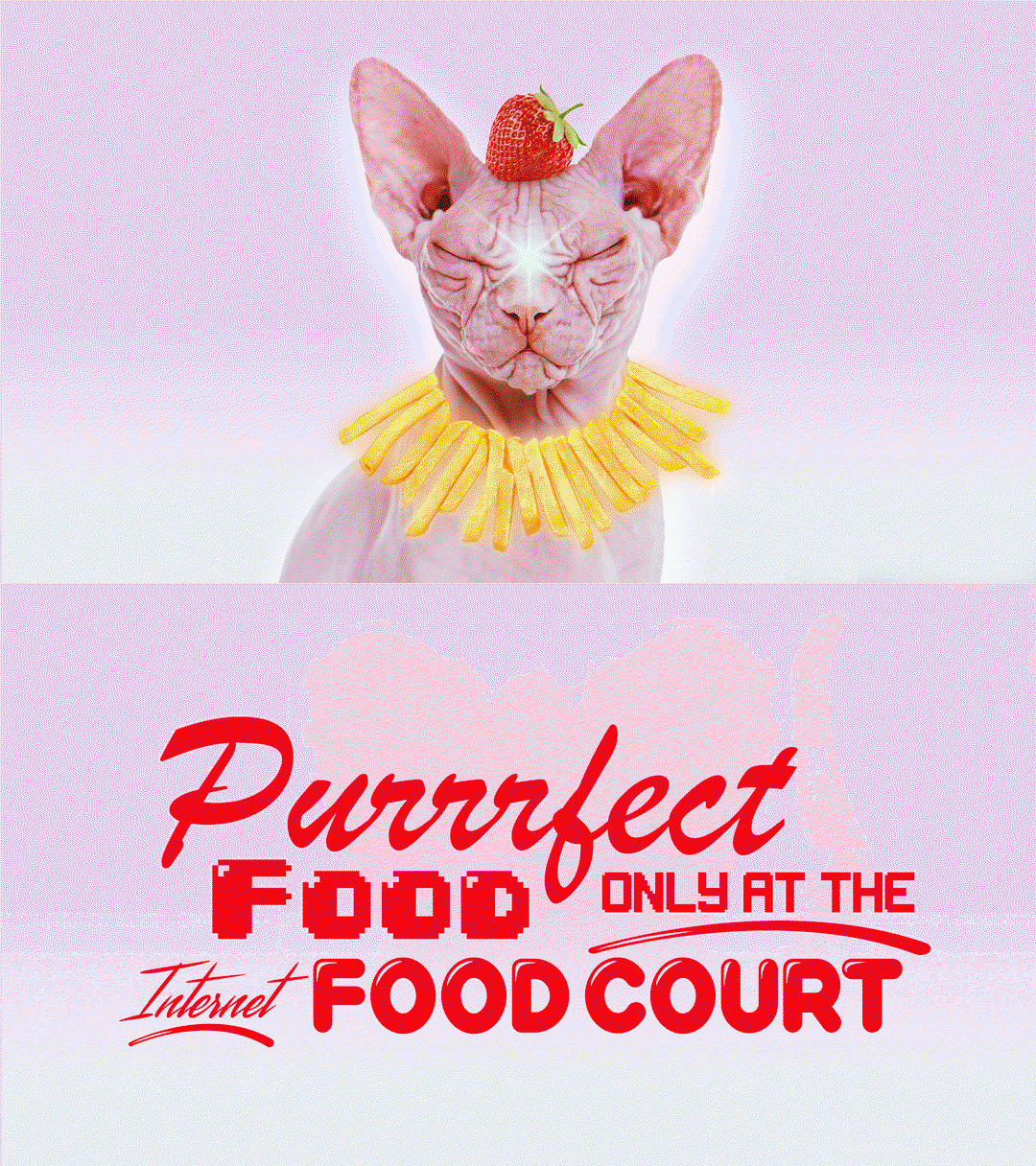
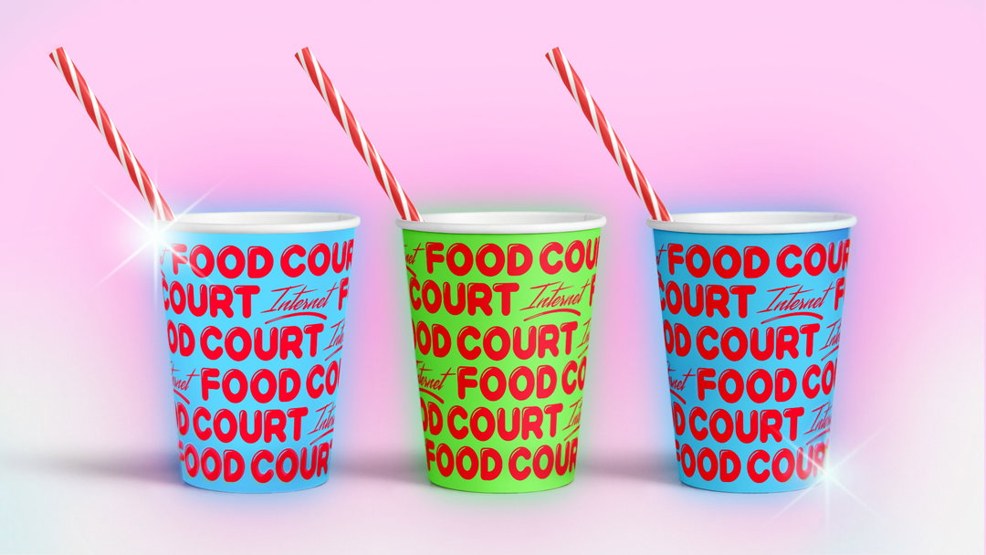
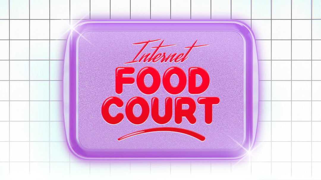
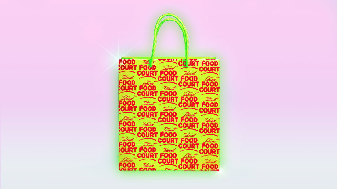
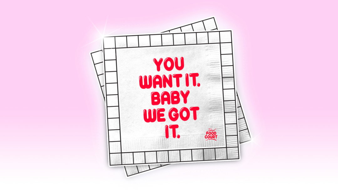
As $U$HI $NOB did so well last year, another food-related brief made its way into Ryan’s inbox. This time, for an internet food court which in Ryan’s words, “is like a mall food court except less mall and more internet.” A delivery restaurant that puts all your favourite restaurants into one place, Internet Food Court allows you to order your pizza from one restaurant and your partner’s healthy kale salad all from the same place – fantastic. Helping to reduce relationship struggles with those issues of compromise, one takeaway at a time, Ryan wanted to brand Internet Food Court with the joy that delicious foods, and no fighting, very well deserves.
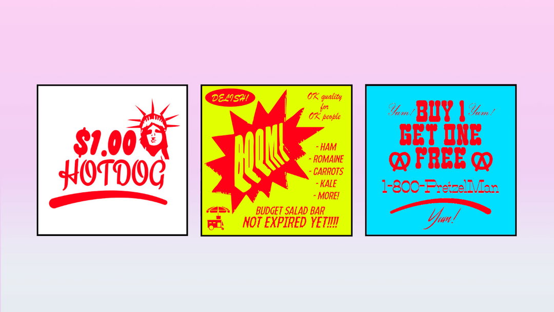
“I love looking at the best-of-the-best, and the worst-of-the-worst that culture has to offer,” says Ryan on his inspiration for the branding project. From fashion campaigns to music videos, the designer is informed by a mish-mash of seemingly disparate references from which he crafts his buzzing aesthetic. Currently “really into” old Hollywood history in particular, Ryan combines these kinds of sophisticated visuals with his love for culture on the “lower-end.” For Internet Food Court however, he looked to Starcourt Mall in Netflix’s Stranger Things, Paris Hilton vibes and retro pre-internet newspaper ads (yes, incredible references, we know.)
Ryan Haskins: Internet Food Court
He goes on to tell us, “I love trashy pop-culture and reality TV. I think it’s important to try and immerse yourself in all parts of culture. If you only look at low-brow culture, you become a pretty big piece of shit. If you only look at high-brow culture, you can become an ever bigger piece of shit!” So for Ryan, “it’s fun to make connections between the two,” and his light-hearted designs are a testament to his playfulness in the medium. In this vein, having a super clear creative vision for a branding project “NEVER works out” for Ryan in his practice.
If he plans or thinks about a project too much, it loses its sense of amusement, cutting experimentation short. “It just loses its soul!” retorts the designer who has learnt to let go of creative control over the years, allowing a project to “reveal itself” with time and space. “You have to flirt with it,” he goes on jokingly, “Trust it. Don’t try to figure it out all at once.” And though this process has led Ryan to many failures in the past, ultimately, it’s allowed him to embrace the excitement within branding and, very importantly, have fun with a brief.
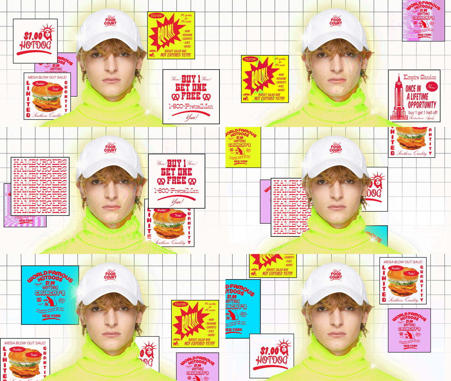
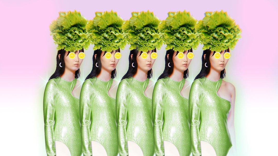
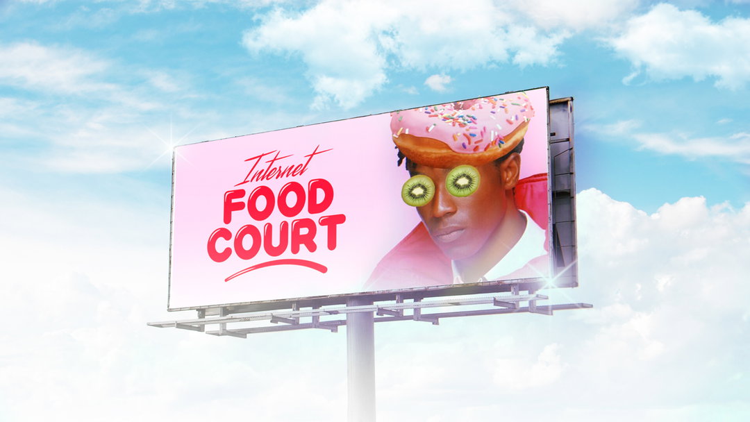
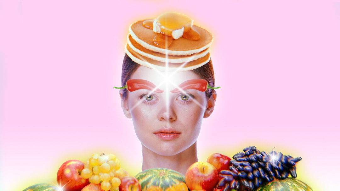
Focusing on the brand expression of the company rather than the logo (which Ryan argues isn’t the holy grail of branding design) he set the overall tone of the the project by producing a variety of mock-ups “with minimal intellectual horsepower”, but tell a story. For Ryan, above all, all these mock-ups have to do is make people smile. “They don’t have to change the world. They’re not going into the Moma,” he adds cheekily. If they make people chuckle, that’ll do. And in this vein, he put pickles on a guy’s eyebrows which he thought was funny (and it is) and just like that, this mock-up inspired the final outcome for the whole brand. Finally, last on his list to design was the logotype, the concluding asset for the branding suite, “The logo is like a bow on a gift,” ends Ryan. “Or a cherry on a sundae. Lovely and special, but not the main event. You can’t think it or overcomplicate it!”
GalleryRyan Haskins: Internet Food Court
Hero Header
Ryan Haskins: Internet Food Court
Share Article
About the Author
—
Jynann joined It’s Nice That as an editorial assistant in August 2018 after graduating from The Glasgow School of Art’s Communication Design degree. In March 2019 she became a staff writer and in June 2021, she was made associate editor. She went freelance in 2022.