Studio XXX on becoming one of K-pop’s most prolific graphic design studios
Seoul-based graphic designer and Studio XXX founder Jiyoon Lee talks us through the “unexpected” success of K-pop and its visual world.
Share
Since the ubiquitous advent of South Korea’s music industry in the last decade, K-pop is now harder to ignore than it is to embrace. With an endless army of devoted fans, it is not uncommon for acts such as BTS, Blackpink, Seventeen, and 2NE1 to regularly eclipse the total global sales of their Western counterparts. Its industry is a well-oiled machine, and only the most successful of K-pop acts manage to break out of Seoul and into the American airwaves. One creative in the middle of this storm of success is Studio XXX, run by Seoul-based graphic designer Jiyoon Lee.
Studio XXX has been one of the most prolific graphic designers of K-pop since the “second generation” of the industry, wherein the celebrated “idol culture” was born. Idol culture was the elevation of K-pop out of standard Western-inspired pop singers' realms and into something more akin to celebrity worship. Collecting physical copies of your favourite artist or band’s latest release became one of the only ways fans could attend exclusive meet and greet “signing events”, and so CDs became important commodities for both the record companies and fans. Consequently, a K-pop act’s graphic and visual narrative became extremely important, even more so in their CD releases. Now seen as a prized possession among K-pop fans, it’s not uncommon for even libraries in South Korea to stock and sell K-pop CDs in the hundreds – of which fans buy by the suitcase.
“The more K-pop gets popular, the more pressure I feel,” Jiyoon tells It’s Nice That. Acutely aware of how important these visual “packages” have become, Jiyoon notes how “the feedback from fans is often really keen.” Still, she tells us it can “sometimes be so unexpected” to see her graphic work collected and critiqued by millions across the globe. Jiyoon understands quite well what it means to indulge in the visuals of an album as a potential consumer. As a child, she tells us she was “fascinated by pop album covers,” and specifically mentions the British rock band EMF’s Schubert Dip release which completely enamoured her. “I thought the drawing like scribbles on the cover was funky and new at that time,” she recalls in her days spent browsing Seoul record shops. For Jiyoon, what excited her most about album visuals was “the power of making [people] want to possess the album without even listening to the music.” It was, essentially, not the music but “just the albums themselves that I wanted to have,” she adds.
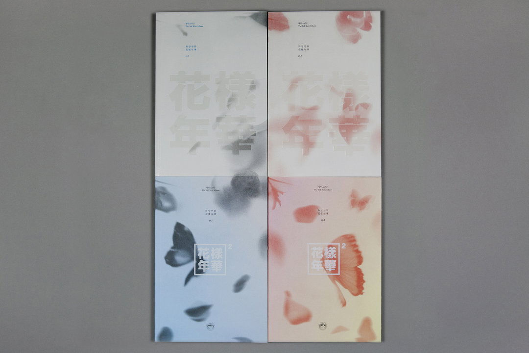
Studio XXX: BTS, The Most Beautiful Moment in Life (Copyright © Studio XXX, 2015)
The idea of an album being a visual commodity in and of itself by way of its cover art is something Jiyoon carries forward in her work today. She first got her start in a Seoul-based design firm back in 2010, and designed the cover for South Korean superstar Lee Hyori’s album h-logic. From there, she caught the attention of South Korean record companies and started her own graphic design studio under the name Studio XXX. “After starting my own studio, my first K-pop-related project was just a concert poster design for the boy band Infinite.”
As K-pop approached its explosive “third generation”, visuals and physical CD packages quickly grew in significance. In an attempt to boost sales even further, record companies then began to release multiple editions of each album with a different and distinct visual theme, often with collectable trading cards of the artist found inside. Jiyoon’s talent caught the eye of several record companies, and suddenly she was working with dozens of the biggest names to create unique graphic concepts fans would want to collect. “The process varies, but usually the record company initially tells me the concept of the album and sends me the title track,” Jiyoon explains on working with the K-pop industrial complex. “Then, I come up with multiple proposals of the album logo and the key [graphics], and they choose one that they think is the best.”
As for a particular style that she works with, Jiyoon says she enjoys “working with big bold fonts and geometric shapes” to bring out the artists and their message. “I personally don’t like asymmetric or organic shapes, or hand-drawn typography. I like perfect geometric shapes like a circle, a square of a cube, and an equilateral triangle.” It’s a trademark style that has disseminated across the entire graphic landscape of K-pop, which Jiyoon quickly mastered. “I designed eight albums in a row for BTS,” she adds, almost casually. It’s a humble way of glossing over the fact that BTS are the biggest-selling artists in South Korean history, the biggest-selling artists across the entire globe in 2020, and one of the most-streamed artists in digital history. “It was from their very first albums onwards,” Jiyoon adds. “I like to design debut albums of artists because I feel like I help them to start their journey from the beginning,” she says, pointing to her early pre-American breakthrough work with BTS and bands Seventeen and LOONA. “I also like to design multiple albums for the same artists, because I’m able to see how they’ve changed and grown over the years.”
As for what’s next in the ever-growing success of Studio XXX, Jiyoon talks about her desire to work with British or American artists, circling back to the pop and rock album covers she first fell in love with at the Seoul record shops. But, when asked about her role in the success story of K-pop, Jiyoon comfortably adds: “It’s very rewarding, and I’m proud to be a part of it.”
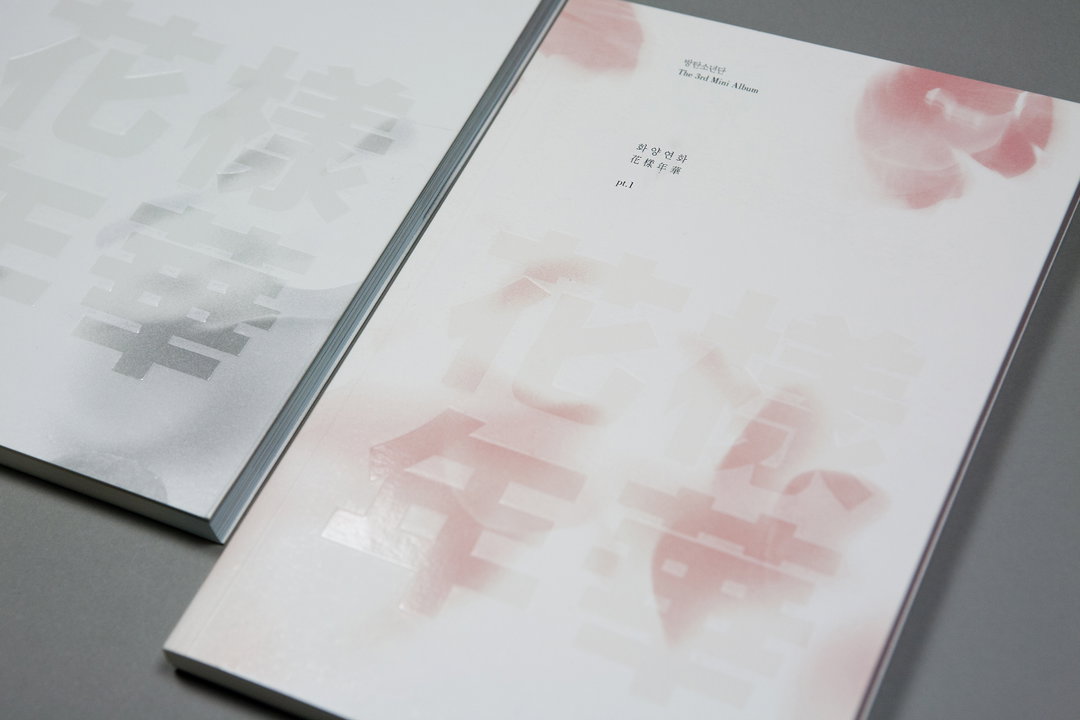
Studio XXX: BTS, The Most Beautiful Moment in Life (Copyright © Studio XXX, 2015)
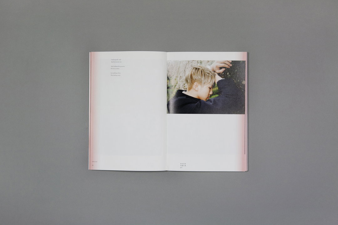
Studio XXX: BTS, The Most Beautiful Moment in Life (Copyright © Studio XXX, 2015)
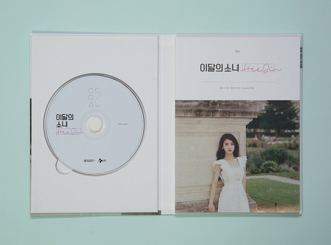
Studio XXX: LOONA, HeeJin (Copyright © Studio XXX, 2016)
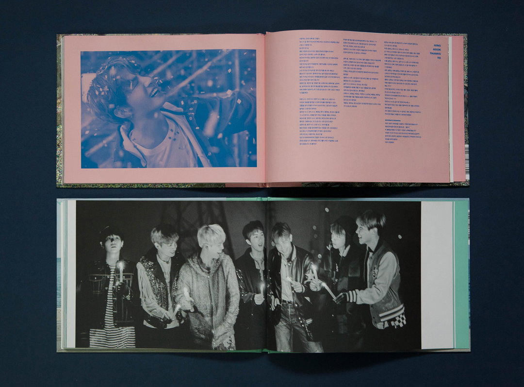
Studio XXX: BTS, You never walk alone (Copyright © Studio XXX, 2017)
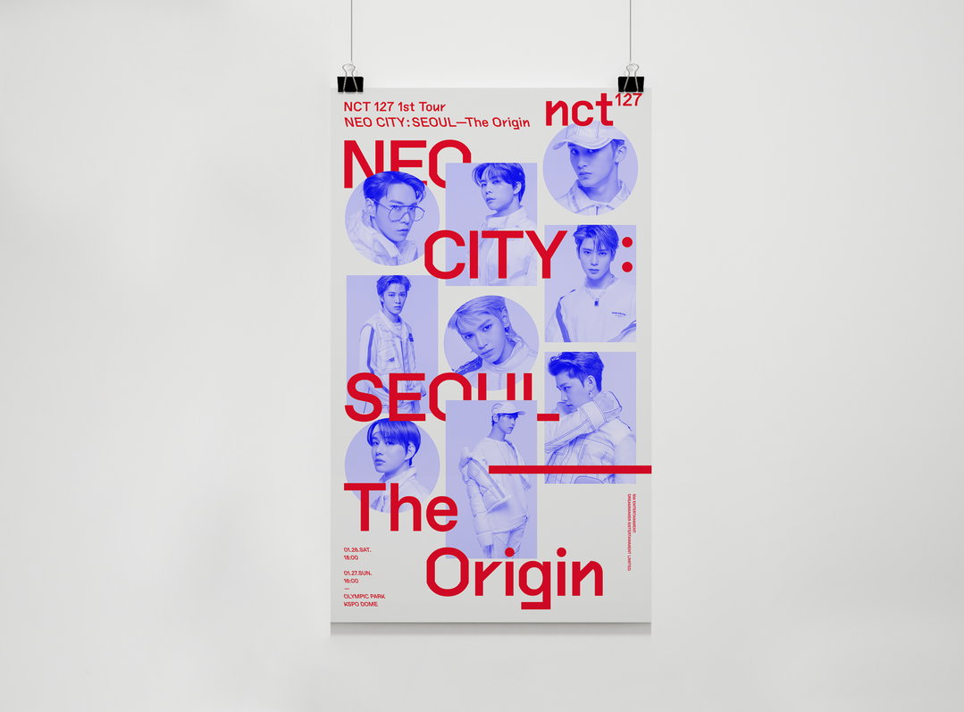
Studio XXX: NCT127, The Origin (Copyright © Studio XXX, 2019)
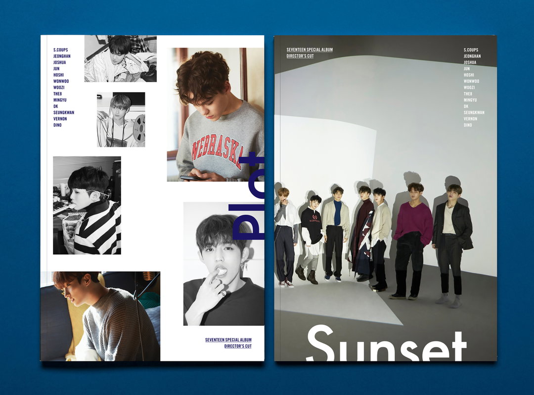
Studio XXX: Seventeen, Director's cut (Copyright © Studio XXX, 2018)
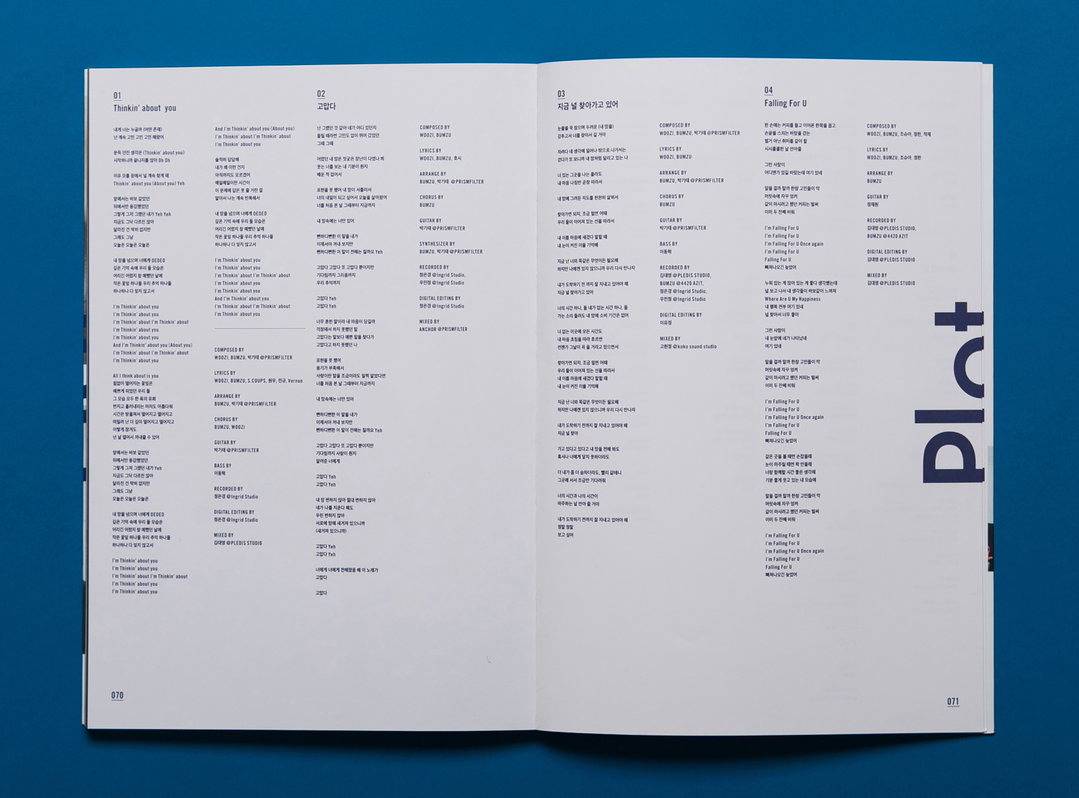
Studio XXX: Seventeen, Director's cut (Copyright © Studio XXX, 2018)
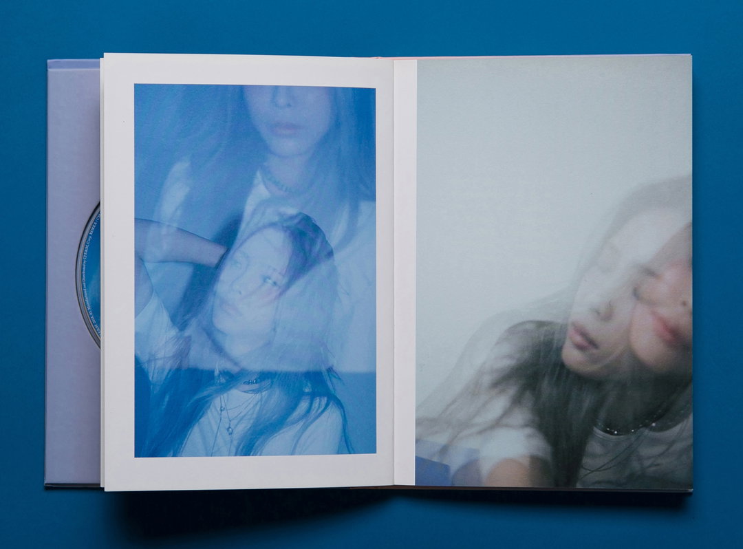
Studio XXX: HEIZE, wind (Copyright © Studio XXX, 2018)
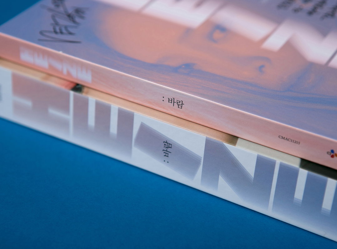
Studio XXX: HEIZE, wind (Copyright © Studio XXX, 2018)
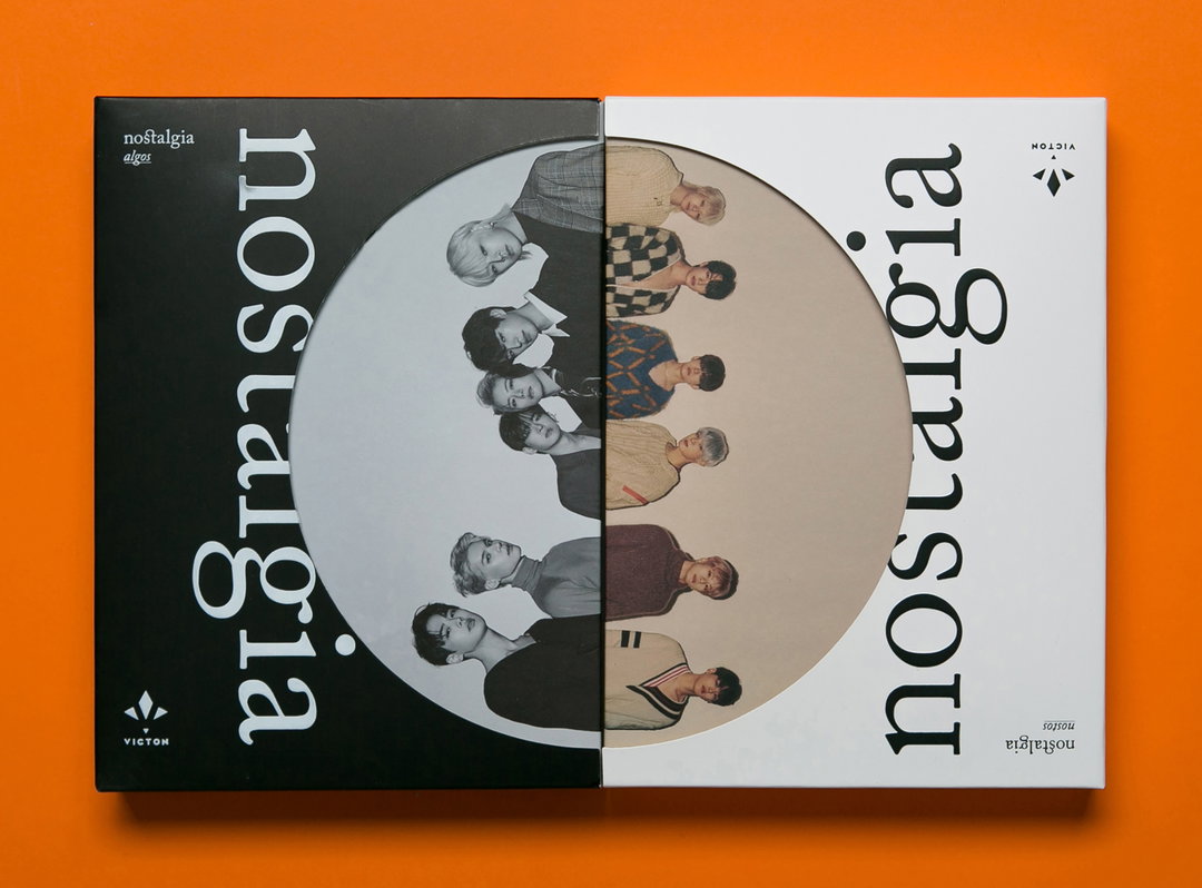
Studio XXX: Victon, Nostalgia (Copyright © Studio XXX, 2019)
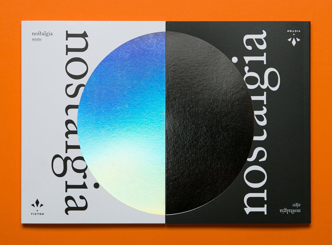
Studio XXX: Victon, Nostalgia (Copyright © Studio XXX, 2019)
Become an Extra Nice Supporter
Unlock an inspiring new way to explore It’s Nice That, get your hands on exclusive perks, and help bring meaningful creative projects to life.
Hero Header
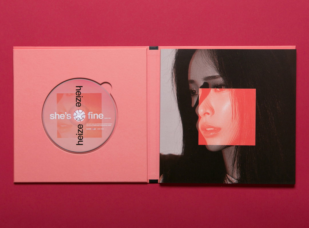
Studio XXX: HEIZE, She’s fine (Copyright © Studio XXX, 2019)
Share Article
Further Info
About the Author
—
Joey is a freelance design, arts and culture writer based in London. They were part of the It’s Nice That team as editorial assistant in 2021, after graduating from King’s College, London. Previously, Joey worked as a writer for numerous fashion and art publications, such as HERO Magazine, Dazed, and Candy Transversal.