The Weekender: It's Nice That's weekly fun supplement – are you ready?
Remember when you used to get left home alone as a treat and you’d do things like ride a mattress down the stairs or spray squirty cream straight into your mouth? Our editor Rob’s been away this week. So far on the site in his absence we’ve had retro food, saucy embroidery, video games and sausage art. Well, when the cat’s away…
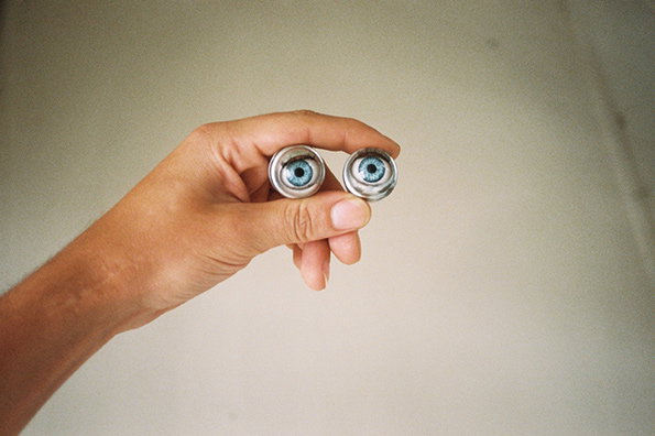
Ohh hellew!
6. Raves in the 90s were more fun than they are now
Even though they were riddled with naughty police having a good time, the raves in the 90s looked so, so fun. Documented and bound thanks to Stuart Griffiths.
5. I would 100% rather live in a video game than real life
I want to lie beneath a pixel coconut tree on sherbert-coloured digital sand and let Rafael Rozendaal-style waves lap at my feet…Let Noir Lac convince you to join me.
4. Wow. Retro food looks DISGUSTING
Maybe it was a result of housewives having too much time on their hands and experimenting with stuffing onions and potatoes, but these recipes from the days of yore are totally wack.
3. These neglected basketball hoops are a bit sad
Kids these days, they’re probably all indoors playing on computer games. Theres something kind of beautiful about these though. Edgy. Poignant. Deep.
2. Speaking of edgy and deep
Here’s the bookshelf of photographer Will Robson-Scott. He broke the rules and chose seven books rather than five, but you know what? His selection was so good we kept ’em all in.
1. MARMITE!
As if this King of Spreads even needs advertising, but they’ve gone and bloody done it anyway. One of the best ads we’ve seen in ages
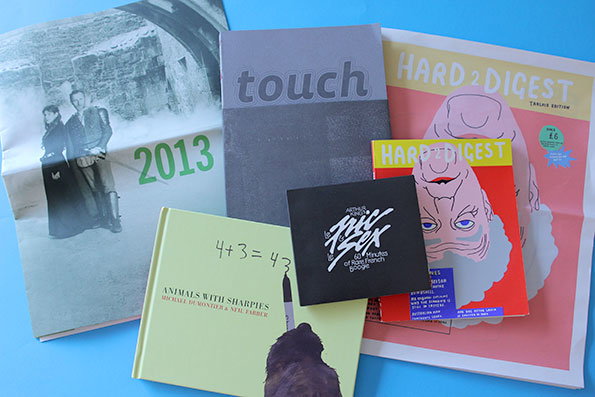
This week’s Things
This week’s Things is a right stonker! A book about letterpress wood type, a selection of animals scrawling obscenities with Sharpies, a mix tape of French boogie-funk, great design from the catalogue from the National Theatre of Scotland, and for the pièce de résistance a naughty-rude but very funny newspaper parody. If ever there were an opportunity to chortle out loud with your hands on your gut like a Dickensian hero having his feet tickled, this is it.
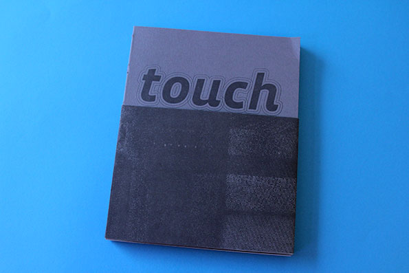
Touch: The Vista Sans Wood Type Project Book, by Tricia Treacy and Ashley John Pigford
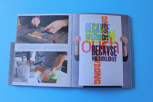
Touch: The Vista Sans Wood Type Project Book, by Tricia Treacy and Ashley John Pigford
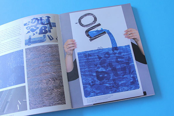
Touch: The Vista Sans Wood Type Project Book, by Tricia Treacy and Ashley John Pigford
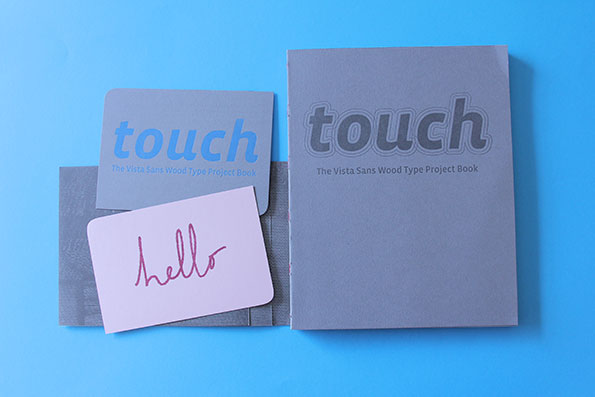
Touch: The Vista Sans Wood Type Project Book, by Tricia Treacy and Ashley John Pigford
Touch: The Vista Sans Wood Type Project Book by Tricia Treacy and Ashley John Pigford
A letterpress wood type geek’s dream, The Vista Sans Wood Type Project Book documents the way Tricia Treacy and Ashley John Pigfrod created letter press wood type from the Vista Sans typeface, designed by Xavier Dupré, and then sent it to 20 international artists to see what they might do with it. Embracing a ‘post-digital’ approach to technology and practice, the final product of the experiment is a proper joy to flick through; carefully crafted with tangibility in mind, and plenty of interesting stuff to learn about design and craft.
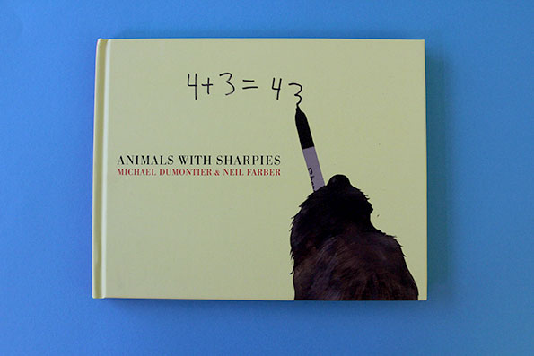
Animals with Sharpies: by Michael Dumontier & Neil Farber
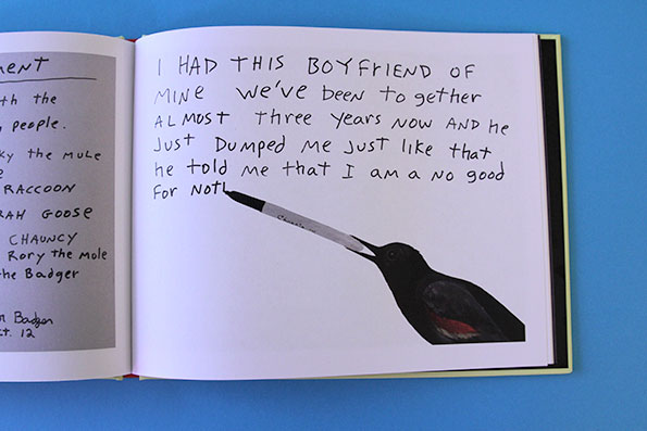
Animals with Sharpies: by Michael Dumontier & Neil Farber
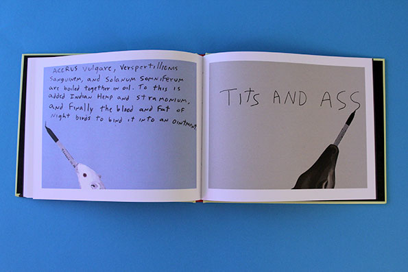
Animals with Sharpies: by Michael Dumontier & Neil Farber
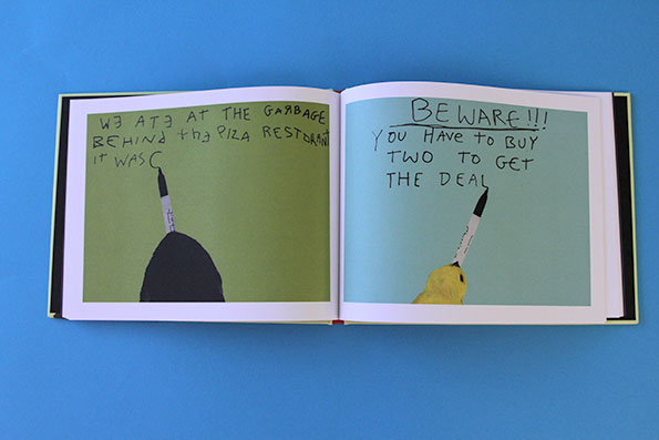
Animals with Sharpies: by Michael Dumontier & Neil Farber
Animals with Sharpies by Michael Dumontier & Neil Farber
Don’t do yourself the disservice of wondering for even a minute what this might be about; in a refreshing twist, it’s exactly what it claims to be, which is nice animals writing cute things with Sharpies. We’d also rather you not pretend to be too good to enjoy it; nobody likes a know-it-all, and even Nick Griffin couldn’t suppress a smile at a bird scribbling down a musical score, or a duck offering up free kittens. Read and laugh.
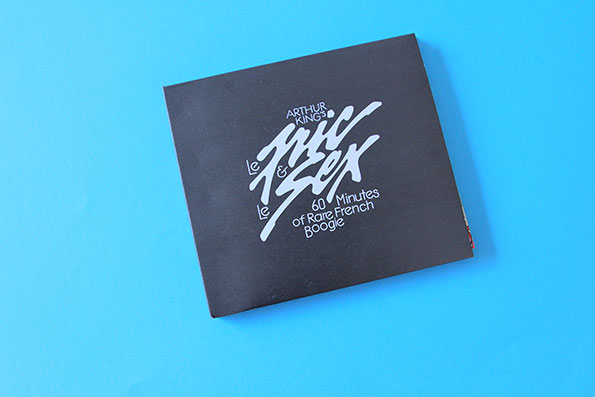
Le Fric & Le Sex by Arthur King
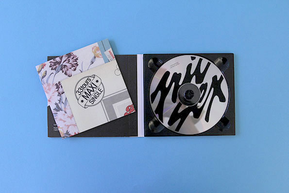
Le Fric & Le Sex by Arthur King
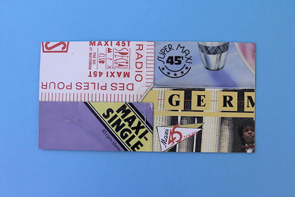
Le Fric & Le Sex by Arthur King
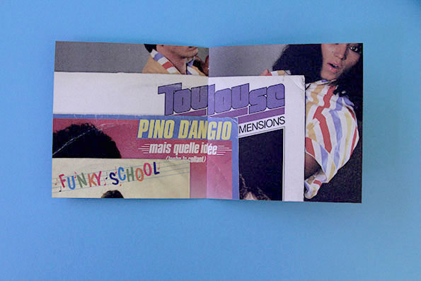
Le Fric & Le Sex by Arthur King
Le Fric & Le Sex by Arthur King, designed by Michael Manoogian
It’s been more than a bit quiet in the studio recently with Rob’s absence, but Arthur King’s donation of his great new CD Le Fric & Le Sex is helping us greatly. “A 60 minute long tribute to the unknown genre of French 80’s boogie. It comes in a digipak with a totally meaningless but nice-looking booklet.” And he’s right! It sounds great and looks even better.
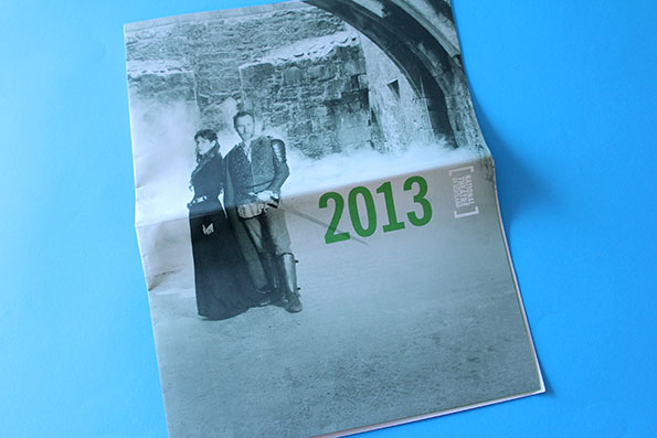
National Theatre of Scotland 2013 Catalogue
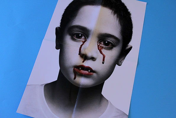
National Theatre of Scotland 2013 Catalogue
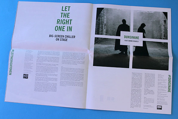
National Theatre of Scotland 2013 Catalogue
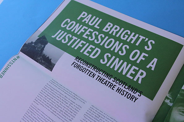
National Theatre of Scotland 2013 Catalogue
National Theatre of Scotland 2013
It’s always a bit of a joy to come across great design in unusual places, so we were chuffed to see that the National Theatre of Scotland have done an admirable job of their 2013 catalogue. With a giant glossy (and super creepy) poster halfway through and a decidedly green tinge throughout, it maintains a gloomy, atmosphere whilst still making you ant to see everything they have to offer.
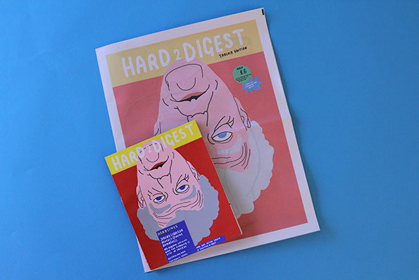
Hard 2 Digest: Peter Judson
Hard 2 Digest: Peter Judson
Hard 2 Digest: Peter Judson
Hard 2 Digest: Peter Judson
Hard 2 Digest by Peter Judson
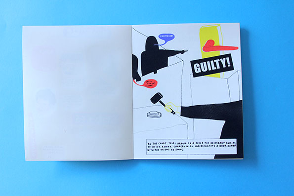
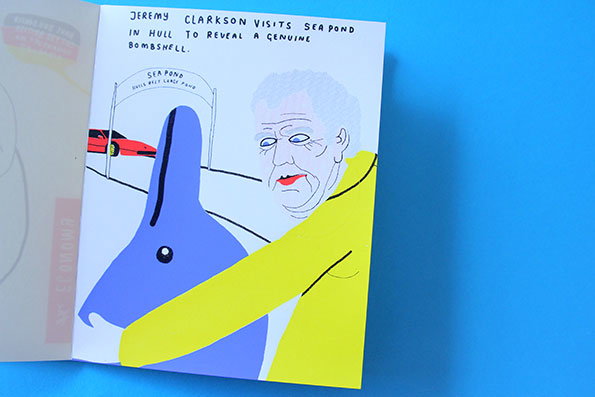
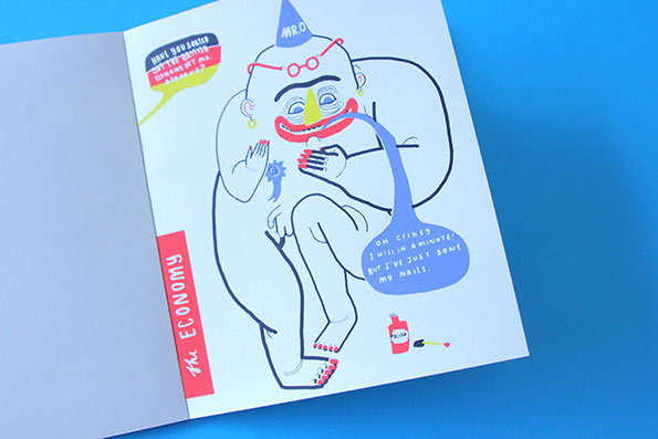
Oh God it’s so CRUDE and so WEIRD and a bit FUNNY TOO. In a slightly distorted version of the news, this wee publication is written, drawn and printed by the many-talented Peter Judson. That’s Jeremy Clarkson’s face upside down on the front (and it gets worse for him). The report on the economy consists of a cartoon of George Osborne and the speech bubbles: “Have you sorted out the economy yet Mr Osborne?” “Oh crikey I will in a minute! Bur I’ve just done my nails”, and the news includes a court case about a hook being found guilty of masquerading as a door handle. Any questions? No? Good.
Tweet of the Week
Simple yet effective. Peter, you deserve a knighthood.
Ugh just bit into a 4-day-old apple that tasted like a haunted house
— Peter Serafinowicz (@serafinowicz) August 5, 2013
Spanish Beatles cover band takes on Yellow Submarine of the week
Nice work, boys.
Hungry raccoon gif of the week
I think I have watched this over 4000 times this week. A friend captioned it as “No eye contact…nooooo eye contact” haha
Cat dressed as a shark cleaning the floor of the week
You heard.
Nicolas Cage as Disney Princesses tumblr of the week
Naturally. Is there anything you can do with Nicolas Cage’s head that isn’t hilarious?
Python-esque, anti-theistic blog of the week
Nothing has given me more joy this week than this blog. Not even that pizza I ate on Wednesday.
Share Article
Further Info
About the Author
—
This article was written by the It’s Nice That team. To find our editors and writers, please head over to our Contact page.