Launch Recite Me assistive technology
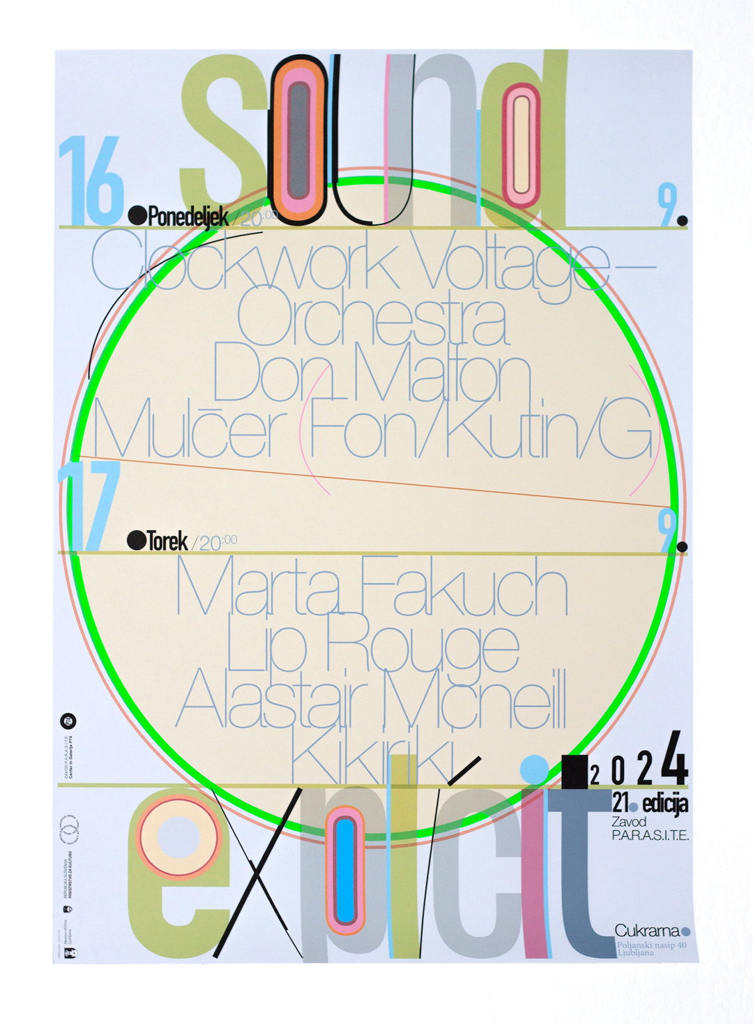
A typographic poster for a music event features the words “Sound” at the top and “explicit” at the bottom in large, colourful letters. A bright green circle frames a list of performers, including “Clockwork Voltage Orchestra”, “Don Malion”, “Marta Fakuch” and “Alastair McNeill”.

Tjaša Cizej’s experimental work blurs the boundaries between the readable and unreadable

The graphic designer uses letterforms to craft abstract shapes, pushing traditional compositions into new territories.

—
Date
14 May 2025

The Slovenian graphic designer Tjaša Cizej works primarily with printed matter, but she does all of her design work digitally. With a focus on typography, colour and shape her creative process turns to the compositional cornerstones of graphic design with a refreshingly playful approach: “I often create my own typographical arrangements, either by designing characters from scratch or modifying existing typefaces – or a combination of both,” Tjaša tells us. The designer moulds many of these found letterforms into simple geometric shapes that slot neatly into, or deviate from her grids.

“I’m happy when I can achieve an interesting dialogue between all these elements – I wouldn’t say I’m trying to achieve harmony, but more to play with the components and create something unexpected, even if sometimes it might look slightly off,” she says. These compositions come from being quite instinctive, she tells us, and often taking something from her day-to-day life and creating a new context for it – like bits of conversations, or a photo a friend took. For Tjaša this means she‘s always quite surprised by the results, as she tends to let her natural creative process lead the way.

A lot of Tjaša’s work takes a different view on legibility. The designer likes to put her own spin on the suits our words wear – “I like to see how far I can go with it,” she says. “How much can a character be modified and still be recognisable? What spaces are created by pushing and blurring these boundaries?” You’ll never know what form her letters might take next, they might come in a cascade of stretched and squashed shapes or neatly spell something out inside a colourful caterpillar. Whether you are trying to read them or not, they are rather lovely to look at.
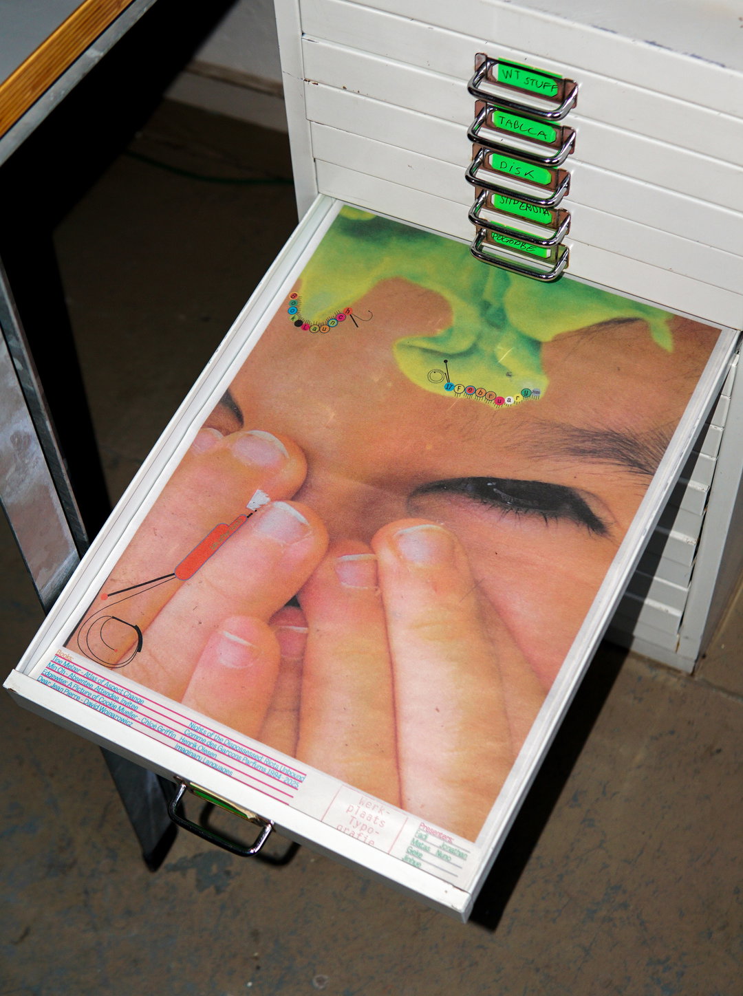
An open white filing drawer contains a large photograph of a person’s face, partially obscured by their hand. A bright green liquid is splashed across the forehead, and a small orange tool rests against a finger.
Above

Tjaša Cizej, Xiaohan Zhang: Poster for Book Launch at Werkplaats Typografie (Copyright © Tjaša Cizej, Xiaohan Zhang 2025)
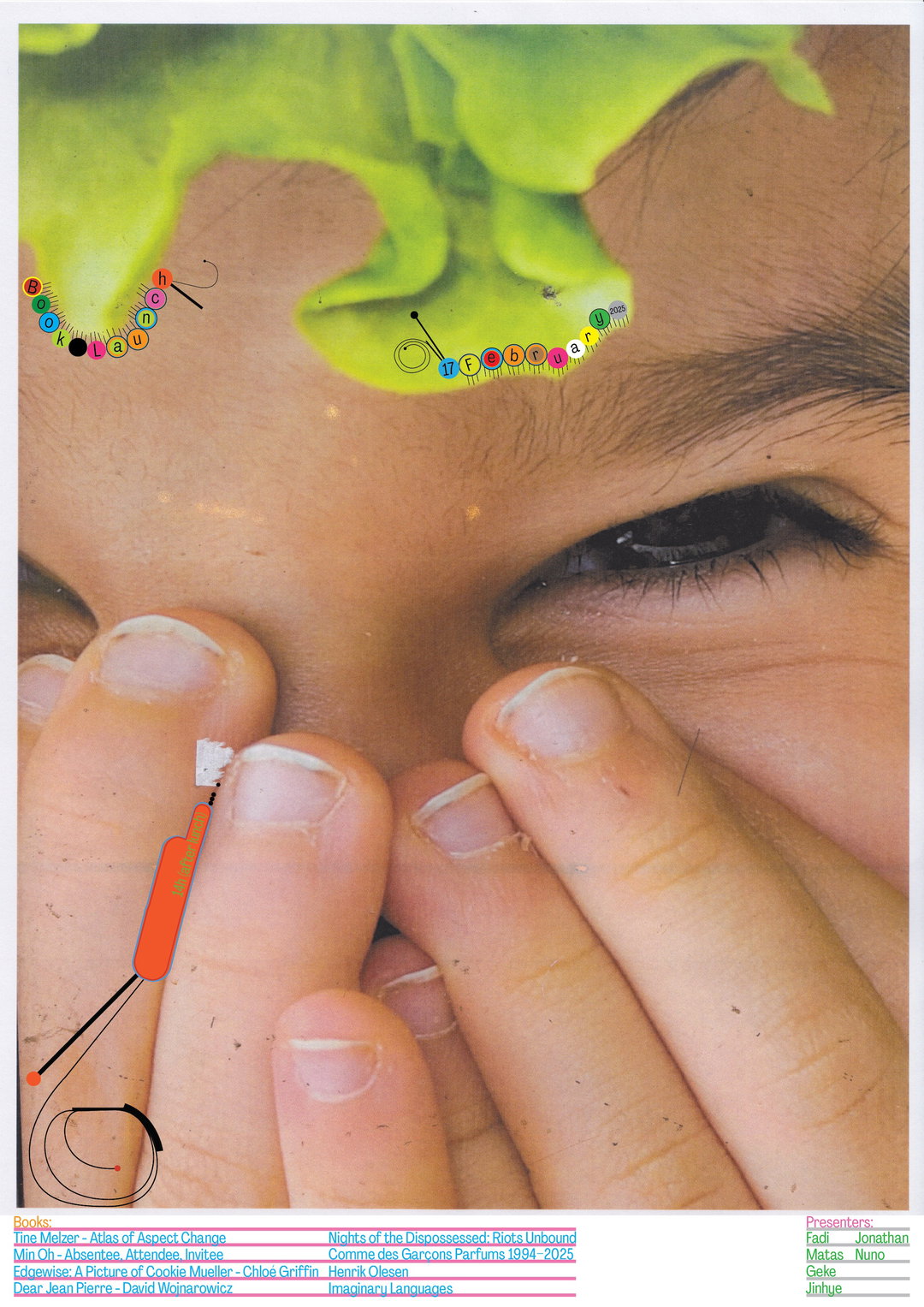
A close-up of a person’s face, with their hand partially covering their nose and mouth. A piece of bright green lettuce rests on their forehead, with small, colourful circles containing letters floating around it. At the bottom, a list of books and presenters is printed in small text.
Above

Tjaša Cizej, Xiaohan Zhang: Poster for Book Launch at Werkplaats Typografie (Copyright © Tjaša Cizej, Xiaohan Zhang 2025)
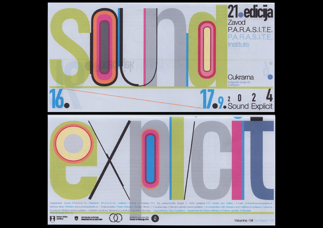
A typographic poster for an event titled “Sound Explicit”. The words are rendered in large, colourful, overlapping letters across two panels. The top panel reads “Sound” and includes the text “21. edicija” and “P.A.R.A.S.I.T.E. Institute”. The bottom panel reads “Explicit” and lists event organisers and venue details in small print.
Above

Tjaša Cizej: Festival Sound Explicit (Copyright © Tjaša Cizej, 2024)
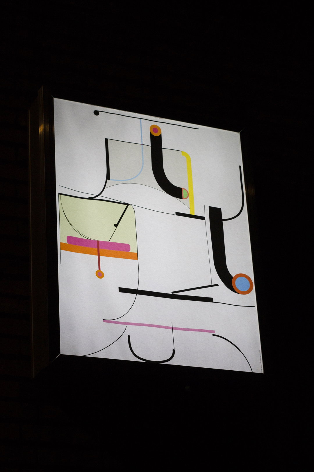
An abstract painting featuring a composition of black lines, curves and geometric shapes on a white background. Accents of yellow, pink, orange and blue add small pops of colour across the minimalist arrangement.
Above

Tjaša Cizej: ’Kompas’ at Werkplaats Typografie (Copyright © Tjaša Cizej, 2025)
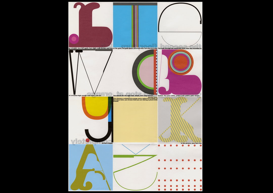
A grid of twelve abstract graphic panels featuring bold geometric shapes and fragments of letters. Small lines of text run across the middle of the composition, including the phrase “A 3.4-metre-high orange wall emits cold air”.
Above

Tjaša Cizej: ’Orange poster’ (Copyright © Tjaša Cizej, 2025)
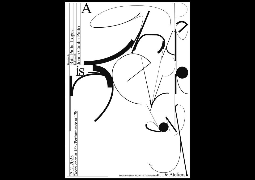
A black and white typographic poster featuring abstract, sweeping curved lines and fragmented letters. Text along the left edge reads “13.2.2025”, “Doors open at 16h / Performance at 17h”, and names the direction and performance by “Rita Palha Lopes” and “Joana Cunha Pinto”. Small text at the bottom lists an Amsterdam address “at De Ateliers”.
Above

Tjaša Cizej: Poster for Rira’s Box ’The Shape Is Never Done’, at Werkplaats Typografie (Copyright © Tjaša Cizej, 2025)
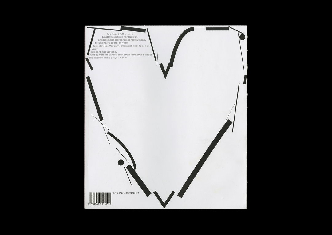
The back cover of a book features a minimalist black line drawing of a heart. A small block of text in the top left corner expresses thanks to the artists and contributors.
Above

Tjaša Cizej: Precious Liquid Magazine (Copyright © Tjaša Cizej, 2023)
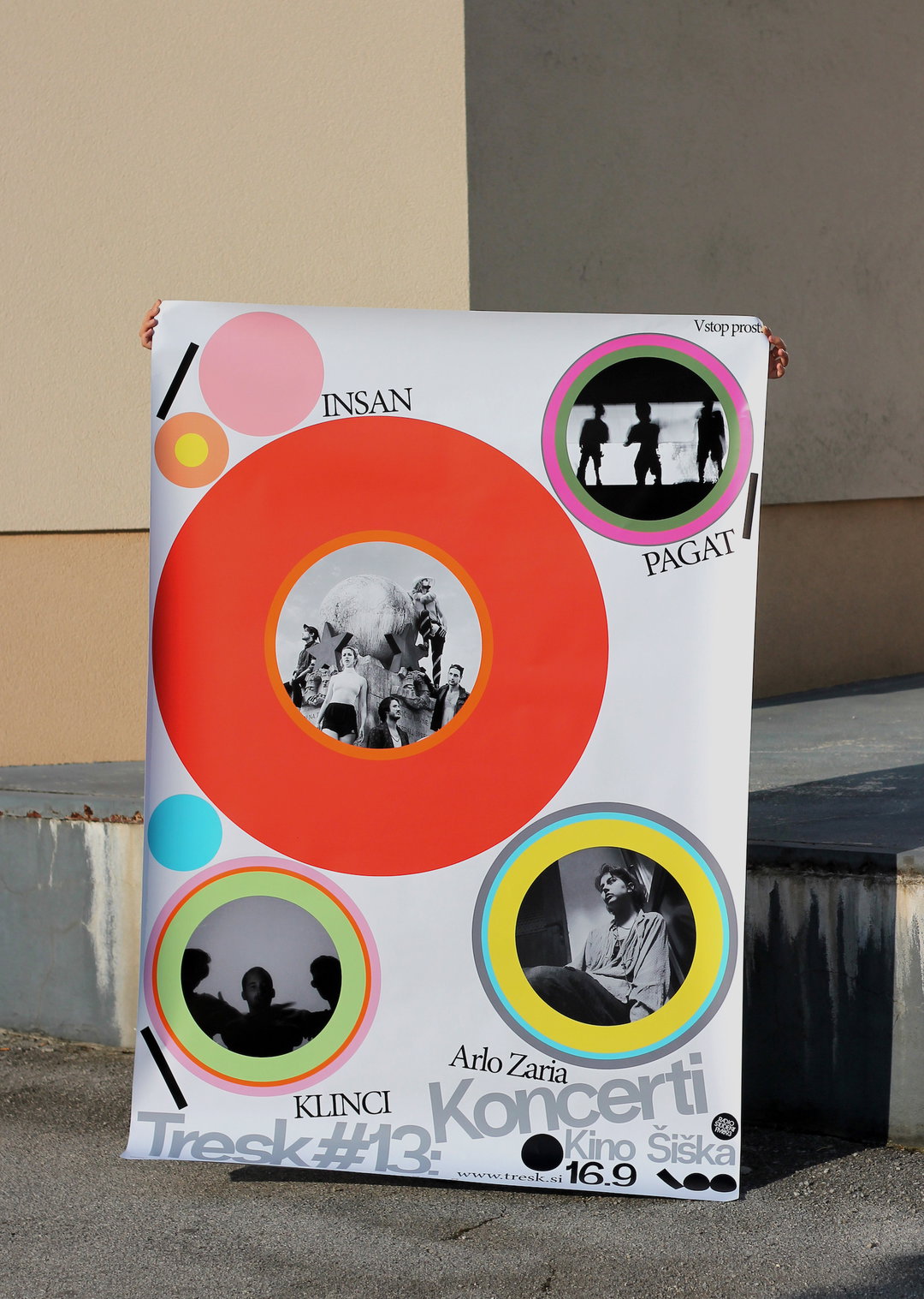
A person holds up a graphic poster featuring a large red circle containing a black and white photograph of a group of people. Smaller circles in pink, blue and yellow surround it, some containing silhouettes and a portrait. Text on the poster includes “INSAN”, “PAGAT”, “Arlo Zaria” and “Koncerti v Kino Šiška”. The bottom reads “Tresk #13” and “16.9”.
Above

Tjaša Cizej: Poster for Festival Tresk (Copyright © Tjaša Cizej, 2022)
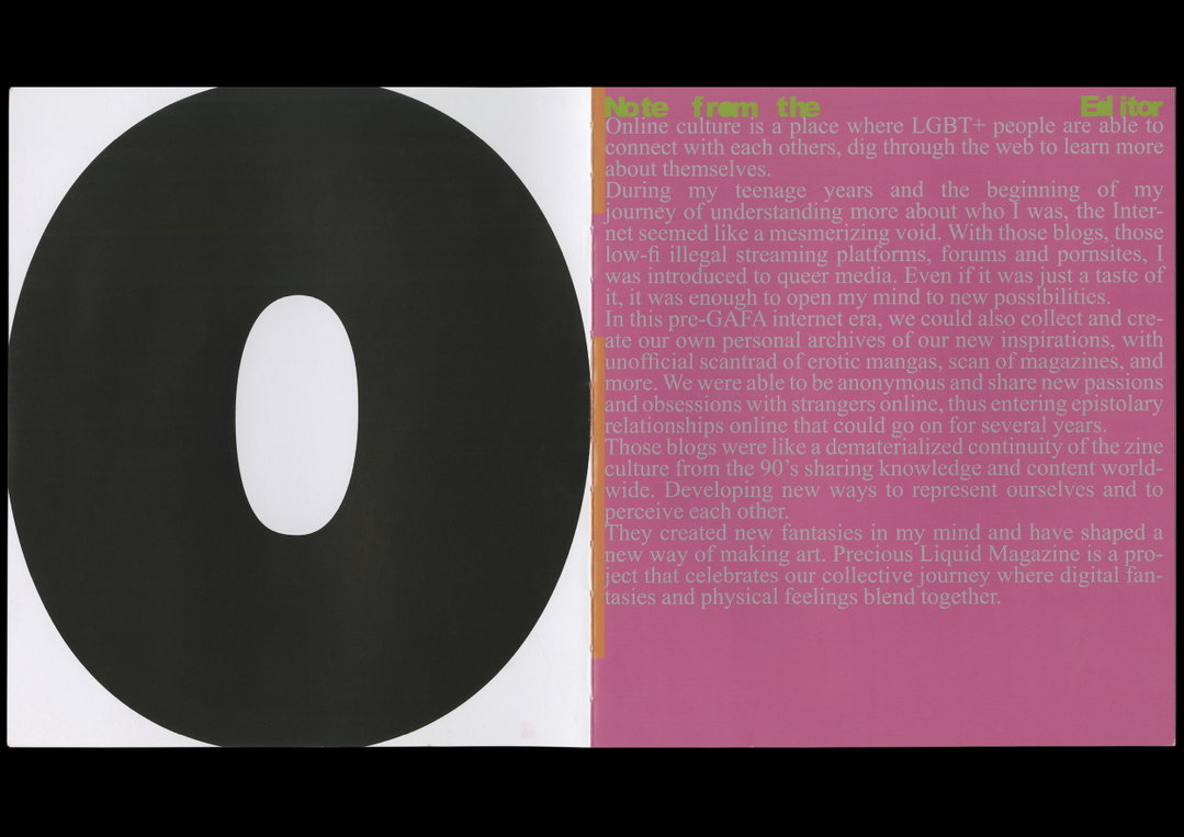
A two-page magazine spread. The left page features a large, black circular shape with a white oval centre, while the right page contains a text block titled “Note from the Editor” set against a pink background.
Above

Tjaša Cizej: Precious Liquid Magazine (Copyright © Tjaša Cizej, 2023)
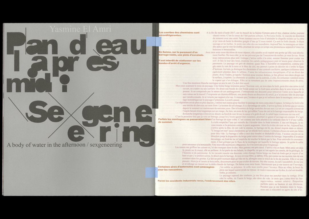
A two-page spread from a publication featuring a minimalist layout. The left page contains large, fragmented typography and the text “A body of water in the afternoon / sexgereening”. The right page is filled with dense columns of French text.
Above

Tjaša Cizej: Precious Liquid Magazine (Copyright © Tjaša Cizej, 2023)
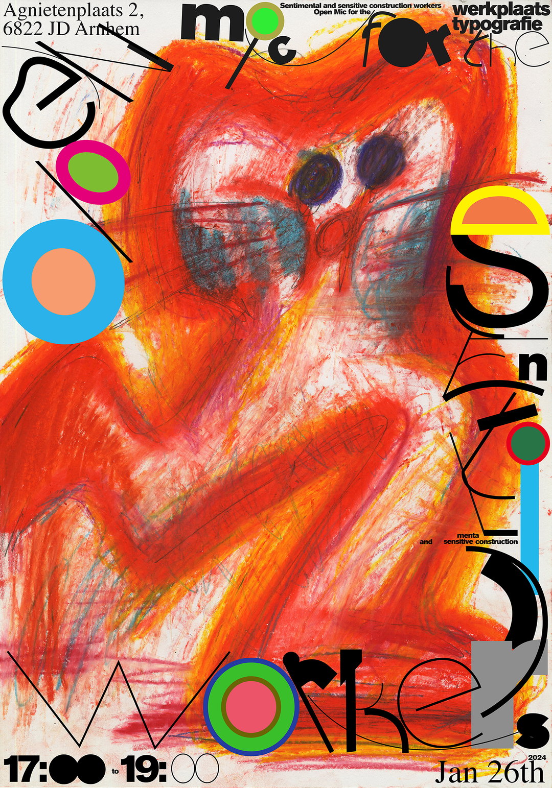
An expressive illustration of a red, creature-like figure with large dark eyes. Bold, fragmented typography wraps around the figure, including the words “mic for” and “workers”. The poster includes the address “Agnietenplaats 2, 6822 JD Arnhem” and the date “Jan 26th 2024”. Text at the top reads “Sentimental and sensitive construction workers”.
Above

Tjaša Cizej, Xiaohan Zhang: Poster for Open Mic ’Open Mic for the Sentimental and Sensitive Construction Workers’, at Werkplaats Typografie (Copyright © Tjaša Cizej, Xiaohan Zhang 2024)

Hero Header

Tjaša Cizej: Festival Sound Explicit (Copyright © Tjaša Cizej, 2024)

Share Article

About the Author

Ellis Tree

—

Ellis Tree (she/her) is a staff writer at It’s Nice That. She joined as a junior writer in April 2024 after graduating from Kingston School of Art with a degree in Graphic Design. Across her research, writing and visual work she has a particular interest in printmaking, self-publishing and expanded approaches to photography. ert@itsnicethat.com

To submit your work to be featured on the site, see our Submissions Guide.
It's Nice That Newsletters

Fancy a bit of It's Nice That in your inbox? Sign up to our newsletters and we'll keep you in the loop with everything good going on in the creative world.