Warriors draws inspiration from Scottish flora and Celtic culture in its rebrand of architecture practice Bard
The practice’s location in the Hebridean Islands, its poetic vision, and its artistry informed Warriors’ approach.
Share
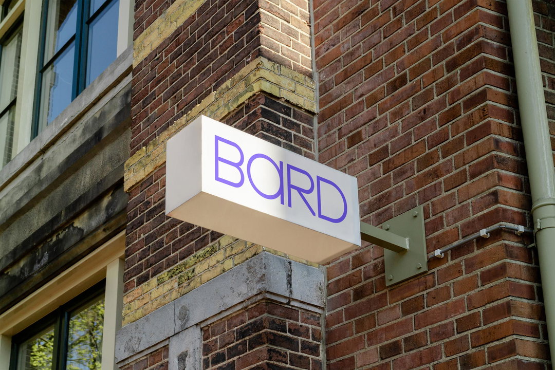
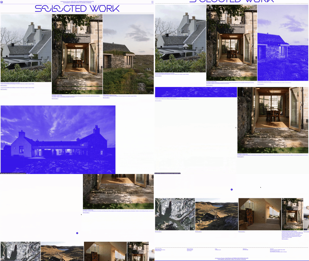
Glasgow-based graphic design and creative agency Warriors has partnered with Scottish architecture practice Bard to create a new identity for its brand. Initially built in-house, Bard co-founder Ruairidh Moir says the firm’s website and communications “were not effectively communicating our desires, aspirations, or capabilities”, and as a result the team reached out to Warriors for a much-needed refresh.
“After meeting with Ruairidh and Ciaran at Bard it was clear to us that they were extremely passionate individuals and had an artistic mentality around almost everything they were involved with,” recalls Warriors co-founder James Gilchrist. “We connected over art, having a rebellious streak, a love of the Scottish islands, and a deadly seriousness about our work.”
Following their agreement to partner for this project, the team at Warriors began identifying the aspects of the Bard brand that made it unique. At the core of this was the practice’s location between Glasgow and the Hebridean Islands, the latter of which went on to inform key aspects of the identity.
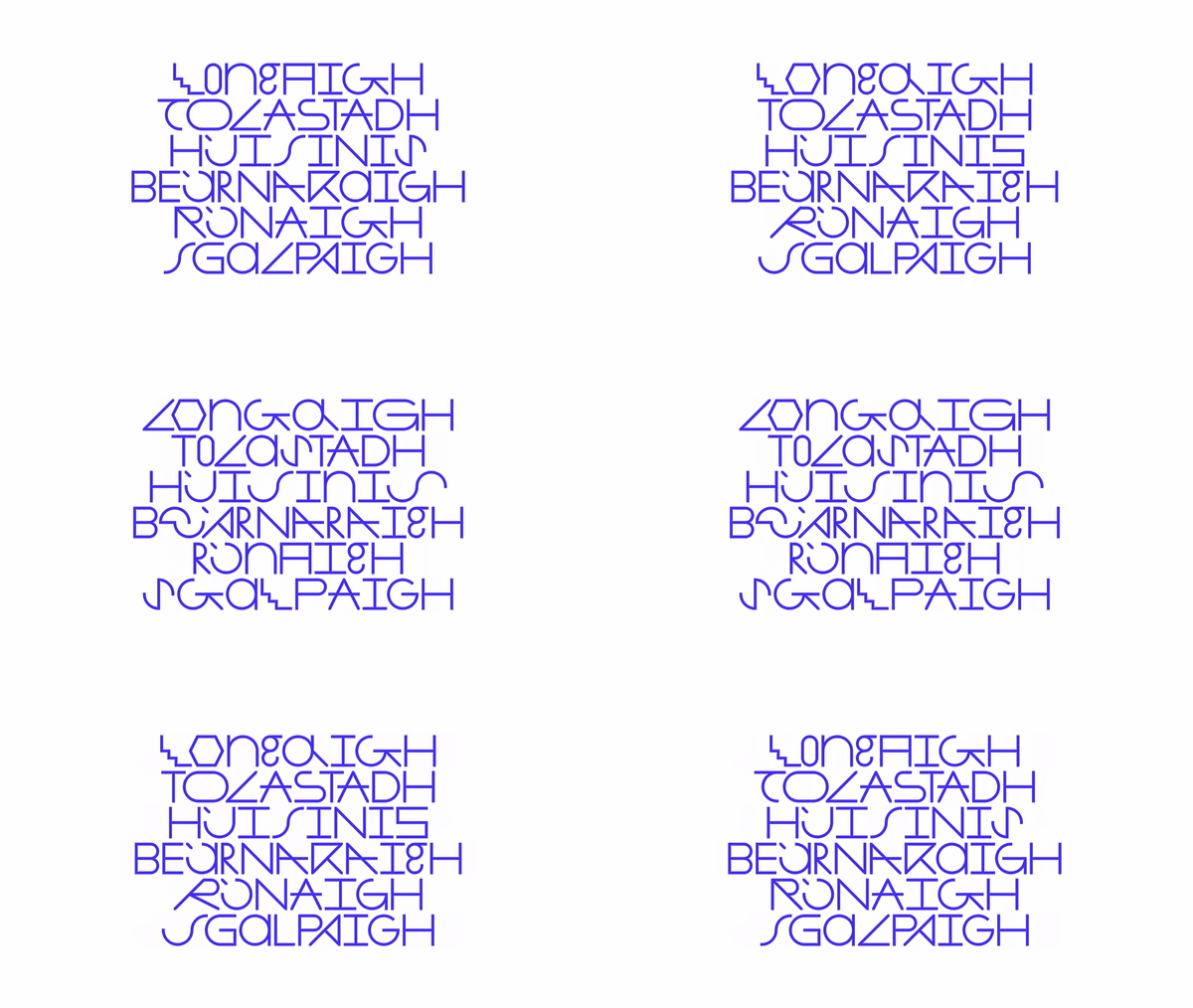
Warriors: Bard Identity (Copyright © Warriors, 2023)
“Colour was a point of contention as a bold, saturated, in-your-face colour without meaningful context or reason did not sit right with any of us,” explains Beth Wilson. “[However] a spring day, as the wildflowers sprung in the fields surrounding Bard’s satellite office in the Hebrides, eventually revealed the brand’s colour: Wildflower Blue.”
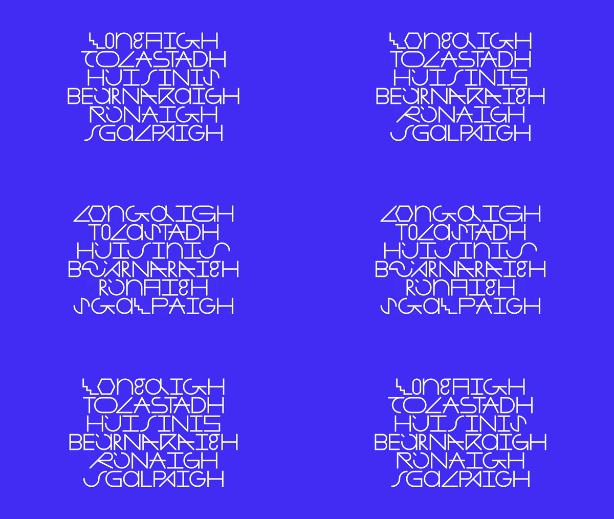
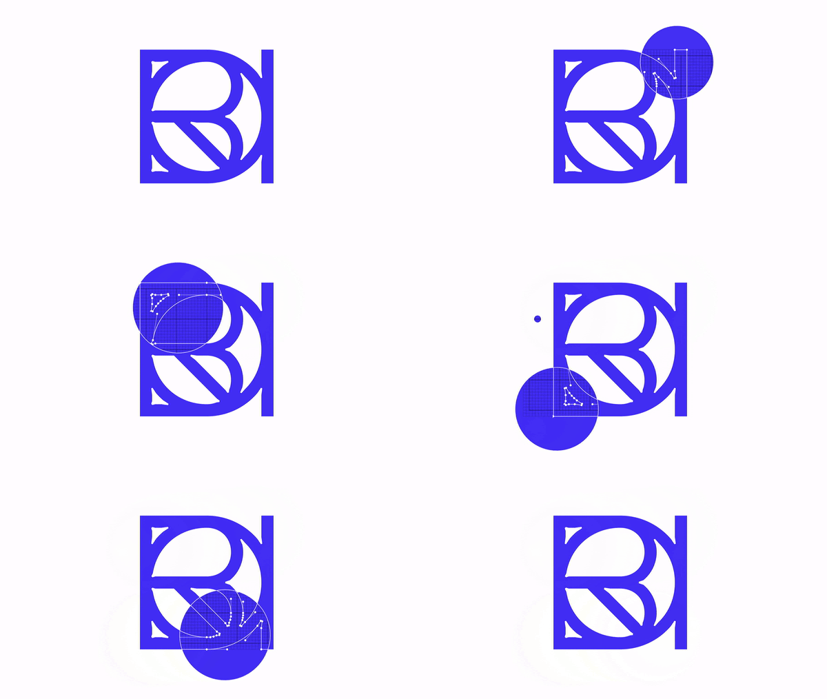
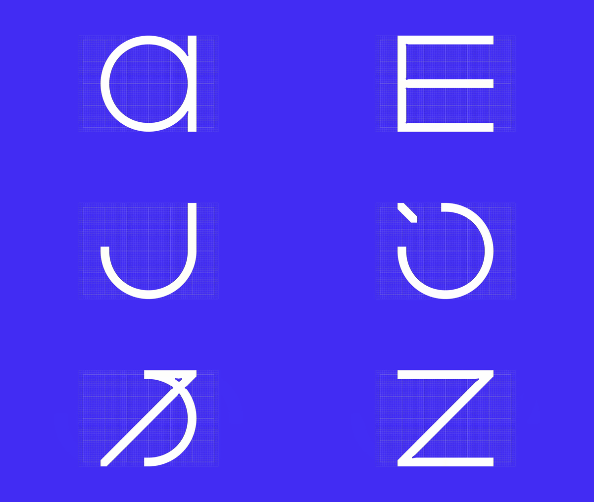
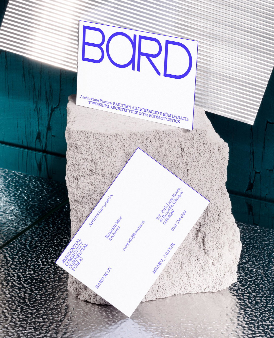
This rich hue became the backbone of the new colour palette, juxtaposing with the otherwise minimal identity. It has even been applied to a custom, hand-drawn typeface that Warriors (in collaboration with Mitchell F Gillies) designed for Bard, ensuring that every minor detail has a link back to the practice’s history and roots.
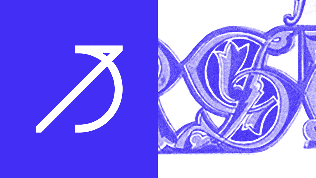
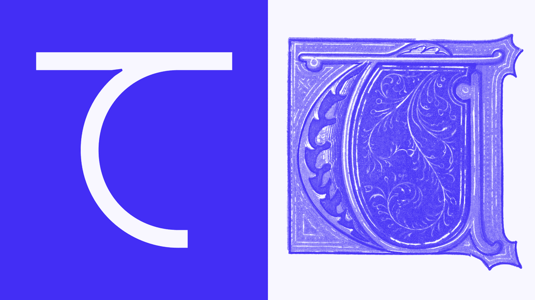
The typeface in question is fittingly called Bard Type and it draws inspiration from a range of sources. Primarily, it is inspired by the late Scottish architect Charles Rennie Mackintosh, whose estate Bard worked with to extend the prototype house Windyhill in Kilmacolm, Scotland in 2017. However, the typeface is also influenced by medieval lettering, architectural drawings and the notion of “pushing creativity within limitations” – the latter of which reflects “how Bard approaches each project within its practice”.
“It was important to have a base set of characters which was clear and functional, but also to draw lettering which was more sculptural, poetic, obscure and artistic to reflect Bard’s poetic vision,” says James of the typeface.
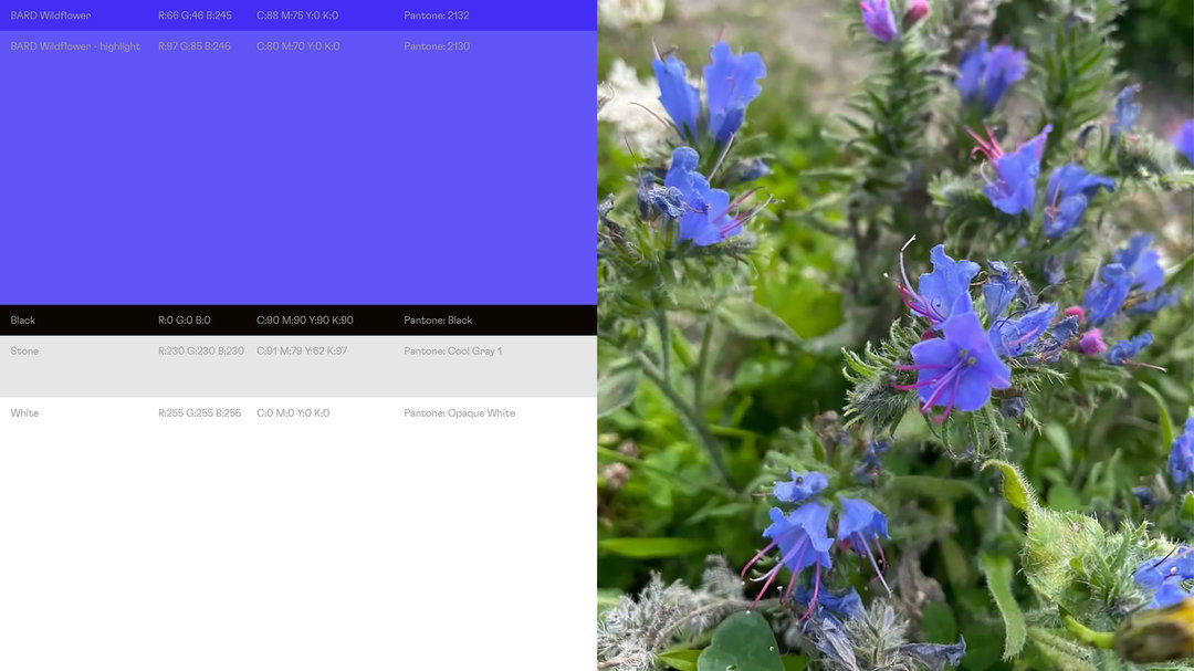
Warriors: Bard identity (Copyright © Warriors, 2023)
The other two typefaces at play within the identity are Journal W08 Regular, which was “inspired by and designed with writing and editorial uses in mind”, and Flexa Light, a grotesk by Grilli Type that was chosen for its “human character and flavour”, but also because it’s “built with clearly constructed linear forms and inktraps” that complement Bard Type. “We chose Journal to contrast the hard, consistent, linear forms of the other two typefaces and to acknowledge the storytelling aspect of the identity and bring an academic tone,” James explains.
All of these elements come together in an identity that is true to Bard and deeply reflects its values and roots. Interestingly, the practice’s name is an acronym of its full Gaelic name, ‘Bailtean Ailteareachd ’s Rùm Dànach’, but it also refers to the way in which the word has been historically used in Celtic cultures, meaning a storyteller, maker or poet. These qualities are inextricably tied to the way in which James and Beth run their studio, and it is these qualities that have guided this identity from start to finish.
Reflecting on the result, Ruairidh says “We love it, and feel a deep sense of pride when we see it and interact with it. It reflects a Bard which was not seen previously. It’s beyond what we could have imagined or hoped for at the outset.”
GalleryWarriors: Bard identity (Copyright © Warriors, 2023)


Hero Header
Warriors: Bard identity (Copyright © Warriors, 2023)
Share Article
Further Info
About the Author
—
Daniel joined It’s Nice That as an editorial assistant in February 2019 and continues to work with us on a freelance basis. He graduated from Kingston University with a degree in Journalism in 2015. He is also co-founder and editor of SWIM, an annual art and photography publication.