Launch Recite Me assistive technology
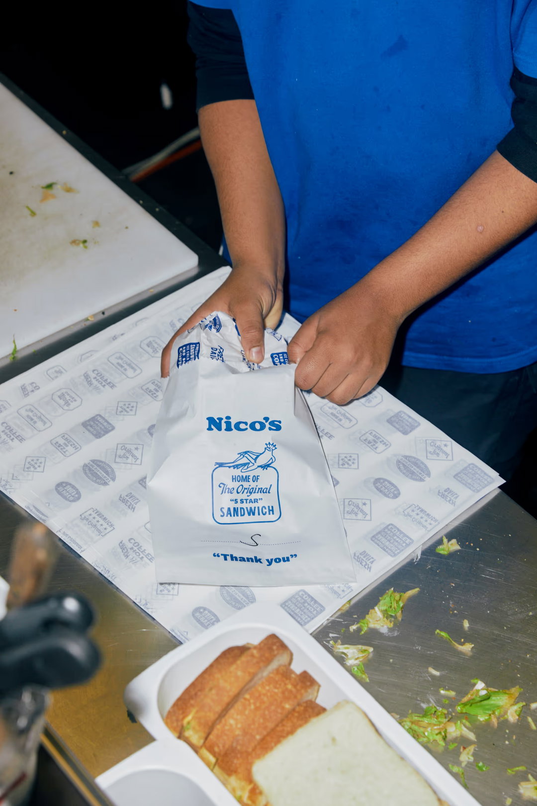
A person in a blue T-shirt packs a white paper bag on a kitchen counter. The bag features a logo for “Nico’s” and the text “Home of The Original ‘5 Star’ Sandwich” and “Thank you”.

Weekdays redesigns everyday pleasures in living colour

This Naarm/Melbourne-based creative studio combines typography, illustration, and space to revitalise the worlds of food, drink, and hospitality.

—
Date
22 October 2025

Creative studio Weekdays is waking up brand identities to vibrant aesthetics. However, further than just aesthetic, Weekdays’ founder Todd Vanneste tells us the studio is drawn to explorations of “how people interact with brands and spaces,” balancing both clarity and storytelling. When dealing with packaging, consumers need to know what they’re buying – and it helps that Weekdays’ designs stand out from the shelf.
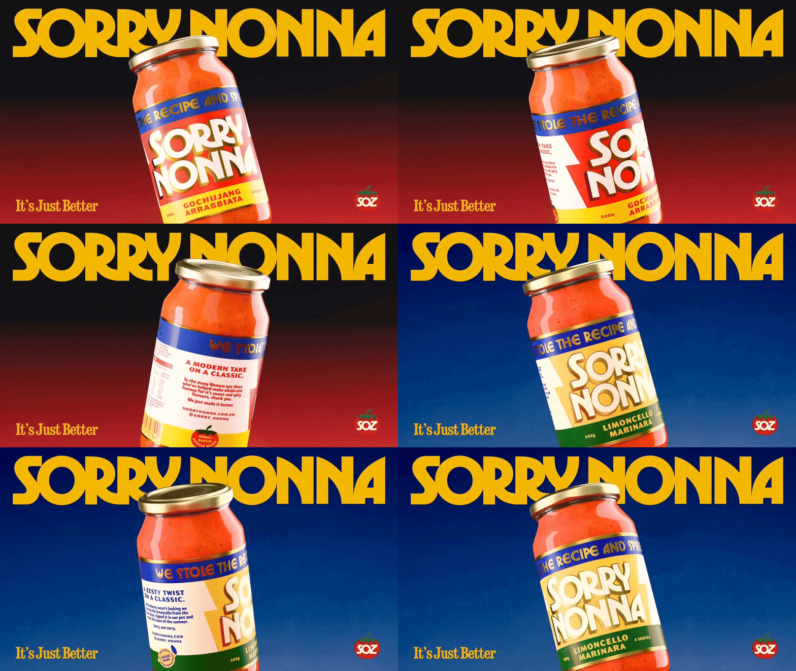
An animation of a jar of pasta sauce against a shifting red and blue background. Large yellow text reads “SORRY NONNA” at the top and “It’s Just Better” at the bottom, while the jar rotates to show different labels including “GOCHUJANG ARRABBIATA”.
Above

Weekdays Design Studio: Sorry Nonna (Copyright © Weekdays, 2024)

Use is converted into optic storytelling to let the customer know what they’re purchasing without compromising attraction and curiosity. For brand Sorry Nonna, typography boldly bounces off the label wrapped with the primary colours of blue and yellow. For wine brand Tozzo, poise and elegance are paired with modern aesthetics by exploiting the wide bottle shape to fill and stretch type across both the neck and base. For the beer Love Shack, Weekdays translates the product using western visual narrative producing a classic crest-style label. What ties the studio’s projects together is a strong spatial awareness, striking typography, and an eye for drawing out a brand’s essence and style throughout a consistent design system.
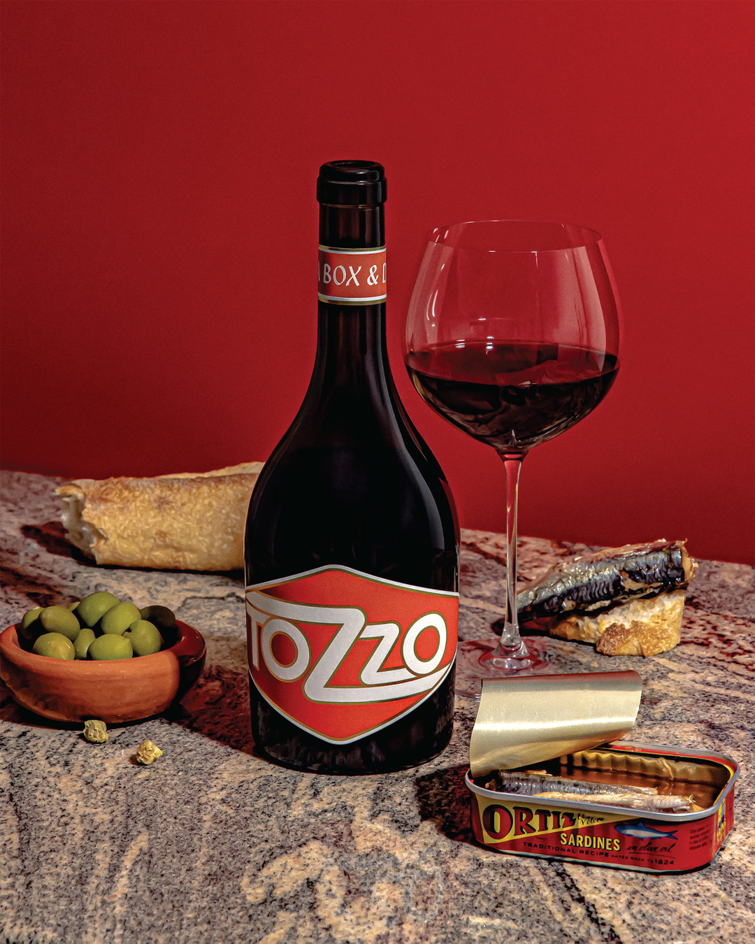
A bottle of red wine and a filled glass stand on a granite surface against a red background. They are surrounded by a bowl of green olives, a piece of crusty bread, and an open tin of “Ortiz” sardines.
Above

Weekdays Design Studio: Weekdays (Copyright © Weekdays, 2022)
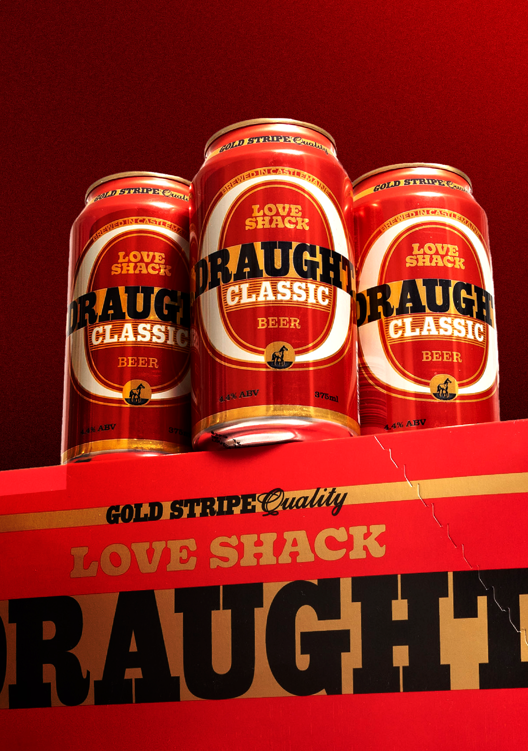
Three red beer cans stand behind a matching cardboard box against a red background. The cans and box feature gold and white branding that reads “Love Shack Draught Classic Beer”.
Above

Weekdays Design Studio: Love Shack Brewing Co (Copyright © Weekdays, 2024)
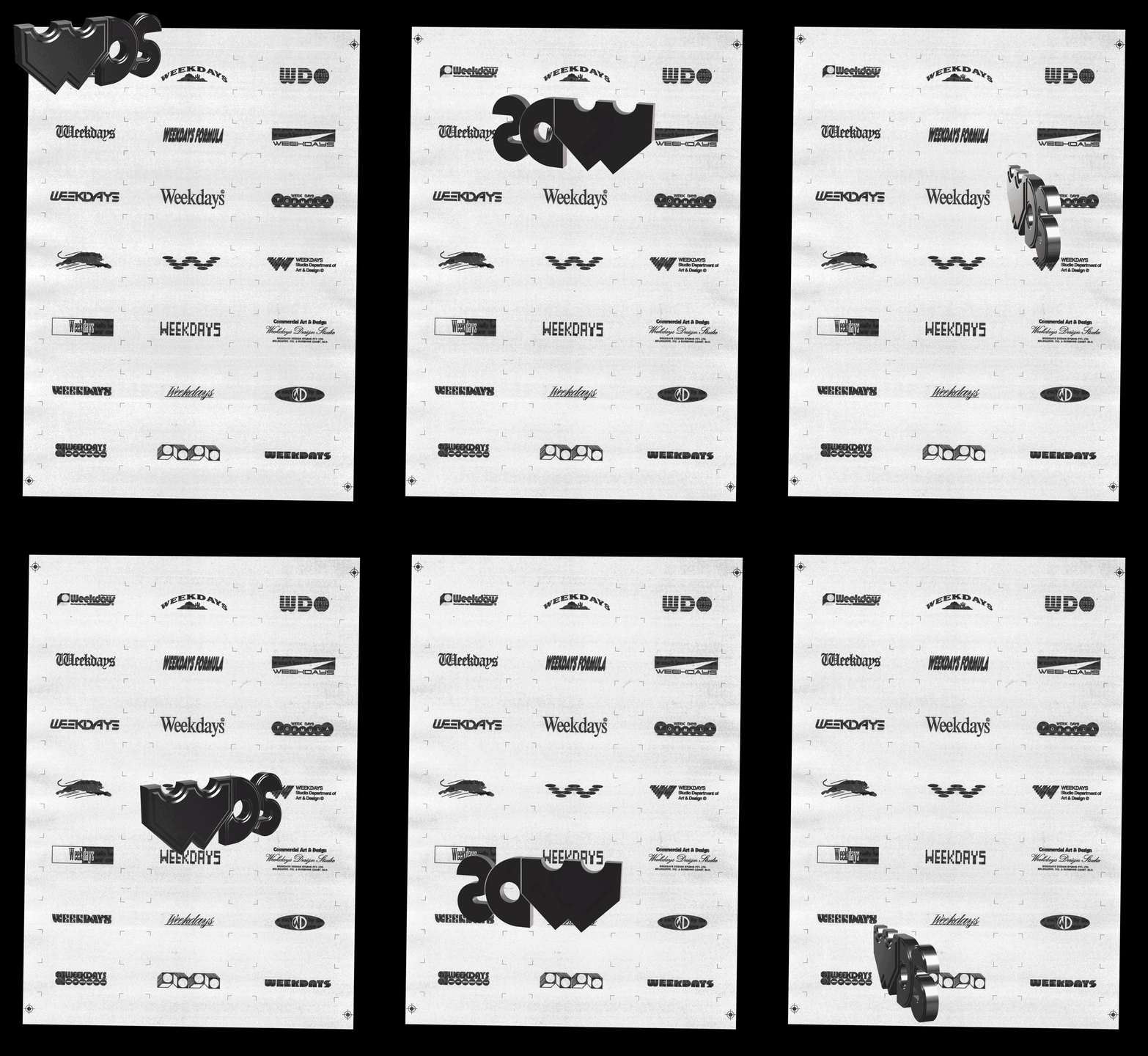
An animation of a grid of various black and white logos for “Weekdays” on a textured paper background. Large, 3D block letters shift and morph across the page, appearing over different logo variations.
Above

Weekdays Design Studio: Weekdays (Copyright © Weekdays, 2025)
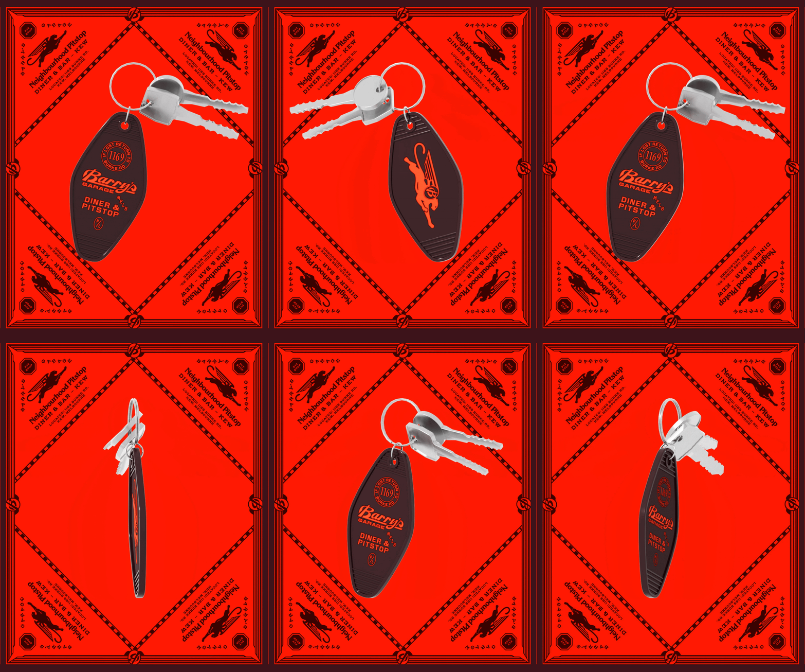
An animation in which a set of keys with a brown guitar-pick fob rotates against a red background. The fob reads “Barry’s Garage Melb Diner & Pitstop”, while the background features a repeated logo for “Neighbourhood Pitstop Diner & Bar – Kew”.
Above

Weekdays Design Studio: Barrys Garage (Copyright © Weekdays, 2024)
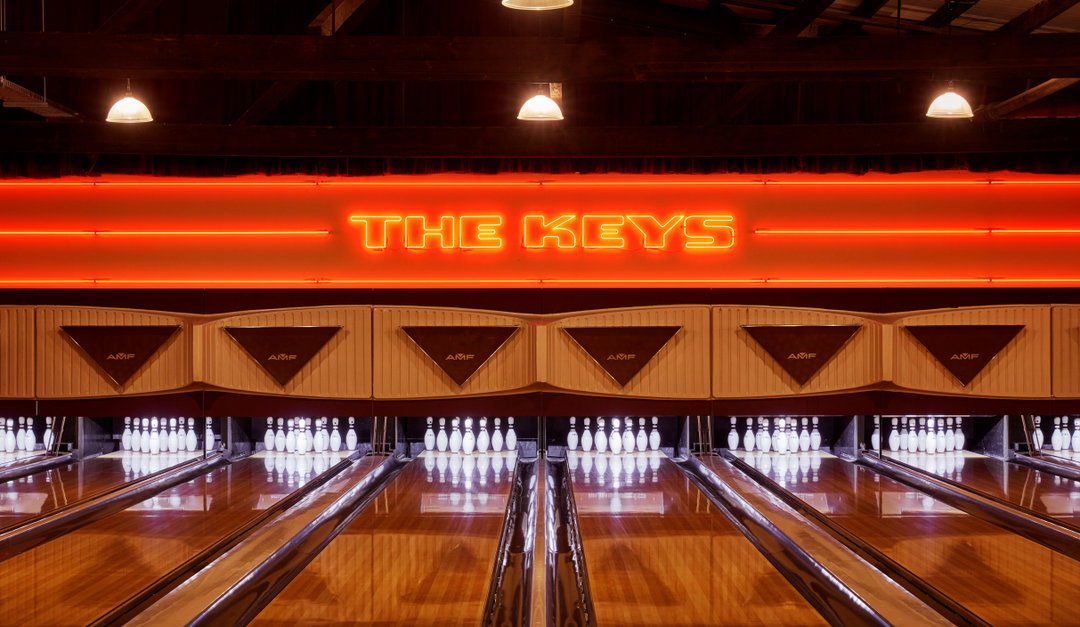
A wide shot of a bowling alley with polished wooden lanes. A bright orange neon sign above the pins reads “THE KEYS”.
Above

Weekdays Design Studio: The Keys (Copyright © Weekdays, 2021)
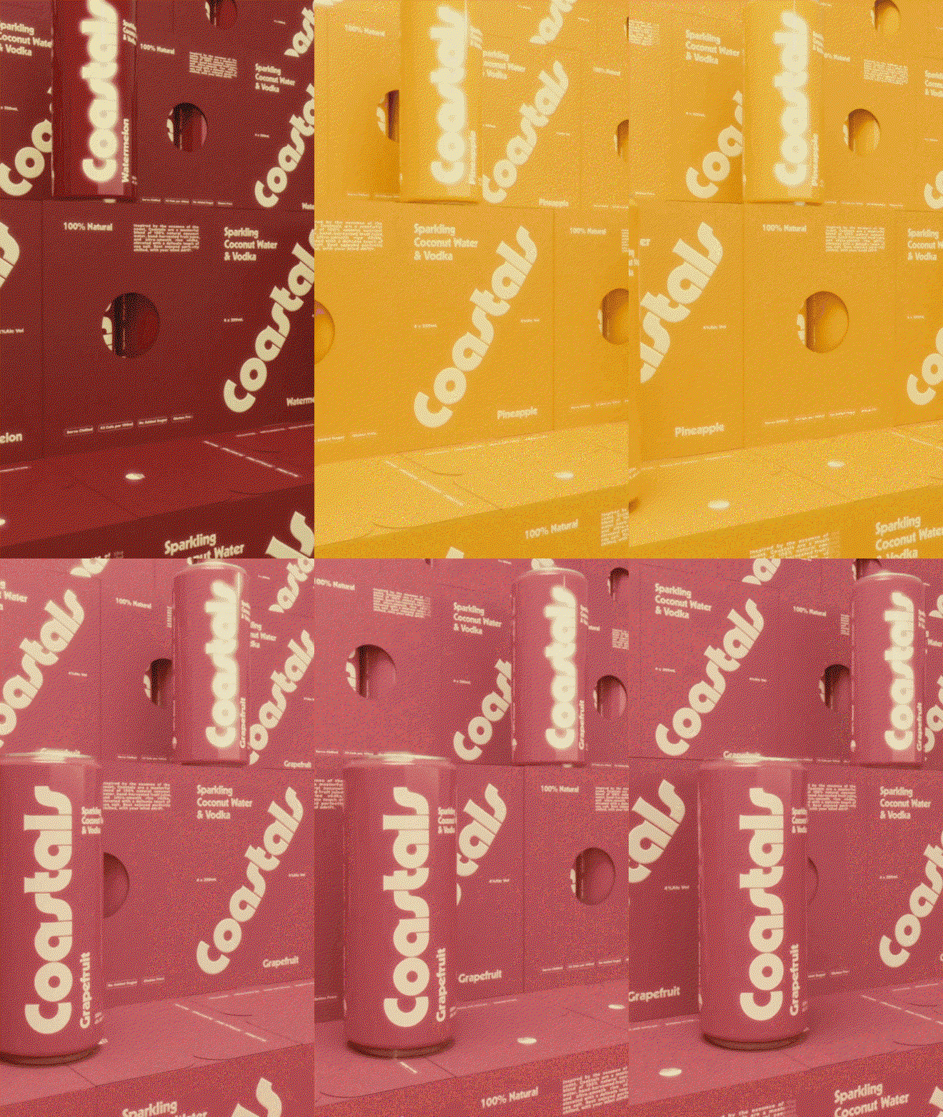
An animation of yellow cans and packaging for “Coastals” sparkling coconut water and vodka, which then shifts to a pink colour palette. The text “Pineapple” and “Grapefruit” appear on the products.
Above

Weekdays Design Studio: Coastals (Copyright © Weekdays, 2025)
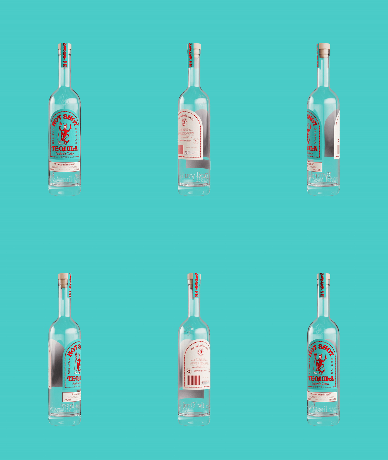
An animation in which a clear glass bottle of tequila rotates against a turquoise background. The red and white label features a red devil illustration and the words “Hot Shot Tequila”, while a smaller caption reads “A dance with the devil”.
Above

Weekdays Design Studio: Hot Shot Tequila (Copyright © Weekdays, 2023)
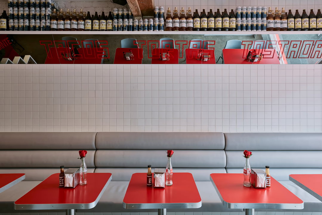
A row of red tables and a grey leather booth in a brightly lit cafe. Above a white tiled wall, a shelf is lined with beer bottles and a red sign reads “Tacos Tortas Tostadas”.
Above

Weekdays Design Studio: Frankies Tortas and Tacos (Copyright © Weekdays, 2023)

Hero Header

Weekdays Design Studio: Nicos Deli (Copyright © Weekdays, 2020)

Share Article

About the Author

Sudi Jama

—

Sudi Jama (any pronouns) was a staff writer at It’s Nice That from April 2025–January 2026, and is now a freelance writer. They have a keen interest and research-driven approach to design and visual cultures in contextualising the realms of film, TV, and music.


It's Nice That Newsletters

Fancy a bit of It's Nice That in your inbox? Sign up to our newsletters and we'll keep you in the loop with everything good going on in the creative world.