Launch Recite Me assistive technology
An animation in which a stylized, rounded letter “S” morphs into various scenes against changing coloured backgrounds. The imagery shifts through a Japanese garden, a hot dog, a gaming console, a clothing shop, chocolate bars, a bullet train, a beach, a golf course, the Space Needle, a mountain, surfers and an airport.

Seattle Southside gets a new lick of paint, shrinking attractions into type

One Twenty Three West agency developed dozens of logo iterations based on real-life attractions or “microadventures” in the region.

—
Date
5 April 2023

When you’re advertising a tourist destination, it can be easy to pile on the superlatives – the biggest, oldest or best. Going on a slightly different route is One Twenty Three West (123w) from Toronto; the agency has just worked with Seattle Southside’s Regional Tourism Authority on a new identity and tourism campaign. Rather than highlighting just one landmark, 123w chooses to spotlight a sea of smaller, unique attractions, so that every visit to Seattle Southside might look different, depending on the visitor.

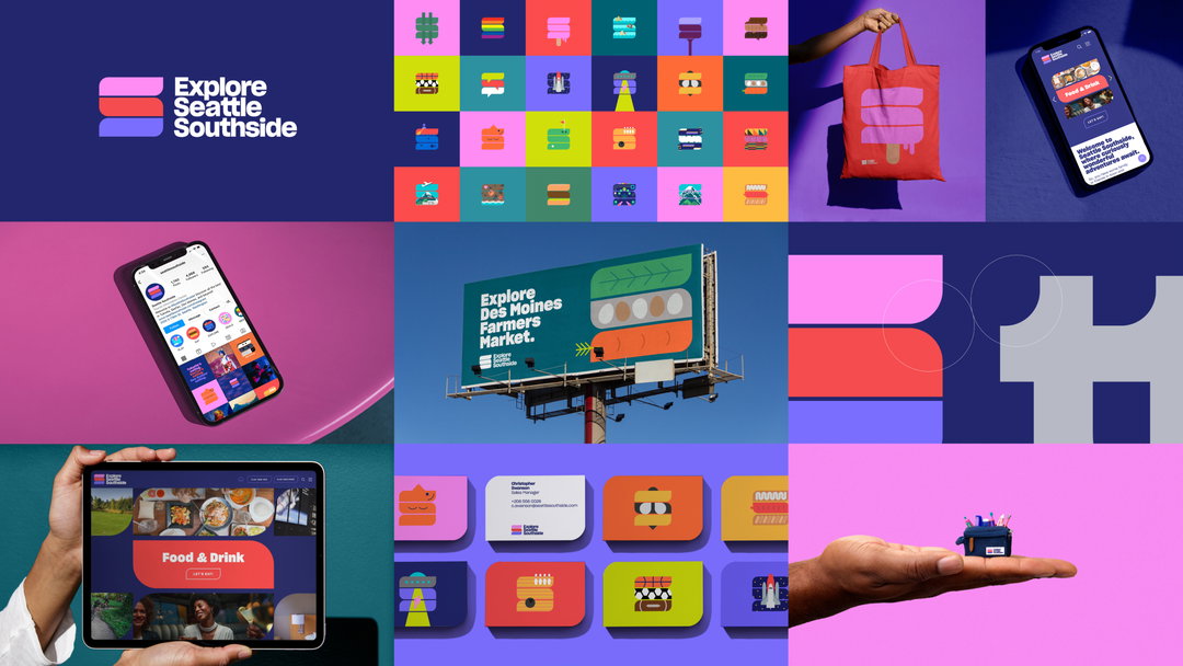
Seattle Southside’s three cities – SeaTac, Tukwila and Des Moines – are represented first in a new logo. 123w splits an S form into three interlinking forms of separate colours, with each denoting a different city.

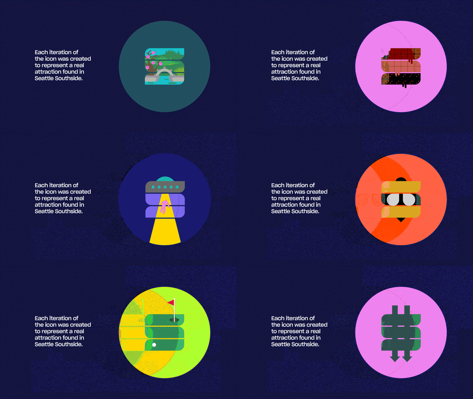
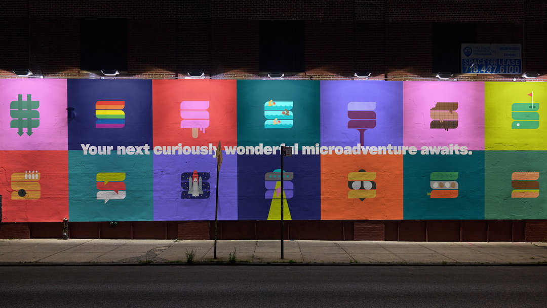
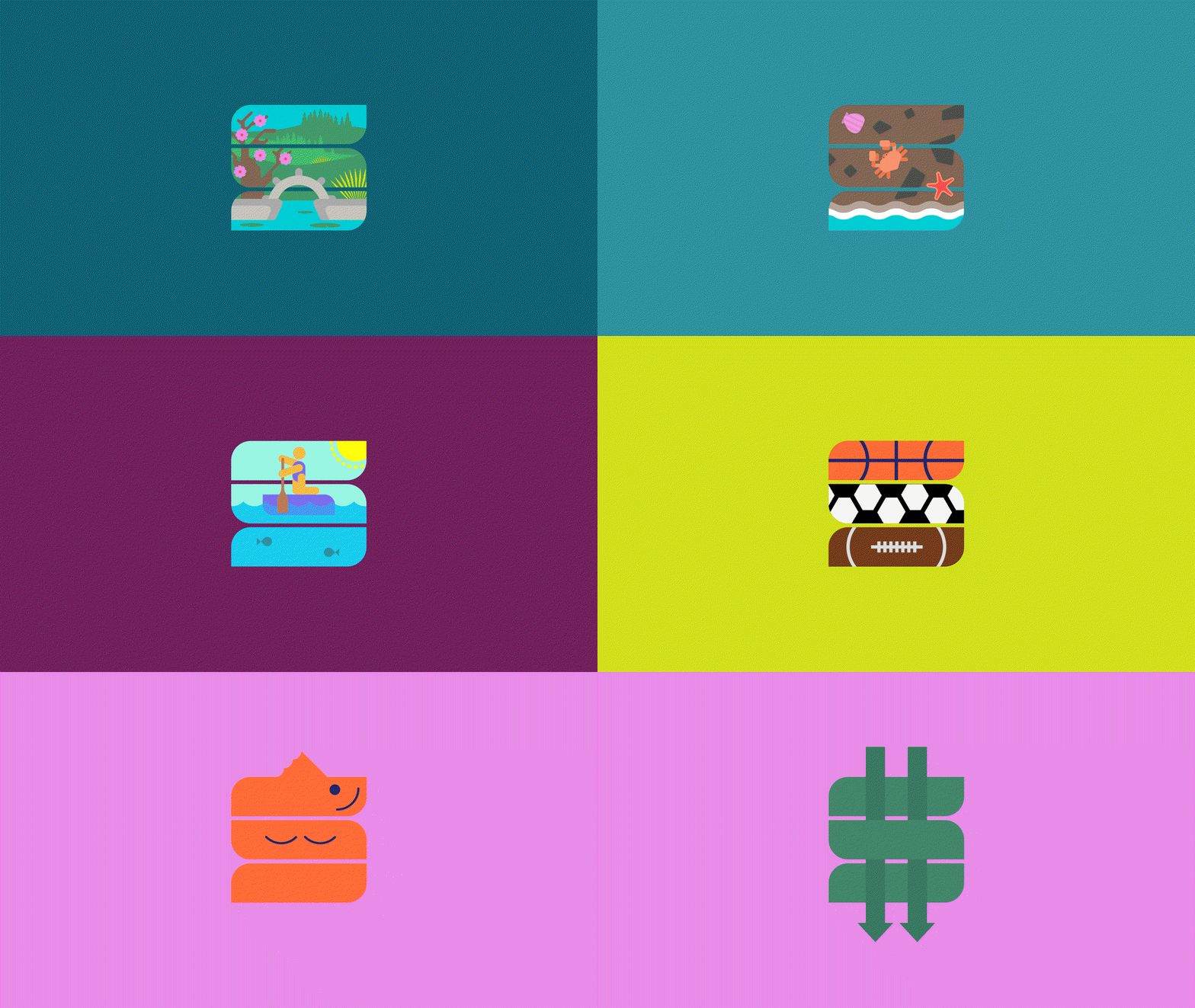
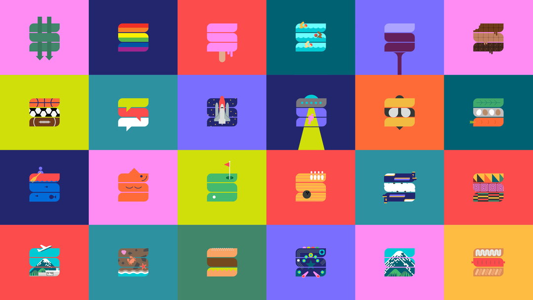
The logo also functions as a framework for further playful typographic explorations, each referencing a different attraction in Seattle Southside. These adaptations allow a range of places to be amplified at the centre of the brand. It’s a playful touch, and we get to see how 123w simplifies a farmers’ market and bowling alley into its simplest parts.
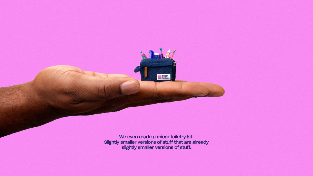
A tiny blue toiletry kit sits in the palm of a person's hand against a bright pink background. Miniature bottles and tubes poke out from the top of the bag. Below the hand, text reads “We even made a micro toiletry kit. Slightly smaller versions of stuff that are already slightly smaller versions of stuff.”
Above

One Twenty Three West: Explore Seattle Southside (Copyright © One Twenty Three West, 2023)

The project features a series of videos that riff on the concept of the microadventure. Perhaps the best is the micro toiletry travel kit, complete with comb and toothbrush, in line with some of the wonderful work in miniature we’ve seen circulating online of late. 123w agency has also created a content series called A guide to microadventures in a few microseconds, offering fun-sized travel guides.

123w designer Jake Lim shares further context on the design direction: “So much of tourism marketing can be oversaturated with photography that can lack a sense of distinction and real identity. So, all the choices in branding from colours to typography to embracing illustration let us jump out from the crowd while also highlighting the unique, left-of-centre character of the region.”

GalleryOne Twenty Three West: Explore Seattle Southside (Copyright © One Twenty Three West, 2023)
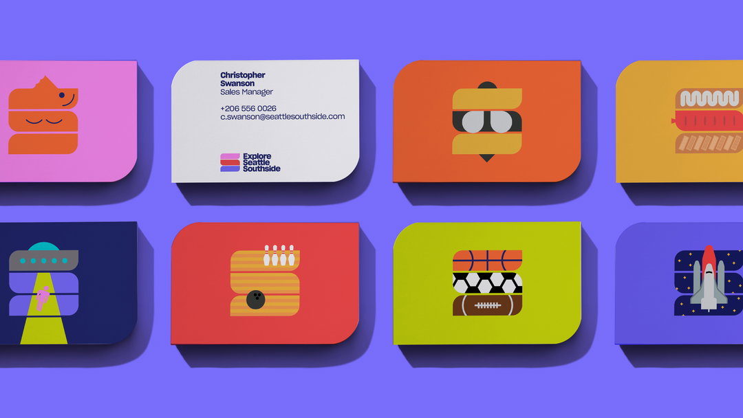
Eight colourful business cards are arranged in two rows against a purple background. One card contains contact details for “Christopher Swanson”, while the others feature abstract, stacked illustrations of food, sports and city landmarks.
A grid of 24 colourful tiles, each featuring a different creative interpretation of a hashtag symbol. The symbols are reimagined as various objects, including a rainbow, a rocket ship, a sandwich and a slice of cake.
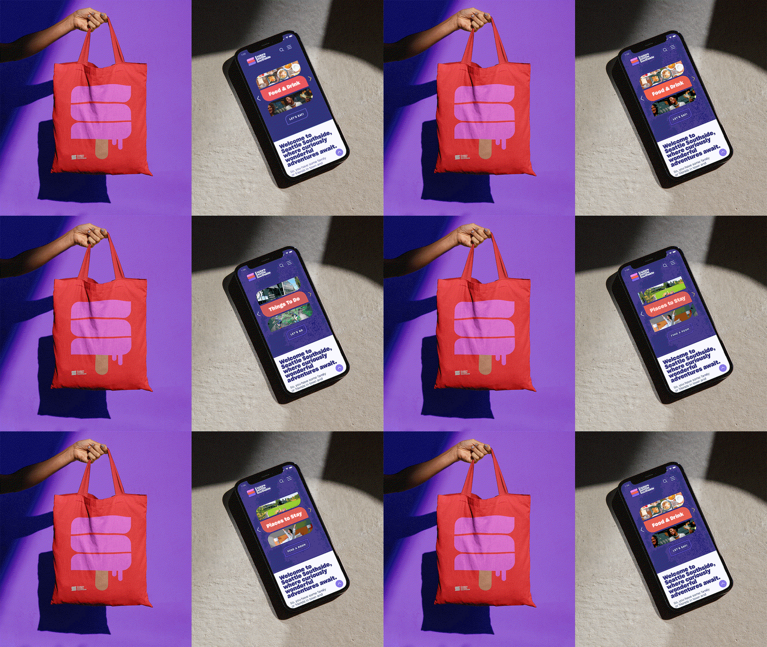
An animation showing a red tote bag held against a purple background, alongside a smartphone displaying a travel website. The phone screen cycles through categories, including “Food & Drink” and “Things To Do”, above a welcome message for “Seattle Southside”.
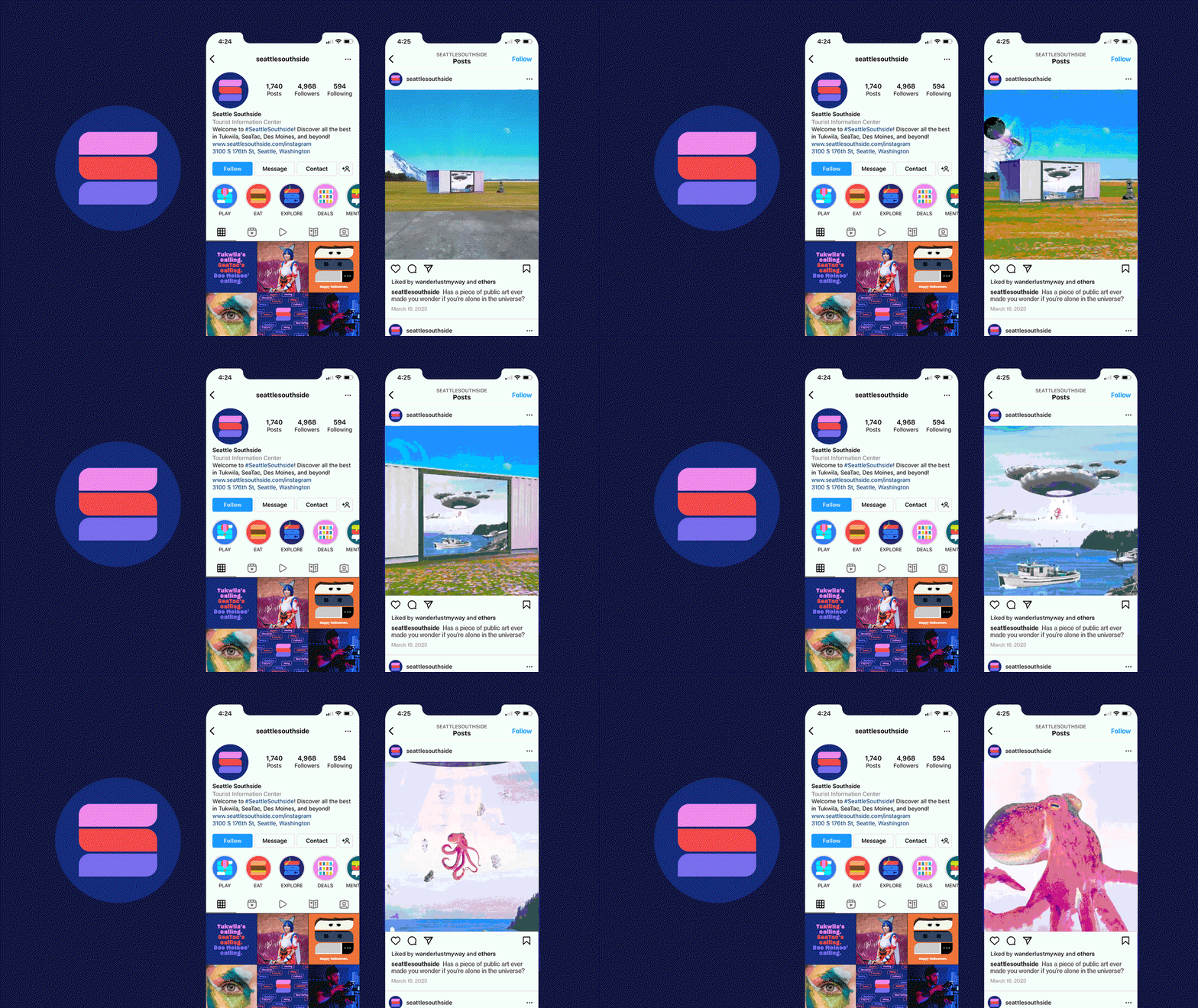
An animation of a brand identity and Instagram profile for “Seattle Southside”. The screen shows a profile page and a feed where the images cycle through a landscape with a futuristic building, a close-up of a UFO, and a pink octopus.
A grid of nine images showcasing a brand identity for “Explore Seattle Southside” and “Explore Des Moines Farmers Market”. The visuals include a logo, a colourful grid of icons, a red tote bag, a billboard, and digital interfaces on a phone and tablet.
An animation in which a circular frame on a dark blue background cycles through various colourful illustrations of Seattle Southside attractions. Text to the left reads “Each iteration of the icon was created to represent a real attraction found in Seattle Southside.”
A colourful mural on a brick wall features a grid of abstract icons in bright blocks of colour. Across the centre, white text reads “Your next curiously wonderful microadventure awaits.”
A logo on a deep blue background reads “Explore Seattle Southside”. To the left of the text are three rounded horizontal bars in pink, red and purple.

One Twenty Three West: Explore Seattle Southside (Copyright © One Twenty Three West, 2023)
One Twenty Three West: Explore Seattle Southside (Copyright © One Twenty Three West, 2023)
Hero Header

One Twenty Three West: Explore Seattle Southside (Copyright © One Twenty Three West, 2023)
Share Article

Further Info

About the Author

Liz Gorny

—

Liz (she/they) is the senior editor at Insights, a research-driven department within It’s Nice That. They previously ran the news section of the website. Get in contact with them for potential Insights collaborations or to discuss Insights’ public-facing reports.
It's Nice That Newsletters

Fancy a bit of It's Nice That in your inbox? Sign up to our newsletters and we'll keep you in the loop with everything good going on in the creative world.