Design Research Studio’s British Rail Corporate Identity Manuals to be published in entirety
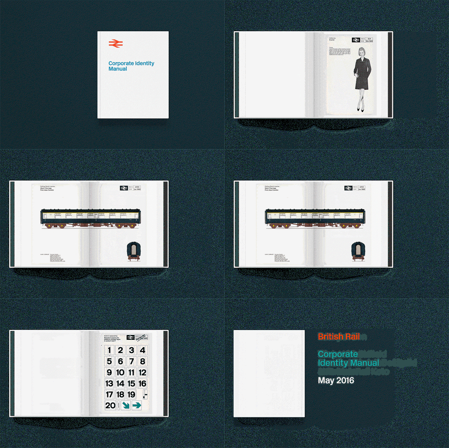
Design Research Unit’s “double arrow” British Rail logo forms part of one of the most iconic graphic identities of the 20th Century, and the manuals that outline it are now to be published a comprehensive book. The identity design was created by Design Research Unit’s Gerry Barney initially in 1965, and a new Kickstarter campaign looks to draw all graphics standards manuals together in a book that “will celebrate British Rail’s identity in its entirety – not only its distinctive symbol.”
Created in agreement with the Department of Transport and alongside Nick Job, a custodian of the British Rail Corporate Identity Manual, the book collates the original four volumes of manuals: the first from July 1965, showing core brand elements such as the symbol, logotype, lettering and colour palette; Binder two, issued in November 1966, shows guidance on printed publicity and binders three and four were issued in 1970 with guidance on architecture and signposting, rolling stock, lineside equipment, road vehicles, ships, liner trains, uniforms and stationery.
The Kickstarter project was initiated by graphic designer Wallace Henning.
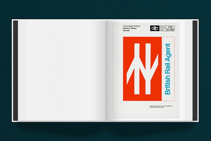
Design Research Unit: British Rail Corporate Identity Manual
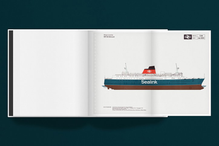
Design Research Unit: British Rail Corporate Identity Manual
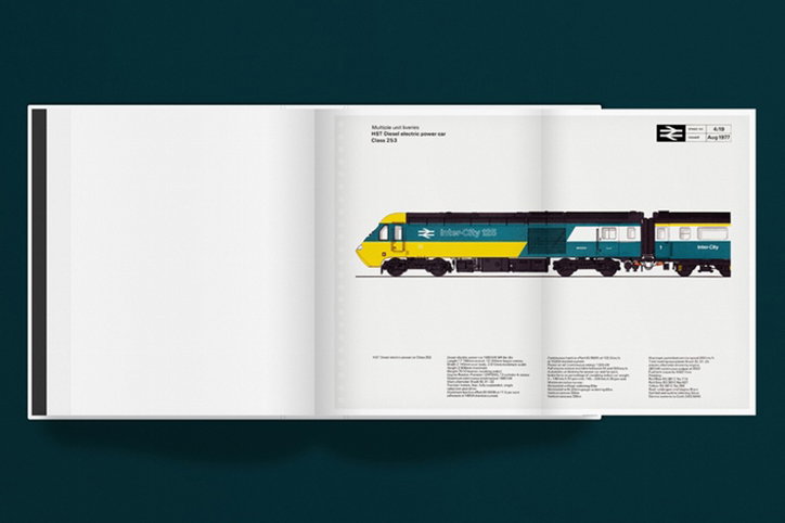
Design Research Unit: British Rail Corporate Identity Manual
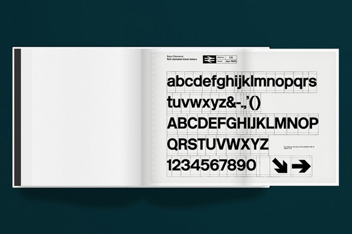
Design Research Unit: British Rail Corporate Identity Manual
Share Article
Further Info
About the Author
—
Emily joined It’s Nice That as Online Editor in the summer of 2014 after four years at Design Week. She is particularly interested in graphic design, branding and music. After working It's Nice That as both Online Editor and Deputy Editor, Emily left the company in 2016.