Cannabis and design. As the US marijuana market predicts further growth, these industries continue to knit closer together and studios, agencies and brands alike are trying to imagine what a cannabis brand should look like. For Eddie Opara, a vital part of this work is avoiding typical marijuana stereotypes, but the designer posits that it’s equally important to know, understand and be wary of how the market works. “With the increase in use comes more abuse,” says Eddie. “30 per cent of US states, still a tiny number, have set up programs to guarantee minorities obtain a fair share of the industry’s profits.”
A “broken system” is how Eddie describes it and, in his latest project, the designer is using cannabis branding itself to rally against it.
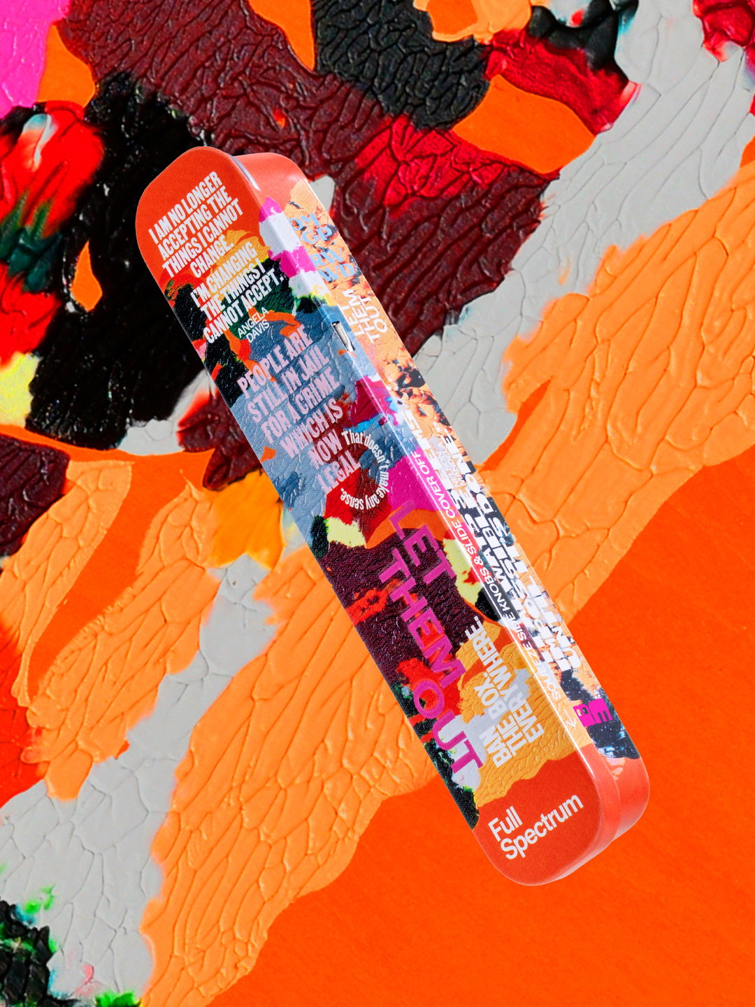
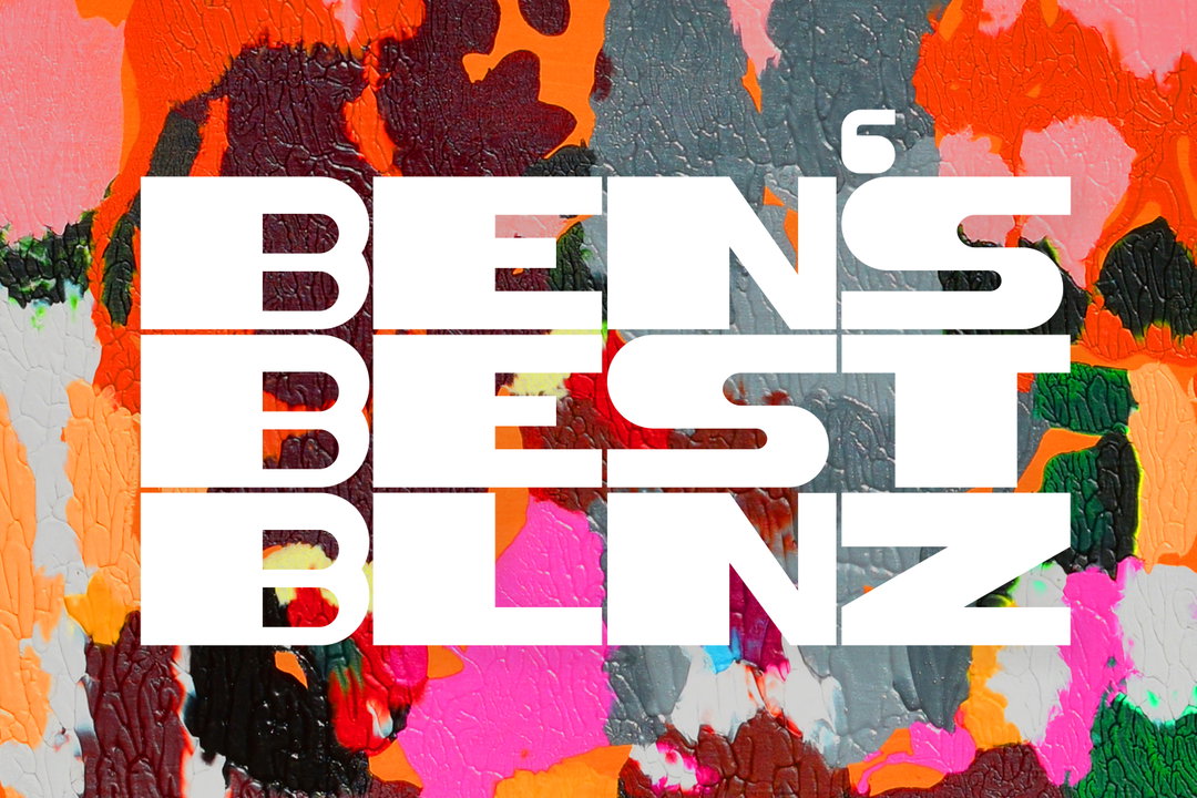
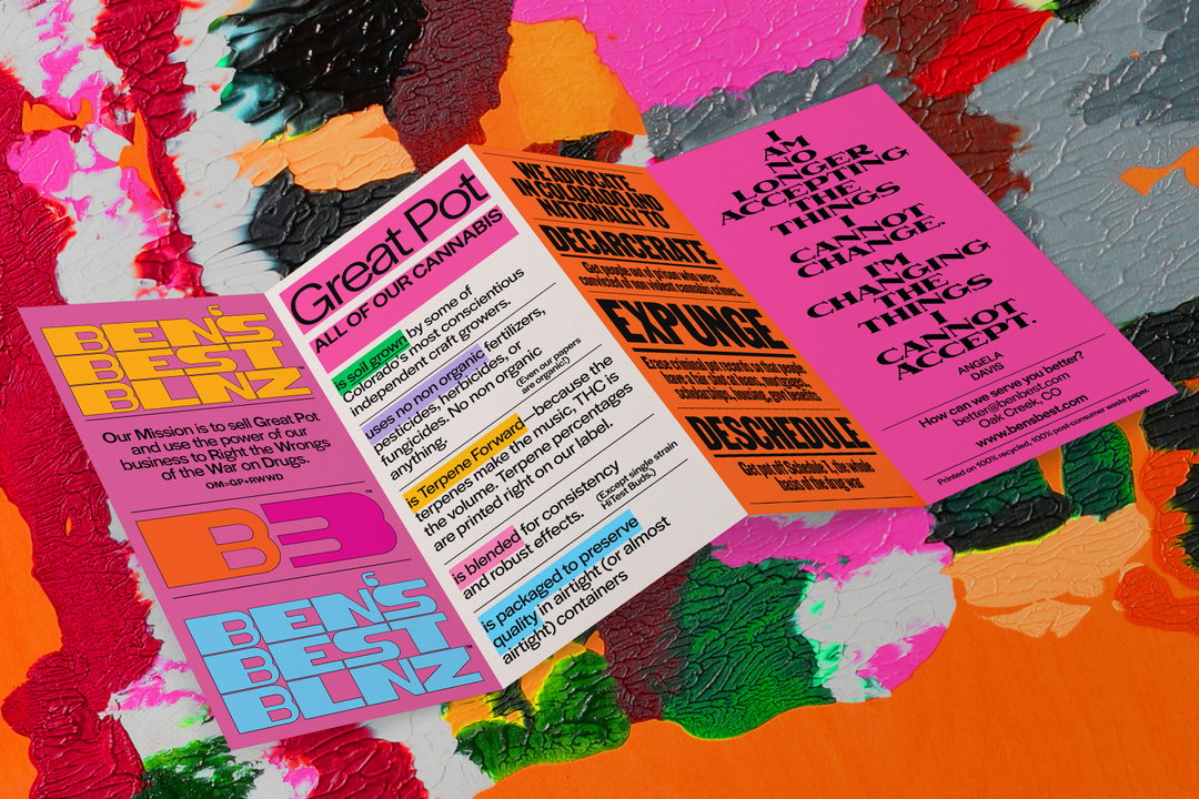
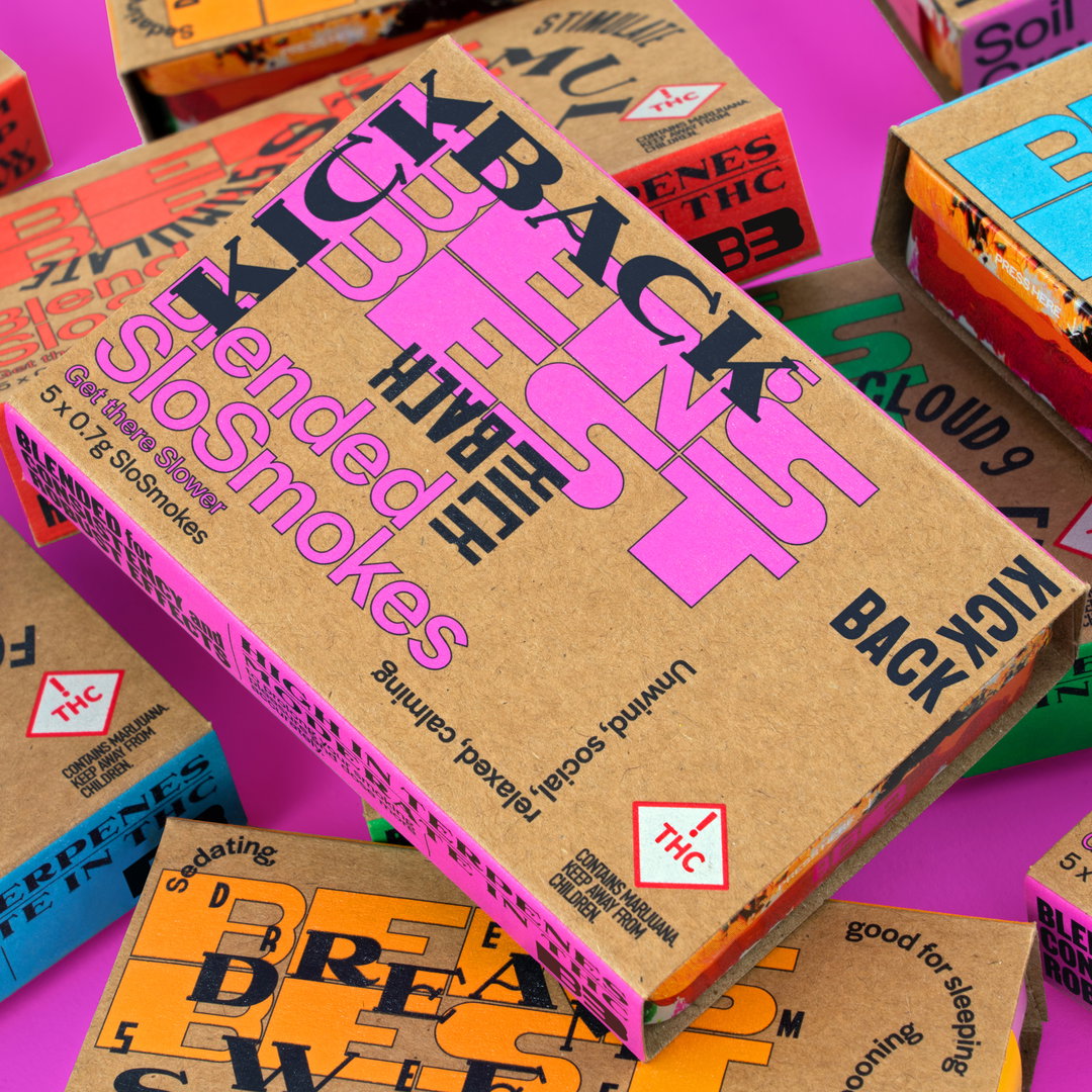
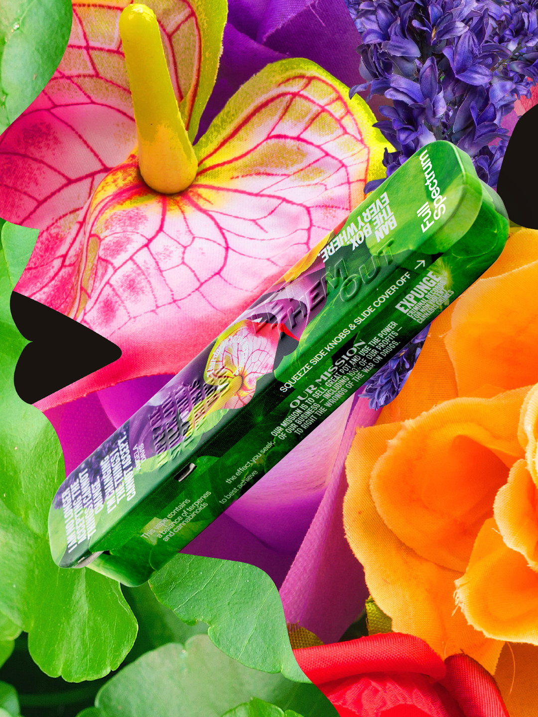
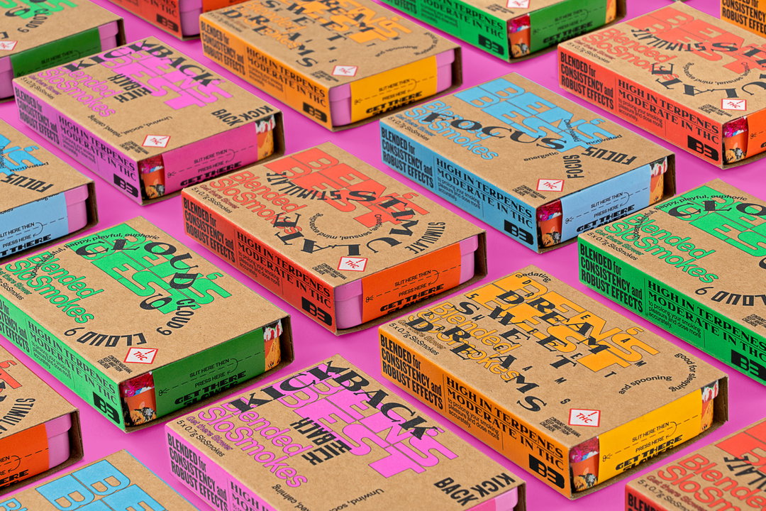
Non-profit Ben’s Best Blnz (B3) is a cannabis brand designed by Eddie Opara and created by Ben Cohen of Ben & Jerry’s, who reached out to Eddie in the pandemic (“Strangely, I wasn't familiar with who he was through the email,” says the Pentagram designer). From concept to identity, B3 is designed to counter the effects of the War on Drugs. Specifically, it advocates for the decarceration of those convicted of nonviolent cannabis crimes, investing 100 per cent of all funds “back into the Black cannabis community and groups advocating for criminal justice reform”, a release states.
This re-centring extends into the creative approach too. “[Ben] was conscious that Black creatives, designers, artists and illustrators have been constantly ignored, and there has been systemic racist discrimination in the creative professions,” says Eddie. “[B3] was a way to instil Black creatives into the mix more.”
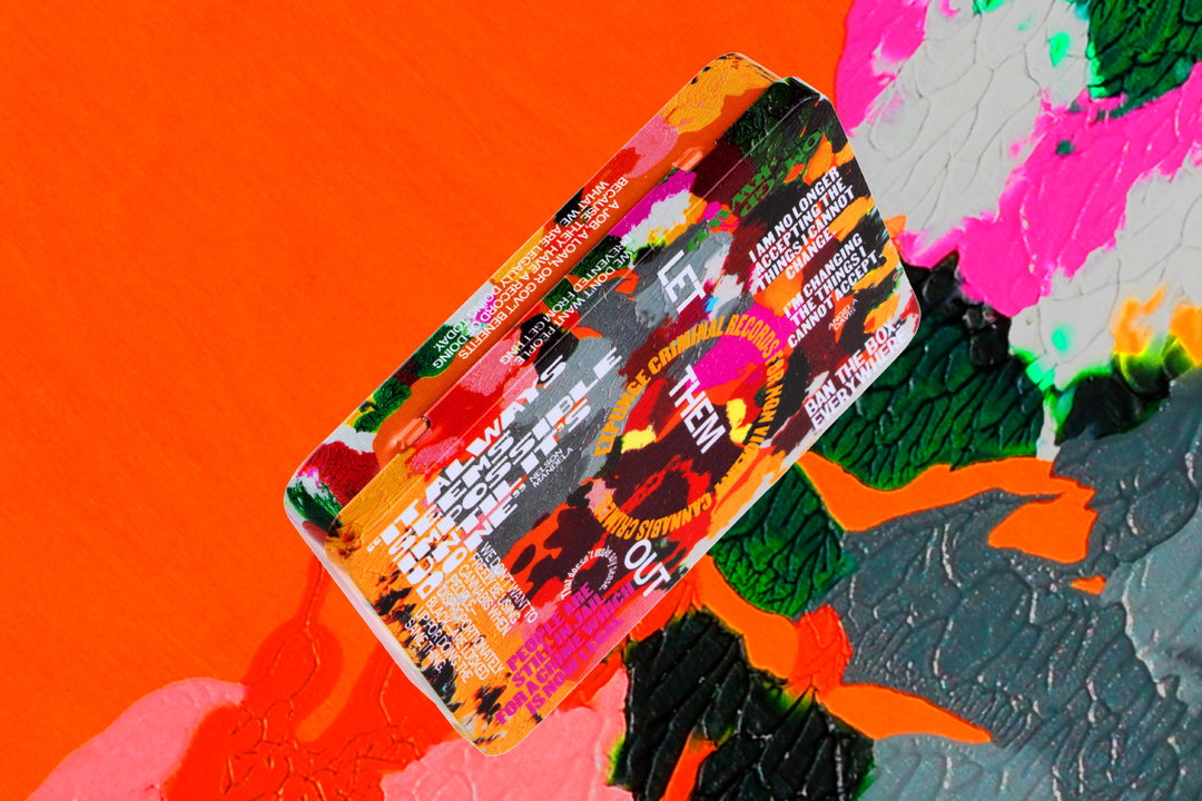
Eddie Opara / Ben Cohen: Ben’s Best Blnz (Copyright © Eddie Opara / Ben Cohen, 2023)
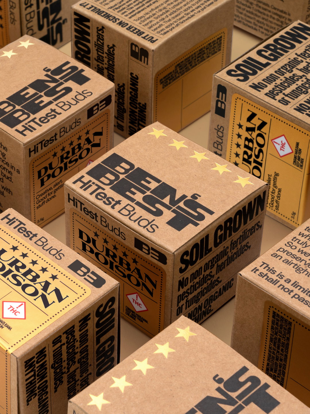
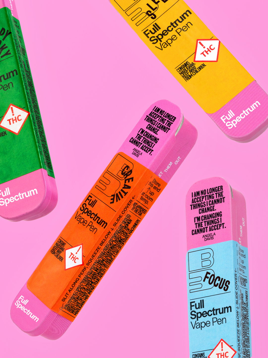
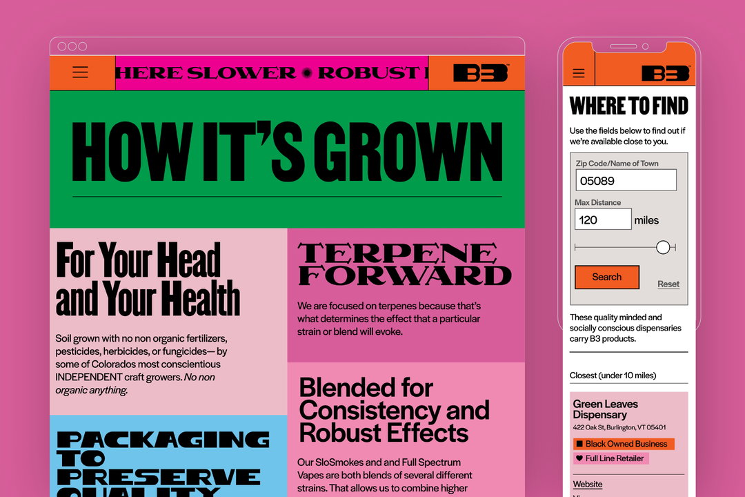
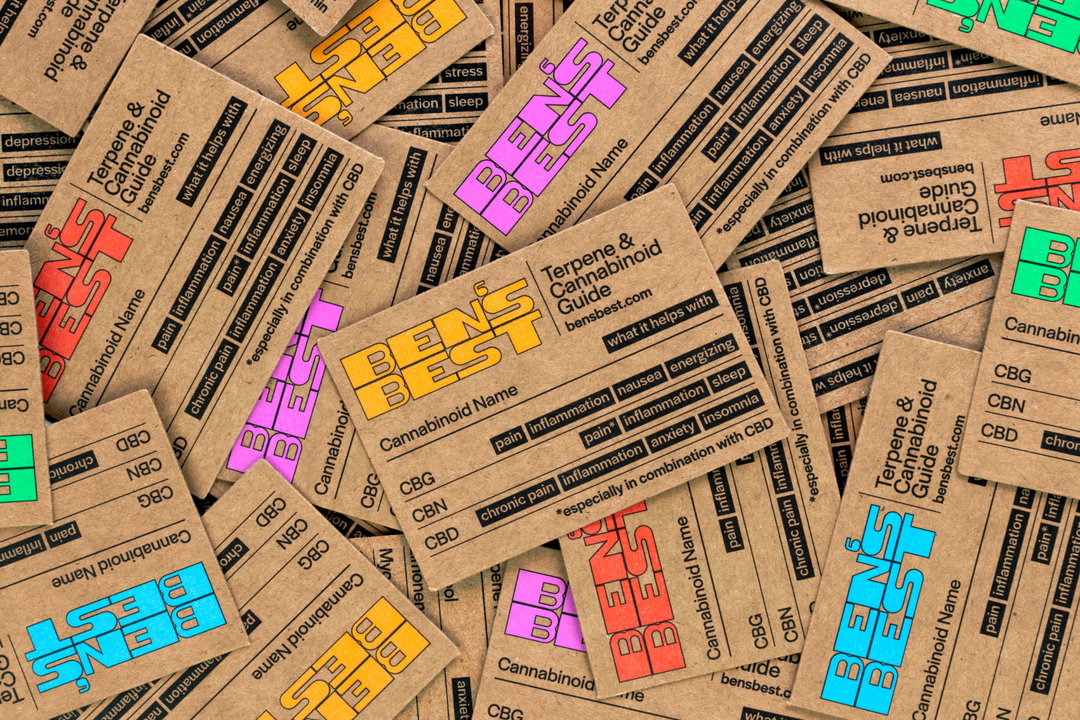
The pure range of collaborators on B3 makes the brand’s visual language rich and varied, though made cohesive by the radical tone throughout. The B3 typefaces are designed by Darden Studio and Vocal Type, the latter contributing a range of typefaces highlighting pieces of history such as the Women’s Suffrage Movement in Argentina and the Civil Rights Movement in the US.
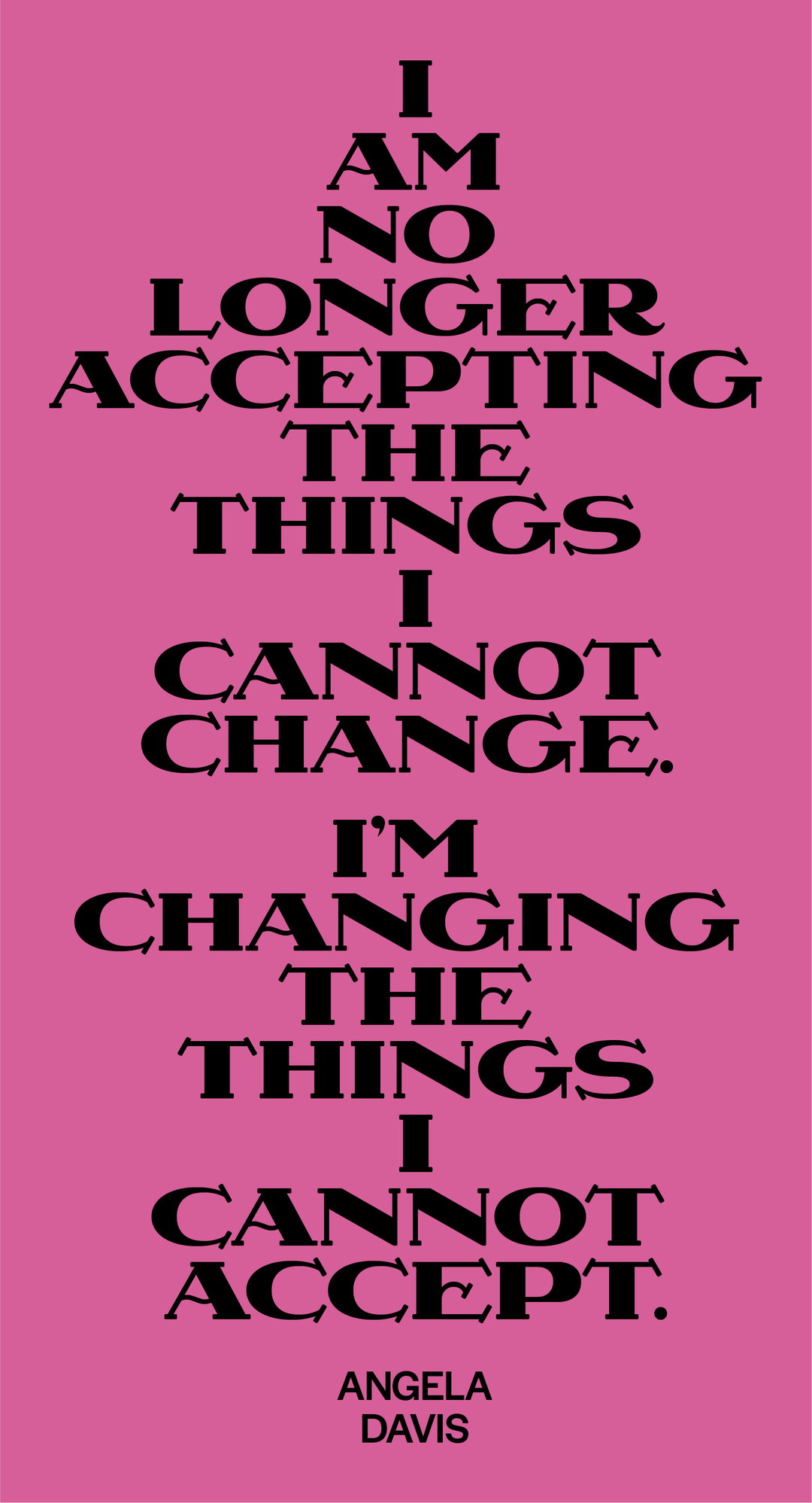
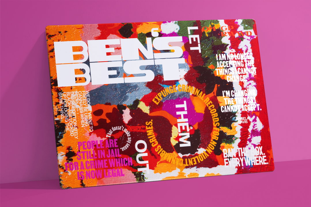
Meanwhile, artwork from Dana Robinson is embedded into the packaging, showing ads and imagery from Ebony magazine, smeared and pressed to make monoprints. Eddie Opara also contributes artwork that shows “the side profile of a Black man in an orange incarceration jumpsuit, with his face and hair built from images of flowers – symbolic of flower or ‘bud’,” says Opara. Words of protest and calls to action completely cover almost every element of packaging, which is designed to to be reviewed and returned to over time.
At every corner of the identity, the issues emerging from the cannabis market are at the forefront. “The cannabinoid industry has become a conventionalised, homogenised market,” says Eddie. “As part of our concept, we wanted to be divergent and transformational, which is sown throughout the identity.” The designer adds: “We wanted every channel of this project to permeate social injustice, equity, sorrow and faith in a movement through the typeface we chose, the artwork, the compositions and the message they conveyed.”
Credits:
Pentagram Project Team
Eddie Opara, partner-in-charge and creative director
Jack Collins, associate partner and designer
Raoul Gottschling, designer
Ruben Gijselhart, designer
Dana Reginiano, project manager
Typeface Design
Vocal Type Foundry
Darden Studio
Illustrations:
Dana Robinson
Eddie Opara
Product Photography
Claudia Mandlik
Type Animations
Michael Justiz
GalleryEddie Opara / Ben Cohen: Ben’s Best Blnz (Copyright © Eddie Opara / Ben Cohen, 2023)
Hero Header
Eddie Opara / Ben Cohen: Ben’s Best Blnz (Copyright © Eddie Opara / Ben Cohen, 2023)
Share Article
Further Info
About the Author
—
Liz (she/they) is the senior editor at Insights, a research-driven department within It’s Nice That. They previously ran the news section of the website. Get in contact with them for potential Insights collaborations or to discuss Insights’ public-facing reports.