The Feeld rebrand is fluid, changing and full of heat
The app calls on studio Made Thought, typographer Charlotte Rohde and photographer Molly Matalon for a brand identity that makes space for multiple ideas of sexuality.
Share
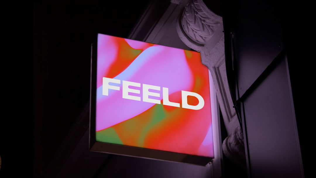
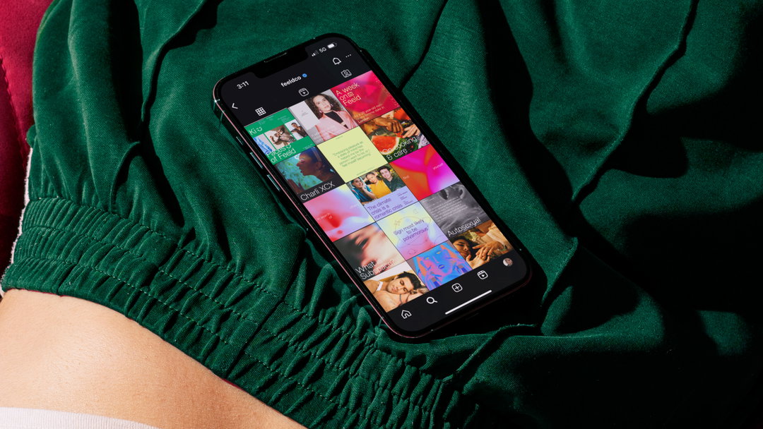
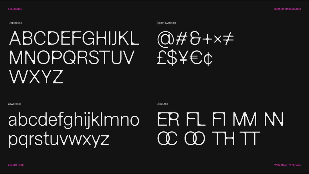
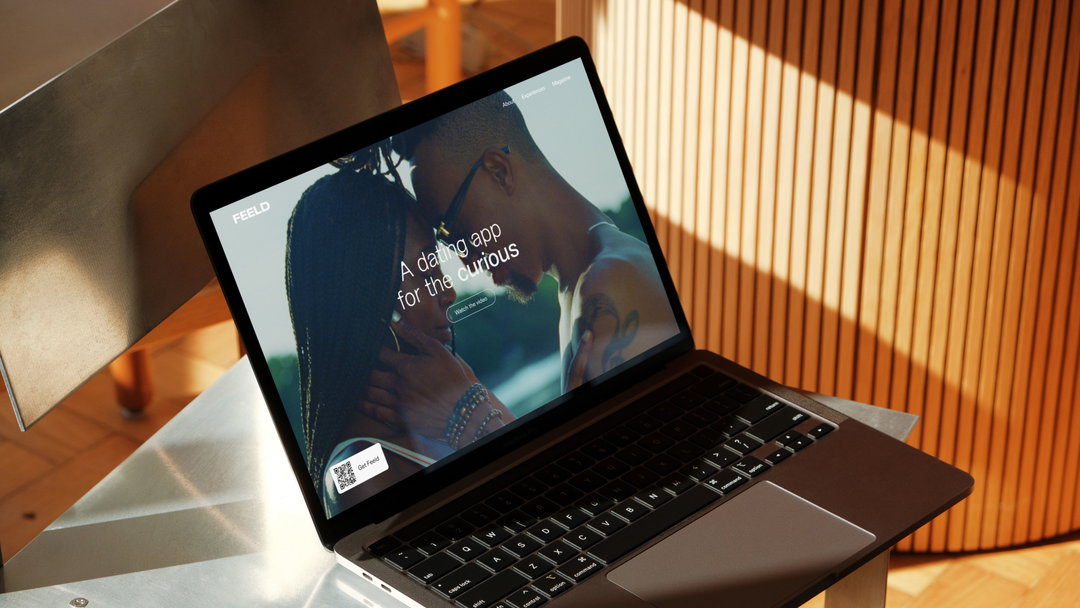
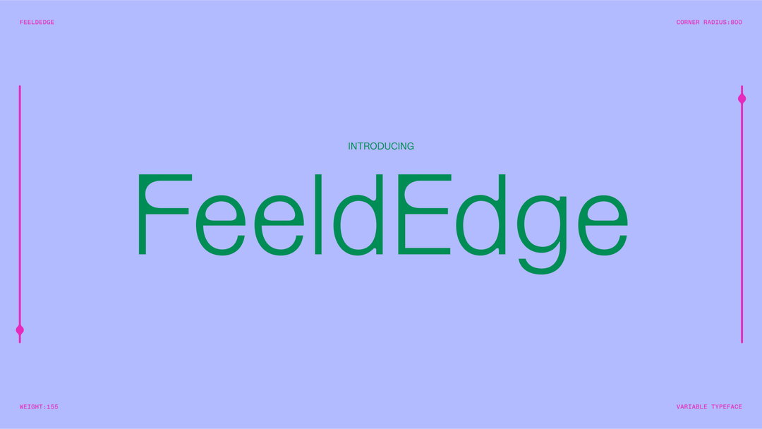
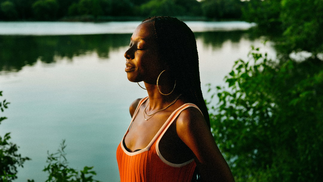
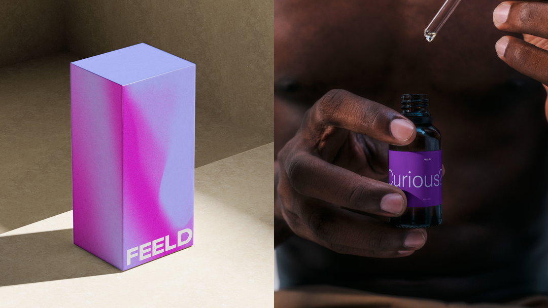
One of the most popular dating apps for sex-positive explorations, Feeld, has rebranded. The updated look comes ahead of its ten-year anniversary and features a custom typeface and wordmark created by Berlin-based type designer, writer and Feeld member Charlotte Rohde. Just like its blend of soft and sharp edges represents a wide spectrum of intimate practices, Feeld’s new gradients (by Made Thought) and photography (Molly Matalon) represents a number of relationship values that you can find on the app.
The rebrand began with data gathered by Concept Bureau, which showed how personal transformation and curiosity are key experiences shared by users. (A few snapshots from that study shows that boomers looking for threeways increased by 520 per cent on Feeld in 2023, and a third of straight males changed their sexuality to heteroflexible, bi-curious or bisexual on the app). Themes of exploration and fluidity quickly became the jump-off point for the work.
While the old Feeld brand used elements like illustration (by Joey Yu), the new look wants to keep its links to the creative world. “We know from our data the Feeld members over-index on creative careers and pursuits; we wanted to lean into that fact and create something that appealed to that side of them,” says Andrew Peet, VP of creative at Feeld.
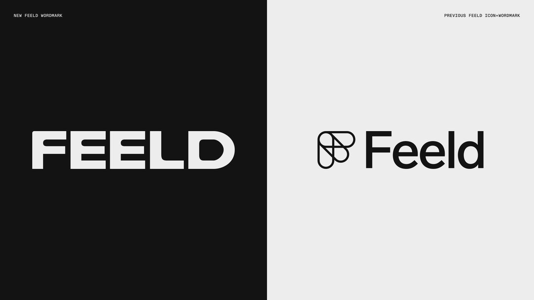
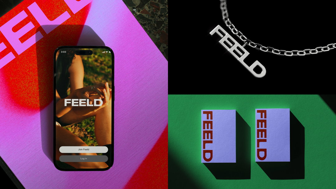
Feeld rebrand. Typography by Charlotte Rohde, photography by Molly Matalon. Partners Made Thought and Concept Bureau (Copyright © Feeld, 2023)
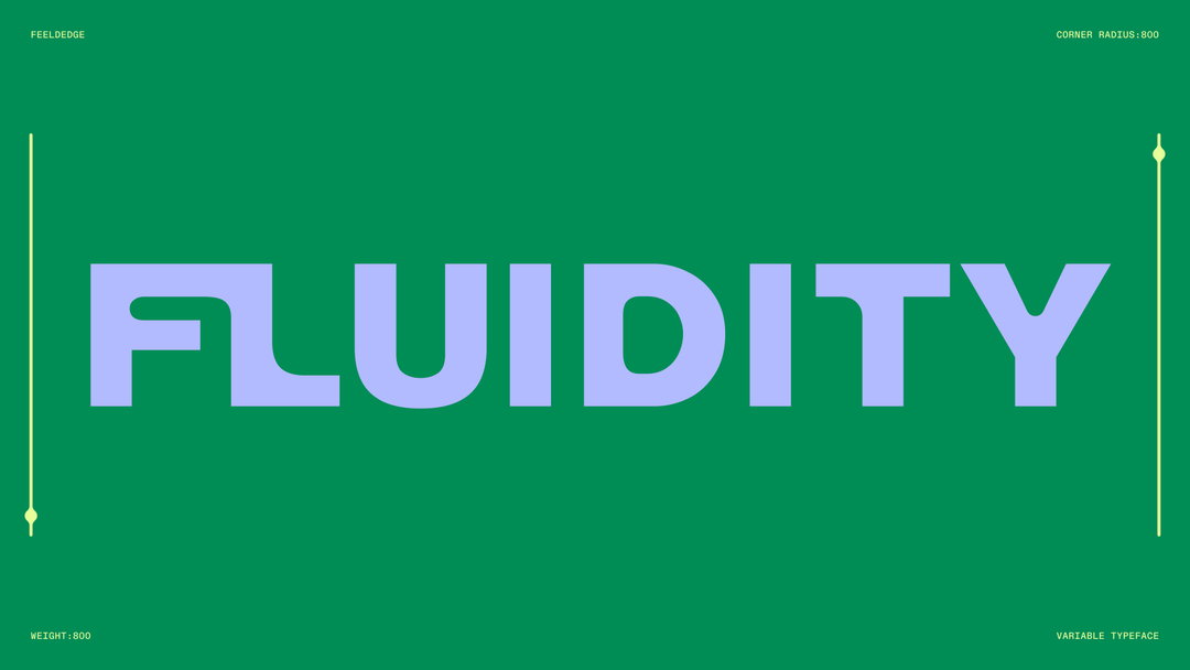
The typeface New Edge 666, for example, was initially developed for the feminist artist-run project space Soft Power based in Berlin, and still maintains some of that subversive atmosphere. But it also nods to concepts that are relevant to Feeld. It features variability on two axes, ranging from Ultra Light to Ultra Bold and from Straight to Rounded. For Charlotte, the “fragile but strong light to the ultra bold and loud weight as well as the rounding of the corners resembles the idea of the perfect switch [a person who might swap between dominant and submissive during sex].”
A custom set of ligatures were also developed, folding in the idea of connection and fluidity – at points it looks like merging pools of water or ink. “The fluidity of the typeface perfectly mirrors the app’s unique approach to sexuality as a spectrum, which is something I also personally relate to,” says Charlotte.
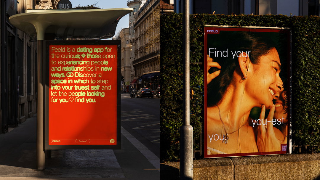
Feeld rebrand. Typography by Charlotte Rohde, photography by Molly Matalon. Partners Made Thought and Concept Bureau (Copyright © Feeld, 2023)
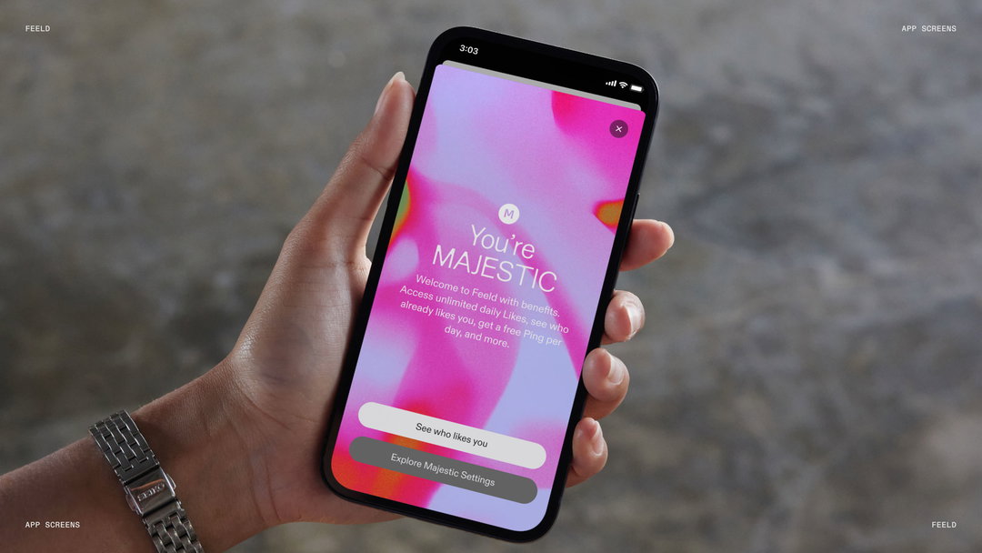
Feeld has introduced a new “image treatment tool” (gradients) inspired by heat mapping and auras. “We knew from the beginning that we wanted to represent the spectrum of sexuality and identity, but wanted to avoid the trope of the rainbow,” says Andrew. After many weeks working with Made Thought on different treatments made with software and code (AI was even considered), Feeld decided it needed to work with humans.
The team called on dancers, performers and actors, capturing them touching and moving in a studio. Made Thought used this footage as a base for a library of colour fields. So while the gradients might feel random, “occasionally you are rewarded with a moment of discovery when you realise you are looking at an arm, a thigh or a neck,” says Andrew.
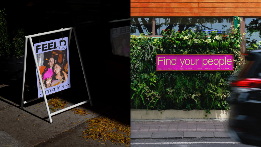
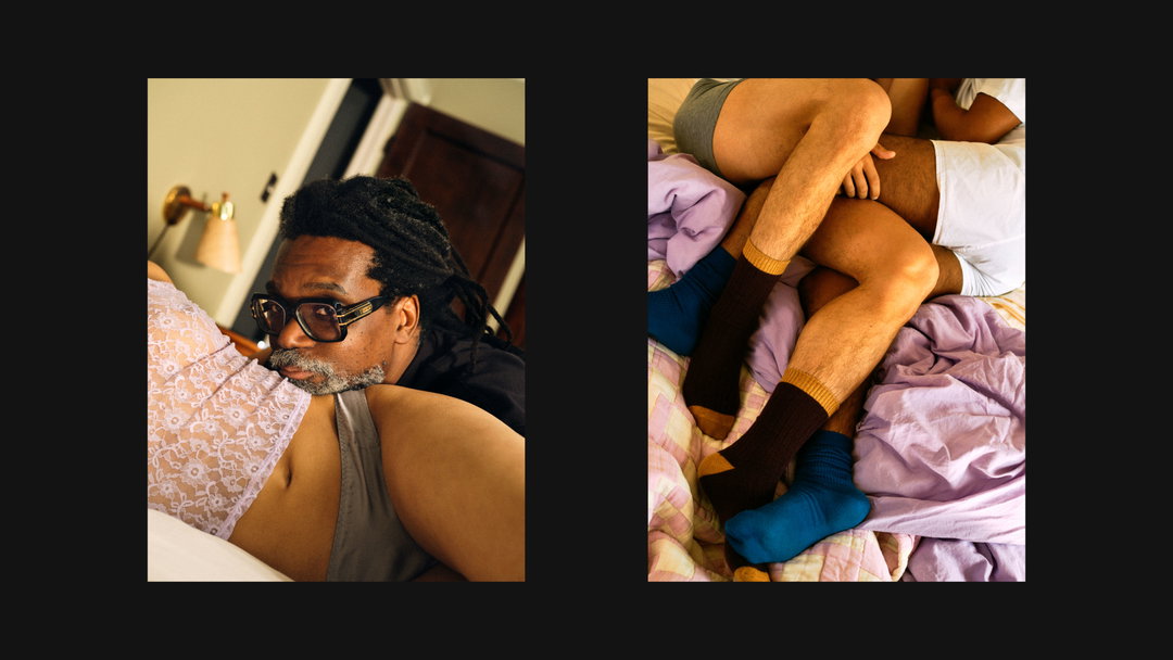
Photographer Molly Matalon (also a Feeld member) worked with 13 members on the app’s community on a shoot in New York for the brand visuals.
For the meantime, much of the Feeld app will remain familiar to users; the new identity will begin to show up in the coming days. “The biggest part of our app update is the technology stack it’s built on, which has been reconstructed from the ground up,” Andrew explains. We’ll start to see some new features launch in 2024, enabled by that technology overhaul.
GalleryFeeld rebrand. Typography by Charlotte Rohde, photography by Molly Matalon. Partners Made Thought and Concept Bureau (Copyright © Feeld, 2023)
Hero Header
Feeld rebrand. Typography by Charlotte Rohde, photography by Molly Matalon. Partners Made Thought and Concept Bureau (Copyright © Feeld, 2023)
Share Article
About the Author
—
Liz (she/they) is the senior editor at Insights, a research-driven department within It’s Nice That. They previously ran the news section of the website. Get in contact with them for potential Insights collaborations or to discuss Insights’ public-facing reports.