Move it or lose it with Mélina Poiré’s kinetic branding for Motion Motion festival
Heading to Nantes, France this May? Check out Motion Motion Festival. Used up all your holiday hours? No problem, check out the excellent trailer from Mélina Poiré.
Share
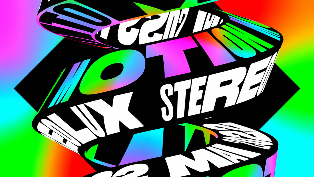
Montreal-based motion designer Mélina Poiré says the brief for motion design festival Motion Motion (yes, we know that’s a lot of “motions” in one sentence) was pretty straightforward: do whatever you want. “Damn! Who hasn’t dreamt of a brief like that?” the designer tells It’s Nice That. But faced with building a trailer and identity for the event entirely from scratch, Mélina quickly realised the downside of too much freedom, or as she puts it: “I had NO IDEA what I would do.” Somewhere along the way, it’s safe to say the designer figured it out, as Motion Motion – the three-day Nantes-based festival boasting exhibitions, screenings and conferences – has announced it will open on 13 May, and it did so with an energetic, type-led and definitely finished trailer and identity from Mélina.
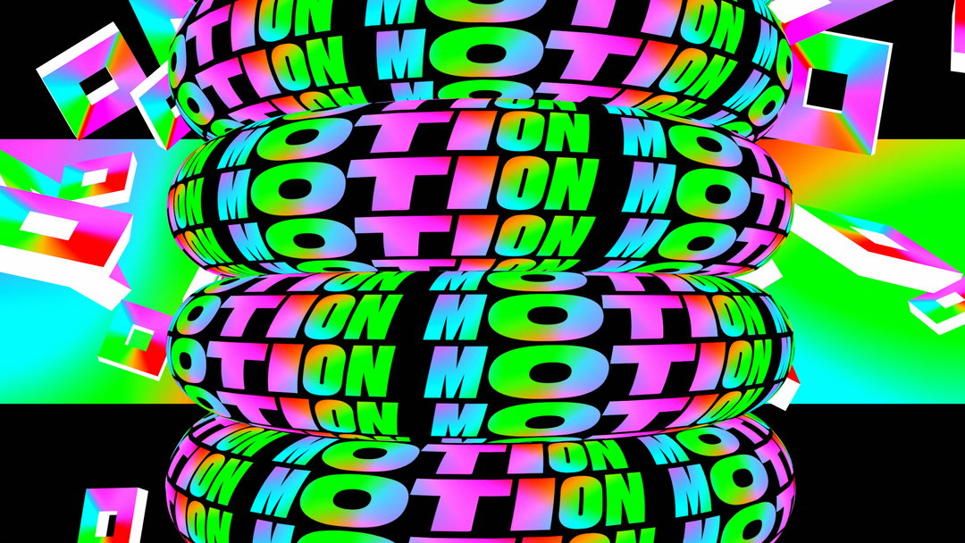
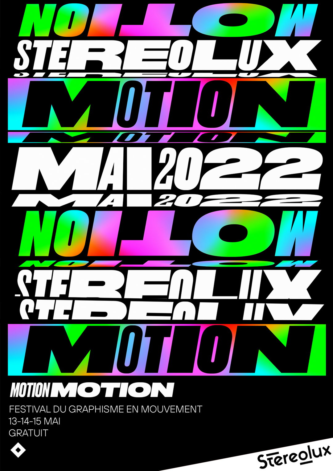
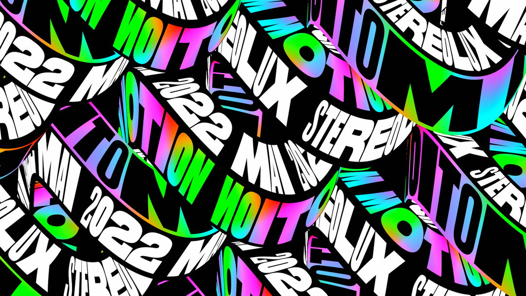
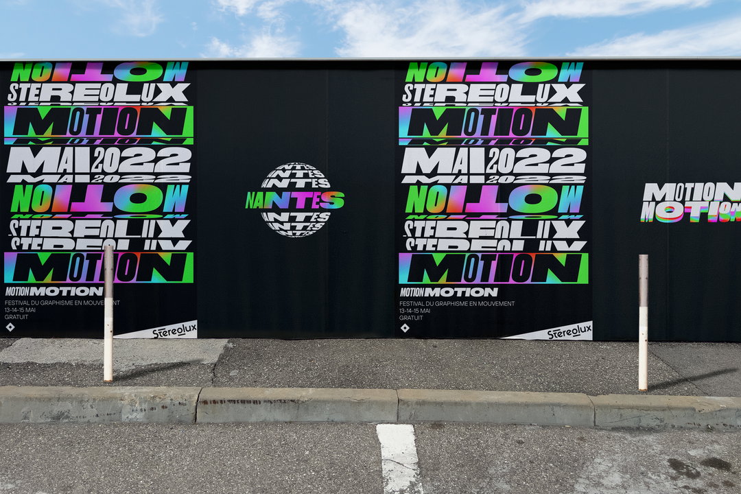
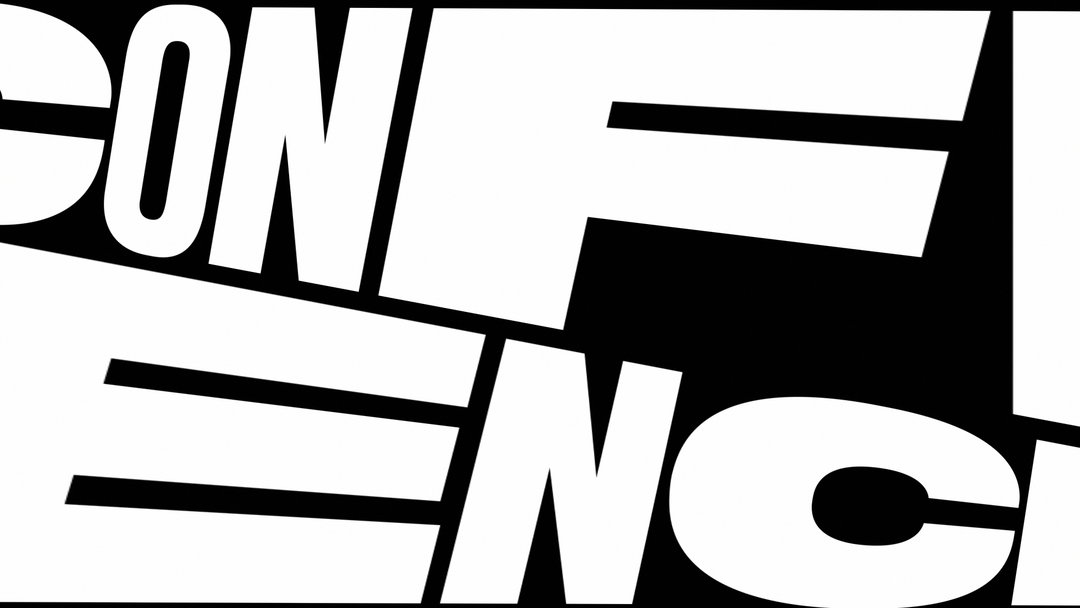
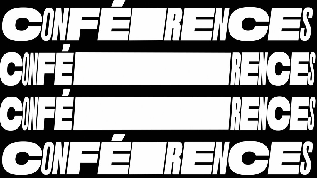
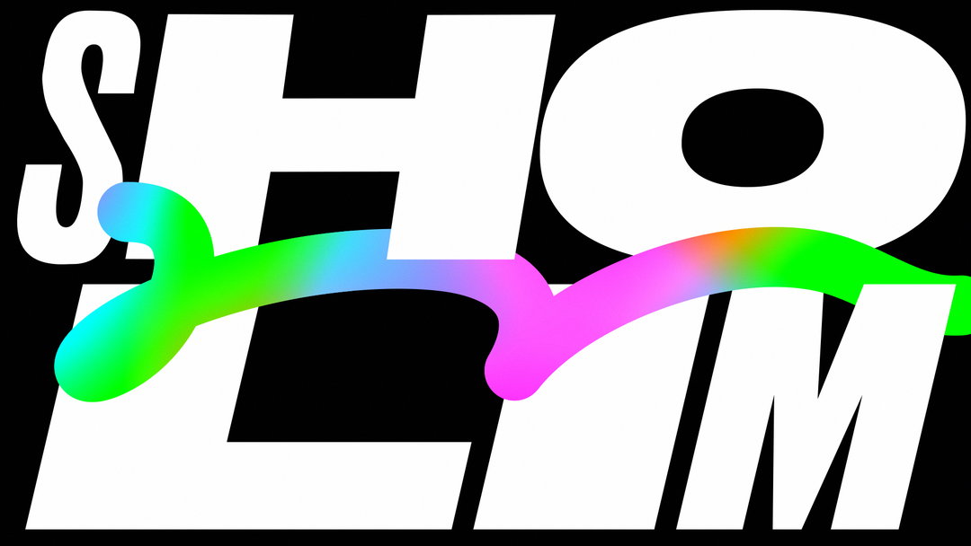
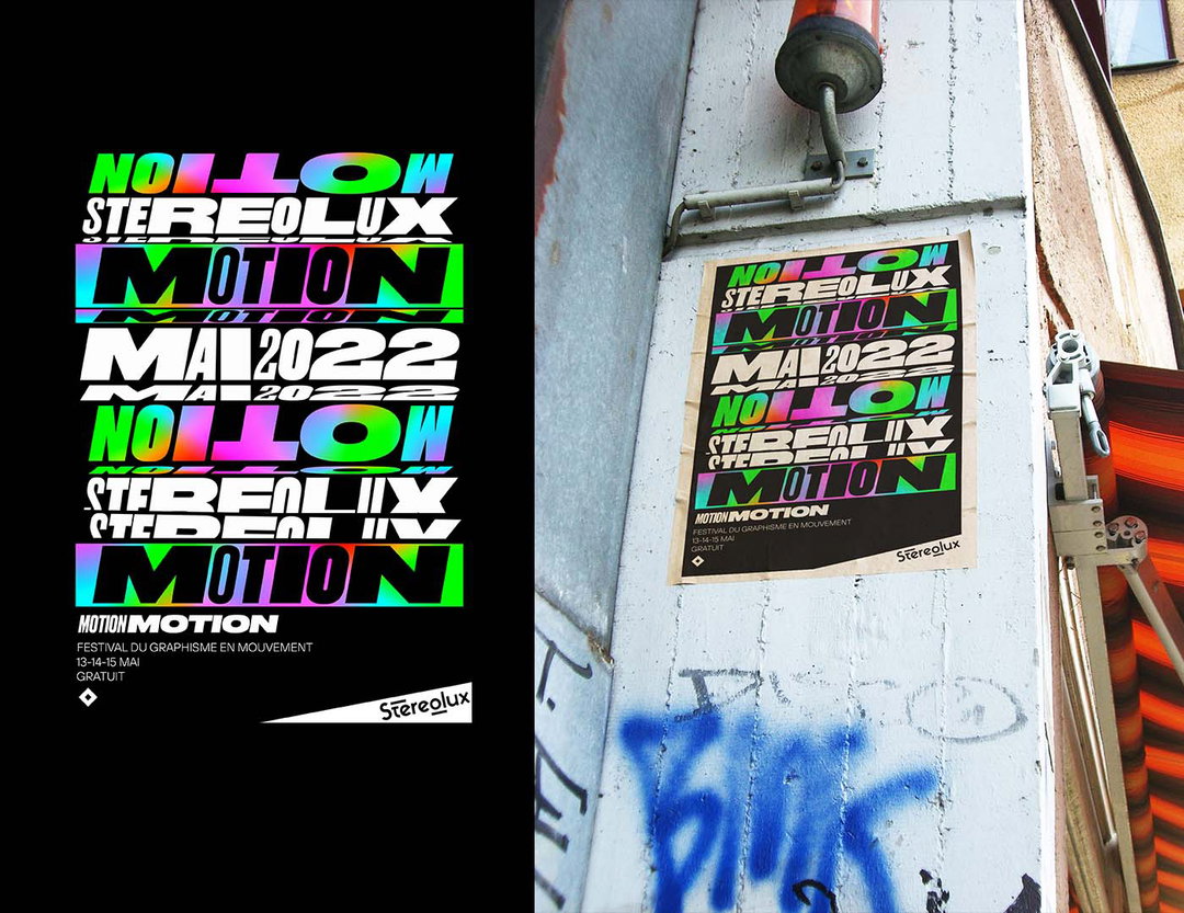
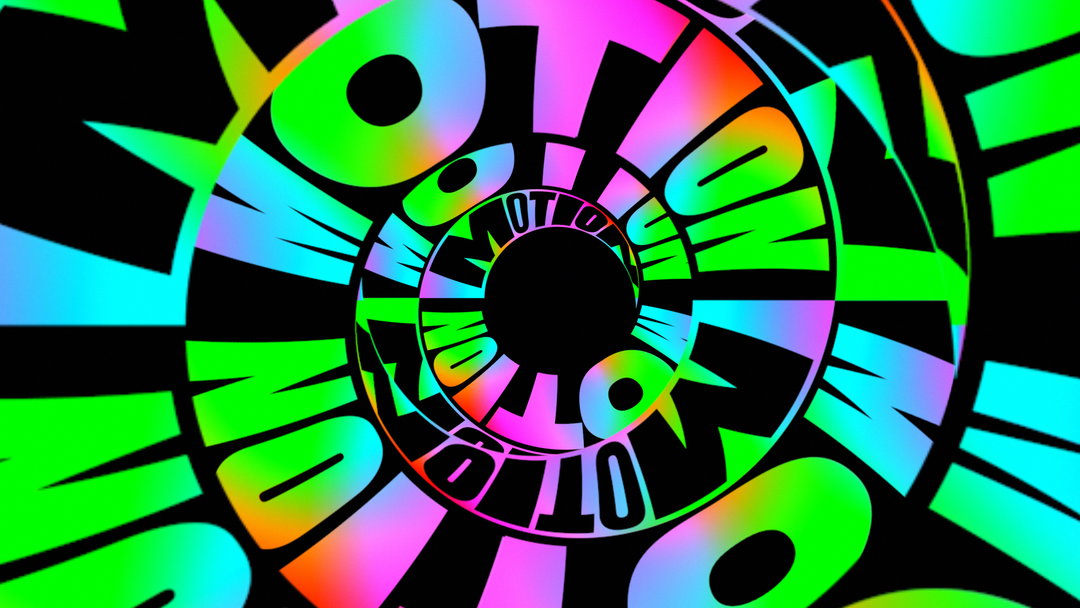
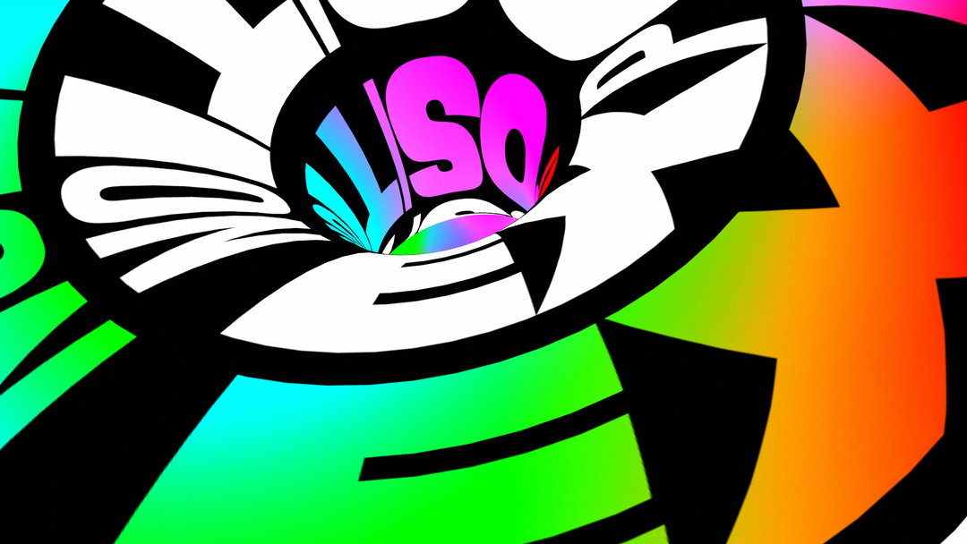
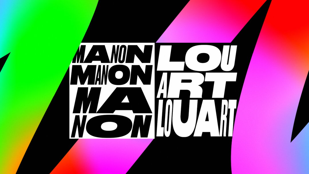
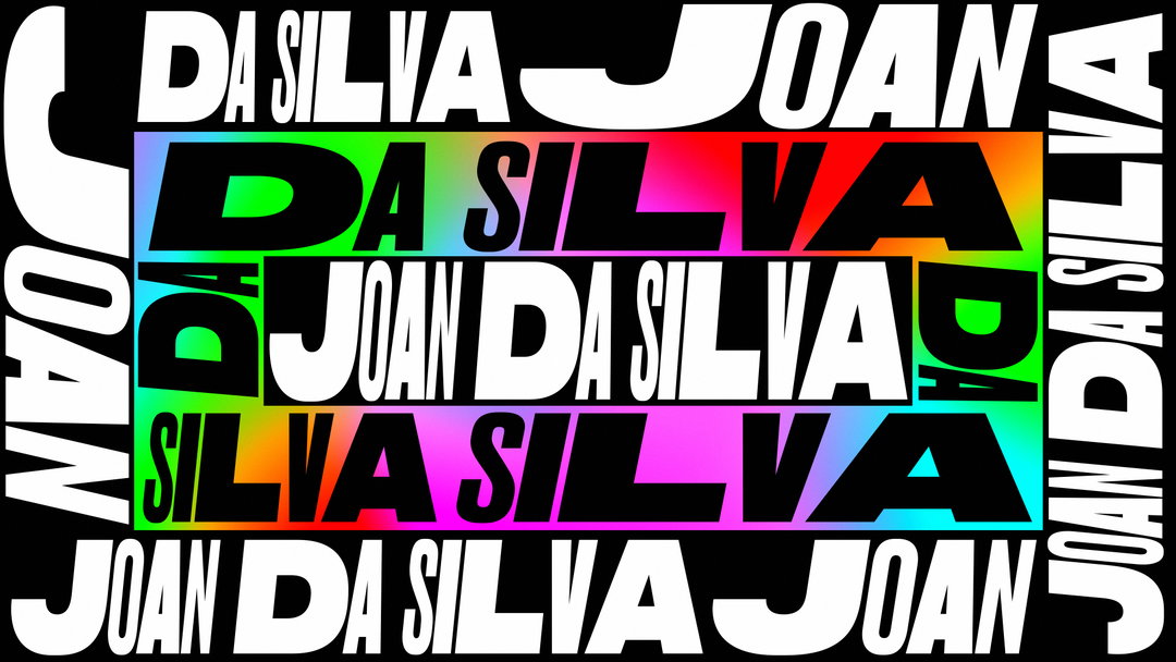
Mélina has also managed to create a trailer in which every frame looks like it could be a finished asset for the identity. “I wanted the trailer to look good, even if we stopped the video on a random frame,” the designer says. A similar ethos applies to Motion Motion’s static branding; each poster looks like it could jump into motion at any moment. To achieve this dynamic result, Mélina utilised flashy gradients and bold typography, while employing a mix of 2D and 3D in the video. “I was learning Cinema 4D as I was creating the trailer. That was pretty hard; to learn a new software while creating a commissioned job. I’m glad I pushed myself to add another medium to this project. 3D is a huge part of the trailer and it would have looked totally different without it.”
To hammer home the medium of the festival and its “energetic” atmosphere, Mélina steered clear from sticking to one colour for the trailer. Opting for a myriad of shifting colour gradients alongside the moving type, Mélina explains: “I wanted the palette to feel wide and energetic, just as the festival is. Some designs feel more epurated – only in black and white – to balance everything that is going on.” Elsewhere, the designer leaned heavily into the beat of the trailer song, Kodama by 20syl, to express a lively universe – “I might have heard that song 1000 times and I still like it!”
As a motion designer, usually Mélina doesn’t print “or touch” anything she creates, so the designer says getting to create posters, T-shirts, totes and flyers felt particularly exciting. “Creating a festival’s branding is quite a big challenge. When I first saw a maquette of the poster, I was so hyped.” Audiences can discover the full range of Mélina’s new work in physical branding at this year’s Motion Motion (the fourth edition of the event), while diving into “the diversity of graphic design in movement”, explains the festival’s website.
GalleryMélina Poiré: Motion Motion (Copyright © Motion Motion, 2022)
Hero Header
Mélina Poiré: Motion Motion (Copyright © Motion Motion, 2022)
Share Article
Further Info
About the Author
—
Liz (she/they) is the senior editor at Insights, a research-driven department within It’s Nice That. They previously ran the news section of the website. Get in contact with them for potential Insights collaborations or to discuss Insights’ public-facing reports.