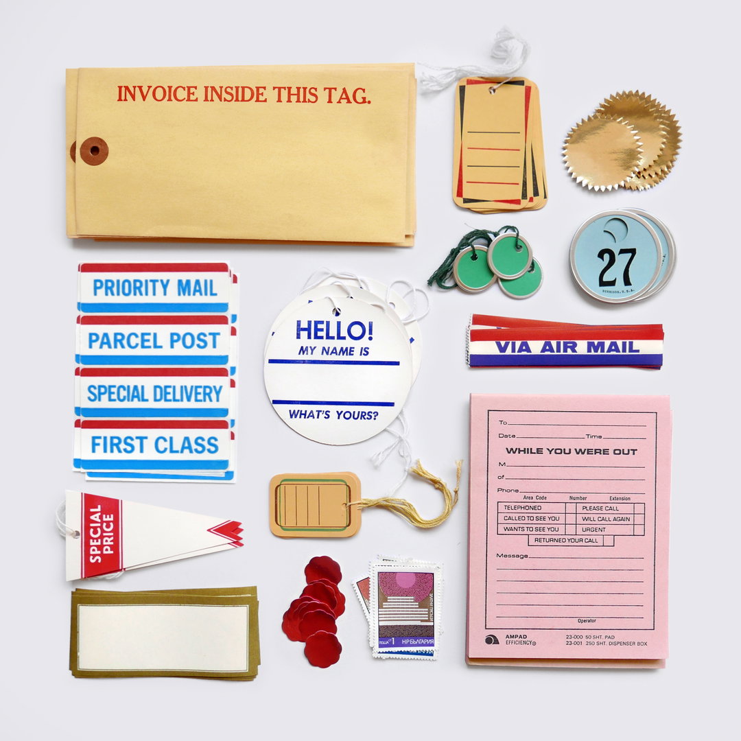
Ragged Edge makes over long-standing British travel agent, First Choice
Simple, modular icons have been introduced to break down the components of a holiday and represent a tailored experience.
If you walked down a British high street in its heyday, you probably spotted a First Choice travel agent – or, if you were lucky, maybe went inside to book an all-inclusive trip. Now an online travel agency, First Choice has teamed with London branding agency Ragged Edge, to relaunch as a platform which helps travellers craft a tailored holiday experience. “That became the focus of the brand. A brand that makes it easy to get picky,” says co-founder of Ragged Edge Max Ottignon.
Personalisation guides many of the choices made by Ragged Edge. A selection of expressive icons represent the way you might choose to tailor your holiday, from the weather to the activities you most enjoy. When combined in a sequence, they become a functional button-like device to communicate what you can expect on a particular trip – which meant optimising them to work at small sizes.
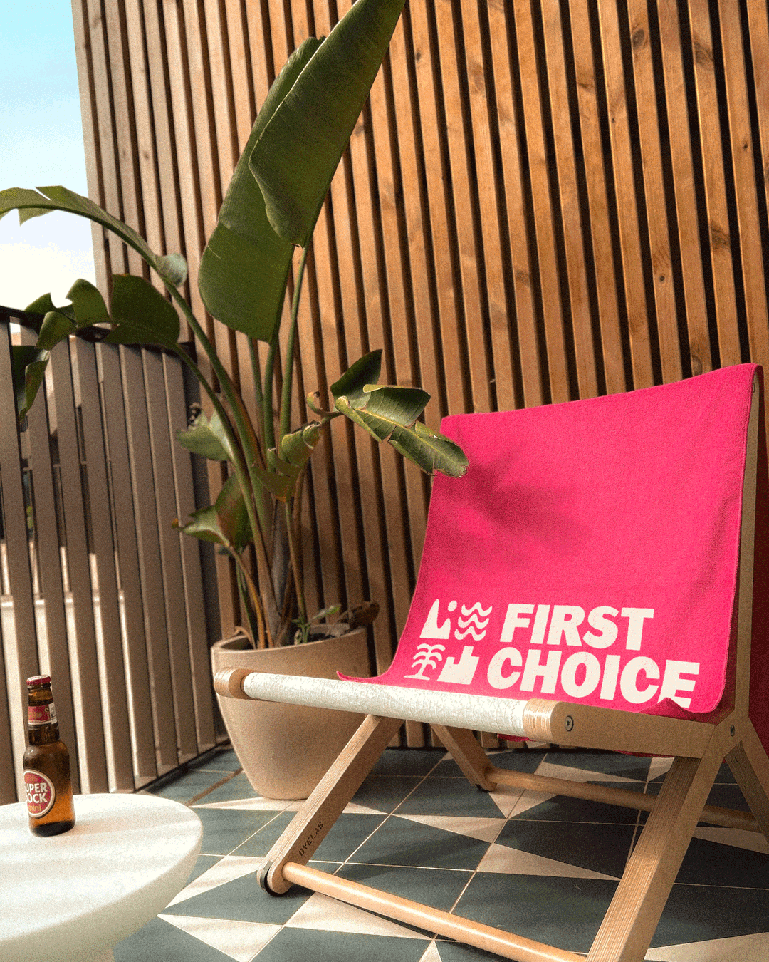
A lot has also been done to separate the brand from your typical travel agent. “There are lots of visual conventions in the space, mostly around the sun, sand, sea and sky,” says Max. Logos in particular often represent one of those four elements, according to the co-founder. First Choice’s new mark, on the other hand, shows a multitude of destinations. “The challenge was how to make that work in a way that didn’t compromise on scalability, so we worked hard to find that balance.”
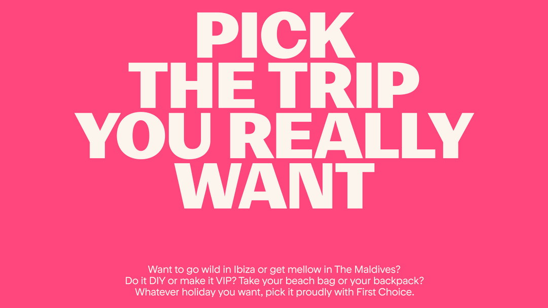
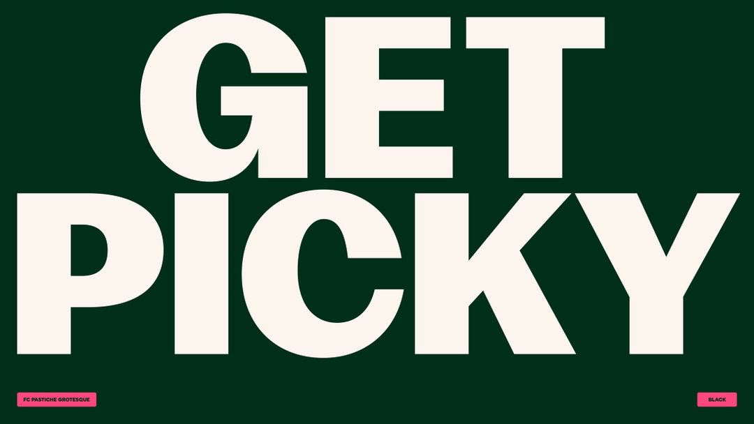
Hot pink remains First Choice’s brand colour, helping it to stand out against the excess of blue used by competitors. The headline typeface is a customised version of Pastiche Grotesque developed with Order Type Foundry. Max says the goal here was to combine “character” and “directness” to push forward First Choice’s new tone of voice.
GalleryRagged Edge: First Choice (Copyright © Ragged Edge, 2023)


Hero Header
Ragged Edge: First Choice (Copyright © Ragged Edge, 2023)
Share Article
Further Info
About the Author
—
Liz (she/they) is the senior editor at Insights, a research-driven department within It’s Nice That. They previously ran the news section of the website. Get in contact with them for potential Insights collaborations or to discuss Insights’ public-facing reports.