Designer and collector Ashley Kinnard on the unpolished power of printed matter
An avid amasser of books, leaflets, and found ephemera, this South London-based designer brings a sensory-driven approach to every project he creates
Ashley Kinnard has a visceral and nostalgic relationship with printed objects. “Growing up, I’d go to libraries and bookshops with my mum. She’d open a book, smell the pages, and pass it to me to do the same. I still do this. For me, it’s not always about reading; sometimes, it’s just about holding the book,” he says. “It could be the weight of a book, or the typeface on a cover. Sometimes it’s a leaflet from a life drawing class I picked up years ago that suddenly becomes relevant. For me, it’s about more than just seeing something. I need to touch it, smell it, and really explore it.”
This intrinsic relationship with printed materials informs Ashley’s practice as a designer today. Based in South London, his studio is stacked with books, leaflets, and other randomly collected ephemera. These objects often inform the beginnings of his projects, which range from book and type design, to website development and branding. Ashley’s approach to design is bespoke and thoughtful. He’s constantly looking for inspiration, not just within his collection but in exhibitions or on long walks where he’ll photograph anything that catches his eye. He’s interested in vernacular design too, and scooping up references from unlikely places.
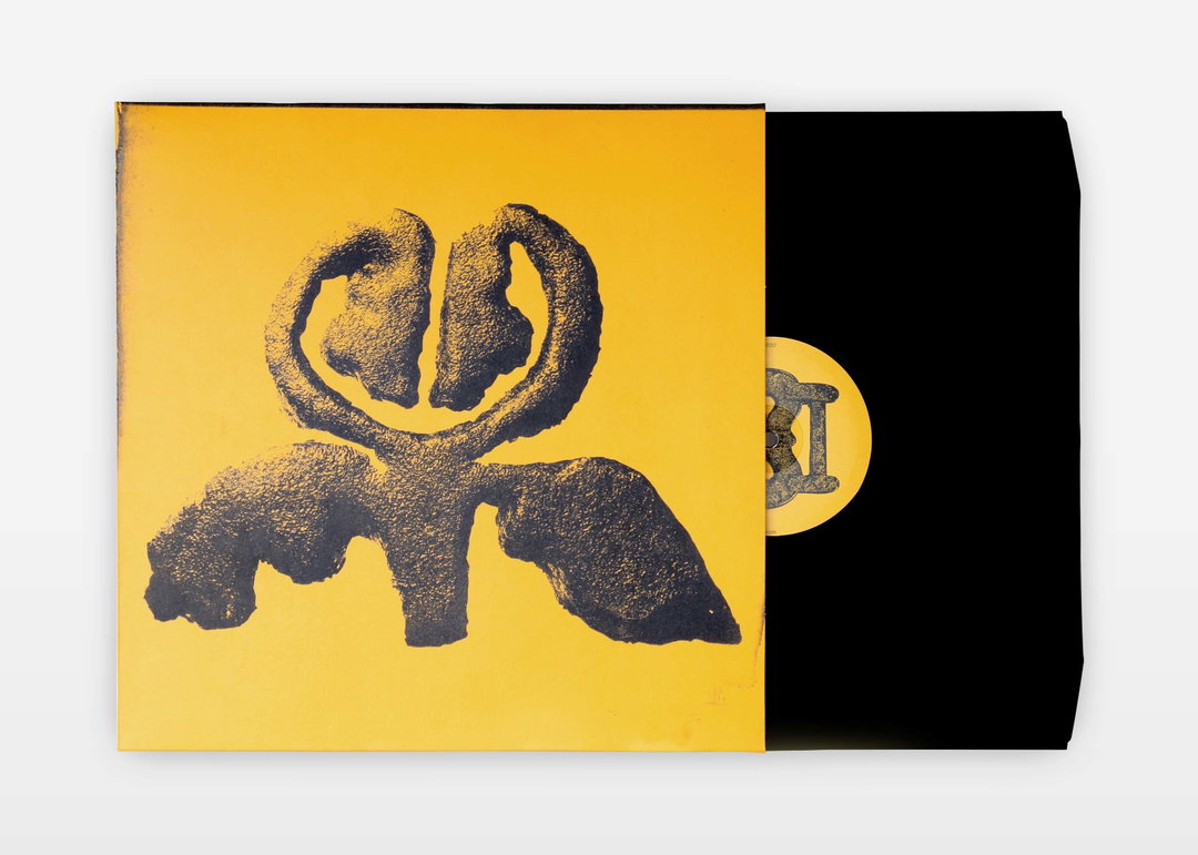
Ashley Kinnard Studio: Flaer: Preludes released on ODDA Recordings (Copyright © Ashley Kinnard Studio, 2024)
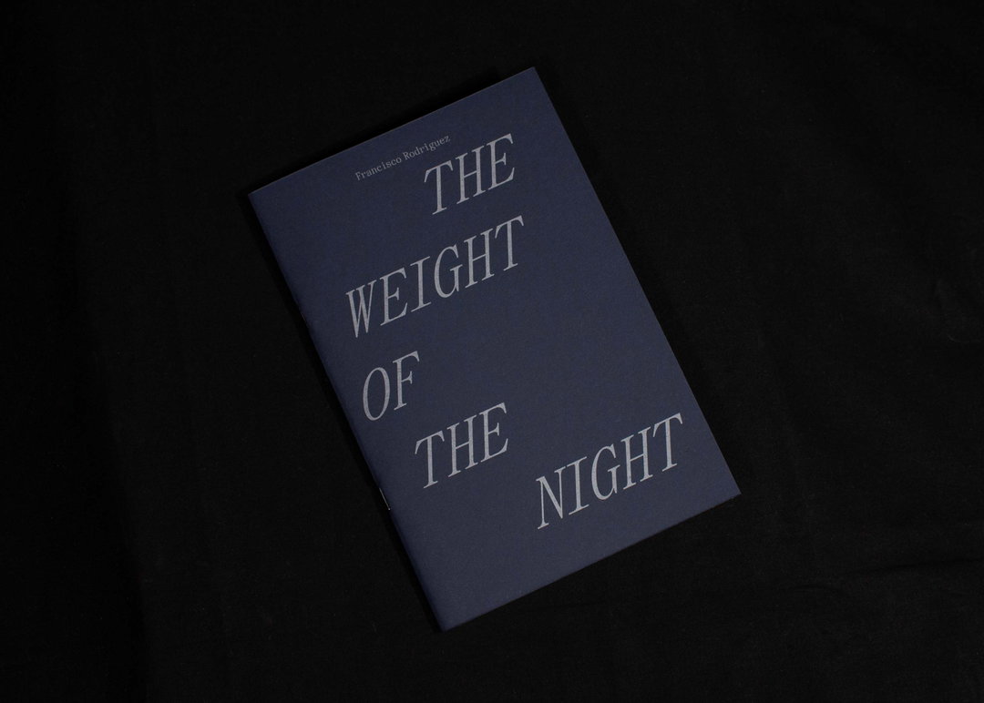
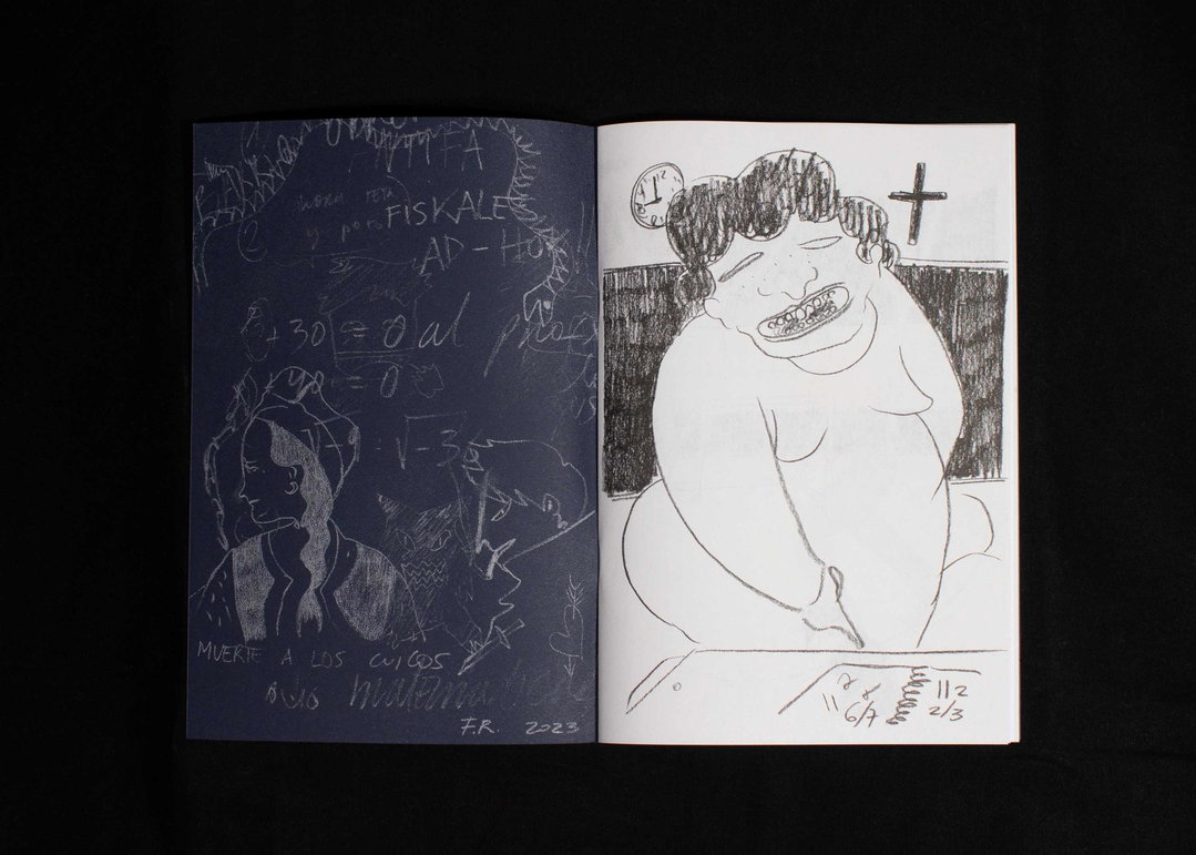
This is all part of his desire to communicate layered meanings – but with clarity. For example, last year he worked on a publication for artist Francisco Rodriguez, The Weight of the Night. The title is set in a crescent moon shape: “To me it’s an obvious idea, but it looks abstract – it’s playing with a direct idea in an unusual way.” Another case is Lily Pearmain’s Throwing Mud: A diary of liberated gestures in clay. For the cover, he personally screen-printed the design with clay at his studio. “It’s important to me that the work feels like a unique response that could only come from me,” he says. “I try to identify idiosyncrasies within each project and interpret them in a way that’s both direct and poetic.”
Since setting up his studio in 2015, Ashley has also taught himself how to code; mostly out of necessity, because budgets were often too small to bring in an external developer. “Learning how to code has been an essential part of creating the stability that allows me to be in the studio all the time,” he says. This means he can focus more time on personal projects, like his new publishing imprint Stranger Pages. Specialising in eccentric or unusual design by unconventional voices, it will aim to publish books that are “just a bit stranger than those I usually see at book fairs”.
As an avid collector himself, it makes sense that Ashley wants to make objects for others to collect too. Recently, he’s been picking up religious leaflets, usually found on the street – he now has around 70. “Last week, my house mate gave me one and I was legitimately speechless,” he says, describing a 36-page leaflet bound in a plastic sleeve by a single staple. On the cover, printed in metallic gold type are the words ‘pure gold’. “I find these booklets super interesting, but have no idea what I’m going to do with them,” he says. But just like all of the other books, leaflets, and references he collects, it doesn’t matter. They’ll continue to stack up in his studio until one day, when the colour, texture or weight of these unique booklets will spark an idea for his next project.
GalleryAshley Kinnard Studio: Francisco Rodriguez: The Weight Of The Night published by Cooke Latham Gallery (Copyright © Ashley Kinnard Studio, 2023)
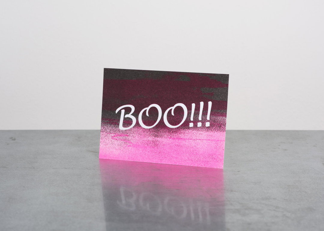
Ashley Kinnard Studio: Scrap Zine: Ghosts (Copyright © Ashley Kinnard Studio, 2018)
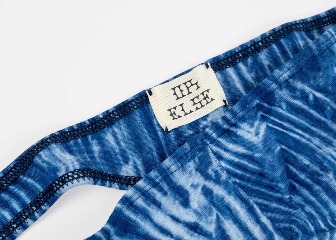
Ashley Kinnard Studio: OR ELSE Label (Copyright © Ashley Kinnard Studio, 2021)
Ashley Kinnard Studio: Special Animal (Copyright © Ashley Kinnard Studio, 2024)
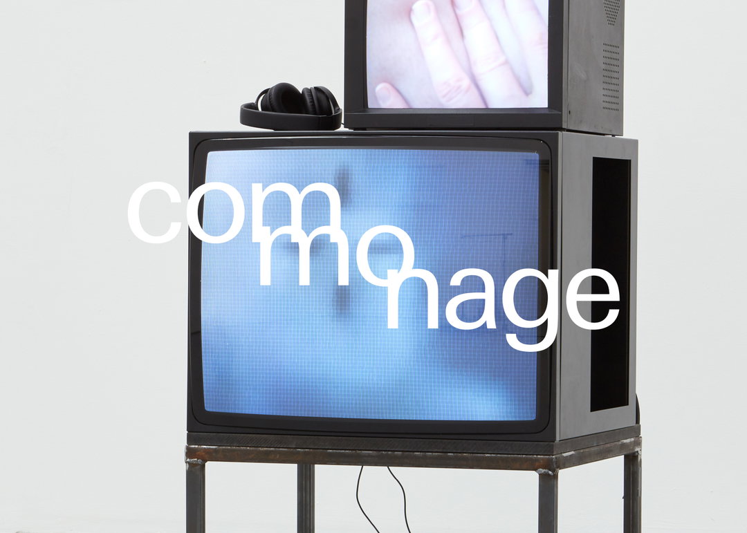
Ashley Kinnard Studio: Commonage Projects (Copyright © Ashley Kinnard Studio, 2020)
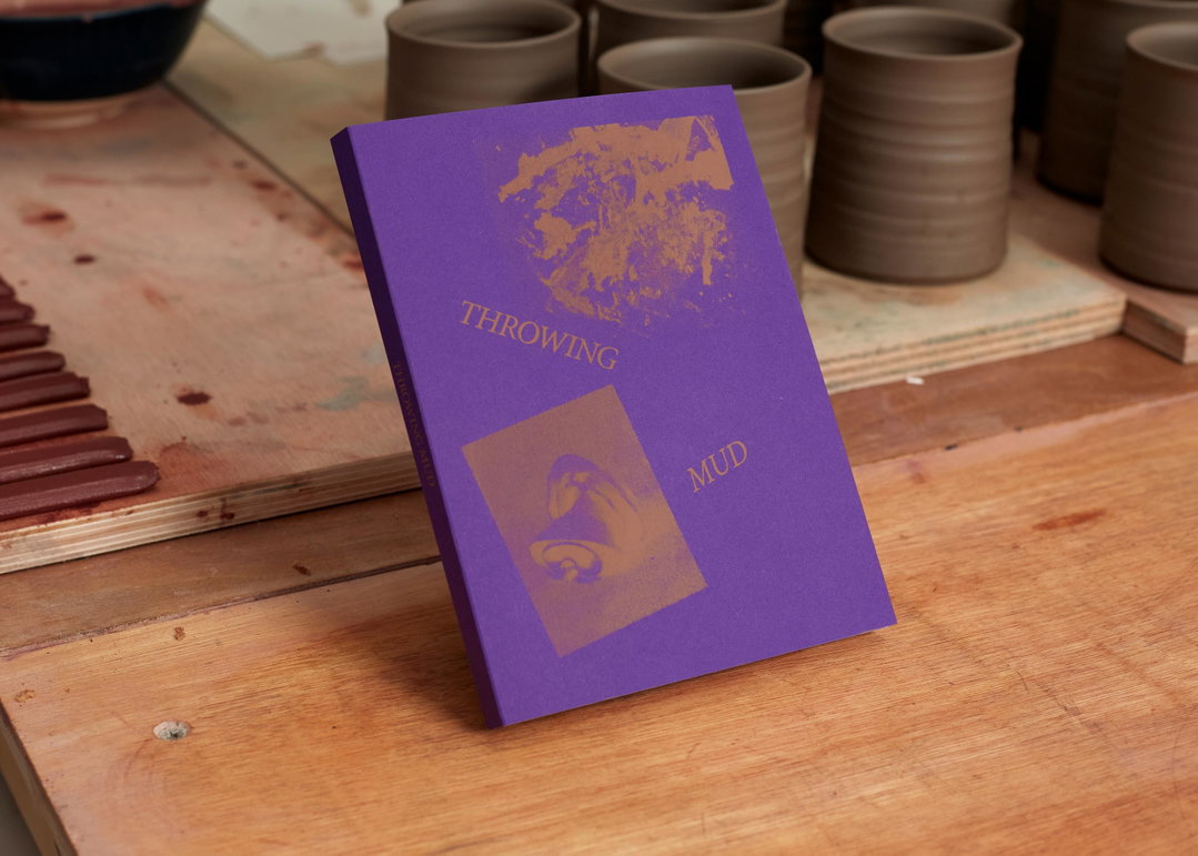
Ashley Kinnard Studio: Throwing Mud (Copyright © Ashley Kinnard Studio)
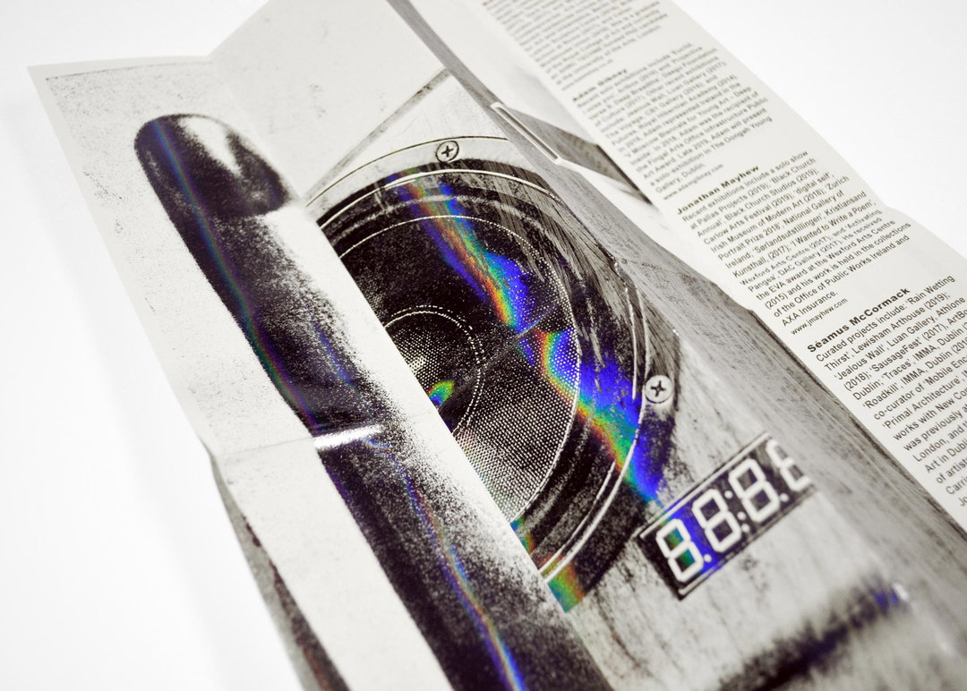
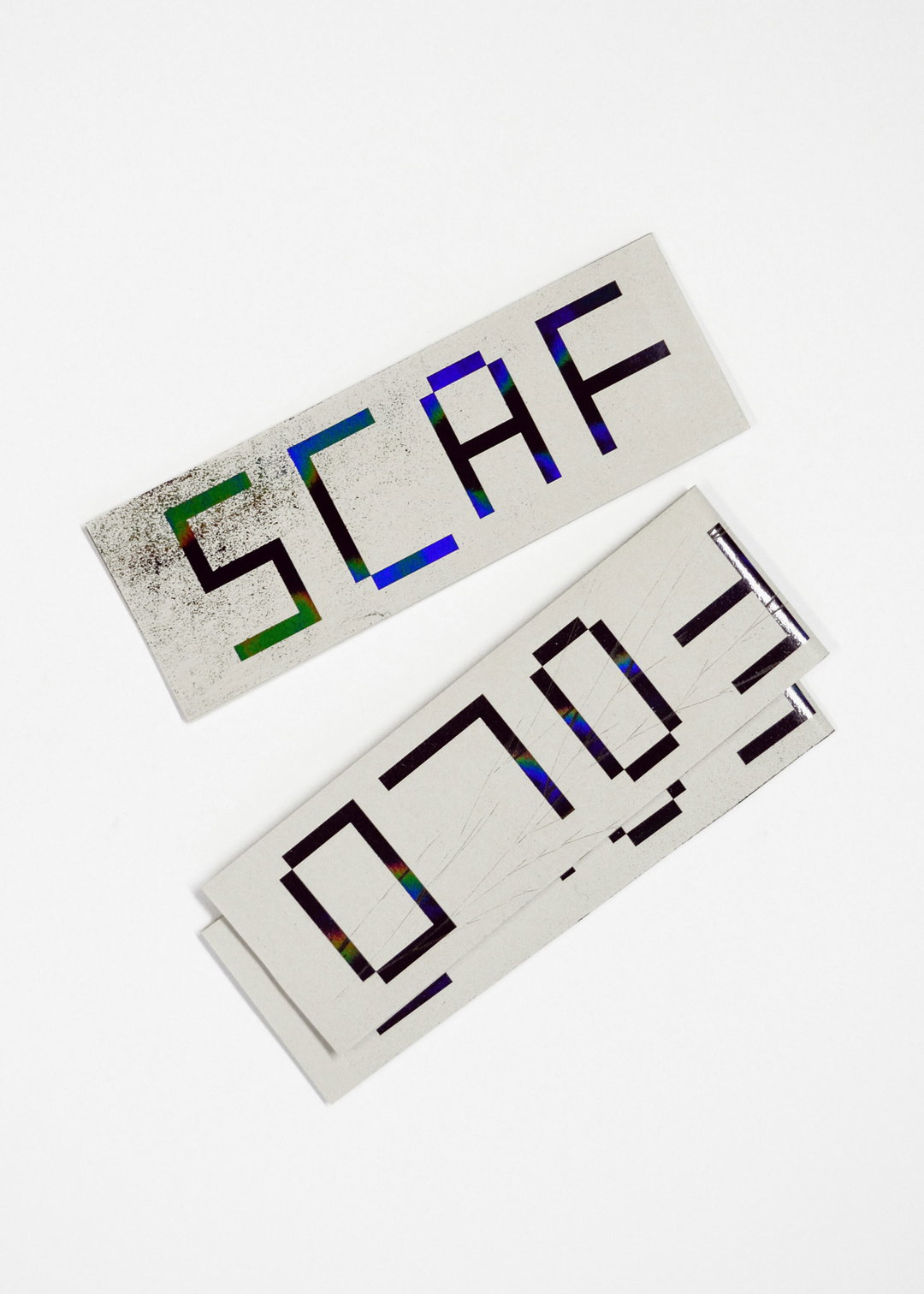
Ashley Kinnard Studio: Scaffold (Copyright © Ashley Kinnard Studio, 2019)
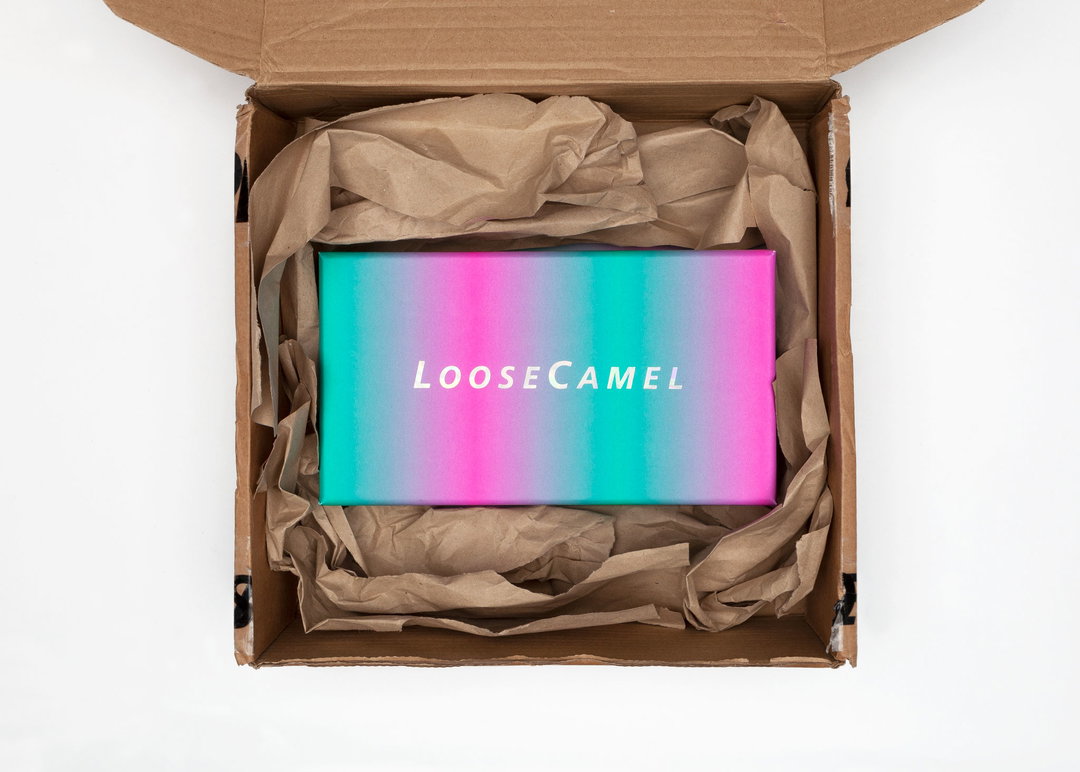
Ashley Kinnard Studio: Loose Camel Sunglasses (Copyright © Ashley Kinnard Studio, 2019)
Hero Header
Ashley Kinnard Studio: Scaffold (Copyright © Ashley Kinnard Studio, 2019)
Share Article
Further Info
About the Author
—
Marigold Warner is a British-Japanese writer and editor based in Tokyo. She covers art and culture, and is particularly interested in Japanese photography and design.