Charlotte Rohde asks “what do typefaces have to say beyond the words they spell?”
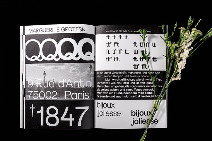
“All my typefaces have feminist concepts or thoughts woven into them," says the type and graphic designer Charlotte Rohde. Based out of Amsterdam but having studied in Düsseldorf where the typography is usually very bold – “almost brutal but playful at the same time” – Charlotte’s designs visibly encapsulate the place where she studied while hinting at feminism which adds an emotional value to the text.
While studying retail design at university with the hopes of becoming a scenographer (otherwise known as a production designer), Charlotte unexpectedly fell in love with typography in her fifth semester and focused on the discipline from then on. “I wanted to explore the possibilities within such a predefined system and continued to delve further into it," she tells It’s Nice That, "so my interests in typography happened quite naturally.”
Working with typography on an emotional basis, Charlotte’s interests lie in the manipulation of form and language through type. As a youngster, she saw herself becoming a curator and a writer which have fed into the surrounding context of her type designs over time. For her second typeface Calyces, Charlotte wanted to create a typeface that would “read like an opera – sharp, elegant with a hint of pathos.” Once it was realised, she decided to give it away for free if the project had feminist intentions. “This is one way of feeling like I am contributing and showing solidarity to a worthy cause”, adds the designer, “I realised that design does not necessarily have to have a feminist concept to do feminist actions.”
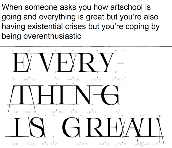
Charlotte Rohde: Serifbabe
Similarly designed with bags of intuition, Charlotte’s typeface Serifbabe started off as an experiment with serifs. “Some time ago I was trying to find out how serifs worked, nothing special,” explains Charlotte. A year later, she was suddenly hit with inspiration and knew exactly how to solve the work-in-progress design. “I worked maniacally for a few weeks and got really excited about it because it expressed a feeling within me. The name was just a working title as well, but when someone asked to use it and I sent it out, the name stuck.”
Currently expanding on the emotional concept of Serifbabe at Amsterdam’s Sandberg Instituut, Charlotte is investigating how to invoke emotion through designed letterforms. “The process of designing Serifbabe felt so genuine and personal, I wanted to explore this emotionality," she adds on the matter. Kicking off the project by experimenting with abstract objects and asking whether these objects can successfully translate an emotion, Charlotte continues to look into the communication of emotion. Fundamentally she’s pondering, “What do typefaces have to say beyond the words they spell?” Working with poetry and collaborating with the artist Octave Rimbert-Rivière, Charlotte intends to write a thesis about the emotionality of typeface and how they can be seen, and used as visual voices.
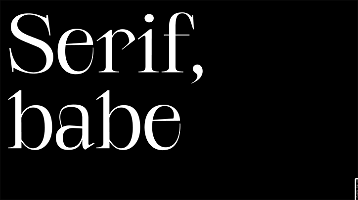
Charlotte Rohde: Serifbabe
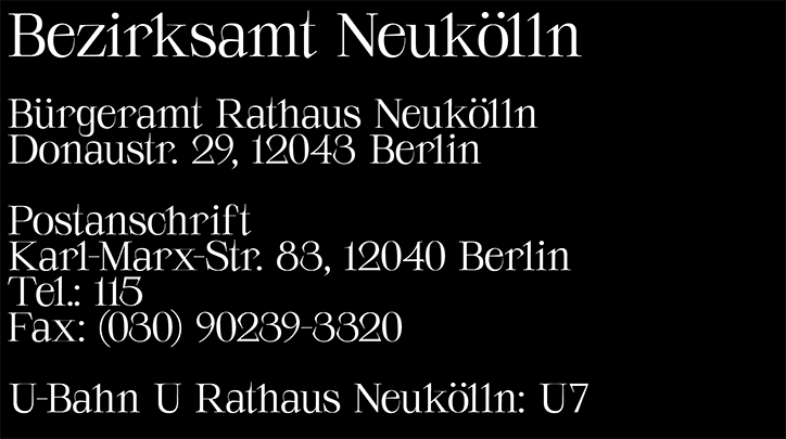
Charlotte Rohde: Serifbabe
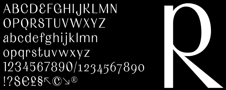
Charlotte Rohde: CalycesBildschirmfoto 2019-05-14 um 20.43.07
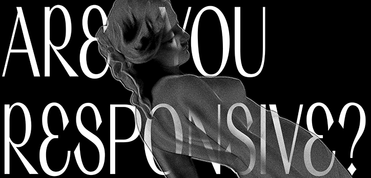
Charlotte Rohde: Calyces
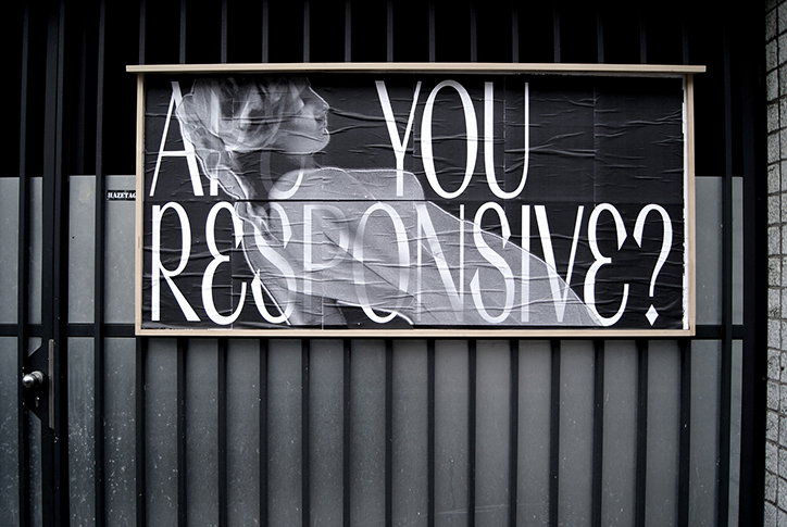
Charlotte Rohde: Calyces
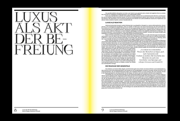
Charlotte Rohde: Serifbabe, luxury
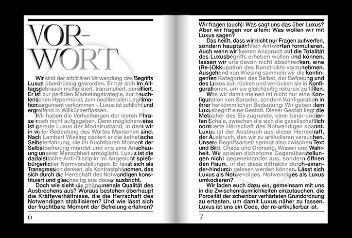
Charlotte Rohde: Serifbabe, luxury
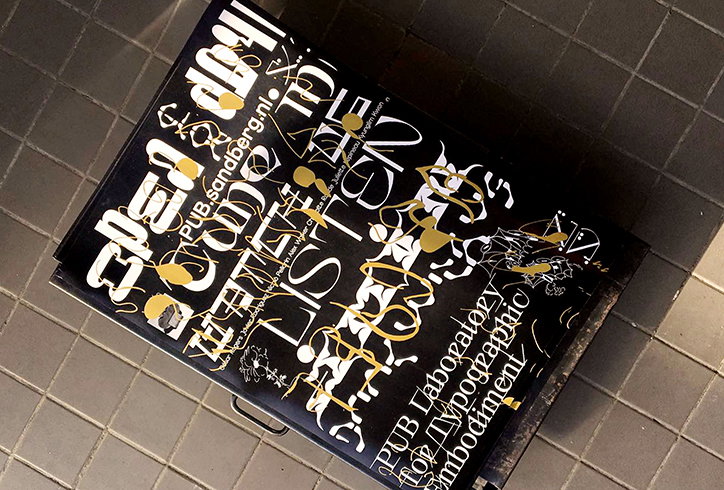
Charlotte Rohde: Pub Type
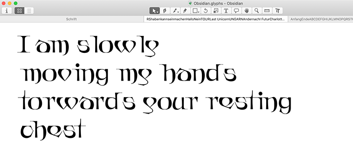
Charlotte Rohde: Bildschirmfoto
Share Article
Further Info
About the Author
—
Jynann joined It’s Nice That as an editorial assistant in August 2018 after graduating from The Glasgow School of Art’s Communication Design degree. In March 2019 she became a staff writer and in June 2021, she was made associate editor. She went freelance in 2022.