James Vinciguerra on art and design being for everyone "not just elitist gatekeepers"
We chat to the artist and musician on analogue vs digital practices and finding inspiration from everywhere and anywhere.
Share
With a refreshingly honest and varied approach to graphic design, Australian designer and musician James Vinciguerra admits there is often no logic to the work he makes, “only god given knowledge – or rather intuition,” he tells It’s Nice That. Purposefully making work far away from the strict confinements of traditional graphic design, the work James creates benefits aesthetically from having community at the heart of it too, trying to “use images that are made only by me or friends of mine,” adding the advice to attempt to “create as much of your own imagery as possible.” As a result, he sums up work perfectly nonchalantly as consisting of a “drawing of a funny looking person and some zany type, but not always.”
In this approach James also points out how his inspiration tends to come from everywhere and anywhere. “I remember my teacher at design school referring to Swiss Style as ‘graphic design porn’, but I personally find more inspiration looking at non-latin characters, signs, artwork made by children, handwriting, deviant art, freeware fonts, old printed matter, damaged things, clouds, oil stains,” he lists. “There’s so much in the natural world to look at that can give you ideas.”
Despite this openminded approach to possible creative inspiration, typography remains a central component of James’ design work. Usually working in the realm of record sleeves, posters and t-shirts, his use of typography is brilliantly sporadic, often looping, stretching and making the best possible use of the space available. In some pieces, such as his work for the band Constant Mongrel, type that appears to be drawn by hand using a mix of sizing in letterforms, creates a fluid design link between its graphic output – whether its the title of an LP or the text displayed on a t-shirt James has designed for them.
“There’s plenty of good type design now that I look at for sure, but I don’t see the point in using it if everyone else is,” James adds on this part of his practice. “I tend to do my own characters or crudely customise existing ones. I’ve learnt much more from ignorant people that make strange things than I have from uptight designers complaining about poor letter spacing.” In also showing how doing things a little differently from his contemporaries – and as we believe having much better results – the designer also points out his belief that “Art and design should be for all the people, not just elitist gatekeepers (though it’s definitely for them also),” he tells us. “It’s not that I think rules aren’t important but you can always use them as a launchpad into more uncharted areas, but some bending is required.”
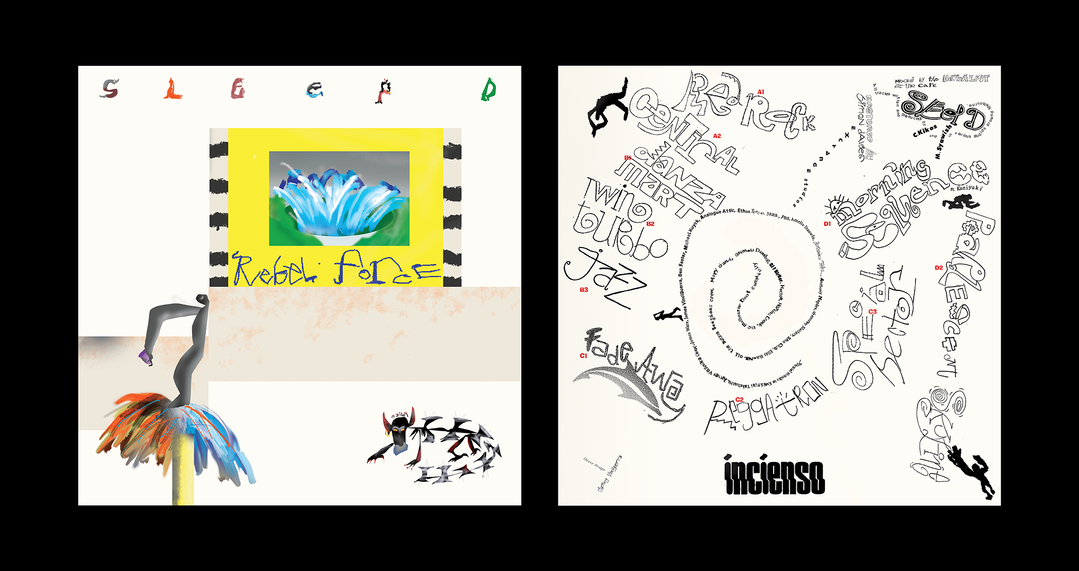
When it comes to taking all these components and piecing them together as a cohesive work, James explains his process is equally mixed. Never using a tablet, he’ll often begin by drawing on paper, photographing or scanning it in, “and then get funky with it.” Certain aspects still remain as a digital practice however, such as the airbrushing technique that can often be found in both his typographic forms or larger illustrations. It also used to be how he created the majority of his work until recently, explaining how “three years ago I would almost never do anything off the computer but I’m increasingly inclined to go off the computer and do stuff, so much freedom,” he tells us. “Procrastination and free association are excellent tools for allowing ideas to percolate.”
Working both as a designer and a musician (James is the drummer in Total Control and a solo artist performing under the name of Trevor) there is ultimately always a little cross over between his two creative practices. When it comes to Total Control he acts as more of an art director than a designer, working on their t-shirts and gig posters rather than sleeve design. In his solo material he took back on the role of designing his own output “with some help from the wonderful Kia Tasbigouh and Brittany Wyper”, and when it comes to other bands he’ll work with the process develops from research, conversations, “looking for meaning in the lyrics, song titles – anything,” he explains. “Also, being a designer the client often has their own vision so you sort of become collaborators to achieve a common goal.”
Now looking to the year ahead James is excitingly scheduled to do a residency at the Tom of Finland foundation in Los Angeles towards the end of the year, but most all of all, “I would like to continue doing what I am doing, move away from the computer more,” he tells us. “That would be nice. Draw more erotica. Would love to make shirt for R&M leathers. Going to learn airbrush. And, can I just say, shapeshifting image recycling fools be damned.”
GalleryJames Vinciguerra
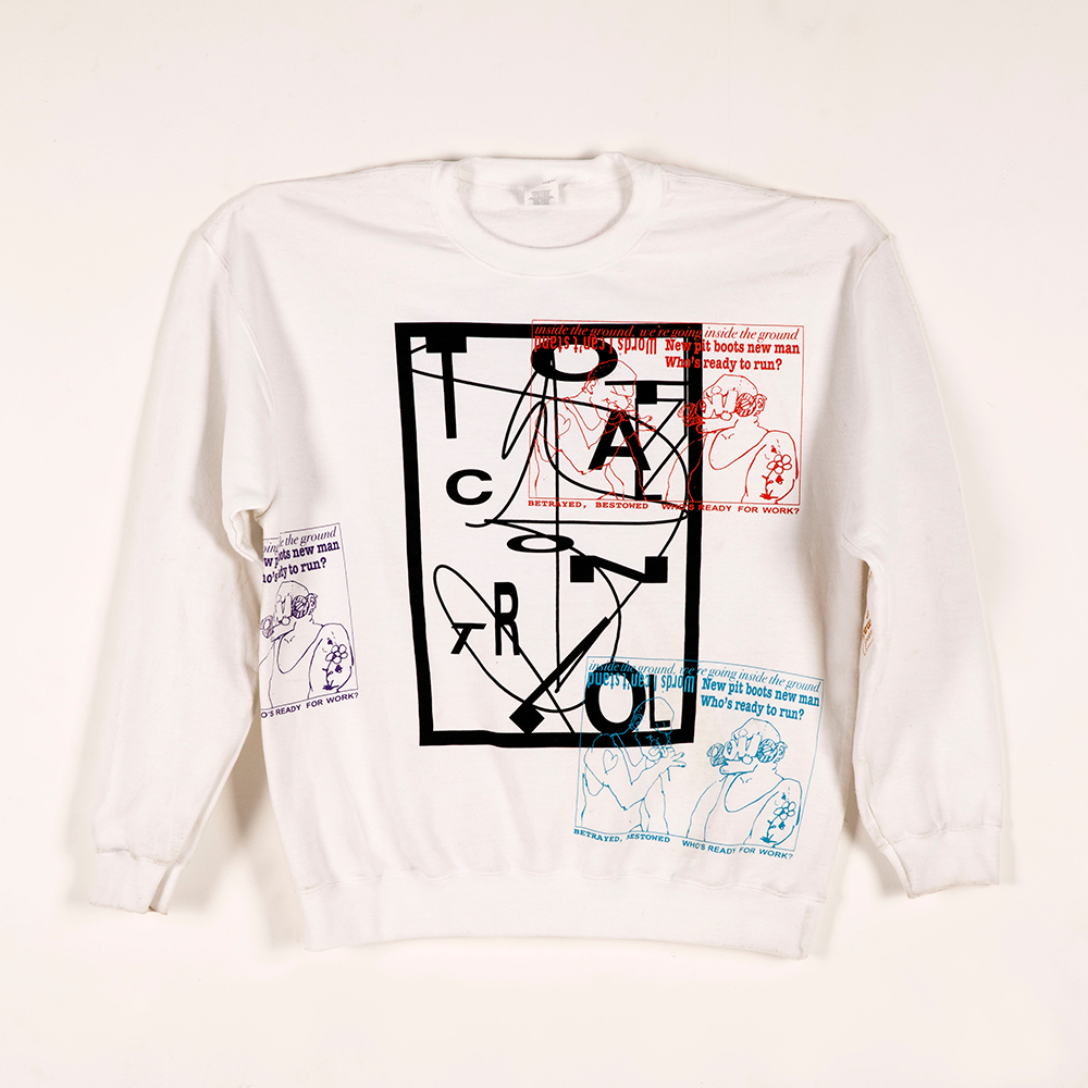
Total Control (in collaboration with Ruby Jeppe)
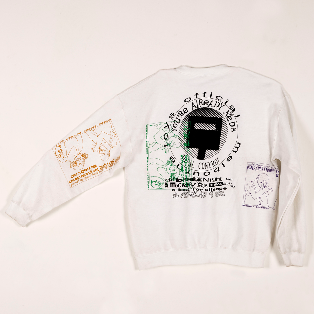
Total Control (in collaboration with Ruby Jeppe)
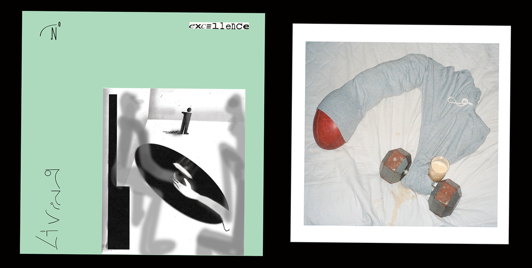
Constant Mongrel LP and insert
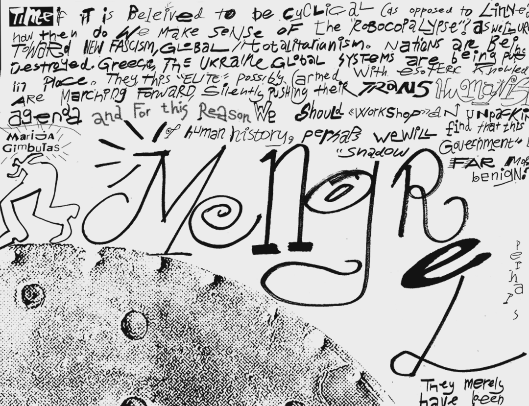
Constant Mongrel t-shirt
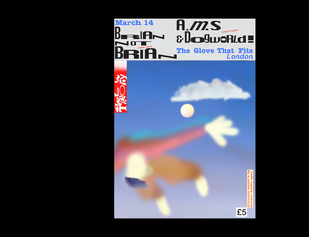
Club in Theory
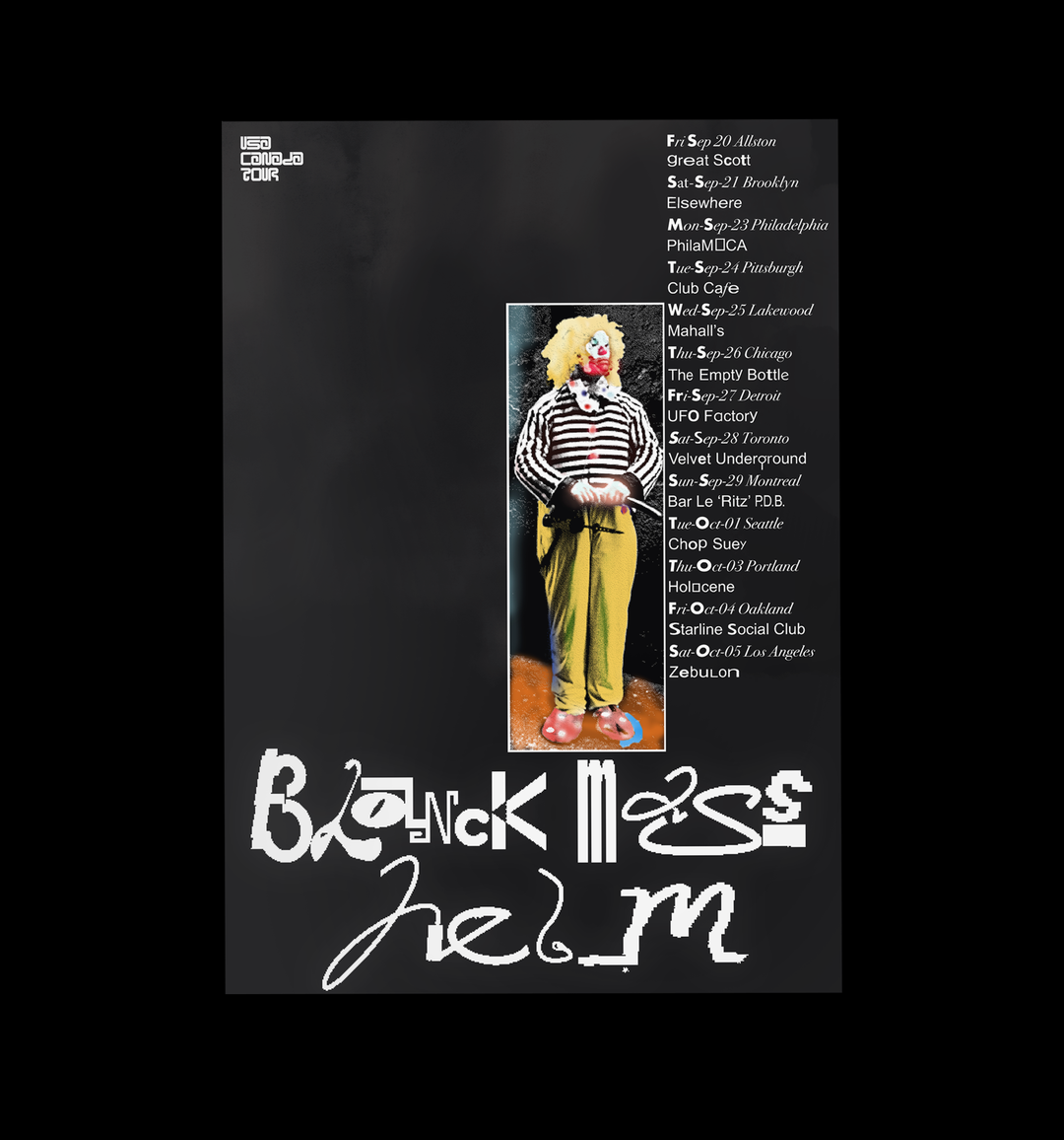
Helm
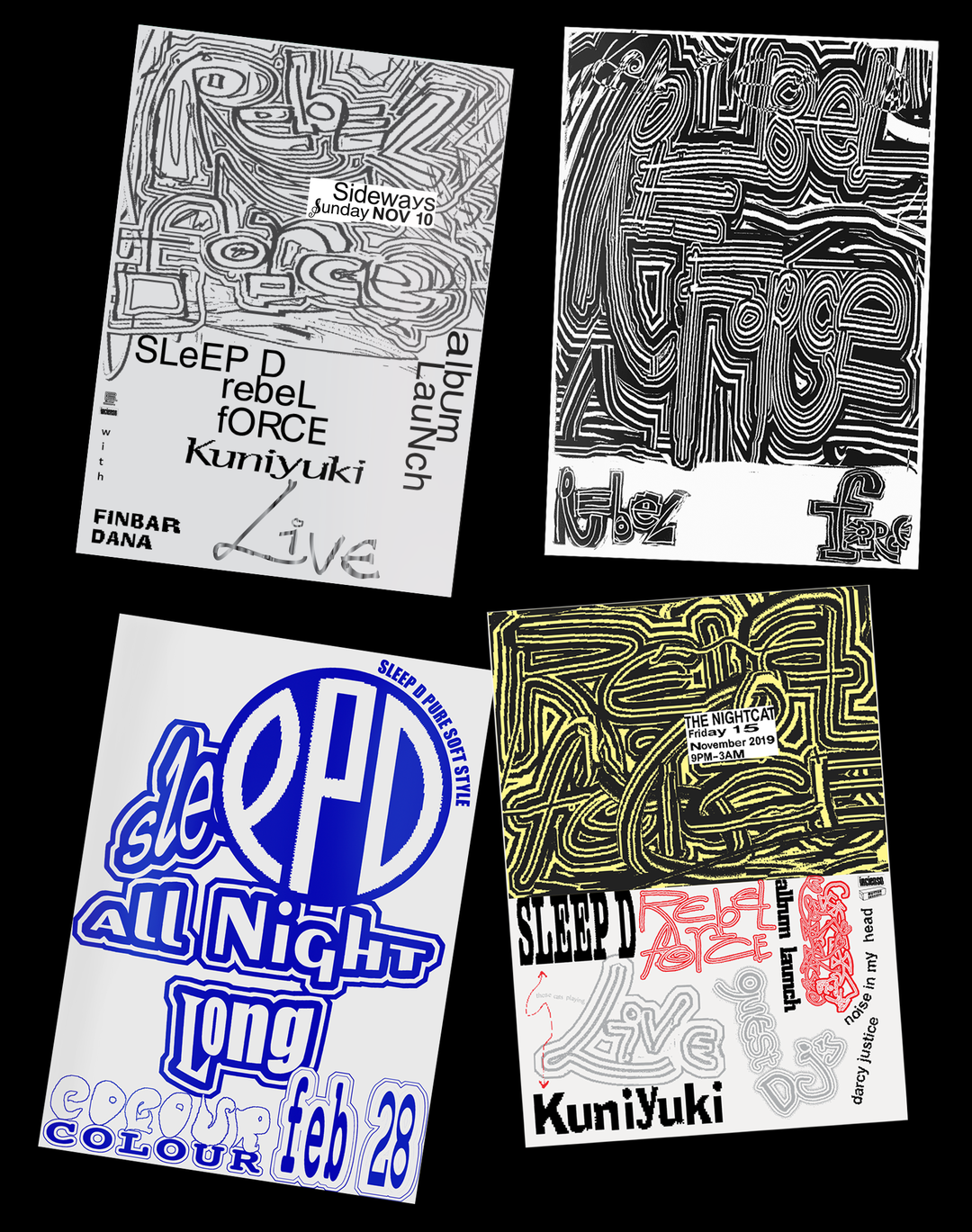
Sleep D posters
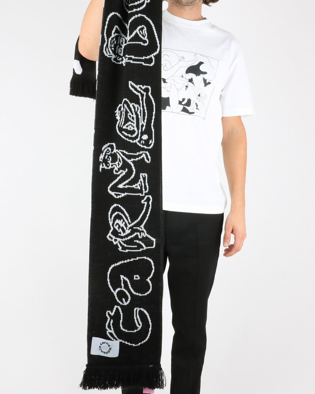
Dirty James Scarf
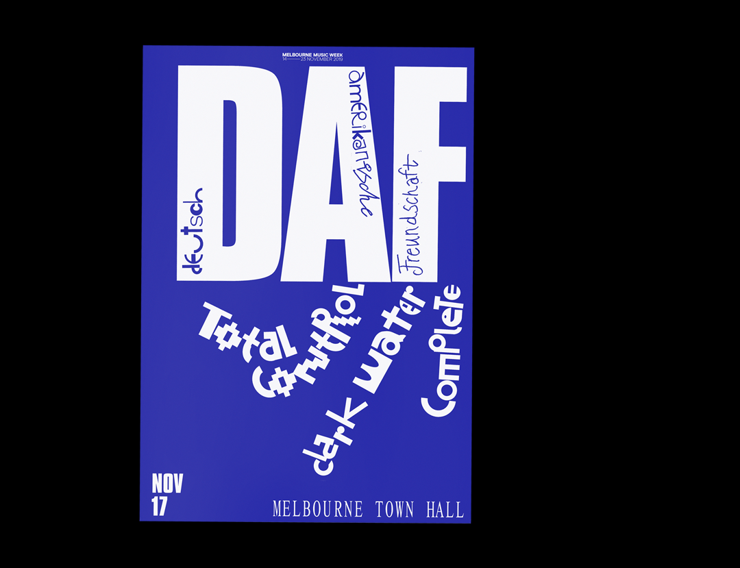
DAF Total Control
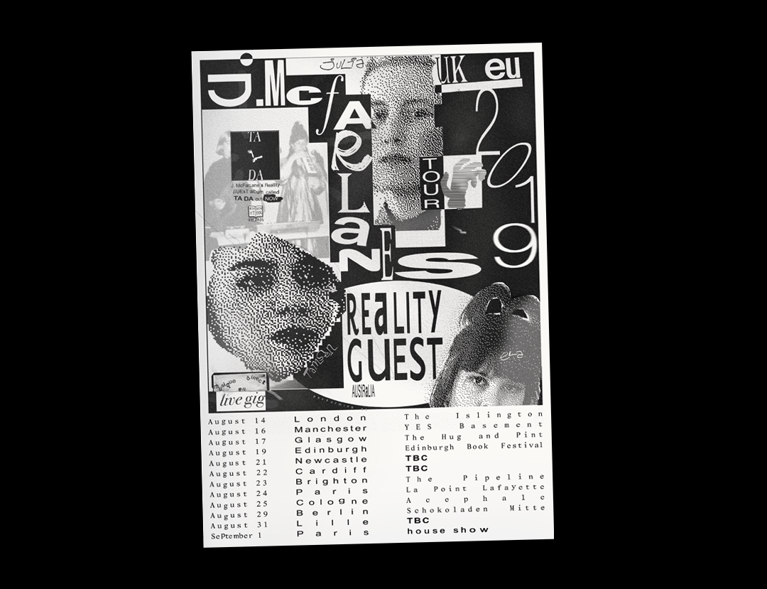
J McFarlane Euro Tour
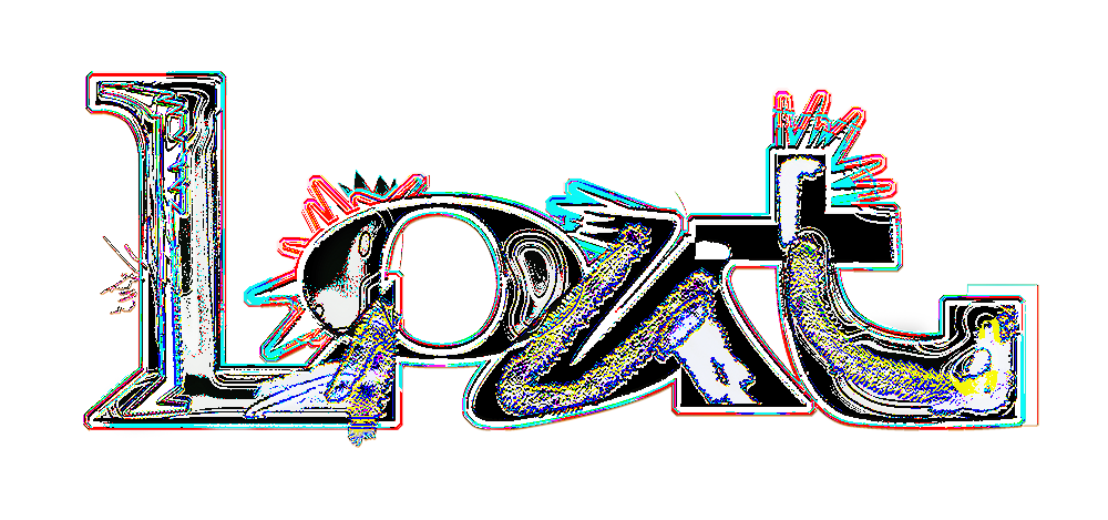
Lout
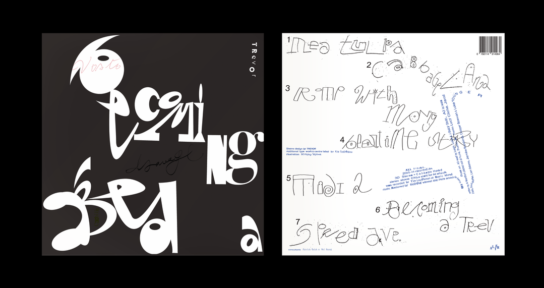
Trevor
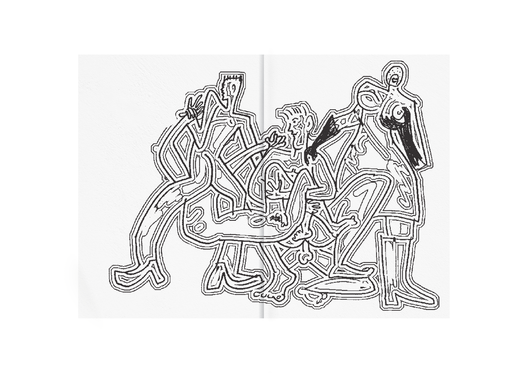
Erotic Drawings Booklet
Hero Header
James Vinciguerra: Diät
Share Article
Further Info
About the Author
—
Lucy (she/her) was part of the It’s Nice That team from 2016–2025, first joining as a staff writer after graduating from Chelsea College of Art with a degree in Graphic Design Communication, eventually becoming a senior editor on our editorial team, and most recently at Insights, a research-driven department with It’s Nice That.