Effortlessly chic, office_hlc creates pared back designs for the Parisian clientele
Hadrien Lopez talks us through three recent projects; from a rebrand for the architecture studio graal, to a branding project for Adidas.
Since we last featured the graphic designer Hadrien Lopez back in 2017, the former employee of Untitled studio was working away at his sleek, type-centred designs in the creative sector. Now, just less than three years on, Hadrien has set up shop in eastern Paris, “a neighbourhood that I particularly like,” and established his own studio, office_hlc. Having expanded into art direction and digital design, as well as furthered his practice in print, the studio has garnered clients from the likes of Palais de Tokyo and La Maréchalerie in an array of exciting projects and collaborations.
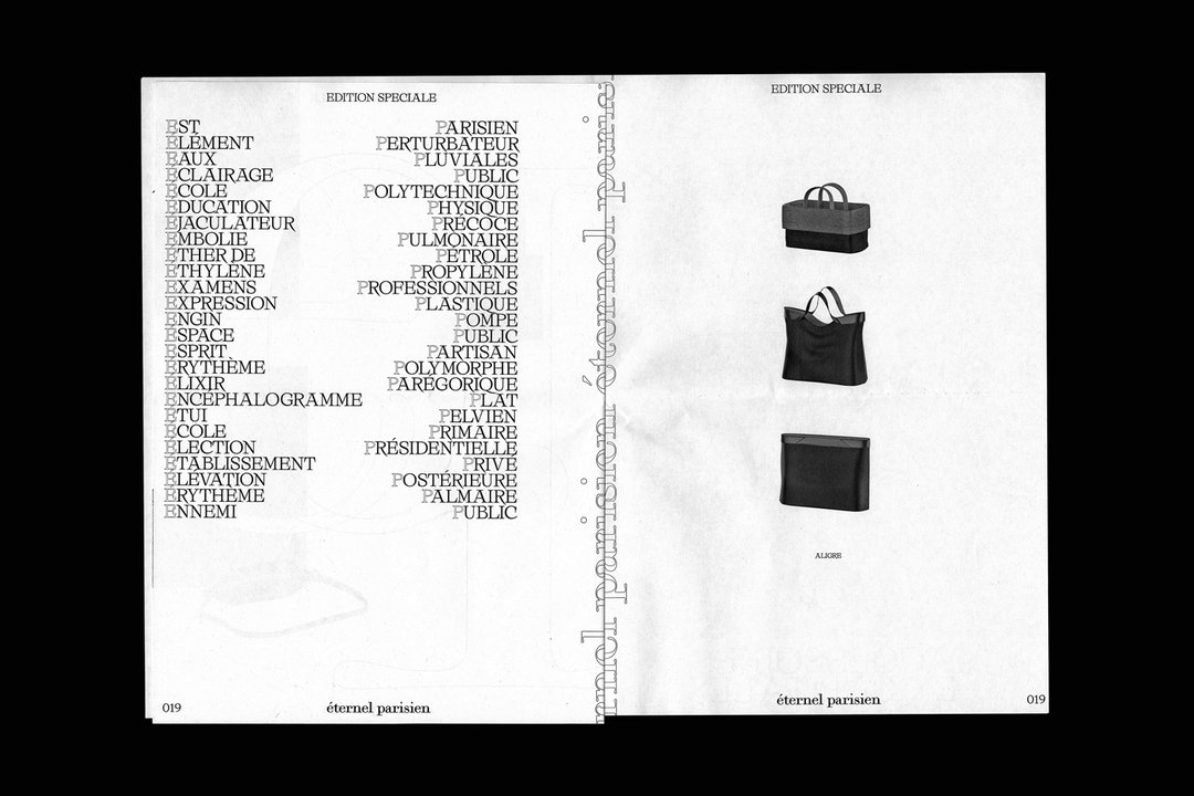
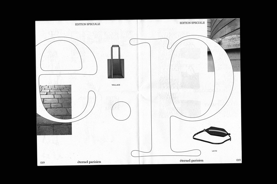
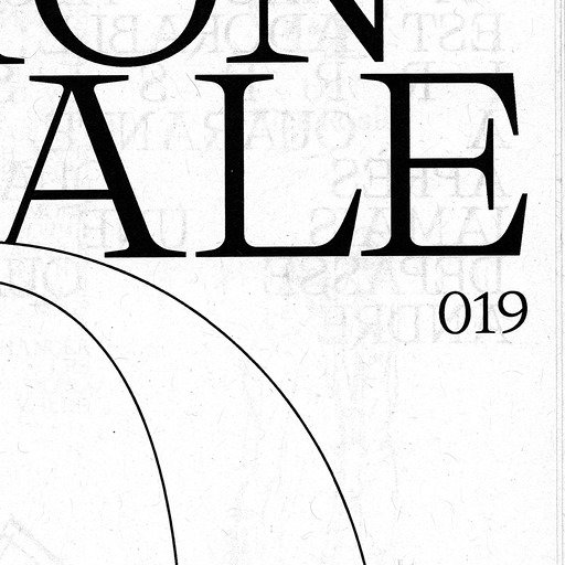
“I think I am looking for conceptual efficiency,” Hadrien tells us on the outlook of his recently founded studio. Applying a graphic elegance with each brief, he aims to create a kind of visual poetry by playing with the relationship between typography, negative space and imagery. In its latest project Edition spéciale, office_hlc designed a newspaper to accompany the new collection of fashion designer Gilles Rosier. After working in Paris’ haute couture fashion houses for years, Gilles recently developed his own line of leather goods and accessories.
To accompany the launch of his new line, the fashion designer asked Hadrien to create a publication that documents the initial drawings of the collection. Curating a space for these sketches, along with inspirational quotes and other products which are “eternally Parisian”, Hadrien decided to create a large format newspaper inspired by the iconic papers from the French capital. Exuding a sense of effortless chic that French design knows all-too-well, Hadrien plays with scale, outlined text and a monochrome simplicity in the document to bring the traditional sophistication of the Parisian newspaper into the modern era.
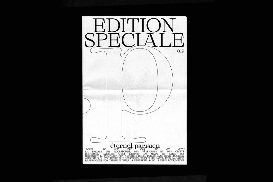
office_hlc: Edition spéciale
In another project, office_hlc worked with the long-time collaborator event agency aimko to create a branding project for Adidas ozweego. Working on the branding for the offshoot of the sporting brand, Hadrien was tasked with creating visuals that could also be deployed across videos. As a result, his type-centred design focuses on movement, tricking the brain to feel like the type is whirring by with its contrasting effects and jutting against each other. Created in collaboration with his friend and motion designer Michel Naufal, together, the pair developed several videos as well as the stage design for the fashion show in Paris’ Marigny Theater.
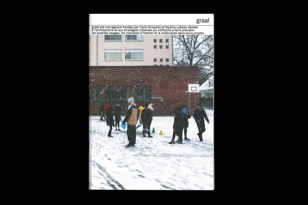
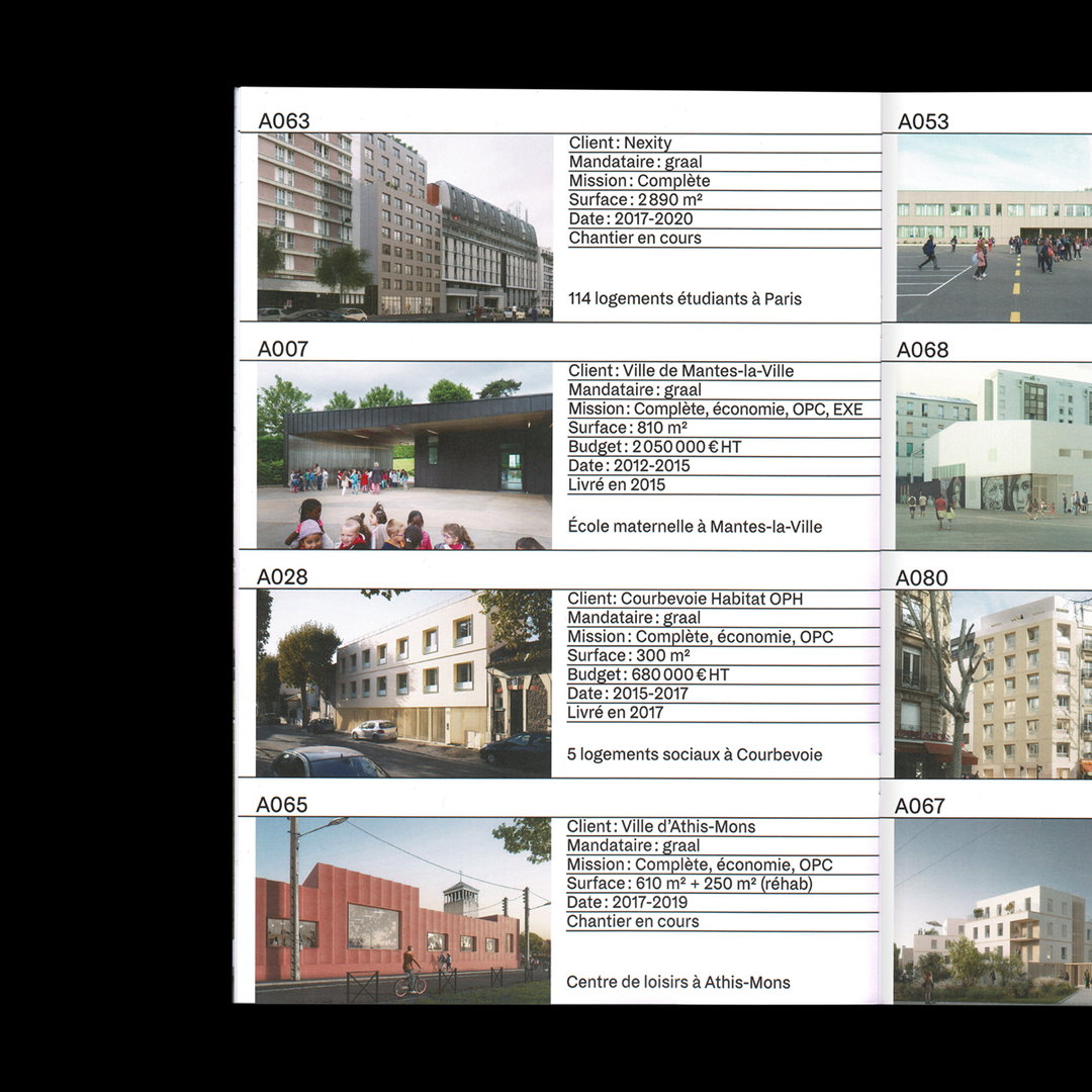
Finally, the studio founder talks us through graal, a redesign of the Paris-based architecture agency led by Nadine Lebeau and Carlo Grispelo. “They gave me the carte blanche to redesign all their platforms of communication as well as their image,” explains Hadrien. From website, social media, stationery and visual identity, the designer created a rigid design system to mimic the strict geometry of architecture and stayed true to the strict, systemised layout throughout.
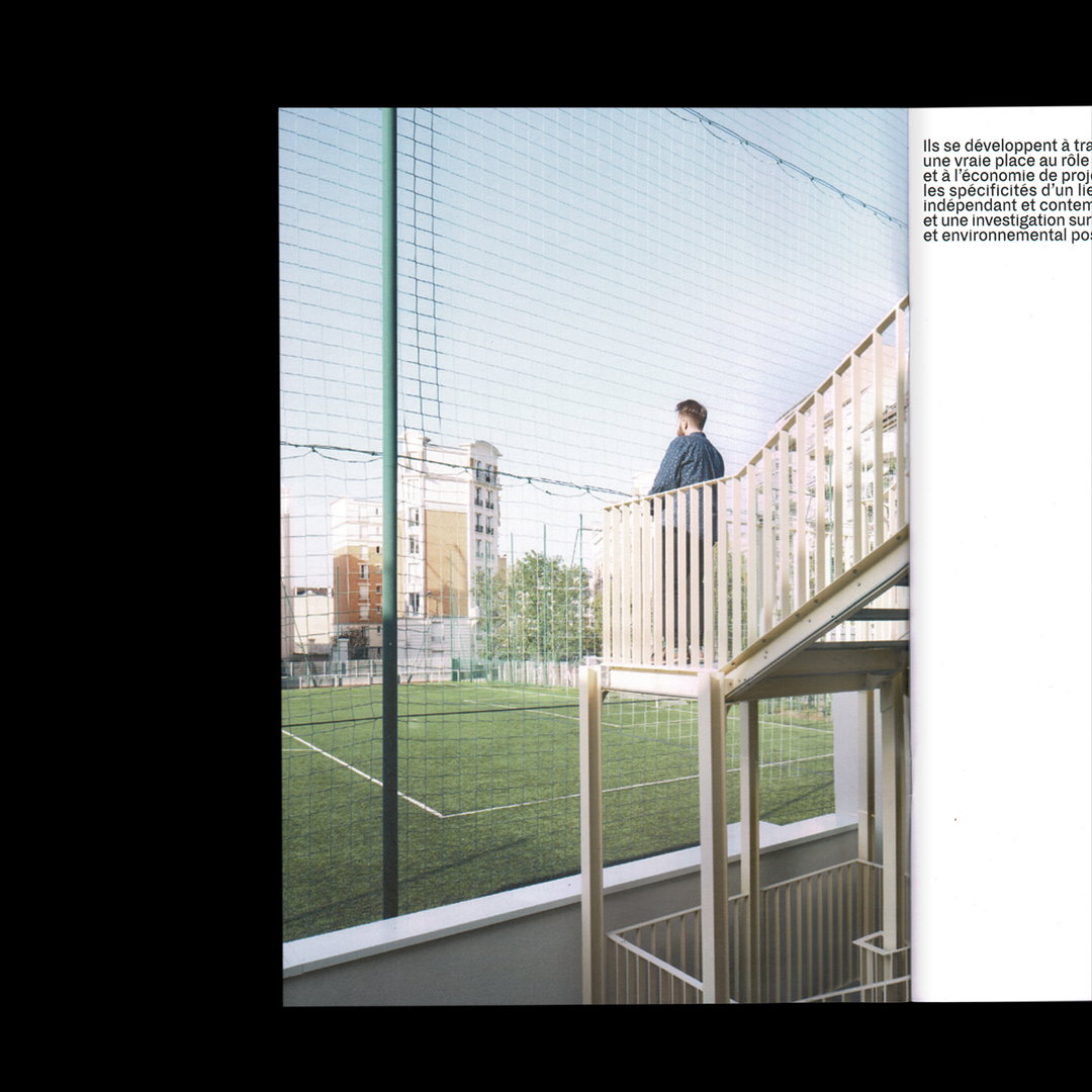
Thoughtful and considered, the identity reflects graal’s artistic direction which lies at the conceptual end of the architectural spectrum. Pared back photography lies alongside minimal sans serif text in both print and web, and through the variation of beautifully shot images, and in his practice in general, Hadrien creates a sense of tranquil silence through his understated design sensibilities.
GalleryAll images by office_hlc
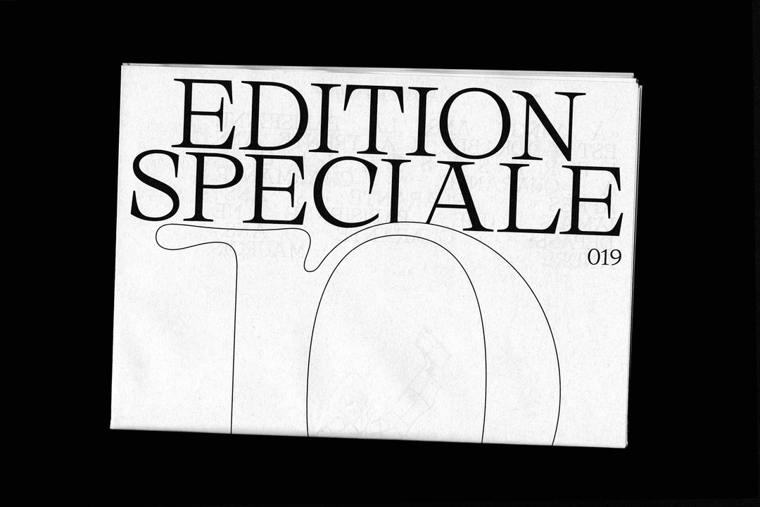
Edition spéciale
Edition spéciale
Edition spéciale
graal
graal
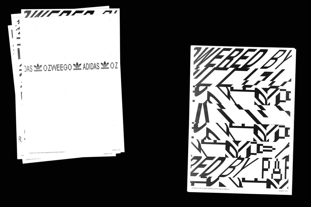
Adidas ozweego
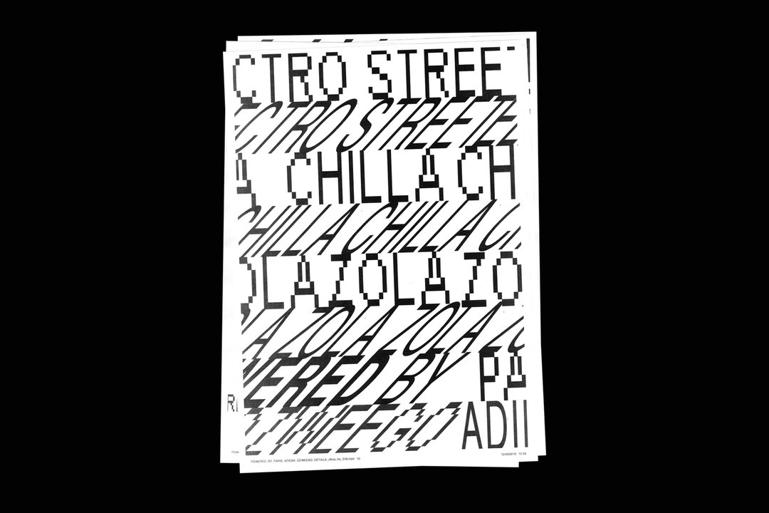
Adidas ozweego
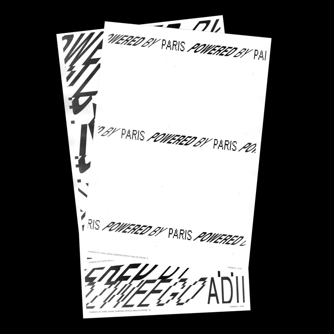
Adidas ozweego
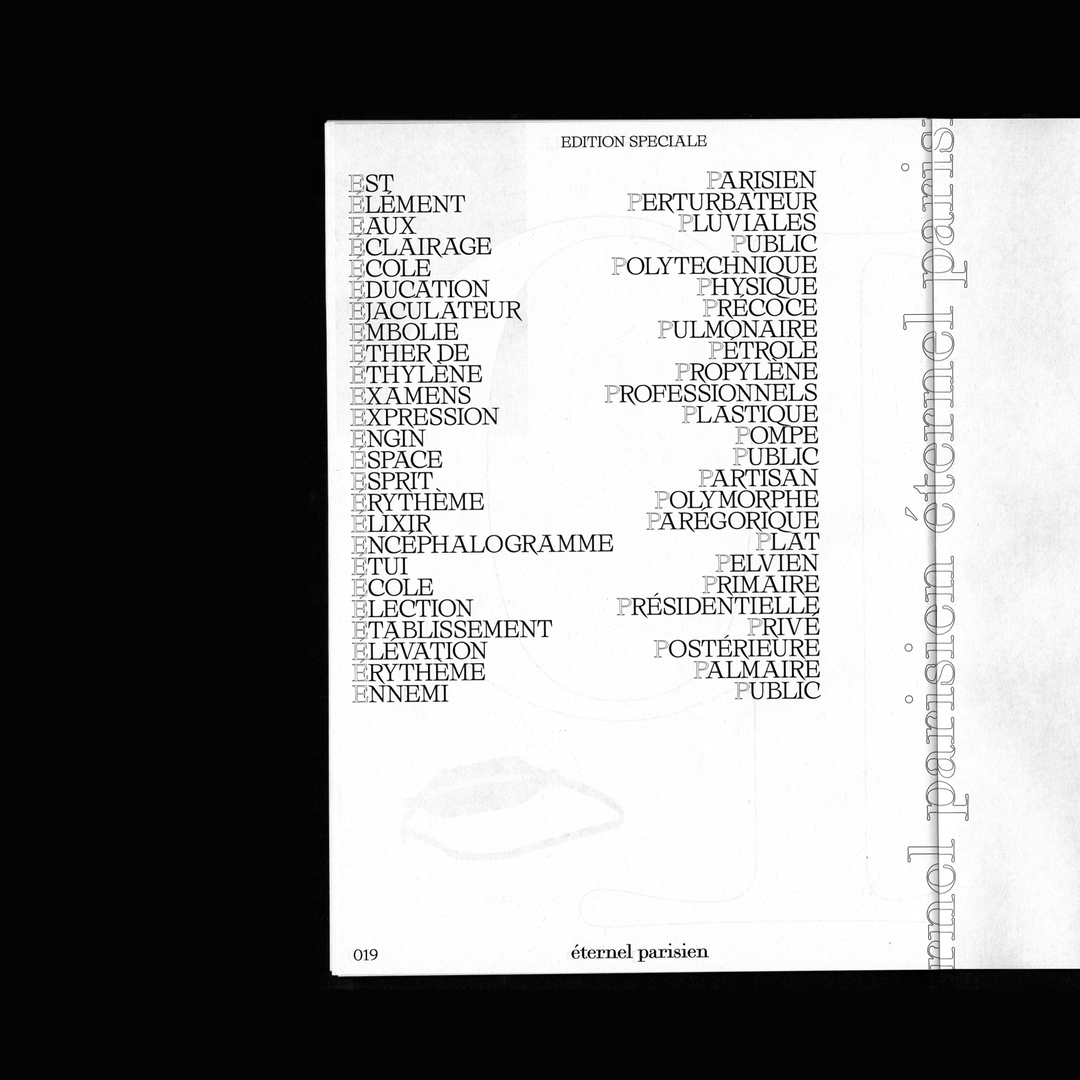
Edition spéciale
Edition spéciale
Share Article
Further Info
About the Author
—
Jynann joined It’s Nice That as an editorial assistant in August 2018 after graduating from The Glasgow School of Art’s Communication Design degree. In March 2019 she became a staff writer and in June 2021, she was made associate editor. She went freelance in 2022.