Sakaria Studio helps its clients find a more experimental visual expression
We speak to founder Minna Sakaria about how the Stockholm-based graphic design studio works at “the intersection between the artistic and the commercially viable”.
Share
Whilst Sakaria Studio used to design all things graphic, it has recently settled on visual identities as its core focus. Describing its approach, Minna Sakaria – founder of the studio – tells us that “Sakaria Studio’s typical client is an established organisation that wants to update their visual brand and nudge it towards more expression.” Helping brands to find their identity somewhere at “the intersection between the artistic and commercially viable”, the studio focuses on each client’s personality, rather than attempting to reproduce a specific style. With the clients’ “values and narratives” leading the design, “playfulness and critical thinking” move the design forward, and, Minna explains, the end goal is to achieve something “new and unexpected”. As she puts it: “In my opinion, it is inherent in the concept of design that it should strive to be groundbreaking.”
Prior to discovering her affinity with graphic design, Minna started out in advertising school. But, not being fond of the working climate, she gravitated toward design, which “seemed like a more sustainable way of working with visual communication”. It was while she was studying for a masters in visual communication at the Royal College of art in 2015 that Minna realised graphic design suited her, because “a big part of the craft is thinking and writing and the rest of the process is to some extent generative: the thinking is the code, and if the code works perfectly the result can be generated almost as with the push of a button.” Having always had a penchant for illustration – at one point Minna even toyed with the idea of pursuing it as a career – she likes to keep elements of the practice at the forefront of her work, such as storytelling, the hands-on approach and the movement of the hand being visible in the end result.
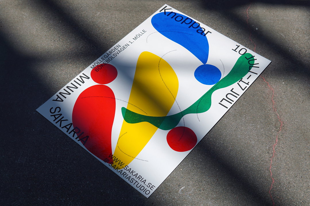
Sakaria Studio: Buds, exhibition poster. (Copyright © Minna Sakaria, 2021)
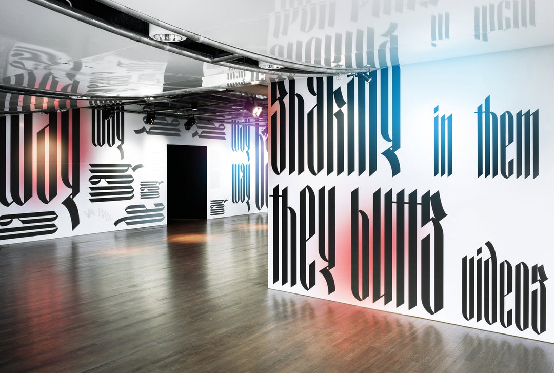
When discussing the elements of design which most excite her, typography first comes to mind for Minna. Talking of the art of type design, Minna says that “aesthetically and functionally it has the power to make or break the design, and beyond that it also has the potential to communicate visually in a subtle layer.” This exploration into the vast potential of typography is brilliantly displayed in the studio’s work with the audio-visual group exhibition Folkmusik 2.0 at Kulturhuset/Stadsteatern, which showcased hip hop as an important contemporary cultural force. Devised in collaboration with fellow graphic designer Sepidar Hosseini, the designs covered the entire 450-square-metre area and the typography, with its spiky yet regal and calligraphic forms, perfectly complemented the exhibition’s content. Inspired by Barbara Kruger’s supergraphics, the type “sampled” parts of the exhibited songs. Also translating into the exhibition posters, the type displays the studio’s ability to create work that suits the brief’s personality and uncovers its artistic potential.
Typography aside, the studio is also drawn to projects that involve large scales and elements of physicality. Minna explains this attraction as a means of being able to view the studio’s work in a different way: “So much of the daily work happens in front of and limited by the size and texture of the screen; the contrast of experiencing your work with your senses is nice.” It’s understandable, therefore, that when exhibiting some of her personal artworks, Minna opted for a large-scale design identity. Having spent her pregnancy “symbolically” drawing buds sprouting from clay trays, Minna exhibited them at a small gallery this past summer, taking the opportunity to “design the process according to [her] own preferences”. Extracting shapes from the drawings, Minna and intern Mikaela Cederholm made stickers, randomly placed onto posters and invitations. But the design’s stand-out element is the supersized shapes custom made for the exhibition’s windows. Boasting bold, primary colours and playful shapes, the window design is as effective as it is inviting.
Soon to release a visual identity for a publishing house and also beginning some commissions involving art and architecture, Sakaria Studio has a busy year ahead. And, whilst the studio often collaborates with creatives, Minna is hoping to forge a more established partnership moving forward: “A fellow designer, a project manager or someone more experienced with dimensions such as timeline, 3D and interaction, would help take the studio work to the next level.”
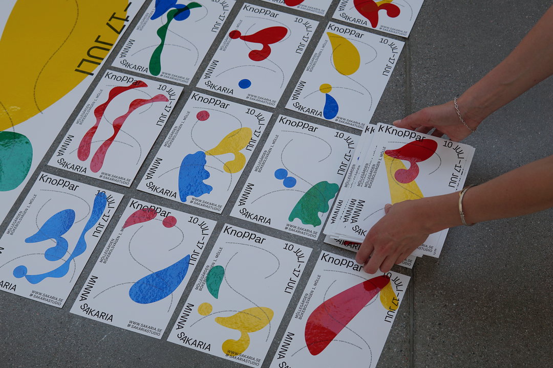
Sakaria Studio: Buds, visual identity.(Copyright © Minna Sakaria, 2021)
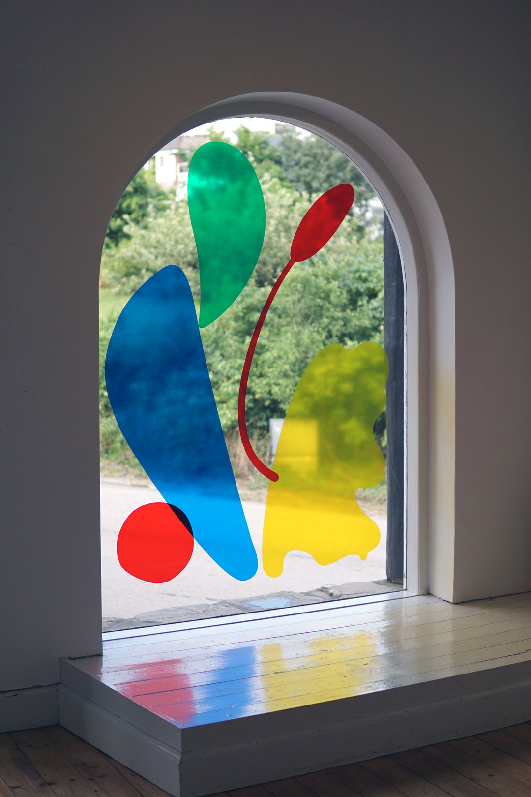
Sakaria Studio: Buds, Window display.(Copyright © Minna Sakaria, 2021) Photo by Patrik Axelsson.
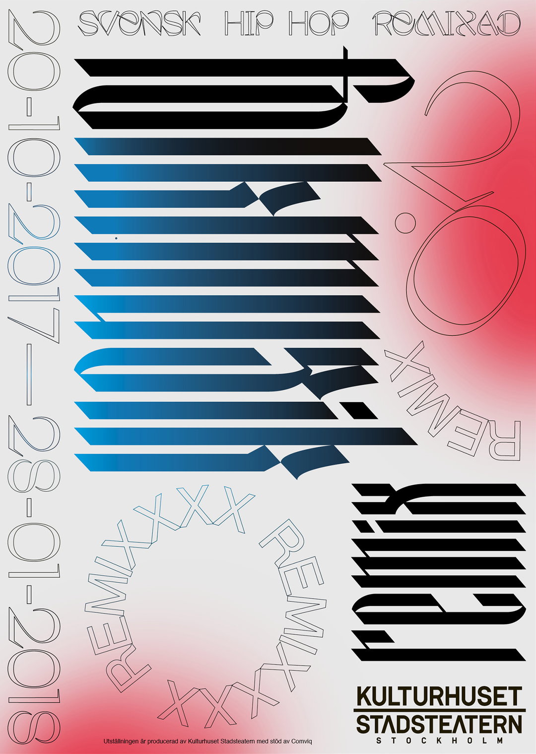
Sakaria Studio and Sepidar Hosseini: Kulturhuset, exhibition poster (Copyright © Minna Sakaria, Sepidar Hosseini 2017)
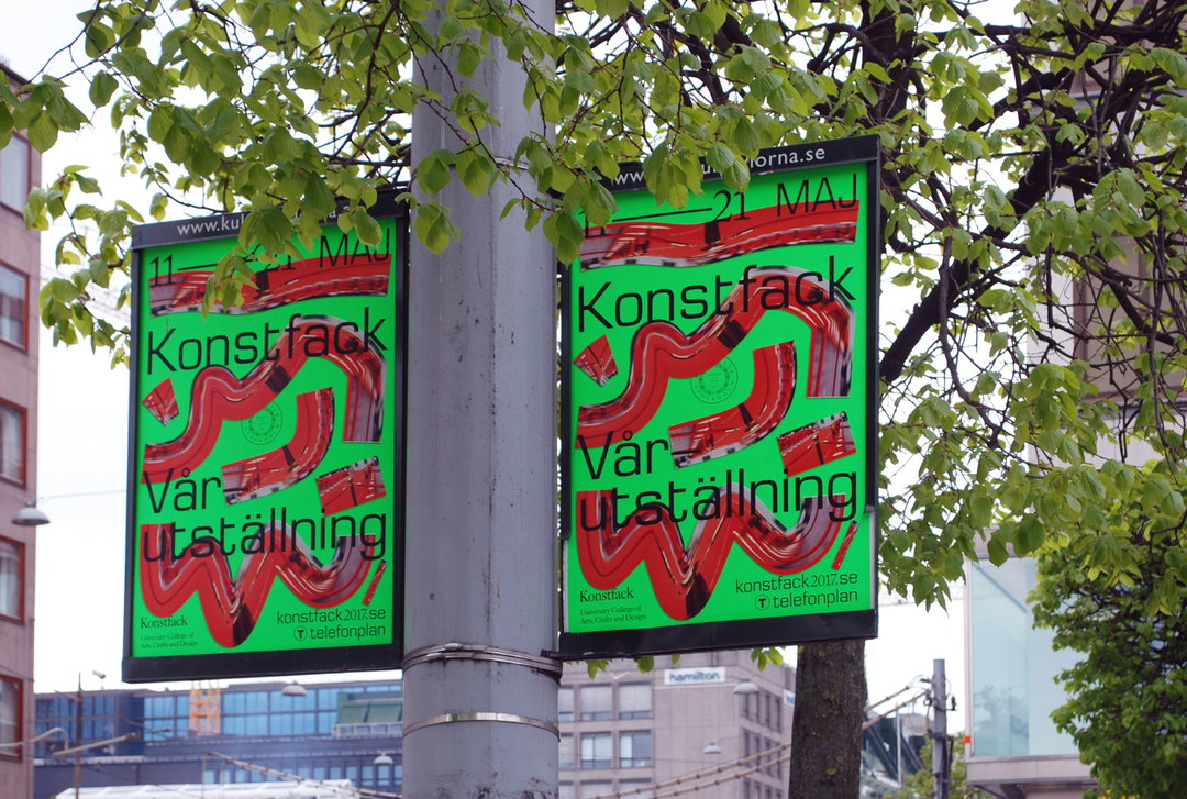
Sakaria Studio: Konstfack, red carpet banners. (Copyright © Minna Sakaria, 2017)
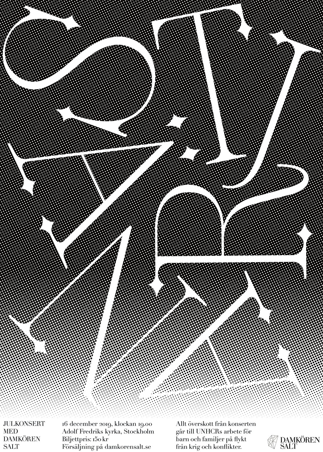
Sakaria Studio: Star Concert, poster (Copyright © Minna Sakaria, 2019)
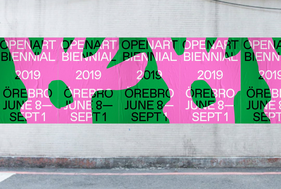
Sakaria Studio: Openart, identity posters. (Copyright © Minna Sakaria, 2019)
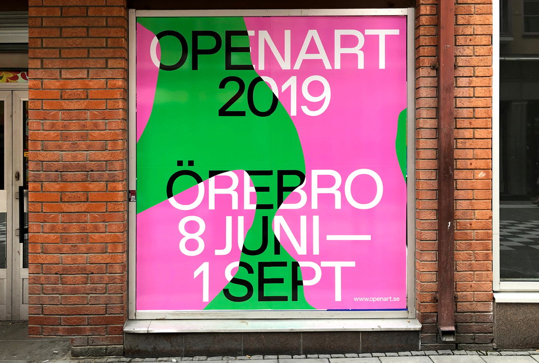
Sakaria Studio: Openart, billboard poster. (Copyright © Minna Sakaria, 2019)
Sakaria Studio: Openart, city square (Copyright © Minna Sakaria, 2019)
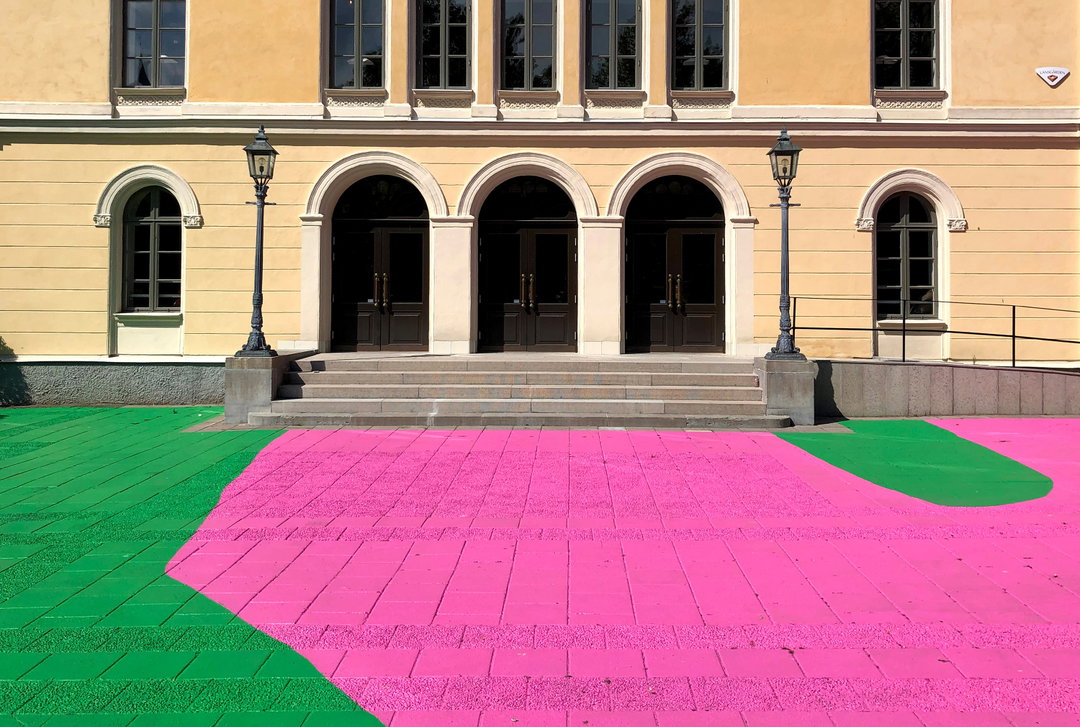
Sakaria Studio: Openart, city square (Copyright © Minna Sakaria, 2019)
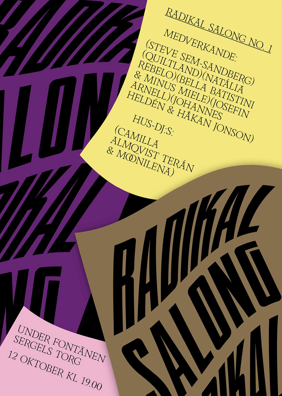
Sakaria Studio and Ray Atelier: Radikal Salong, identity poster. (Copyright © Minna Sakaria, Ray Atelier 2019)
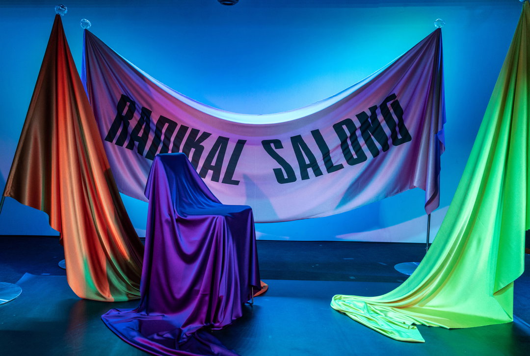
Sakaria Studio and Ray Atelier: Radikal Salong, set design. (Copyright © Minna Sakaria, Ray Atelier 2019) Photo by Fredrik Skoglund
Hero Header
Sakaria Studio and Sepidar Hosseini: Kulturhuset, super graphics. (Copyright © Minna Sakaria, Sepidar Hosseini 2017) Photo by Vidar Sörman.
Share Article
Further Info
About the Author
—
Olivia (she/her) is associate editor of the website, overseeing the day-to-day editorial projects as well as Nicer Tuesdays events. She joined the It’s Nice That team in 2021. [email protected]
To submit your work to be featured on the site, see our Submissions Guide.