Simin Xu reveals the tricks behind his “straightforward, simple and regular” package designs
From perfume bottles to boxes, scented candles to shopping bags, the designer expertly blends minimalist style with clever, to-the-point graphics.
Share
When Simin Xu (徐宾粟) says he likes “straightforward, simple and regular designs”, well, he isn't joking. Working towards minimalism in all its refined and structured glory, each glyph and mark the designer composes has been cleverly thought out before he turns it into a pleasing piece of packaging. It’s clear that he prefers to let the audience know exactly what they’re getting – “to let consumers clearly understand your design and products,” he tells It’s Nice That.
Based in Ningbo, China, Simin defines himself as a graphic designer, photographer “enthusiast and planner”. He learned his craft during university and since (for the past eight years, to be exact), he’s been working as a designer alongside the co-founding of his brand 寓义 to Define®. Through the latter arm, Simin designs for a host of different products in the branding world, often working with Yuihome Living to create identities for perfumes, oils and scented candles, as well as the posters and bags, boxes and packets they all arrive in. When working on a project like this, Simin looks to the user – or consumer – first to determine the style “they can accept and love”. This can be a lifestyle, reading habit or colour preference; the things that make us, us. Then it’s on to the design stage, before turning to the budget, materiality and process. Last but not least, it’s the sketching stage and use of software, typically Adobe and building “some hand-painted or hand-crafted representations”.
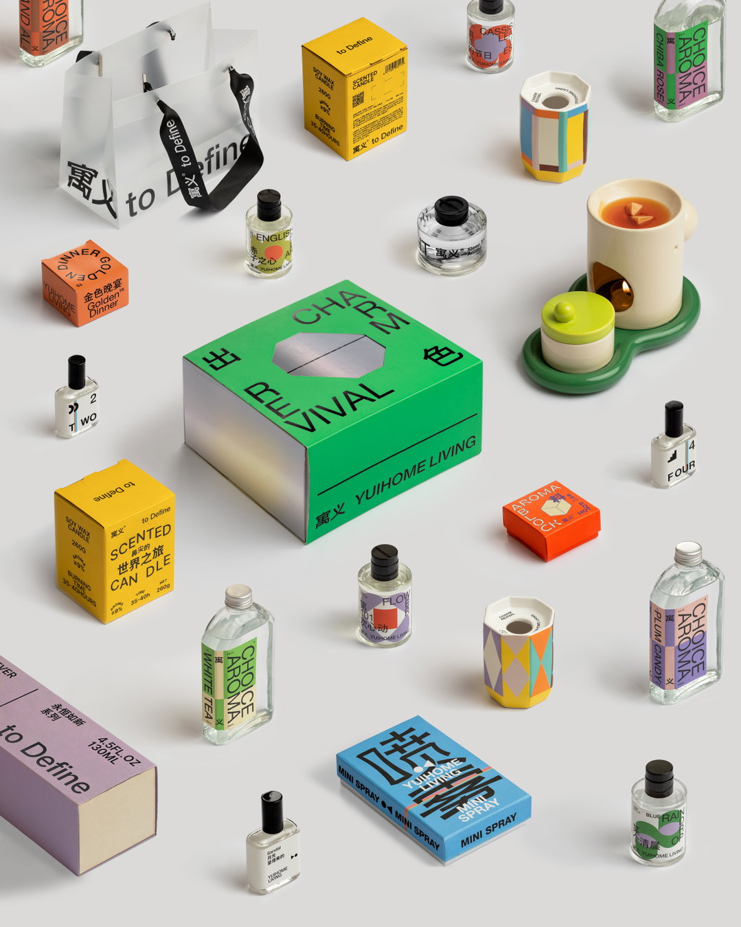
Simin Xu: 寓义 to Define 2021, 22 Colorful Youth线 产品包装合集 包装设计 (Copyright © Simin Xu 徐宾粟, 2022)
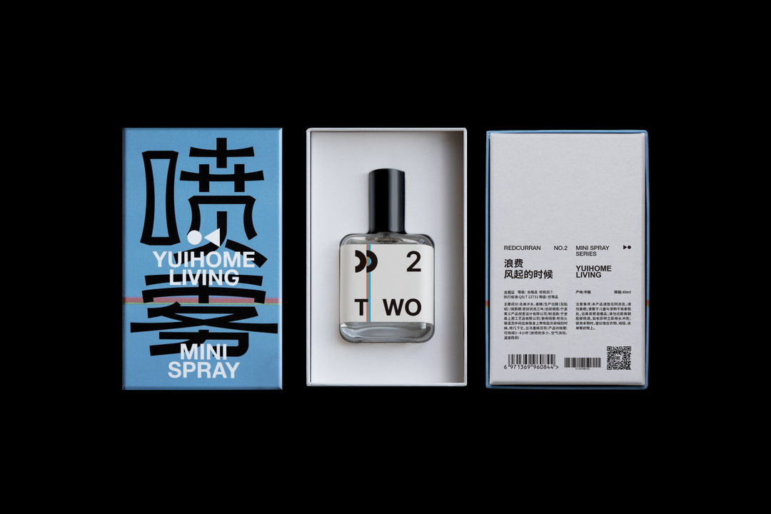
One of Simin’s latest endeavours is the packaging for Mini Spray, conceived as part of the 寓义 to Define® brand. The product does what it says on the tin – it’s a mini spray. It’s also wrapped up neatly in a blue-tinted box, imprinted in one simple word – you guessed it – spray. “The packaging adopts a straightforward form,” explains Simin, citing triangles, circles and general spray patterns as key features of the design. Meanwhile, numbers and scent names are marked on the side of the bottle, while the Chinese on the packaging has been derived from the “proportions of the graphics”. Subtle intricacies are what makes Simin’s work so enticing, not least for the fact that the products they design for can be used for anything, and by anyone. This particular Mini Spray scent series is what Simin refers to as “everyday without counting”. He adds: “Therefore, we emphasise the ‘everyday’ and ‘not making up the numbers’.”
In Simin’s point of view, “particular, caring and serious” are the words that summarise the branding for Mini Spray. But really, they can be applied to his wider portfolio. His work is full of little surprises and we’re all for it. “It’s like a communication that you can emphasise without using words,” he concludes. With plans to release many more perfume design projects this year, we can expect many more great things to come from Simin. There might also be a stylistic refresh at some point down the line too, but that’s all we know for now.
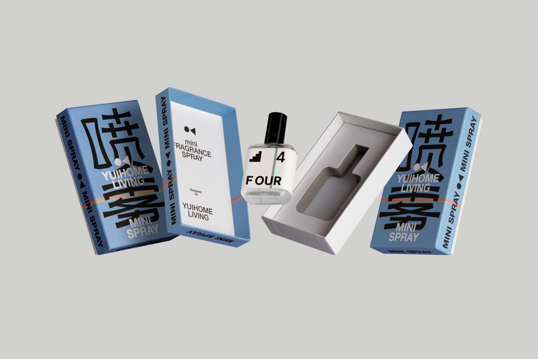
Simin Xu: Award360°年度100 寓义to Define香氛喷雾包装设计 设计师 (Copyright © Simin Xu 徐宾粟, 2022)
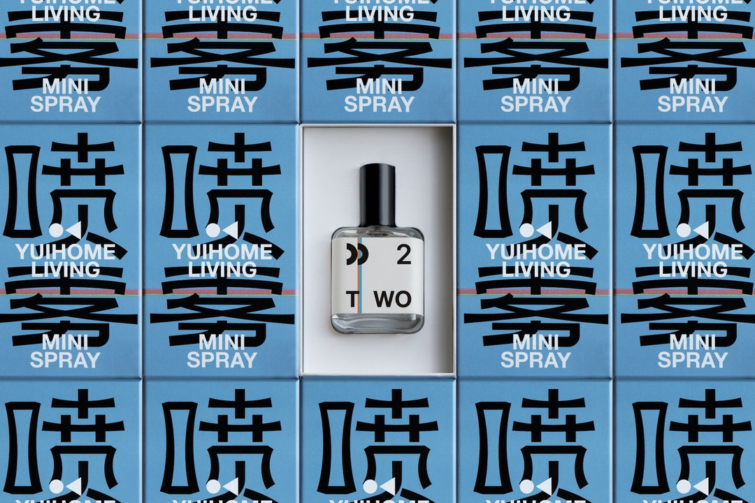
Simin Xu: Award360°年度100 寓义to Define香氛喷雾包装设计 设计师 (Copyright © Simin Xu 徐宾粟, 2022)
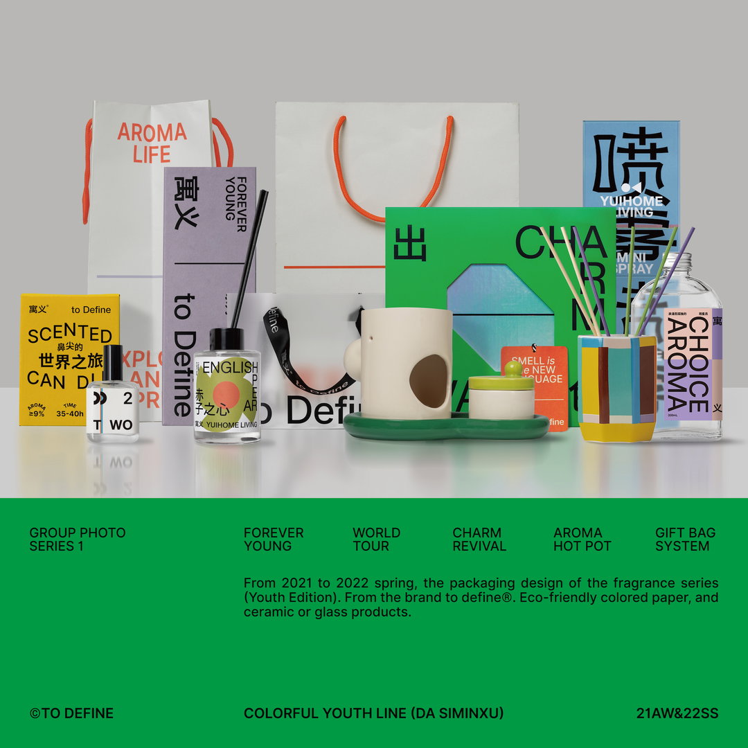
Simin Xu: 寓义 to Define 2021, 22 Colorful Youth线 产品包装合集 包装设计 (Copyright © Simin Xu 徐宾粟, 2022)
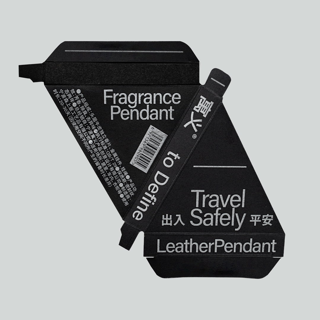
Simin Xu: Fragrance pendant box (Copyright © Simin Xu 徐宾粟, 2022)
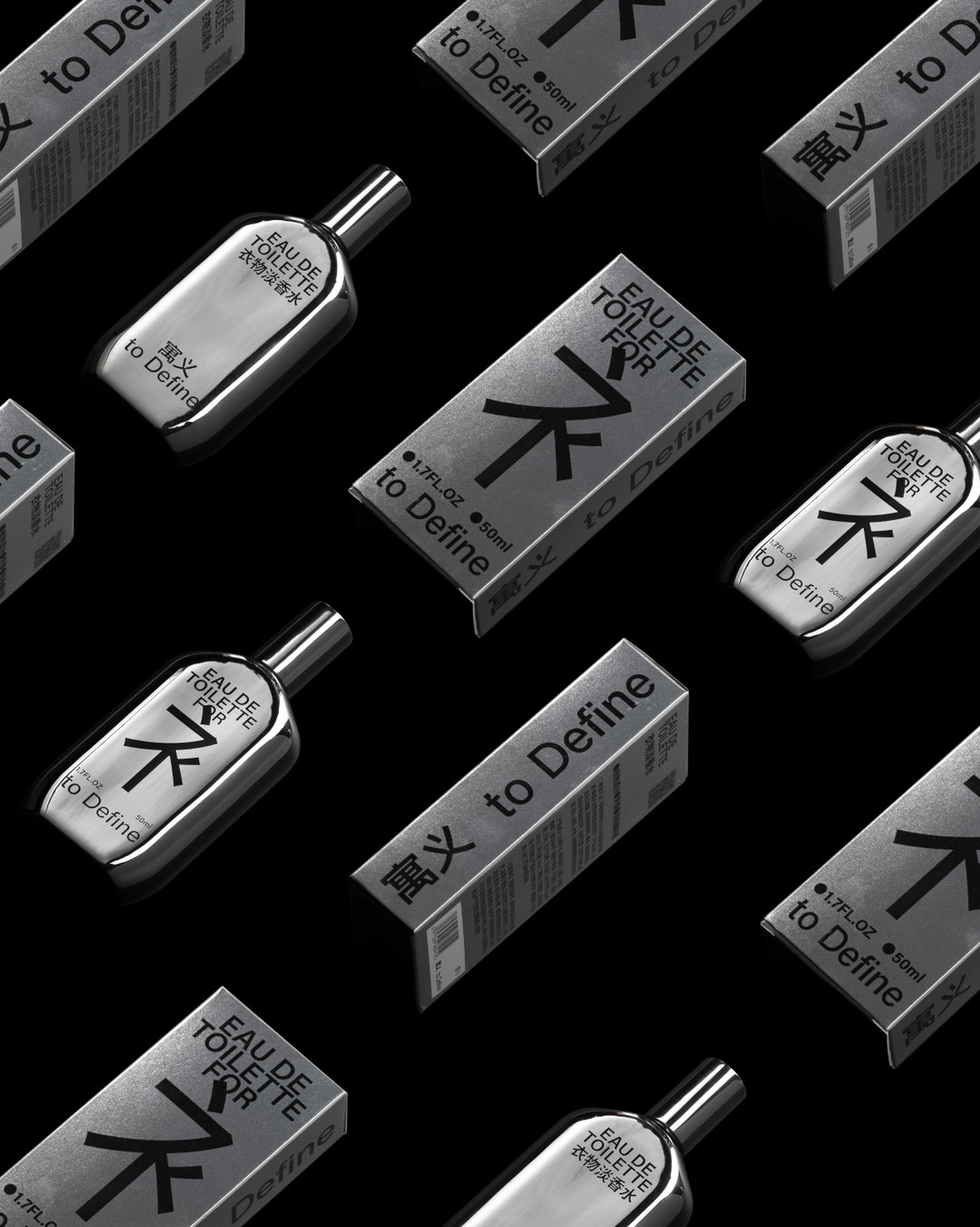
Simin Xu: Clothing Eau de Toilette (Copyright © Simin Xu 徐宾粟, 2022)
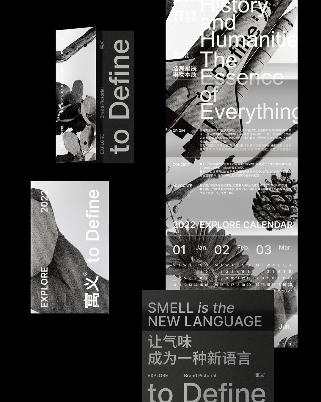
Simin Xu: Brand Manual (Copyright © Simin Xu 徐宾粟, 2022)
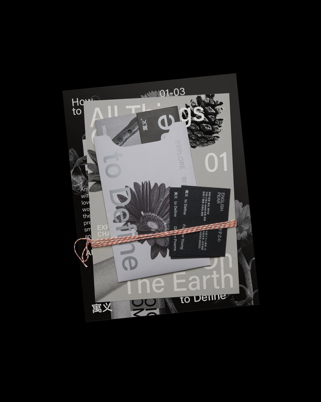
Simin Xu: Brand Manual (Copyright © Simin Xu 徐宾粟, 2022)
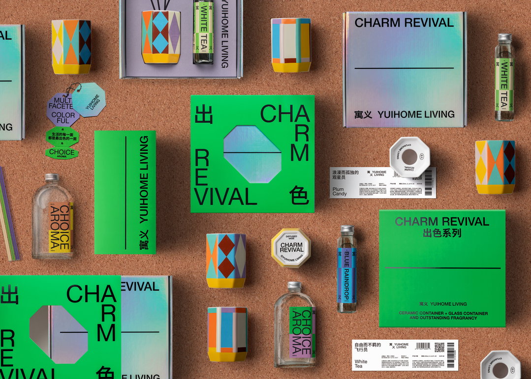
Simin Xu: 寓义 to Define 出色系列 产品&包装设计 (Copyright © Simin Xu 徐宾粟, 2022)
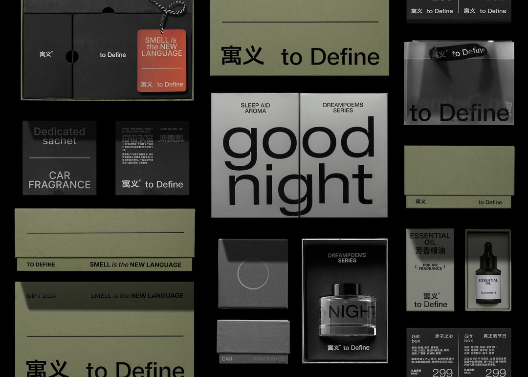
Simin Xu: 寓义 to Define 2021 -22 Neutral Urban线 产品包装合集 产品&包装设计 (Copyright © Simin Xu 徐宾粟, 2022)
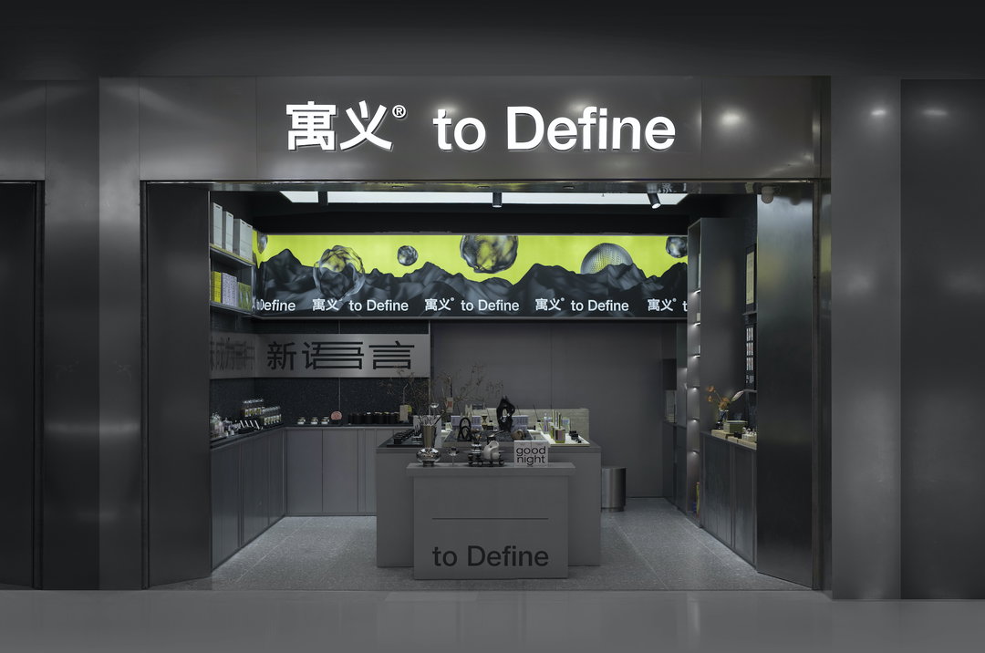
Simin Xu: 寓义 to Define 2021品牌升级线下店 空间设计:杨晓天 摄影 (Copyright © Simin Xu 徐宾粟, 2022)
Hero Header
Simin Xu: Award360°年度100 寓义to Define香氛喷雾包装设计 设计师 (Copyright © Simin Xu 徐宾粟, 2022)
Share Article
Further Info
About the Author
—
Ayla is a London-based freelance writer, editor and consultant specialising in art, photography, design and culture. After joining It’s Nice That in 2017 as editorial assistant, she was interim online editor in 2022/2023 and continues to work with us on a freelance basis. She has written for i-D, Dazed, AnOther, WePresent, Port, Elephant and more, and she is also the managing editor of design magazine Anima.