




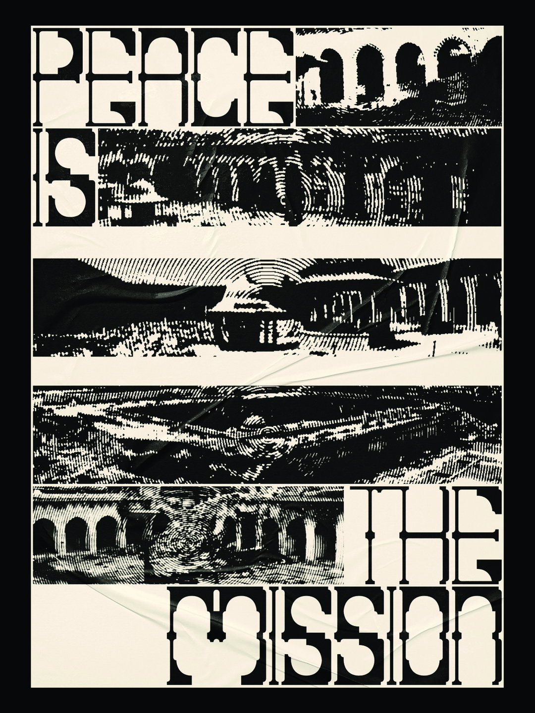
In Singapore, Thaqif Nazri’s intricate typography and graphic design evolution catches our eye
“Art and design in my opinion, whether it’s bad or good, should provoke emotions amongst the audience and spark conversations,” says the Lasalle student on his recent project that builds a font from the architecture of Damascus.
Singapore-based graphic designer Thaqif Nazri has a body of work that is impressively intelligent. From refreshing angles on typography to a dynamic exploration of composition and shape, it’s strange to think Thaqif’s path into the art scene first started askew. “Initially, I was an engineering student,” he tells It’s Nice That. “After creating an infographic poster for a group project, I was curious about graphic design and a few months later, with little to no design background, I managed to put together a portfolio, dropped out from my engineering course, and enrolled into a graphic design course at Lasalle College of the Arts.” As a consequence, Thaqif’s perspective on the world of design was admittedly limited at first. “I can remember the first time I was introduced to Amsterdam-based studio Experimental Jetset, I didn’t know what I was looking at, and neither did it have any visual impact on me,” Thaqif explains. “However, today I’m a huge fan of their work and I love all the pop culture references they put in their designs.”
Atop of influence from Experimental Jetset, Thaqif’s designs also take note from David Carson, a designer whose work encouraged him to be more experimental in embracing the imperfection of graphic design. “I think I observe and interpret things better now, and this makes me more keen to learn ideas and beliefs that differ from my own,” Thaqif explains. As of right now, Thaqif has landed on typography as the apex of his creative expression. “I think letterforms, when explored and utilised smartly, can be a powerful tool in conveying messages with emotion and feeling.” Looking beyond what the letters simply say as a complete word, Thaqif is interested in how the composition “pushes the objective” of one’s design to a new realm of understanding. “Or maybe it’s because I can’t draw very well and that's why I don’t have many illustrative works,” he jokes.
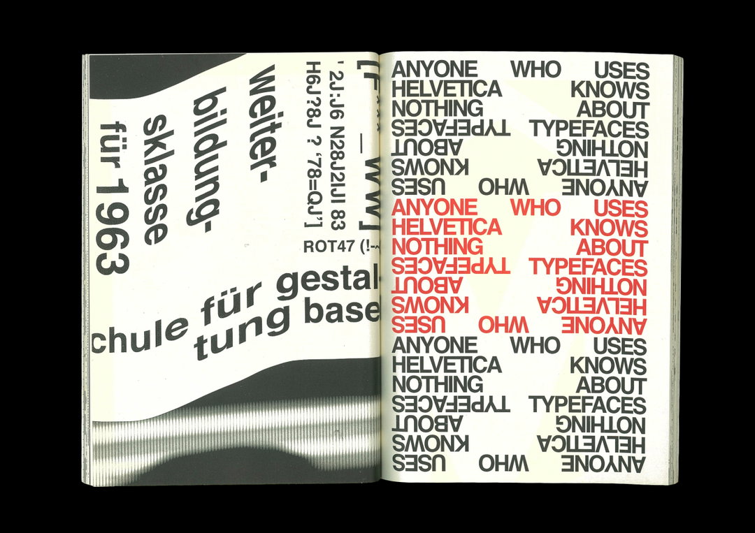
Thaqif Nazri: Graphically Speaking (Copyright © Thaqif Nazri, 2020)
“I live about an hour away from school, so when I’m on the bus or train, that is where concepts and ideas come about,” the designer says. Whilst being lost in reverie and the pits of any given Spotify playlist helps Thaqif zone out and conceptualise new ideas, he’s also an avid scout for material reference. “In my opinion, when I search up something online, often I’d only get what I think I need,” he tells us. “But when I'm at the library browsing through books and pages, I’m forced to look through many things to get to what I want to, and often, I’ll manage to stumble across foreign concepts, ideas, and visuals that would actually help in my process as it opens me to more possibilities and options when I design.” Whilst Thaqif certainly doesn’t forgo the internet’s endless archive all-together, he much prefers the activity of seeking inspiration in its most physical form.
With so many creative and engaging projects that caught our eye, it’s hard for us to single out one project emblematic of Thaqif’s talent. “Amongst all my works so far, my favourite would have to be The Damascus Modular Typeface,” Thaqif says on a project he worked on with the help of his lecturer Darius Ou. “At school, we were tasked to create a grid system based on an architectural form, style, or philosophy and within that grid system, we had to create our letterforms.” What made the project so special for Thaqif was the inclusion of his own culture into the design. “I did some self-reflection and realised I’ve never actually embraced the beauty of my religion in my work,” he says. “And it’s not that I’m a religious person, but I’ve always been influenced by western culture, so much so that I have never considered implementing my own culture into my designs.” Consequently, Thaqif weaved references to the architectural forms of a mosque into the font – and the result is quite stunning. “Known for its pillars that stretch across the courtyard of the mosque, I decided to dissect the form of the Umayyad Mosque in Damascus, and created a modular grid system that would allow me to design a typeface with the mosque’s characteristics,” Thaqif describes. “The concept and style of the typeface were also considered to ensure that each letter can be connected with one another to replicate the arcade of the mosque.”
“I hope that I will continue being enthusiastic to learn and understand more about the arts in hopes of becoming a much more cognitive designer,” Thaqif says on what’s next for him. Whilst still young and eager to learn, we’re steadfast in our belief that Thaqif is already an exceptional designer and typographer. “I think there’s no end to knowledge, and creativity is endless, so I can’t wait to see what more there is for me to find and do.”
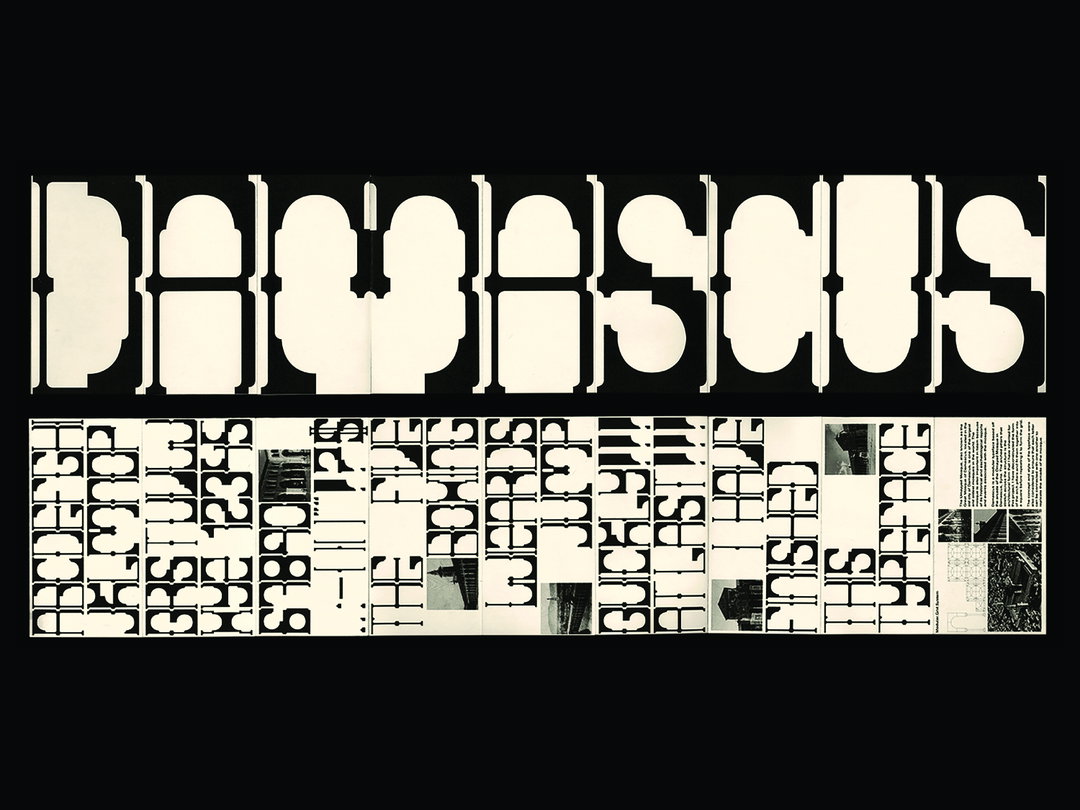
Thaqif Nazri: Damascus Modular Typeface (Copyright © Thaqif Nazri, 2021)
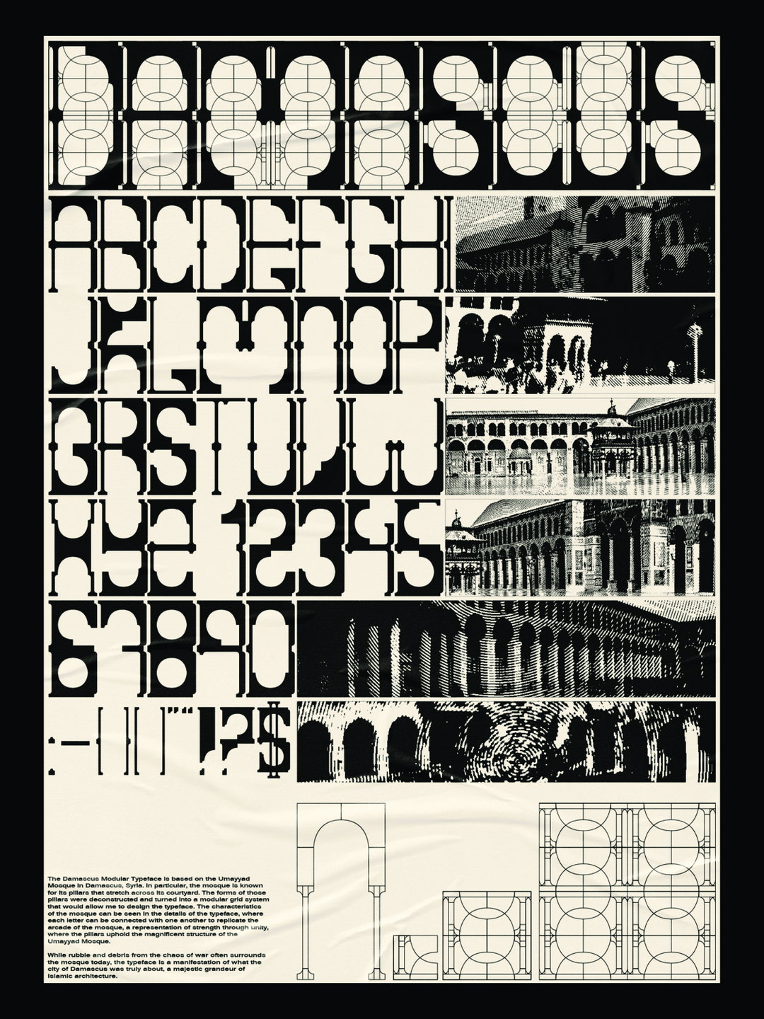
Thaqif Nazri: Damascus Modular Typeface (Copyright © Thaqif Nazri, 2021)
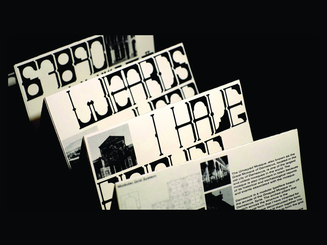
Thaqif Nazri: Damascus Modular Typeface (Copyright © Thaqif Nazri, 2021)
Thaqif Nazri: Damascus Modular Typeface (Copyright © Thaqif Nazri, 2021)
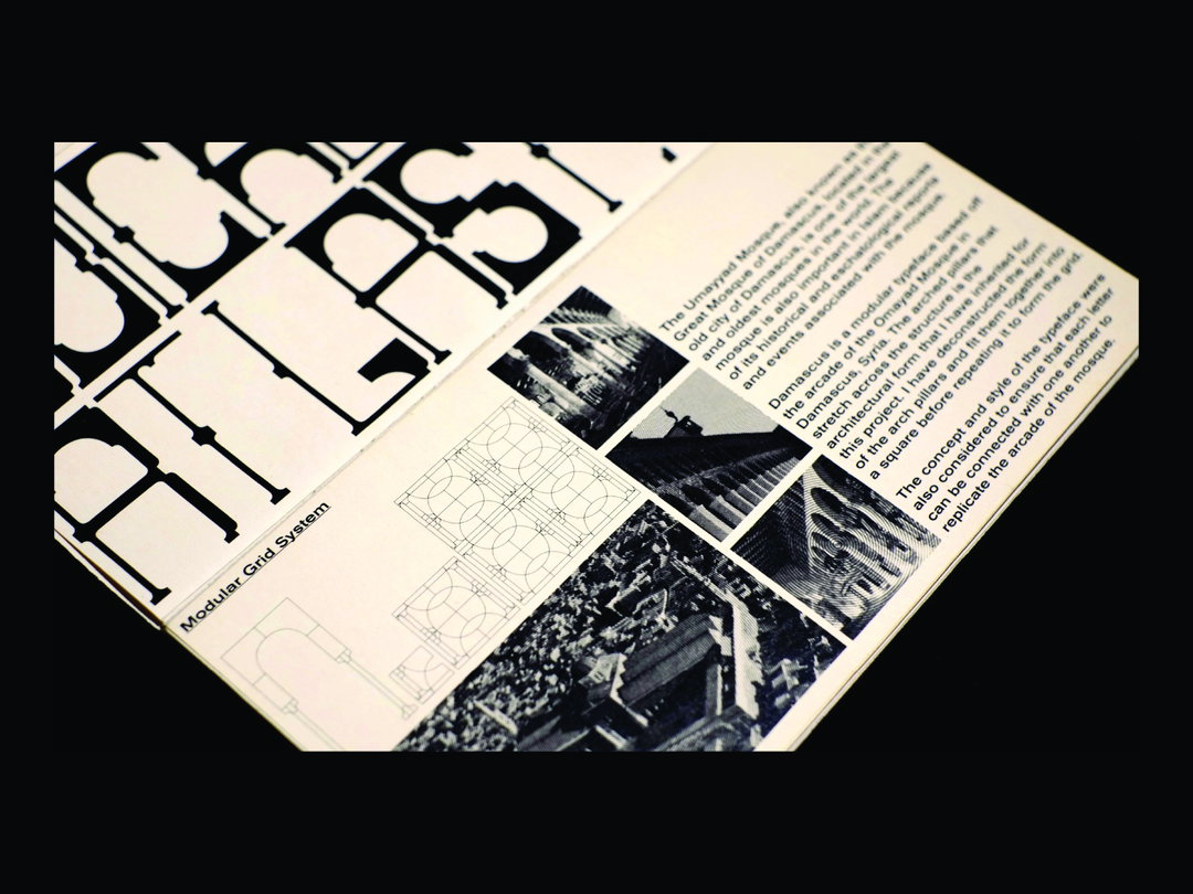
Thaqif Nazri: Damascus Modular Typeface (Copyright © Thaqif Nazri, 2021)
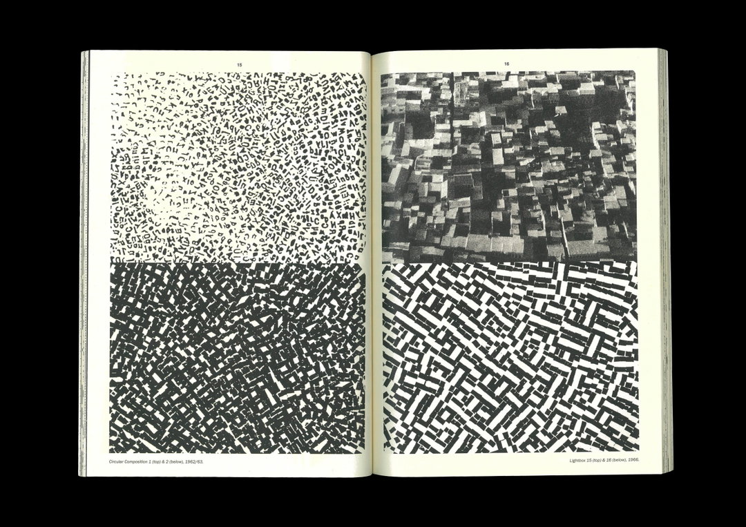
Thaqif Nazri: Wolfgang Weingart Publication (Copyright © Thaqif Nazri, 2019)
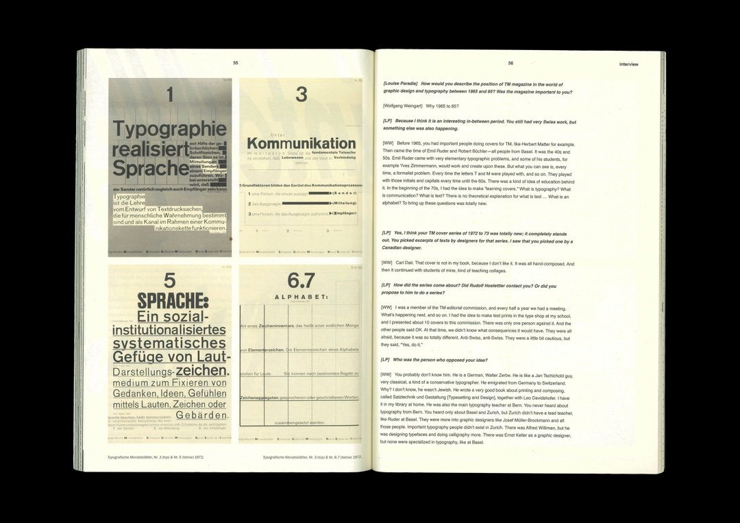
Thaqif Nazri: Wolfgang Weingart Publication (Copyright © Thaqif Nazri, 2019)
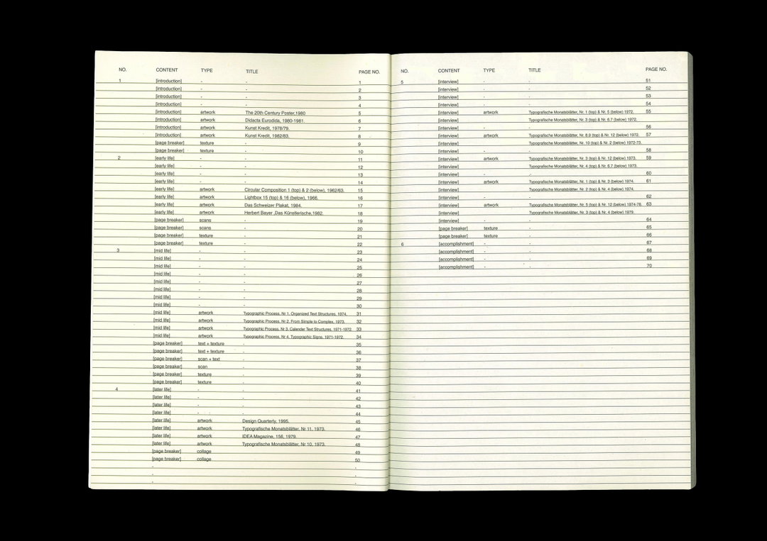
Thaqif Nazri: Wolfgang Weingart Publication (Copyright © Thaqif Nazri, 2019)
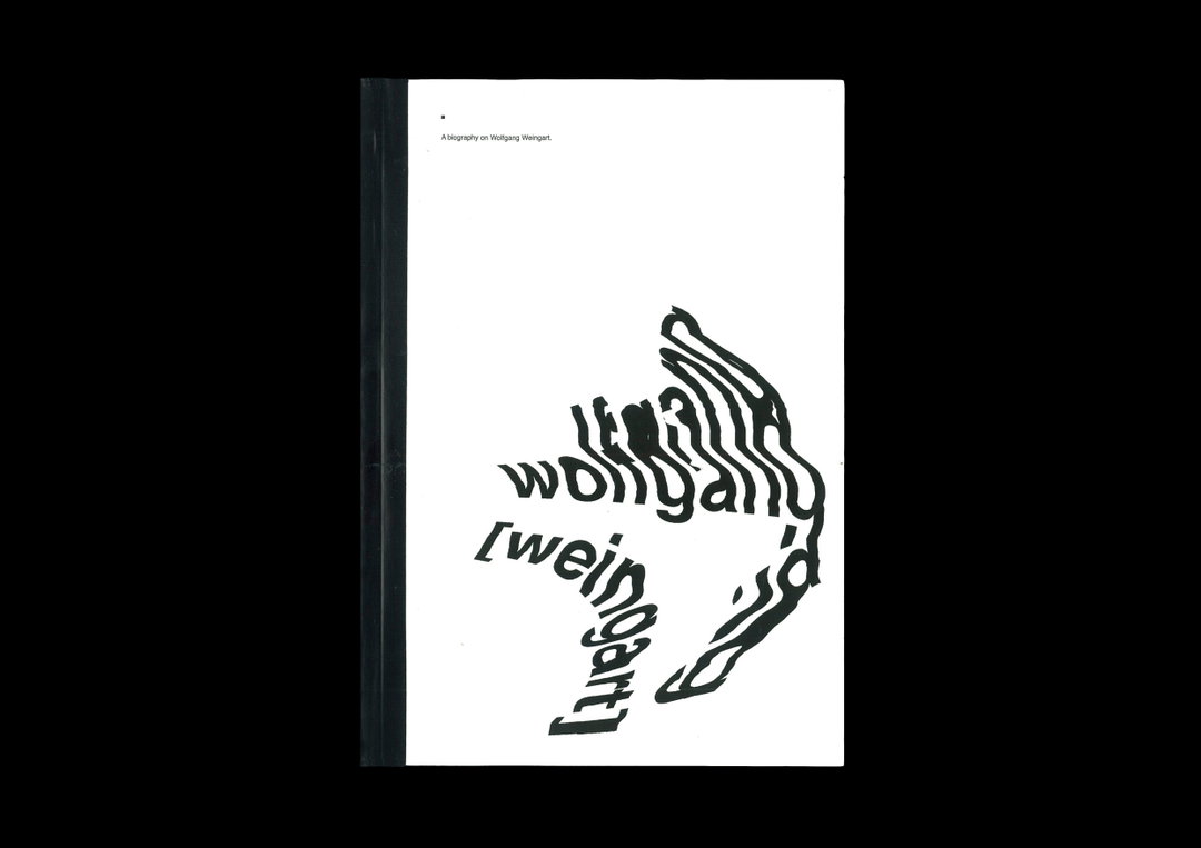
Thaqif Nazri: Graphically Speaking (Copyright © Thaqif Nazri, 2020)
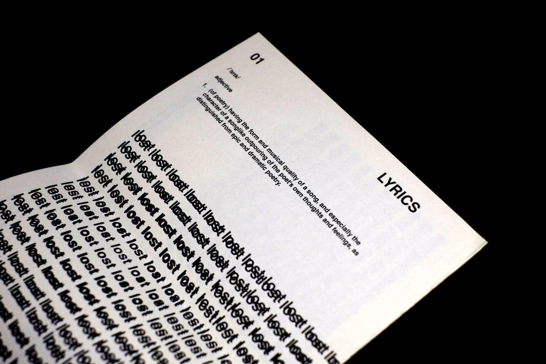
Thaqif Nazri: Graphically Speaking (Copyright © Thaqif Nazri, 2020)
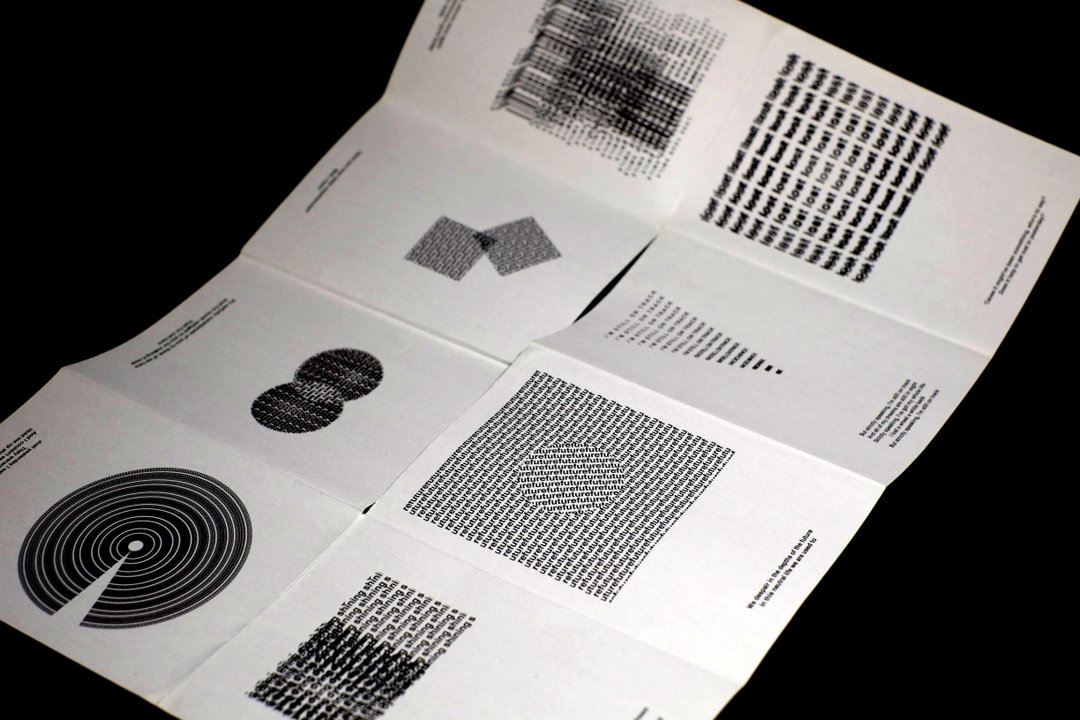
Thaqif Nazri: Graphically Speaking (Copyright © Thaqif Nazri, 2020)
Become an Extra Nice Supporter
Unlock an inspiring new way to explore It’s Nice That, get your hands on exclusive perks, and help bring meaningful creative projects to life.
Hero Header
Thaqif Nazri: Damascus Modular Typeface (Copyright © Thaqif Nazri, 2021)
Share Article
Further Info
About the Author
—
Joey is a freelance design, arts and culture writer based in London. They were part of the It’s Nice That team as editorial assistant in 2021, after graduating from King’s College, London. Previously, Joey worked as a writer for numerous fashion and art publications, such as HERO Magazine, Dazed, and Candy Transversal.
