




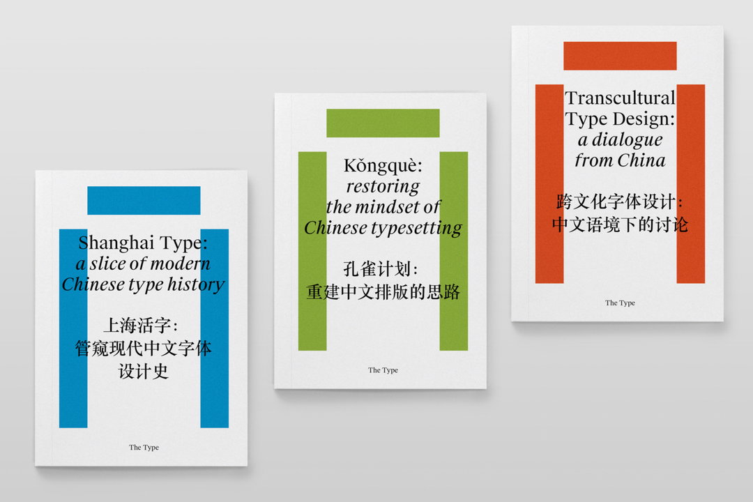
The Type covers the history, development, conventions and transcultural contexts of Chinese typography in three new volumes
For the past ten years The Type has been promoting public awareness of Chinese typography.
Chinese typography is no easy feat to tackle. A logosyllabic writing system, in general, each character represents one syllable of spoken Chinese. It may be a word on its own or part of a polysyllabic word. It’s a complex undertaking to learn the expansive writing system, let alone design it. But for the past ten years, The Type – an independent project on text, design and society – has been promoting public awareness of typography and design in the Chinese community.
With members based in London, Shanghai and Tokyo, The Type was founded back in 2007 by Rex Chen, a London-based designer who is currently editor-in-chief of the initiative. Starting out as a design and typography website in Chinese, the platform has gradually expanded over the years, attracting a small group of designers and researchers also interested in the subject. In time, The Type started its own original research on Chinese and multicultural typography, and much of their findings can now be found in this three volume collection on typography and design in China.
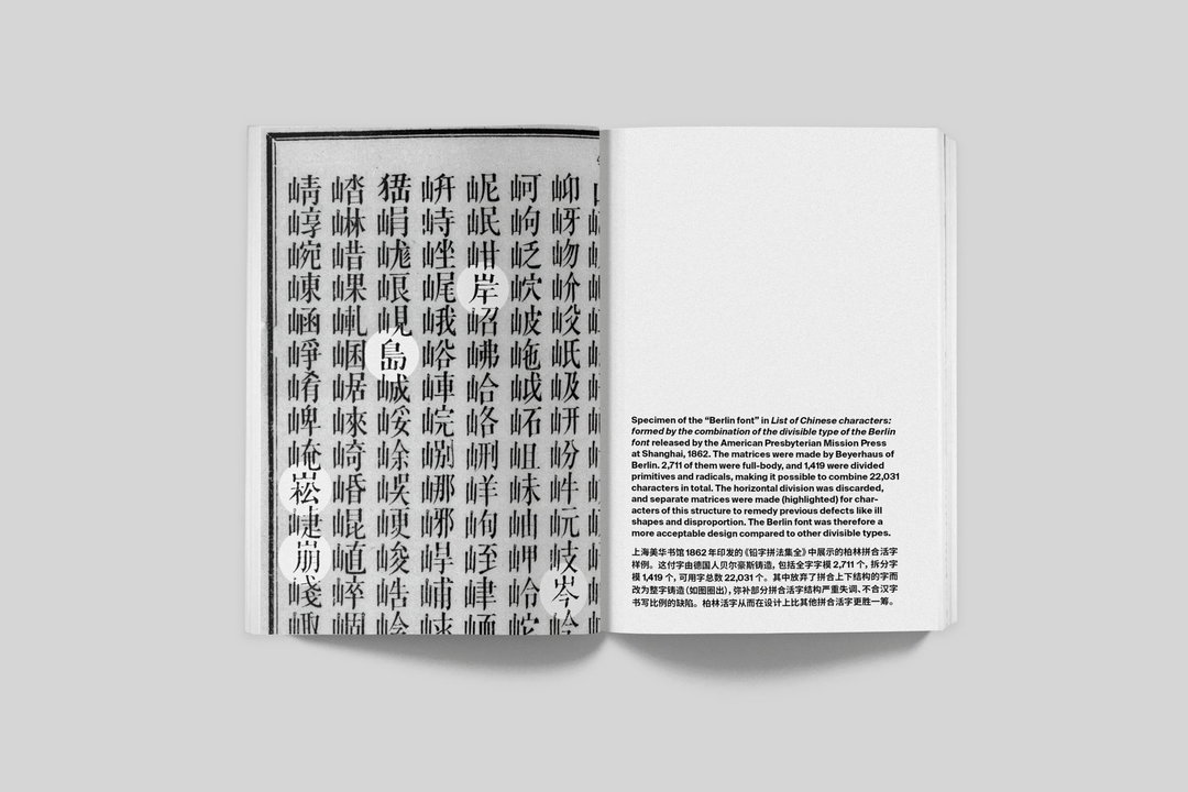
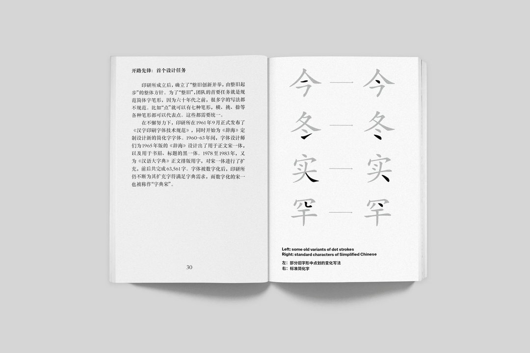
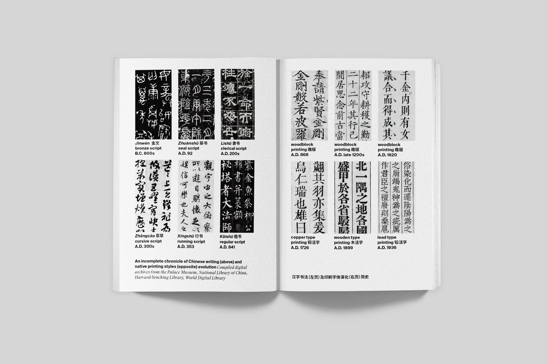
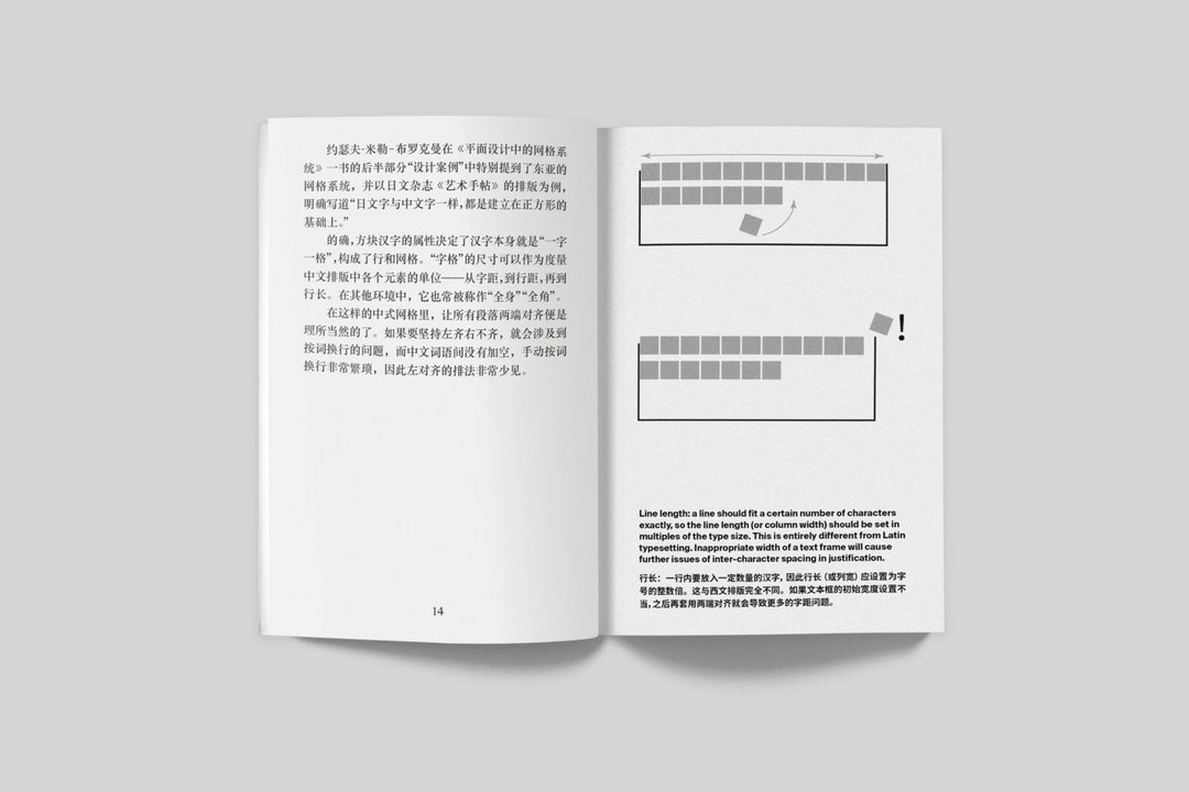
Covering its history, development, conventions, contemporary practice, not to mention transcultural contexts, the volumes are a culmination of the team’s various research efforts over the past decade. From uncovering how type designers in the 60s not only survived the Cultural Revolution, but were able to produce beautiful work that still serves as the basis for many contemporary Chinese typefaces, to some practice InDesign tricks for setting up a document for Chinese typography, the volumes are peppered with both interesting and useful information.
Li Zhiqian, a researcher and designer based in Shanghai, researched the content for one of the three volumes, Shanghai Type. The project started with Zhiqian’s chance encounter with the type designers who designed the very first Simplified Chinese typefaces, whom he later interviewed for the book.
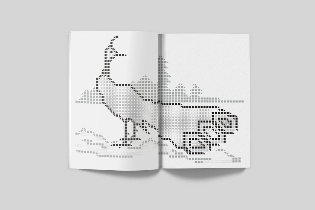
The Type: Collection of Research on Chinese Typography
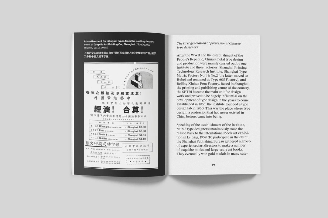
Soon, his research grew into a comprehensive historical excavation of Shanghai, China’s printing capital. Delving into the development of Chinese type design and its foundations in the People’s Republic, the book illustrates “how modern Chinese type design began as a groundbreaking state-initiated endeavour and then gradually faded in the age of market and commercialisation.”
In another volume Kǒngquè: restoring the mindset of Chinese typesetting, Eric Liu – a researcher and podcast host based in Tokyo – explores the convention and wisdom of Chinese typography, a school of thought that was developed centuries ago but has failed to be inherited by designers today. As Latin-oriented writing systems flood computer softwares and so on, the Kǒngquè project resists the typographic traditions of China in a modern context. “The project began with his desire to restore lost Chinese typographic traditions using mainstream digital typesetting tools that were made for Western and Japanese markets,” says Rex, “and how these traditions can stay relevant in a contemporary multilingual context.”
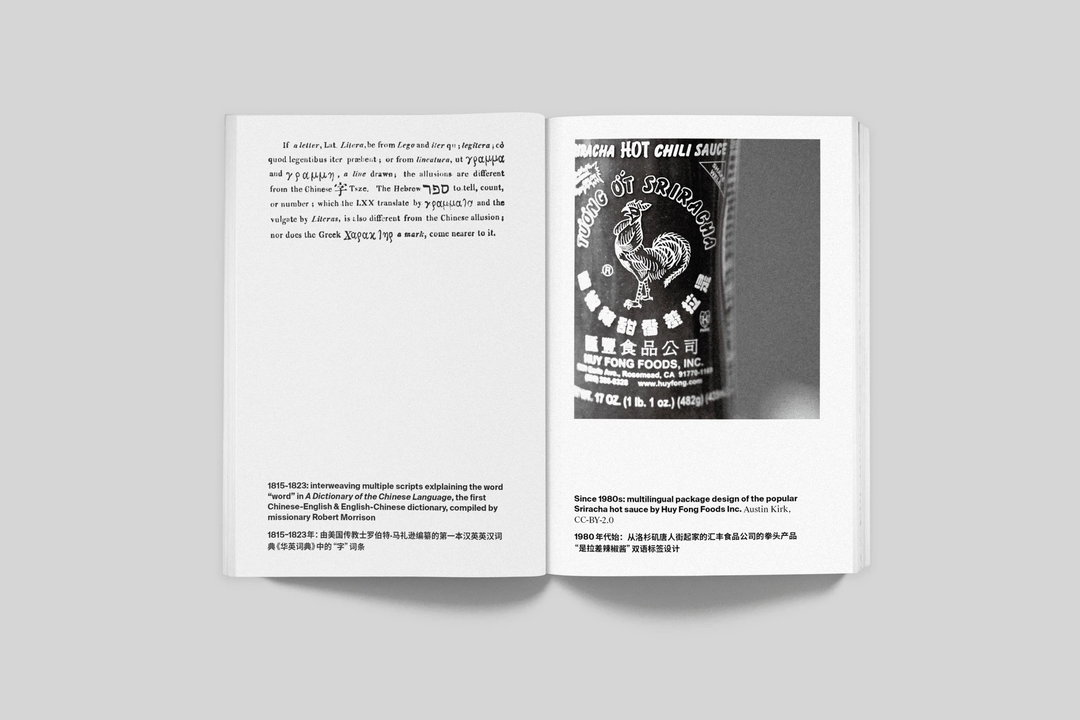
Finally, in the third volume Transcultural Type Design: a dialogue from China, Mira Ying – a Shanghai-based designer, translator and editor – hosts a discussion panel on the subject. Rex explains: “the transcultural panel discussion was sparked by us seeing Chinese typography done overseas that came across to us as alien and bewildering.” In turn, The Type began to reflect on the Chinese script’s roles in a global visual context and information economy.
Hoping to instil a basic understanding of contemporary Chinese typography covering its history, social and cultural context and practical guidance, the three volumes offer support to any designers working in a multilingual context. A comprehensive helping to “thoroughly understand its typographic and cultural norms,” general readers can also benefit from the publications by hearing “concise and sincere conversations from our perspectives as Chinese designers.”
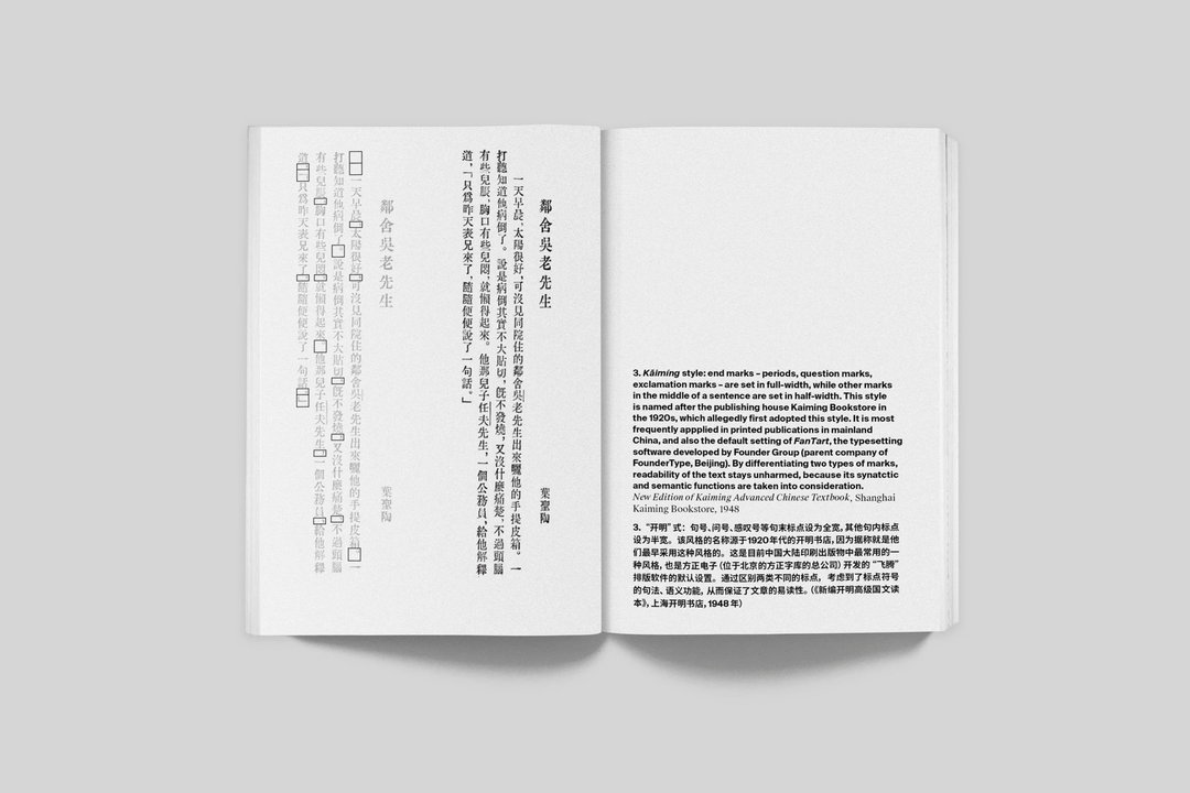
GalleryThe Type: Collection of Research on Chinese Typography
Share Article
Further Info
About the Author
—
Jynann joined It’s Nice That as an editorial assistant in August 2018 after graduating from The Glasgow School of Art’s Communication Design degree. In March 2019 she became a staff writer and in June 2021, she was made associate editor. She went freelance in 2022.
