Graphic design studio Whitman Emorson on how Gen-Z has inspired its fun and inclusive condom branding
Upon discovering how outdated and patriarchal the condom industry was, the studio sought to create a brand that had the interests of women and younger generations at its core.
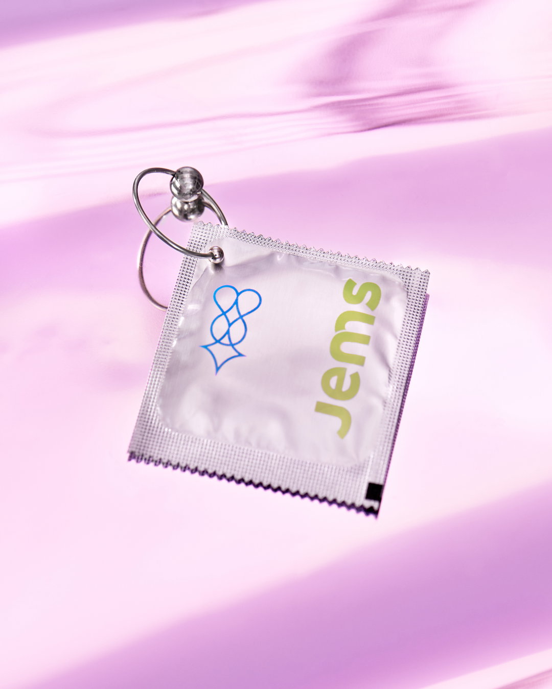
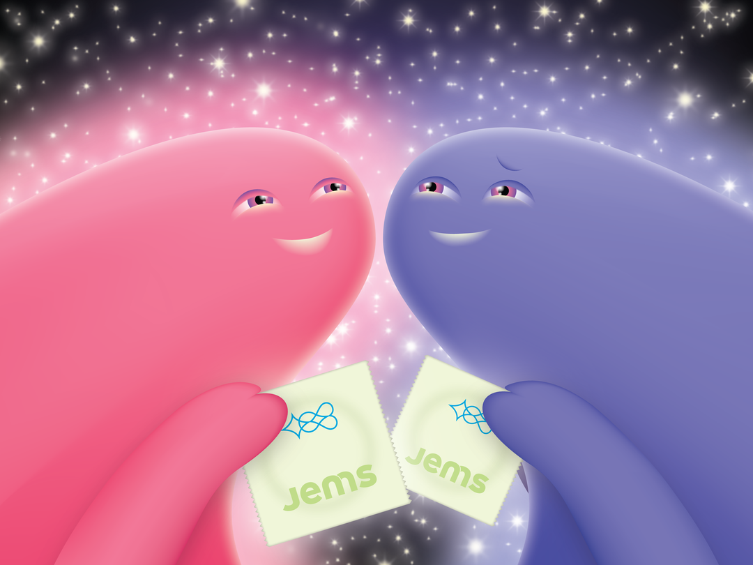
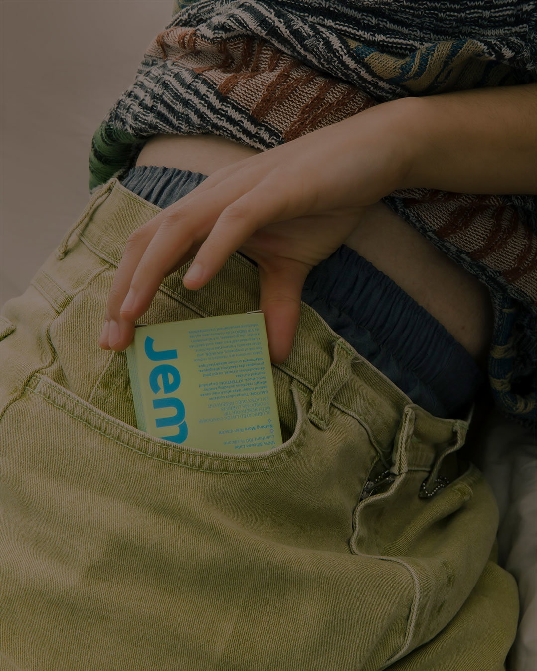
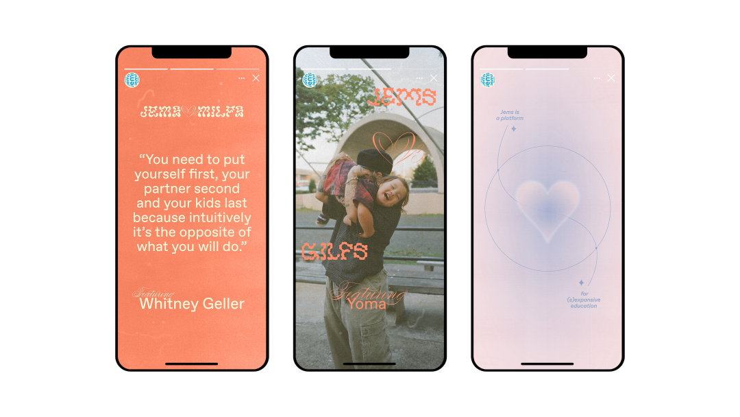
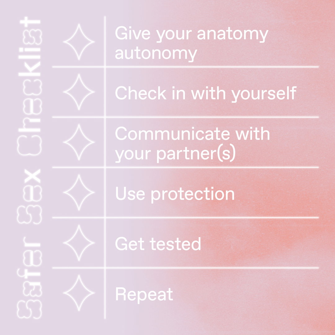
Featuring bright candy colours, intimate photos and endearing cartoon characters, Jems is a condom brand with a difference. Boasting a friendly and informative approach, both the physical product and the entire branding project was devised by the female-led design studio Whitman Emorson. Hoping to demystify the way we view and use condoms, with a focus on the needs of women and younger generations, the innovative project has already made waves within the birth control industry.
The Jems project came into fruition when Yasemin Emory and Whitney Geller – founders of the studio Whitman Emorson – found themselves both in between pregnancies and both on the lookout for an alternative birth control. While on the search, one of the things that most stood out to the pair was how outdated the condom industry seemed to be. In the shop's aisles there was an “overwhelming amount of choice: ribs, flavours and other obscure features”, says Yasemin, but what all the packaging importantly lacked was a list of ingredients. Upon further research, Yasemin and Whitney learned that “some commonly found condom ingredients are toxic and can cause allergic reactions or off-balance PH levels for women”. And, alongside these shocking discoveries, “there is the fact that the condom industry still propagates toxic masculinity and outdated stereotypes in its marketing and advertising”, explains Whitney. Knowing that they couldn't be the only people who felt alienated by the industry, the pair decided to take action.
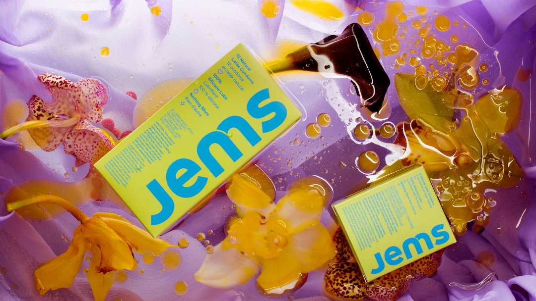
Whitman Emorson: Jems (Copyright © Jems For All Inc., 2021)
With the Jems brand centering around “experimentation, play and exploration”, Yasemin says how liberating it was to “break a lot of the rules around consistency that we often employ for our clients”. When seeking out ways to “break the mould” in the condom industry, the team decided that colour would be the best route: “we intentionally stayed away from black, purple and gold which seem ever-present in the condom aisle, and went for the unexpected: 'alien green' and 'electric blue' (that’s what we call them at least)," adds Whitney. Avoiding stereotypical gendered colours, the studio wanted to ensure that Jem is “truly for all”.
Yasemin continues to explain that “research and strategy” are a fundamental part of their practice, and so there is a lot of thorough groundwork behind the Jems project. Through discussion with family, friends and small focus groups and analysing gaps in the market, the studio realised that its mission “had to focus on a younger demographic that was in need of guidance and support in the sexual health and wellness space.” Whitney adds: “By providing safer sex options to Gen Z, we want to change the perception of condoms and how they are used.” And, not only are they a group in need of more attention and care, they also “celebrate a multiplicity of gender and sexual expressions”, an inclusivity which the studio wants to champion in its design.
This desire to instigate change can be found at the studio’s very beginnings. After meeting whilst studying at McGill university, Yasemin and Whitney moved to New York to work in design. First completing a project together on a charter school’s branding and seeing the impact design was able to have, the duo realised they “had something different to offer which was fundamentally rooted in the research and rigour of our liberal arts education”, shares Yasemin. At the time of joining forces, female-led design studios were much less common. Then, once they had enough work, the duo made the studio their full-time job. Eventually, they moved back to their hometown of Toronto to grow their team which is where the studio is currently based.
Having high hopes for the brand, Whitney says their aim is to get “Jems everywhere!”. Wanting them to be available in all the expected retailers, the studio also wants to push the limited boundaries as to where you can buy Jems. “Who says you can’t pick up a three-pack of condoms at your favourite coffee shop?”
GalleryWhitman Emorson: Jems (Copyright © Jems For All Inc., 2021)
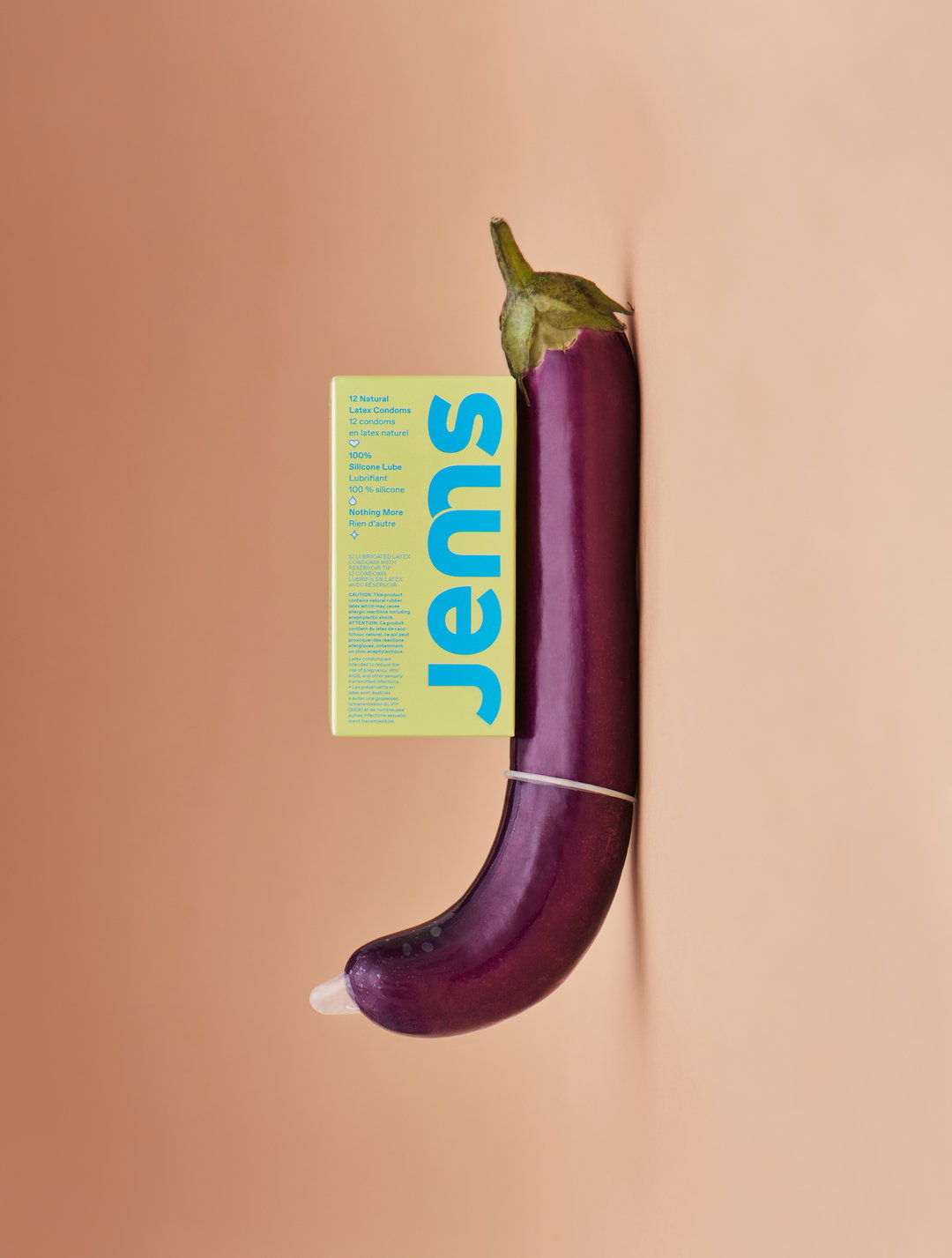
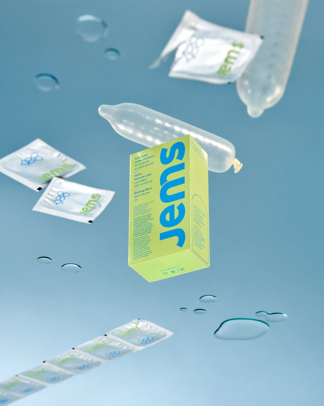





Hero Header
Whitman Emorson: Jems (Copyright © Jems For All Inc., 2021)
Share Article
About the Author
—
Olivia (she/her) is associate editor of the website, overseeing the day-to-day editorial projects as well as Nicer Tuesdays events. She joined the It’s Nice That team in 2021. ofh@itsnicethat.com
To submit your work to be featured on the site, see our Submissions Guide.