The rebrand of Lenny Kravitz’s toothpaste line nods to modern editorial design, like The Gentlewoman and Interview magazine
Embracing a major taboo in the dental hygiene branding space – the colour yellow – design studio Concrete irons out teething problems with editorial cleanliness.
Share
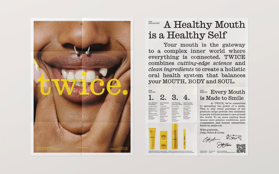
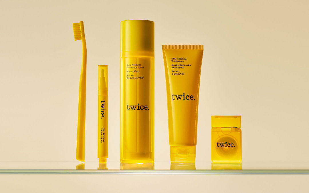
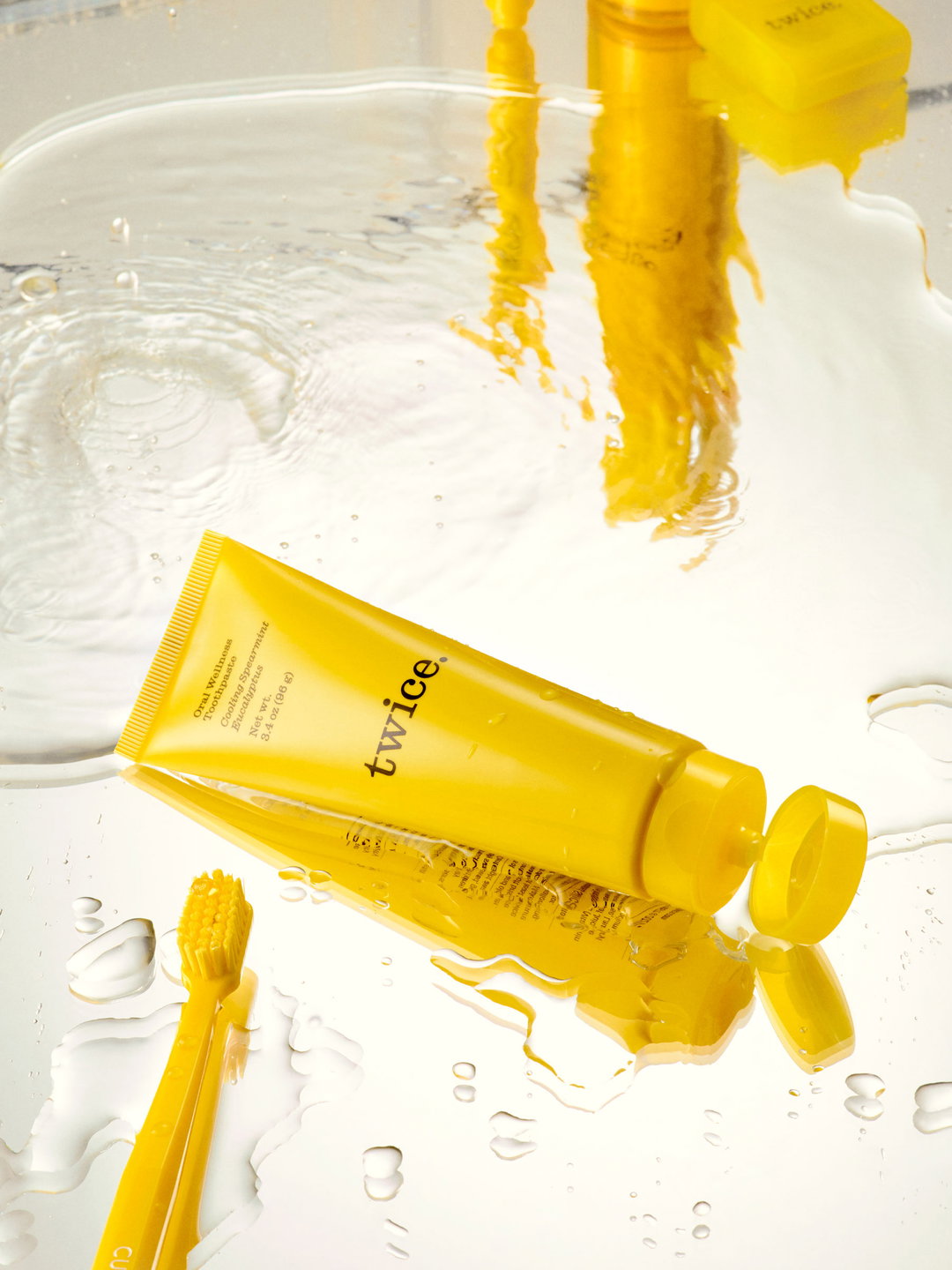
If you didn’t know Lenny Kravitz had an oral care brand with a dental family (two brothers and their renowned NYC prosthodontist father), you might not be the only one. Founded after the duo teamed up to provide free dental work to the community in Kravitz’s hometown of Eleuthera, The Bahamas, the holistic oral care brand, brilliantly named Twice, has just received a dramatic rebrand to ensure no one skips over the brand in the future. Delivered by Toronto-based design studio Concrete, the refresh comprises packaging positioned somewhere between considered editorial design and vibrant positivity; “Lenny’s impromptu rendition of Let the Sunshine In in one of our first meetings certainly set the tone of the spirit of the work,” says the Concrete team.
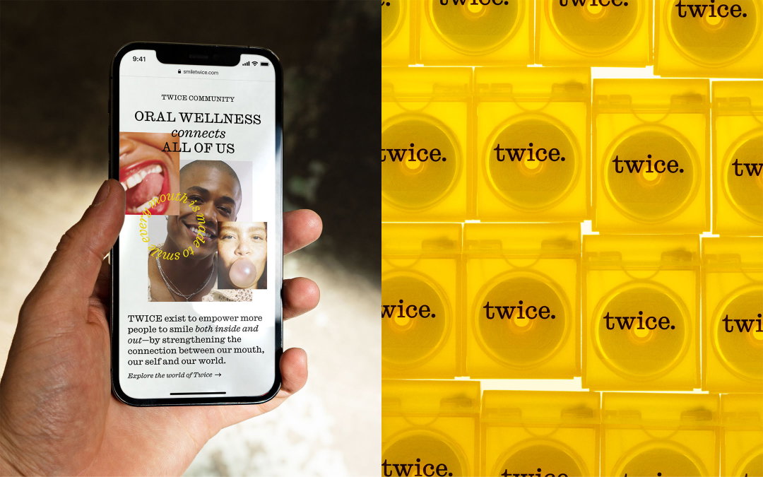
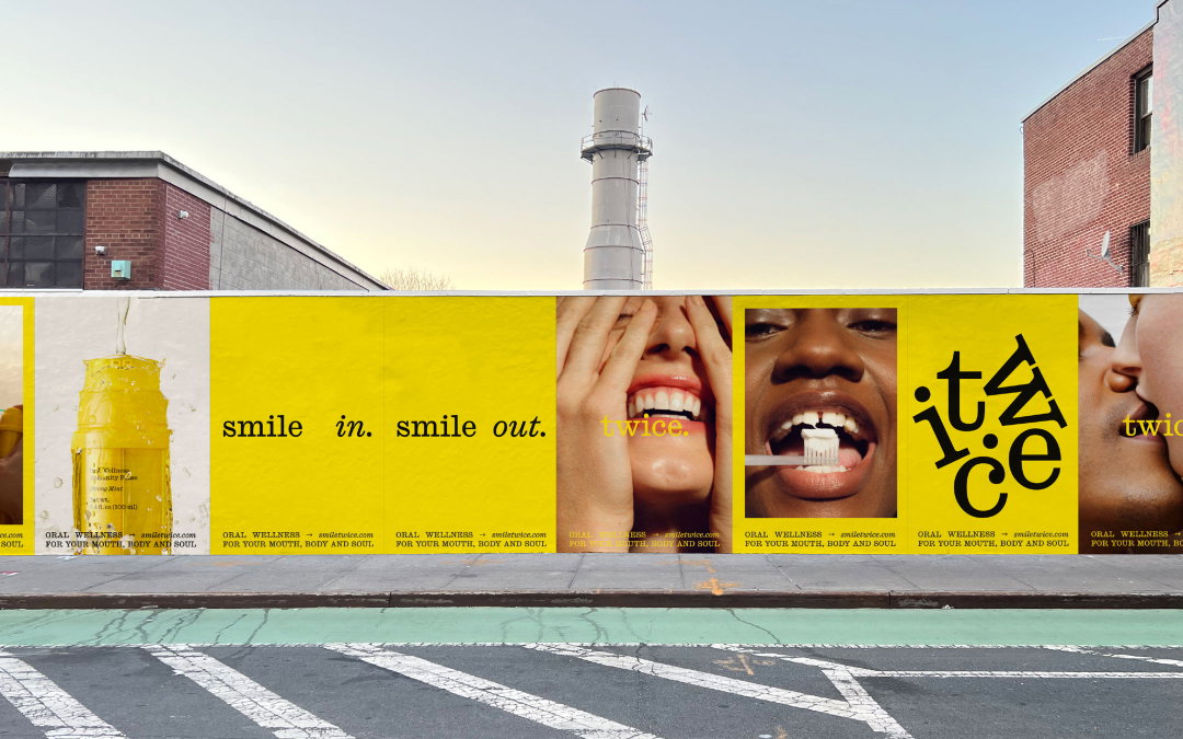
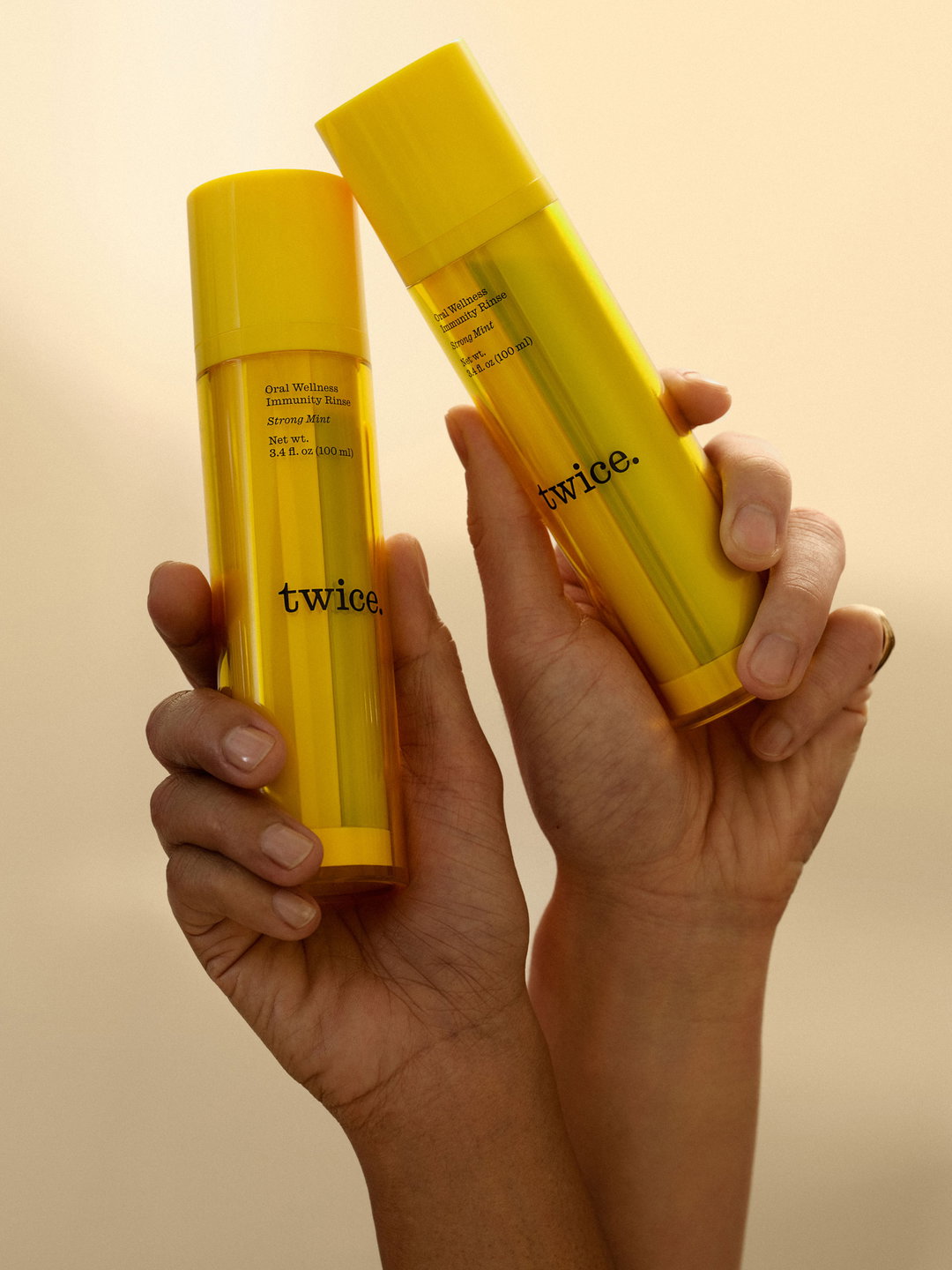
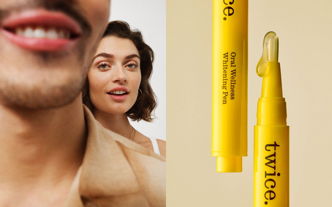
While Concrete aimed to stay clear from the “overall slick aesthetic employed by the majority of oral care brands”, a look that saw the previous Twice brand blending in on the shelf, the studio opted for a different form of crisp minimalism. The team behind the work states: “For the design and typography, we drew inspiration from modern editorial design (The Gentlewoman, Interview) and traditional educational textbooks.” To carry out this effect, Concrete used only a single typeface of Calson Ionic (designed by Paul Barnes and Greg Gazdowicz for Commercial Type) to force itself to uncover creative solutions to bring variety into the work.
GalleryConcrete: Twice (Copyright © Twice, 2022)
Concrete: Twice (Copyright © Twice, 2022)
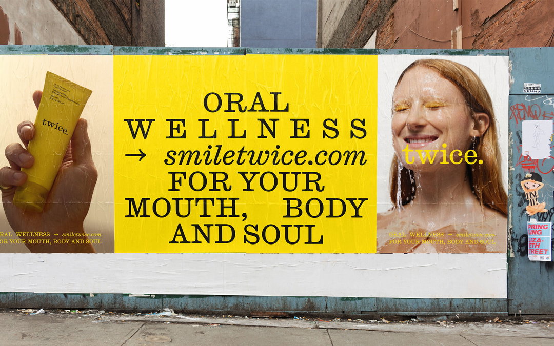
If mature typographic inspirations feel incongruent to toothpaste branding, so too will Concrete’s colour palette: a sunshine yellow. The studio explains: “The distinctive yellow is a colour traditionally avoided in the oral care sector because of its associations with yellow teeth. But this created an opportunity for us to break away from such literal thinking and connect to the positive emotions associated with the colour.”
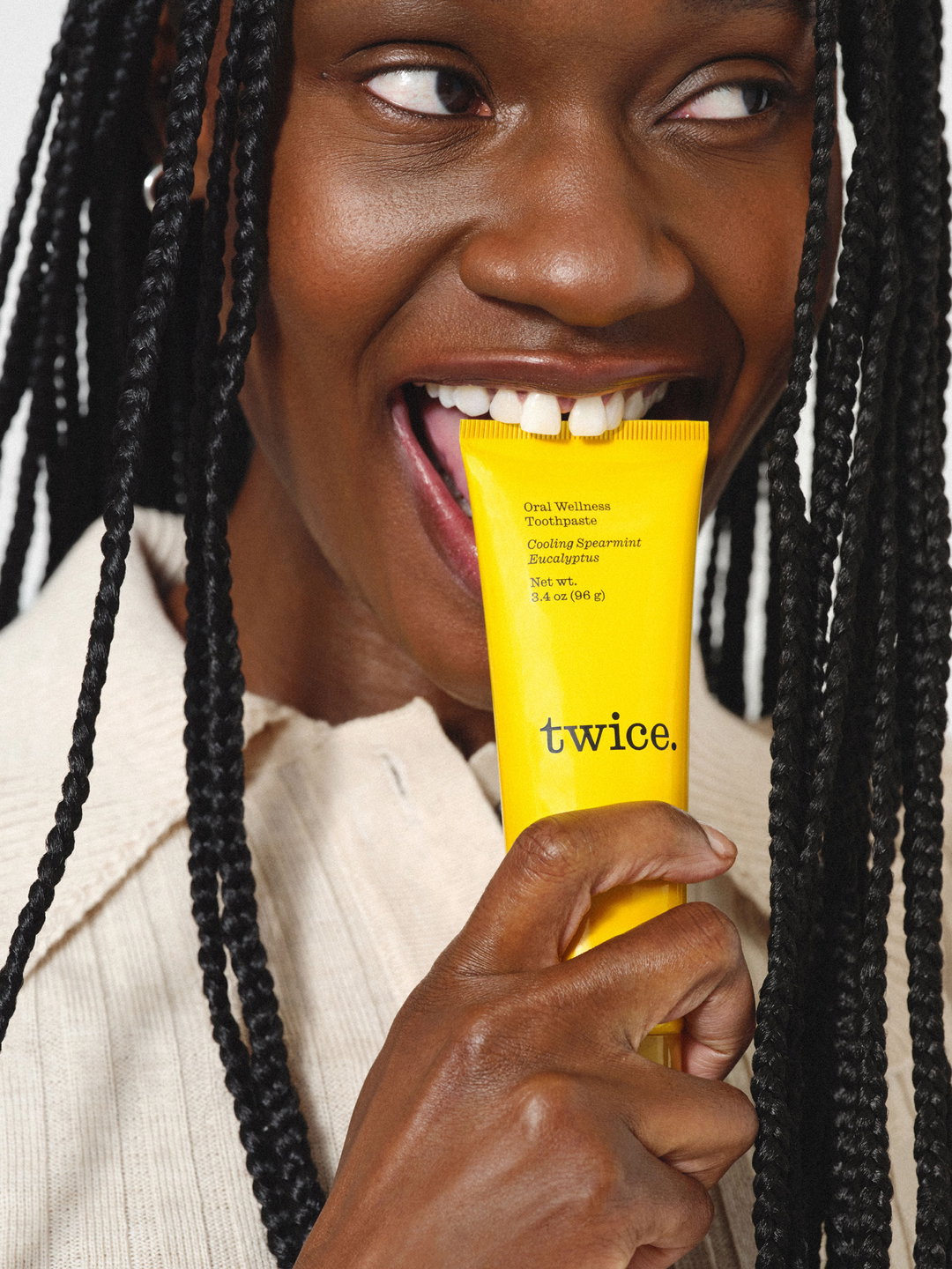
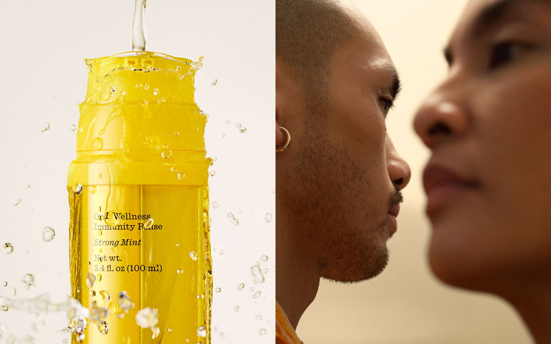
Alongside working closely with the founders and Kravitz, of course, Concrete brought in Leeor Wild for brand photography. Throughout the work, art direction pays homage again to an editorial lens, which meant “not being precious about using only one style of lighting or depth of field”, Concrete explains. The brand imagery also makes a concerted effort to reject the “contrived ‘perfect smile’ aesthetic” that the studio saw as the current norm in the dental sector. The expansive brand overhaul is the first refresh since Twice’s “brick and mortar launch” in 2018, a project that allowed the studio considerable creative freedom; “Besides the name, everything was on the table,” confirms Concrete.
GalleryConcrete: Twice (Copyright © Twice, 2022)
Hero Header
Concrete: Twice (Copyright © Twice, 2022)
Share Article
Further Info
About the Author
—
Liz (she/they) is the senior editor at Insights, a research-driven department within It’s Nice That. They previously ran the news section of the website. Get in contact with them for potential Insights collaborations or to discuss Insights’ public-facing reports.