Oddity Studio turns glyphs into wagging dog breeds for Fluffle
The Hong Kong design team found most pet branding relied heavily on illustration, so decided to play with typography instead.
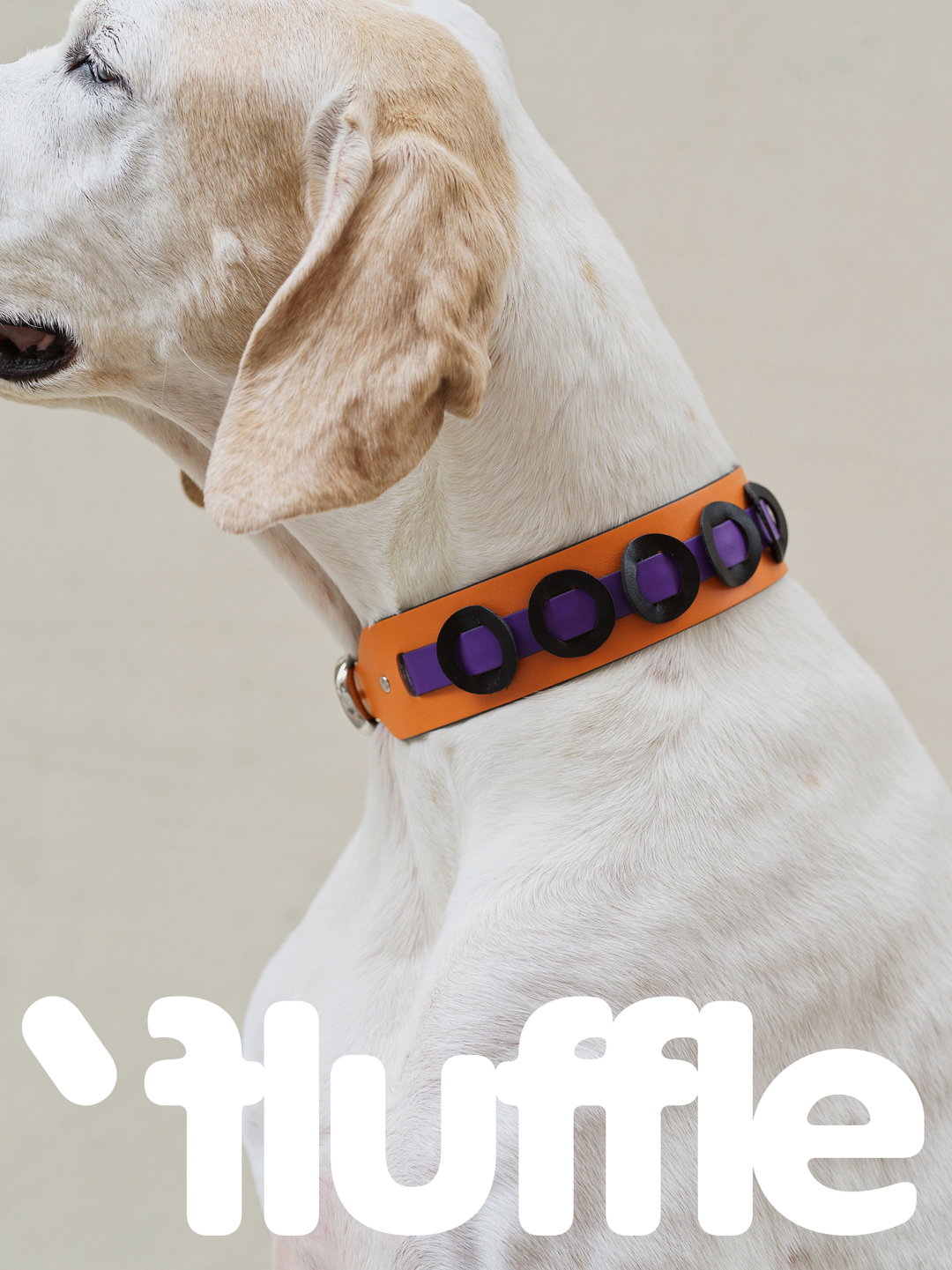
Oddity Studio has done a lot of great work with local brands in Hong Kong before. Now Fluffle, which makes hand-crafted accessories for dogs, has turned to the design studio for a fresh look. Like most brands operating in this space, Fluffle looks playful. But the route Oddity took is distinct. Rather than relying on colour or a cute mascot, the identity plays with the territory of glyphs to suggest different dog breeds.
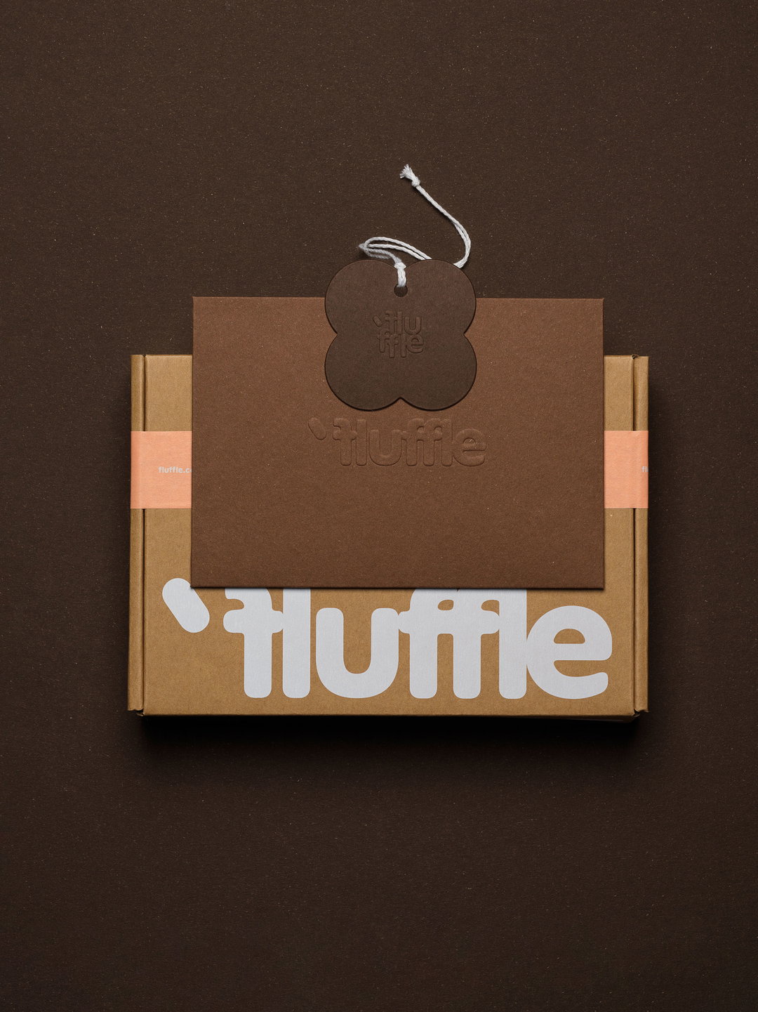
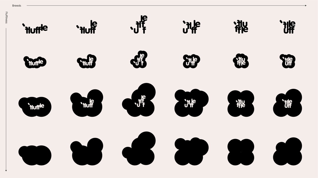
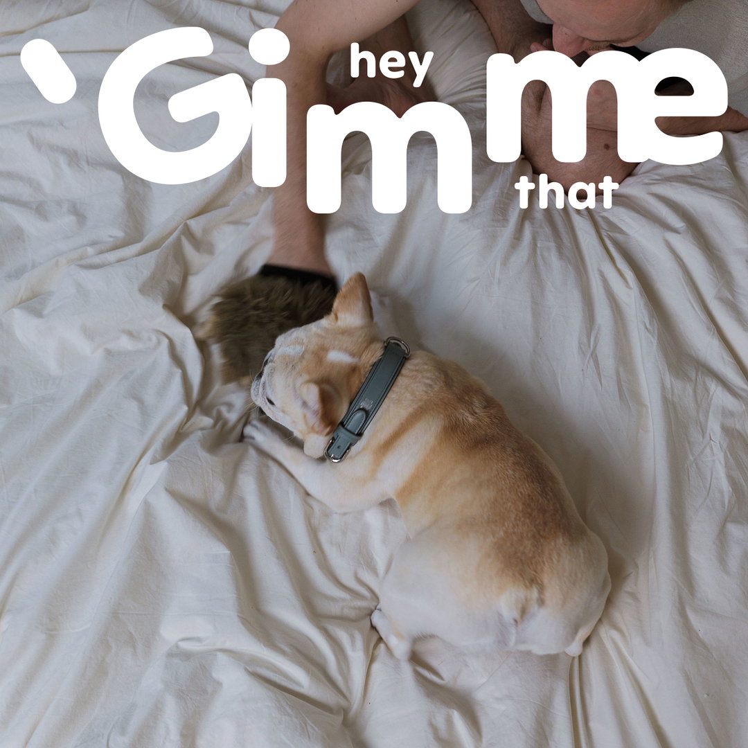
The idea all started with kerning. Oddity wanted the logotype, set in ES Peak Rounded by Extraset, to look like a “tight hug”. Alice Mourou, founder and creative director at Oddity, explains: “We were observing how we are and how our neighbours are interacting with their dogs, and came up with the idea of a tight hug as a pure expression of love that no one can resist.” The extra tight kerning on the logotype works to convey this idea.
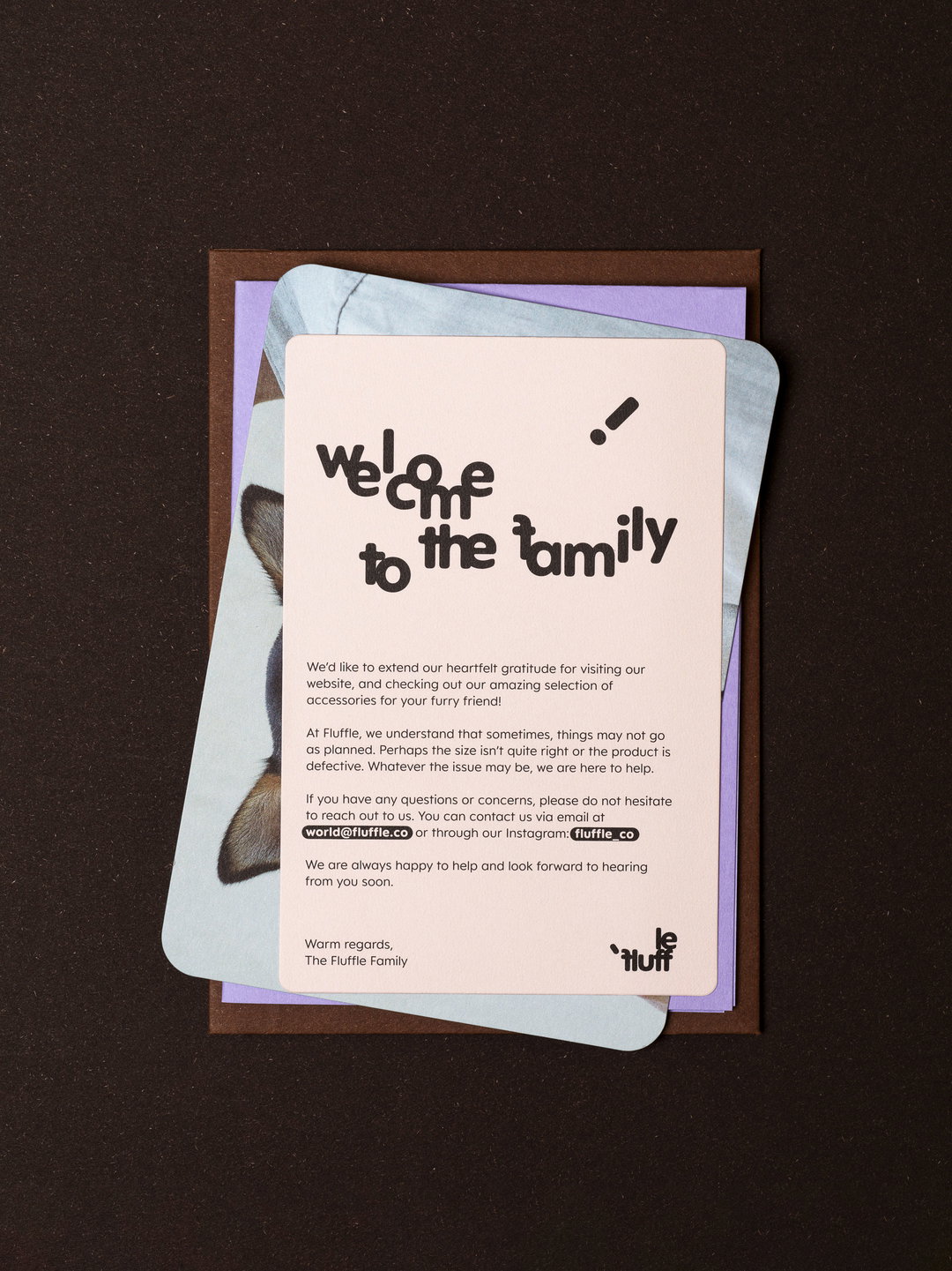
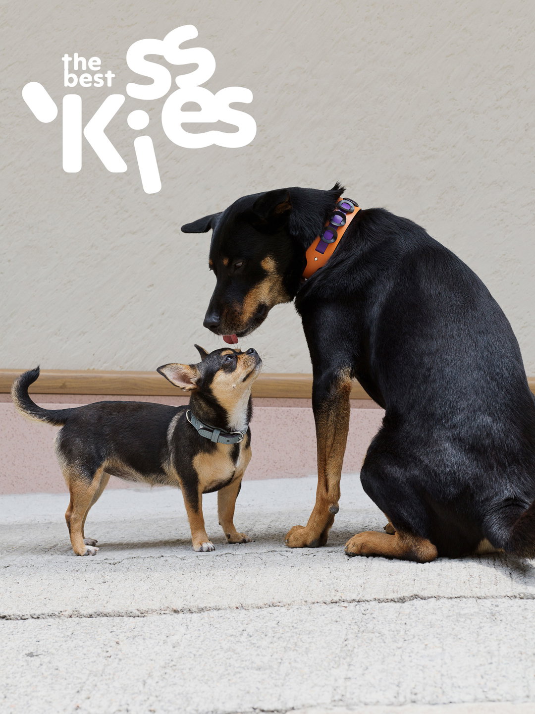
From there, Oddity started seeing more possibilities in that scrunched wordmark. “We were curious about what would happen if we squished it even more and came across the first sketches of the glyphs jumping up and down from the axis.” The result is typography that looks fluffy, like a marshmallow, or better yet, jumping dogs.
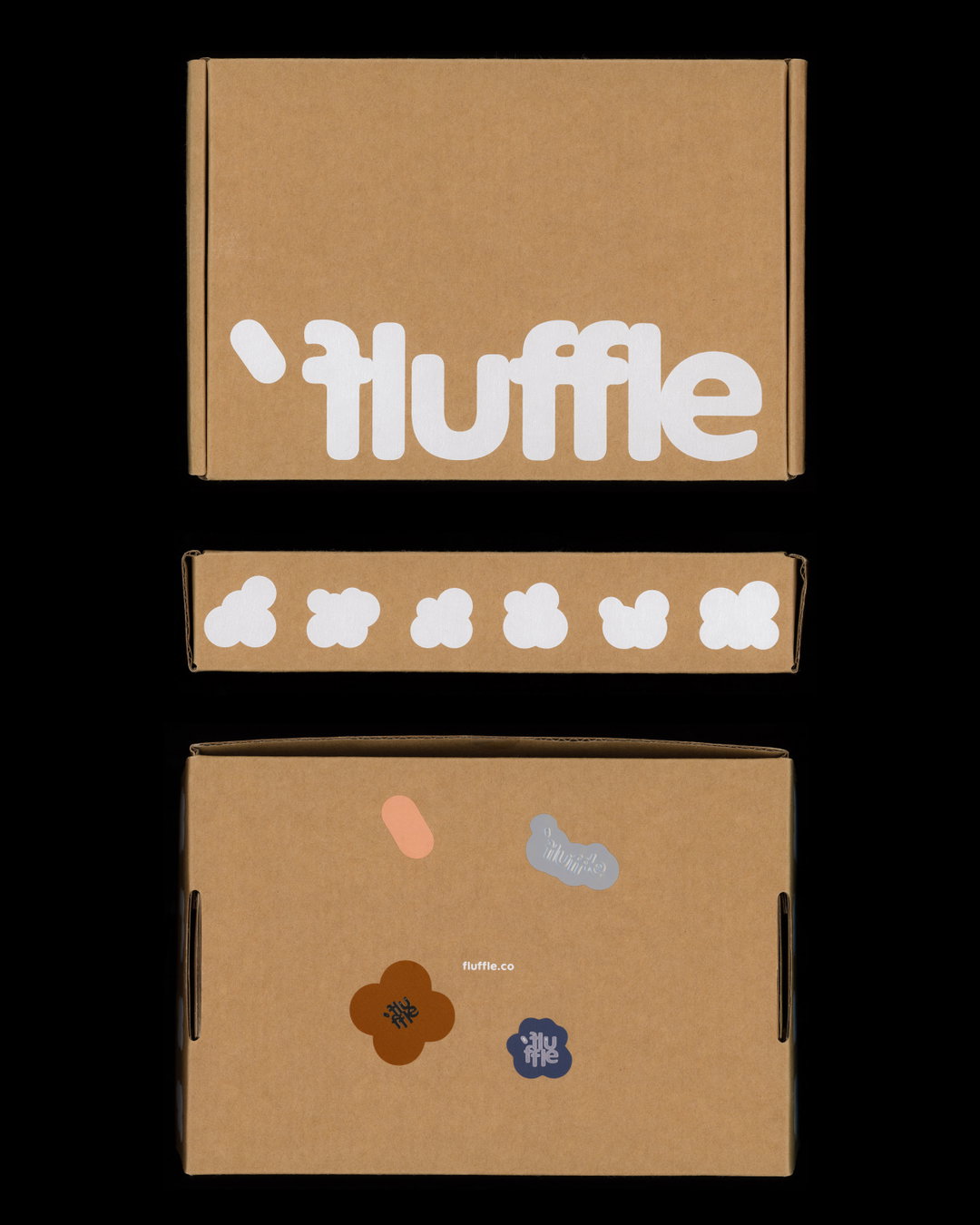
The packaging is not as excessively cute as most pet products. “The actual design of Fluffle’s products and their philosophy played a big role in this direction – treating pets as equals and dressing them as you would dress yourself. It is quite a rare and needed point of view in this industry,” says Alice.
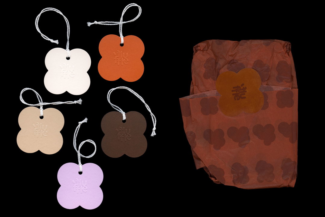
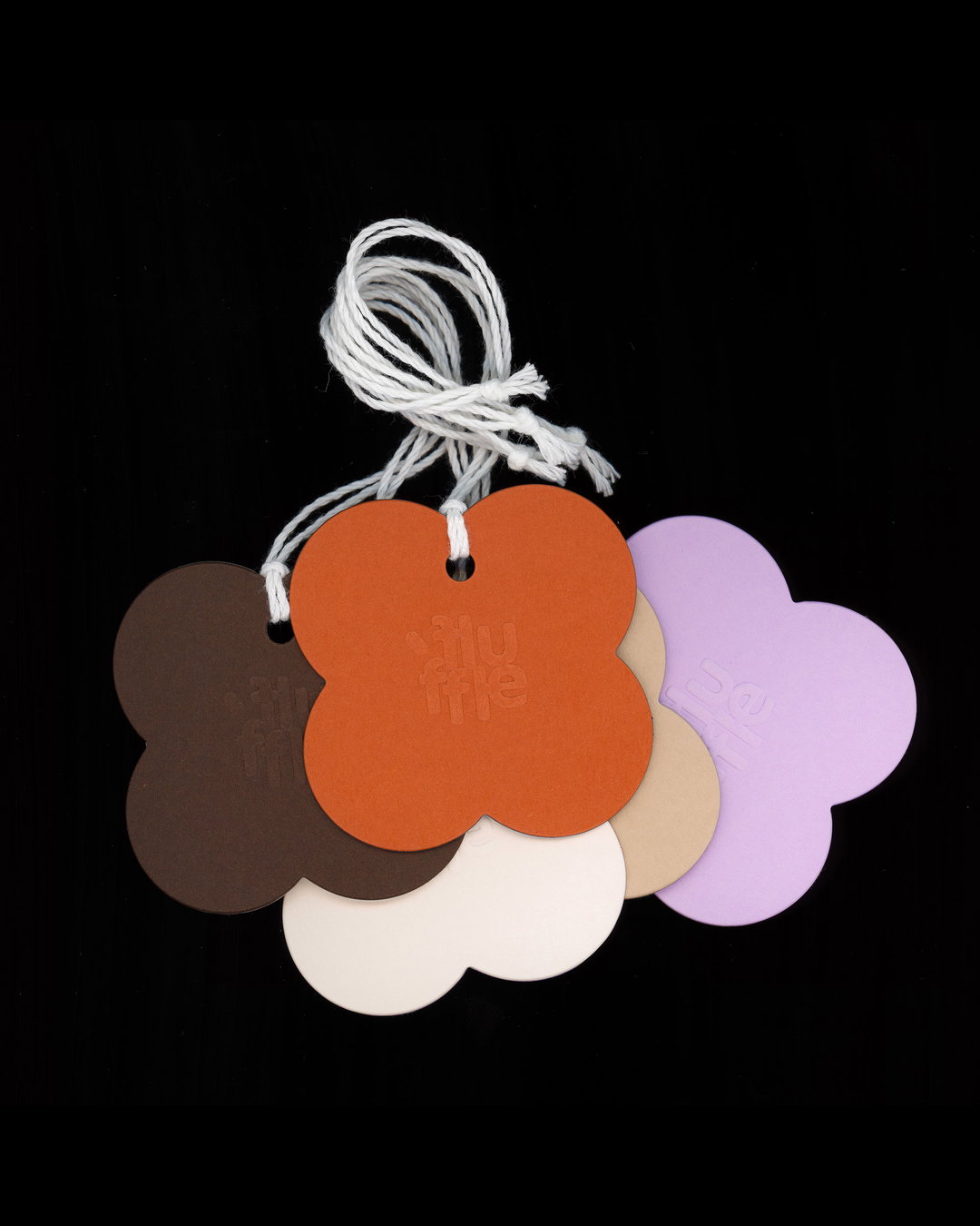
Instead, Oddity takes its cue from Fluffle’s real leather accessories for the colour palette, which features warm browns and oranges. This is paired with textured papers and emboss accents to strike a balance between stylish and approachable.
Fluffle is not the only one bringing out the animalistic qualities of typography recently – the Shenzhen studio DXD recently launched a project for Maowoo which takes a similar approach.
GalleryOddity Studio: Fluffle (Copyright © Oddity Studio, 2023)
Hero Header
Oddity Studio: Fluffle (Copyright © Oddity Studio, 2023)
Share Article
Further Info
About the Author
—
Liz (she/they) is the senior editor at Insights, a research-driven department within It’s Nice That. They previously ran the news section of the website. Get in contact with them for potential Insights collaborations or to discuss Insights’ public-facing reports.