Order gives textile brand Chatham a type-led overhaul
The New York design studio draws upon historic Chatham typefaces for its contemporary rebrand.
Share
Chatham, an American textile brand originally founded in 1877, has worked with Brooklyn-based design office Order Design on an identity to mark its recent revival. As Alex Chatham, great-great-grandson of the original founder, restarted the company with an authentic Chatham blanket in 2020, Order delivered an identity aligned with the company’s new direction. The brand’s new design is also steeped in its typographic history.
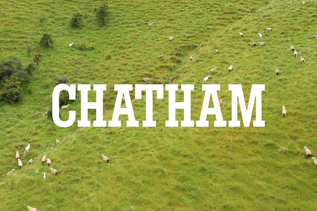
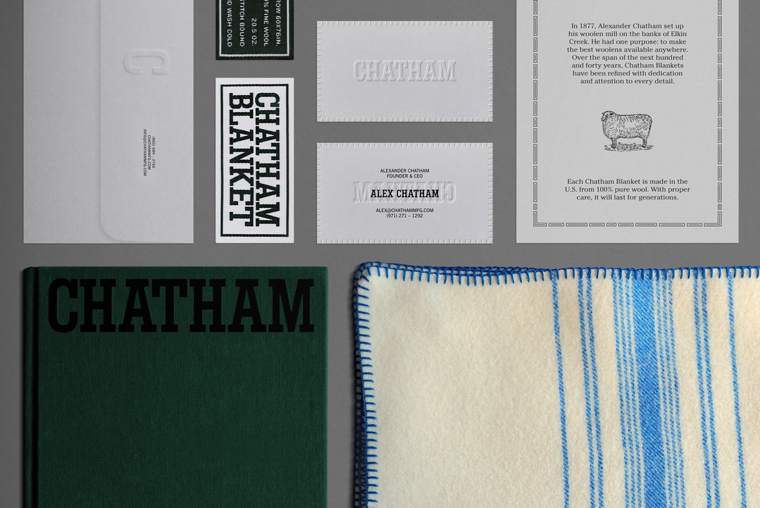
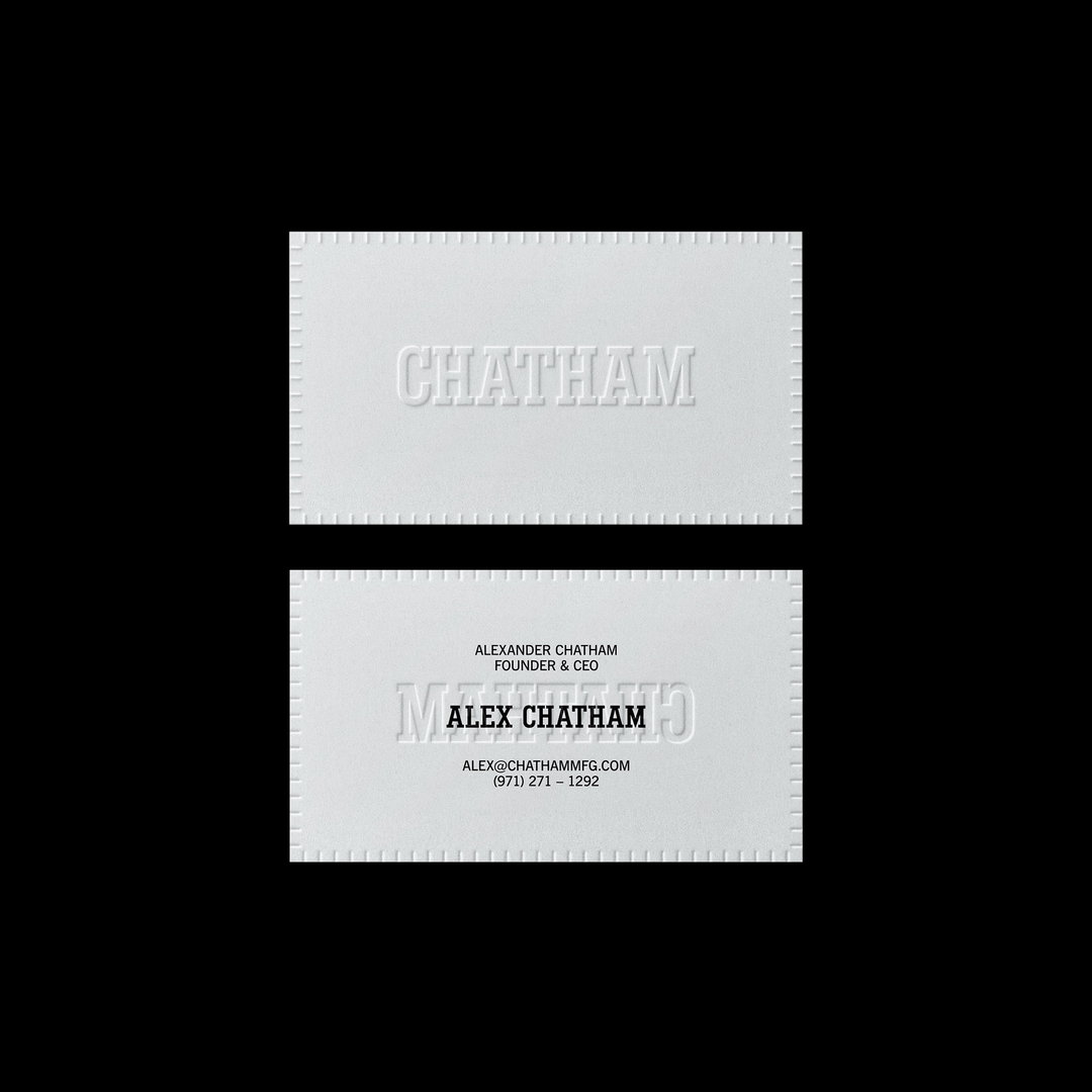
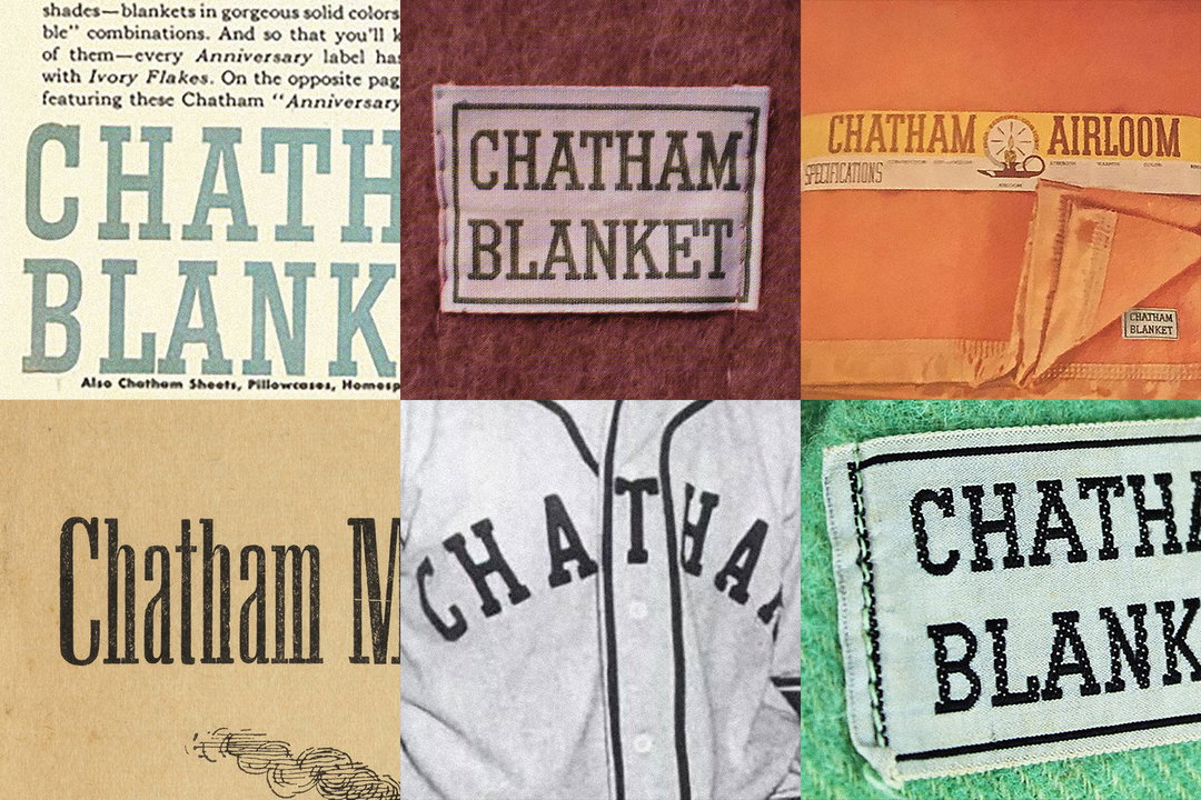
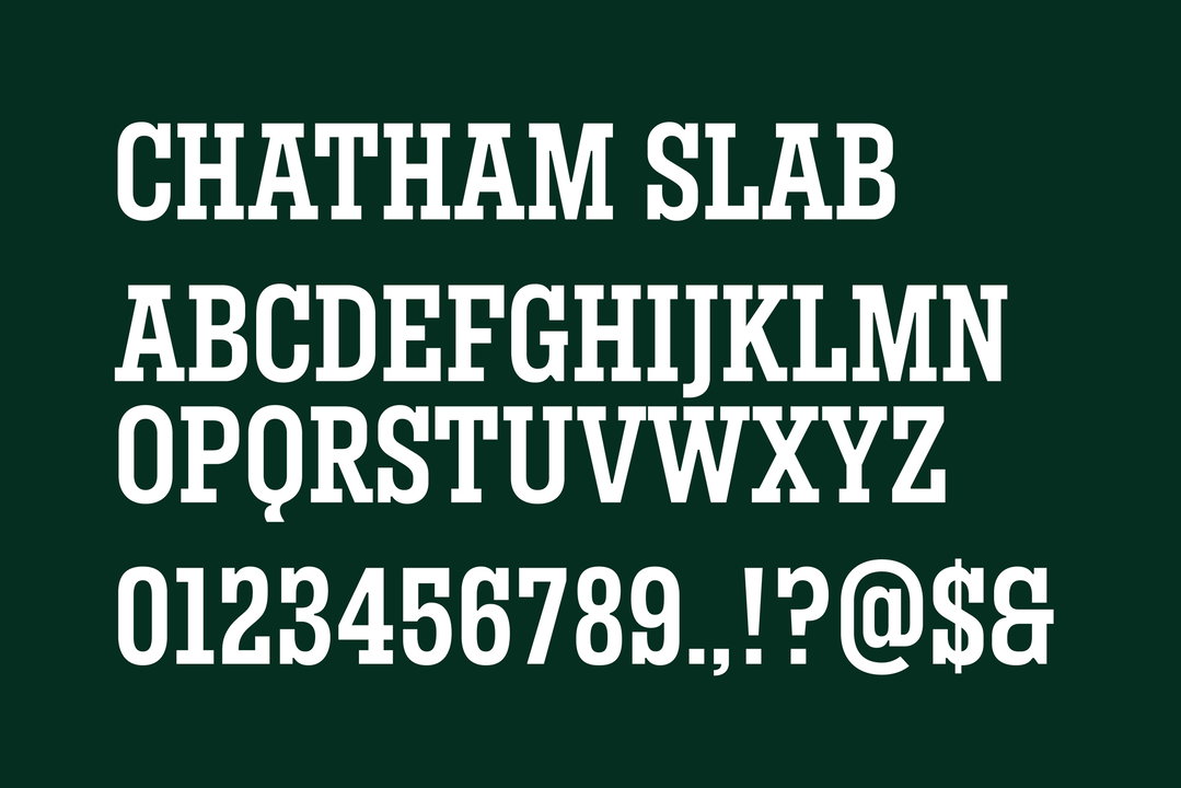
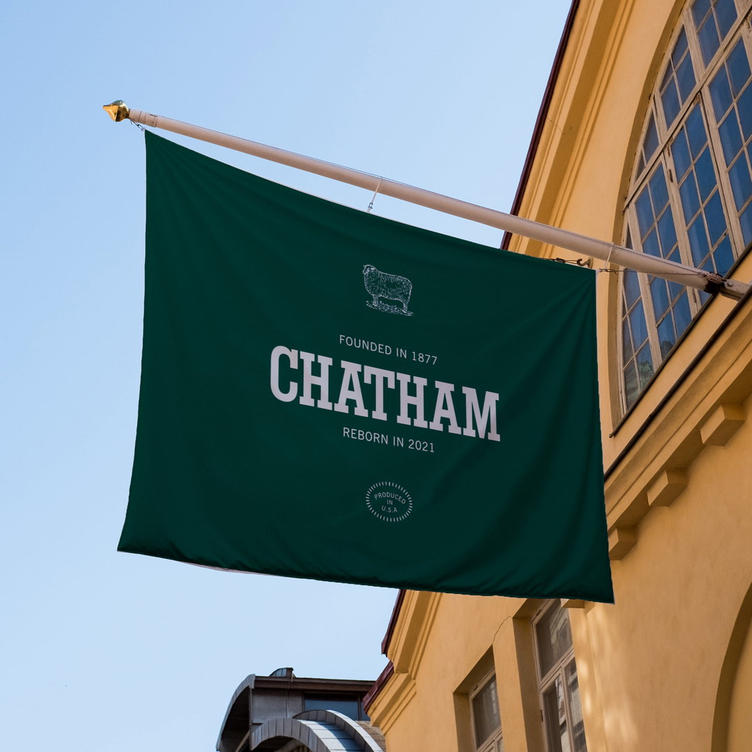
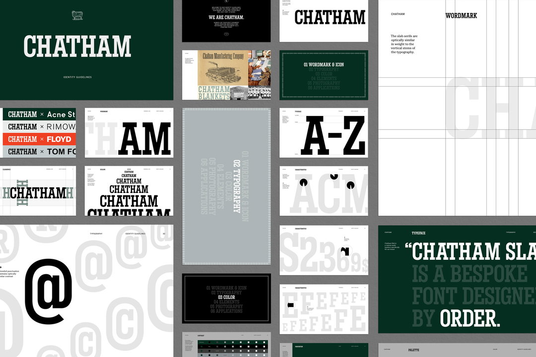
Order looked to slab lettering used most often throughout Chatham’s history for inspiration, as an Order case study explains. The primary wordmark has been restored from a 1940s slab type, drawing particular inspiration from a Chatham Blanket tag lockup from the same era. Order’s slab wordmark has also been extended into a revived, unicase typeface, with core elements of the original type – such as thick square serifs – retained; unique characteristics, such as thick ink traps, have been emphasised. Mastered by Robin Mientjes, Chatham Slab is used across all headers for the brand.
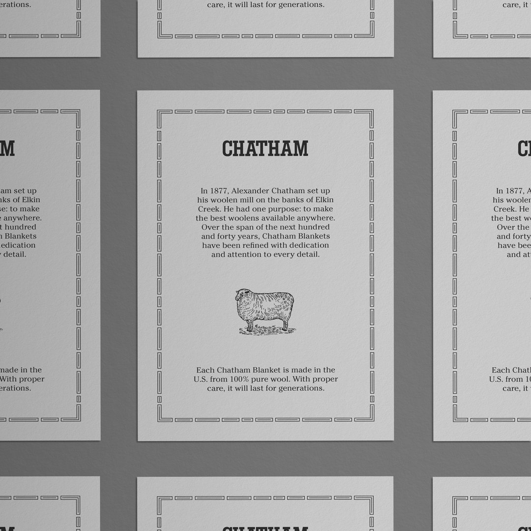
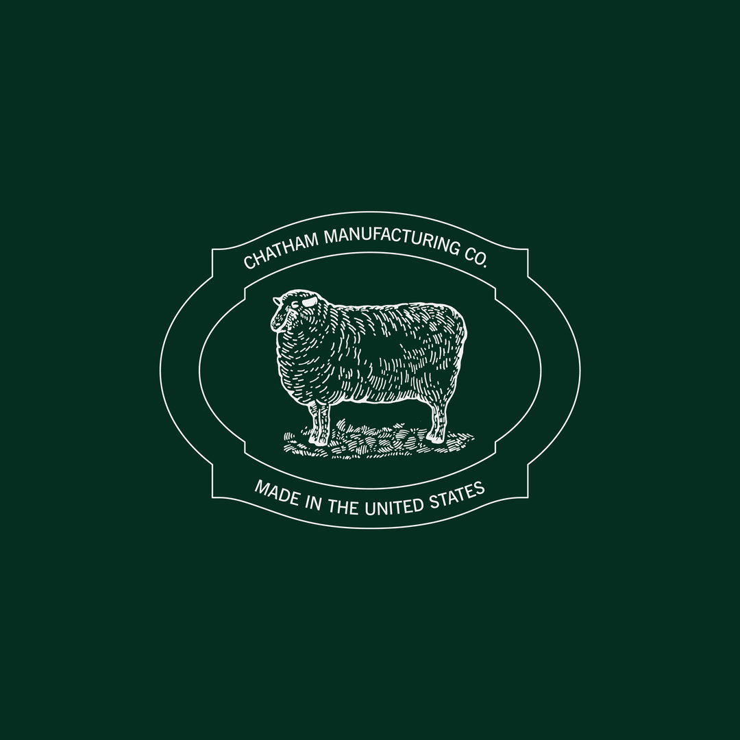
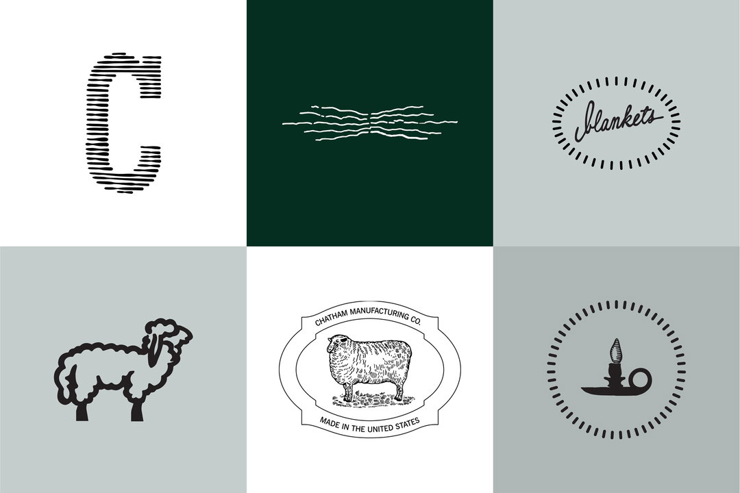
For subheaders, News Gothic, a typeface from the early 20th century, features throughout the system, “mirroring the typography used during Chatham’s founding years,” says Order. A “rich dark green” has been introduced for the primary colour in the palette, while “shades of cool greyscale values act as support”. Chatham’s visual history has also been used for new illustrations and symbols, like the repeated sheep motif, redrawn by Order to be used “minimally in the system”.
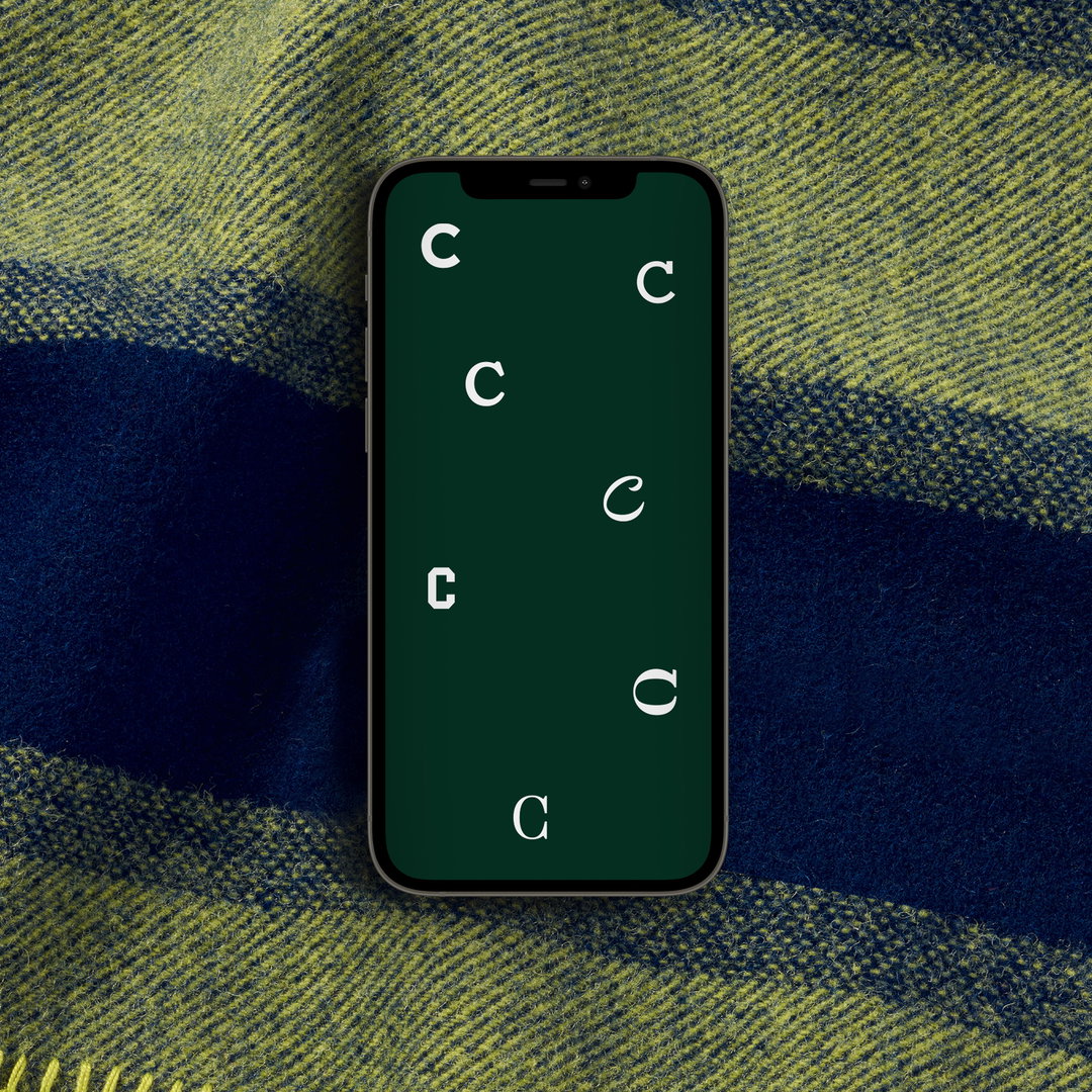
Chatham ‘Cs’, pulled from the company’s archives, are used sparingly across the identity, and will be used as quick signifiers in “the furthest extension of the brand”. They feature in certain areas of the new Chatham website, also designed by Order to coincide with the brand’s relaunch.
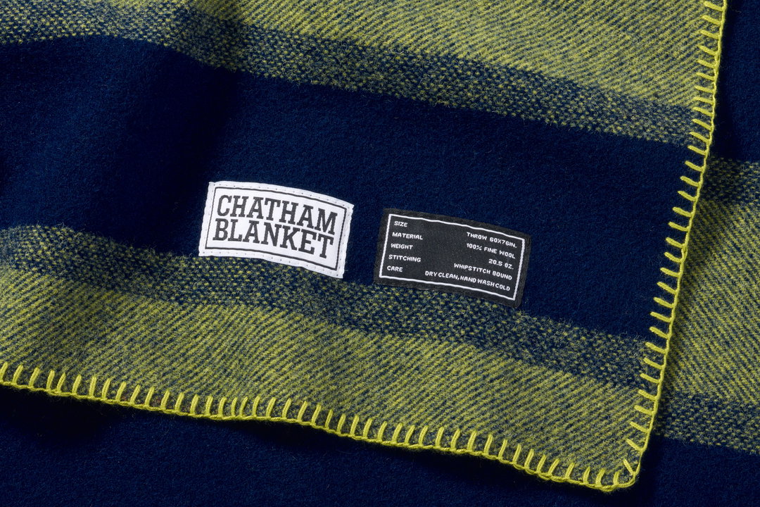
Chatham’s new typographic voice supported the launch of two blankets in 2022, including the revival of the Original Chatham Blanket in Elkin Blue Stripe, for which Order designed a suite of labels and tags.
GalleryOrder Design: Chatham identity (Copyright © Chatham, 2022)
Hero Header
Order Design: Chatham identity (Copyright © Chatham, 2022)
Share Article
Further Info
About the Author
—
Liz (she/they) is the senior editor at Insights, a research-driven department within It’s Nice That. They previously ran the news section of the website. Get in contact with them for potential Insights collaborations or to discuss Insights’ public-facing reports.