Regrets Only’s identity work is the antithesis of big corporate branding
Combining design strategy with a personable approach, Regrets Only finds the truth in a brand to communicate visually.
Share
When asking Caleb Halter, founder of Regrets Only, to describe his studio’s output, he turned to his colleagues for their thoughts. This action in itself displays Caleb’s process in design; one that puts collaboration and sentiment first, which is relayed in one of the designers responses saying, “it felt personal,” he tells It’s Nice That.
Based in Massachusetts, Regrets Only specialises in developing identities for a variety of brands. This focus is led by Caleb’s own experience starting in the industry as an animator, before expanding further afield into design, art direction and later brand strategy. Working in New York on a variety of freelance projects – “from print to visual effects, to children’s book-style illustrations” – the designer later settled at creative studio Gretel, becoming “struck by their systematic approach to design” and in turn joining the agency’s team full time.
At Gretel, the creative, identity-led design work offered soon became Caleb’s bread and butter. The more brands he worked with, “the more I learned how to shift the conversation away from any one aesthetic to a larger strategic thought that underpins and guides every expression of it,” he recalls. “Bigger ideas led to more striking visual executions, and my own practice overall really matured during my time there.” As he grew into director-level roles, this creative approach developed alongside experience with running a team, projects and eventually a business in starting Regrets Only.
With this in mind, this personal approach to design now leads all aspects of Regrets Only's projects. “I think at its heart is what the development of an identity is all about,” explains Caleb. “There’s been this proliferation, especially in corporate branding, where the goal isn’t actually to say anything directly as much as it’s meant to make you feel comfortable based on its familiarity – which is an unfortunate race to the bottom in my opinion.” Therefore the studio’s work “is the antithesis of that movement” and the guiding principle is not only creating an identity that works for the client at hand, “but is it also something that no one but us could deliver,” he explains.
Regrets Only: Forage (Copyright © Regrets Only, 2021)
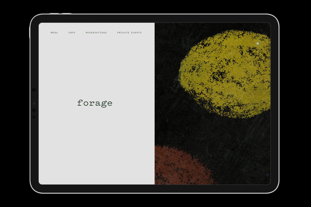
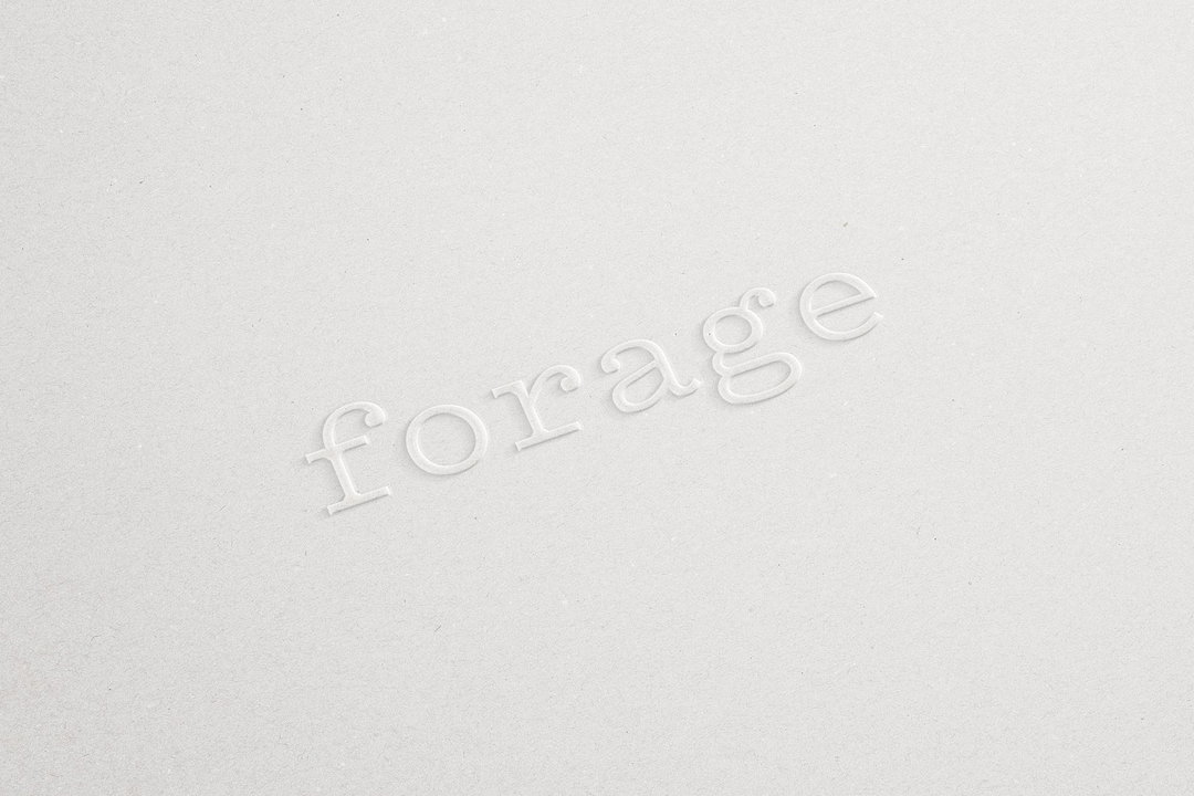
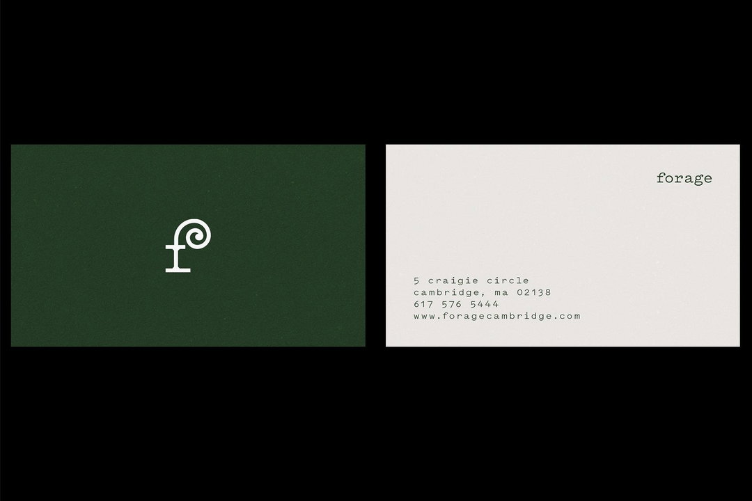
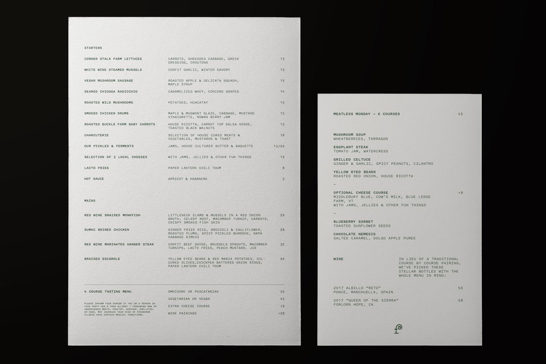
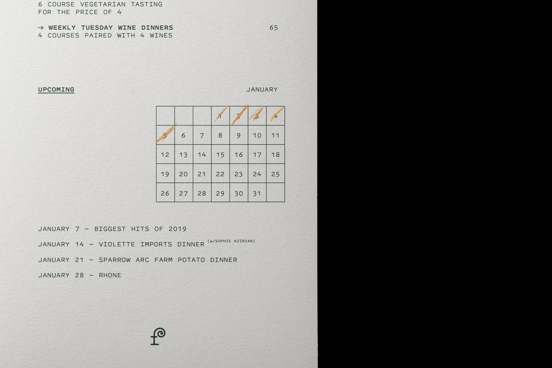
Across Regrets Only’s recent portfolio there are two projects which best display this creative thinking. The first is an identity for Forage, a restaurant focusing on hyper-local ingredients to create a menu which is “a beautiful snapshot of what’s happening nature at any given moment”, formed in a setting Caleb describes as “almost like you’re eating at an eccentric friend’s home.” As a result, there was no question that the studio’s work would reflect this unique dining experience, especially as the “level of detail in everything they do is really inspiring.”
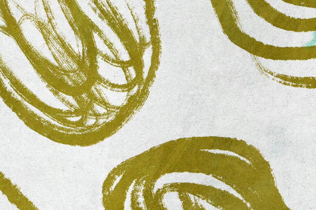
To demonstrate this, Regrets Only led with a two-fold approach. It was important for the identity to have a duality, one that is “unassuming and sophisticated”, and most prominently deployed in its monogram. Inspired by the fiddlehead fern (an ingredient frequently on Forage’s menu) the monogram is like a high-end mascot for the restaurant, representative as a humble ingredient “but is increasingly complicated and detailed the closer you look at it.” The graphic backbone is mostly typographic, “anchored by the typeface Pitch from Klim”, and contrastingly “feels very utilitarian,” adds Caleb. This process-led execution was then inspired by the behind-the-scenes details at Forage, taking inspiration from fermentation calendars, label-maker tags on ingredients and even receipts, to be paired with “a more elegant layer that feels artful, gestural and earthy, more like the dishes themselves.”
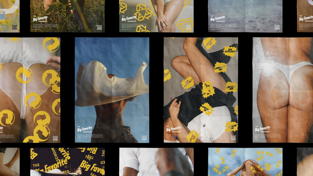
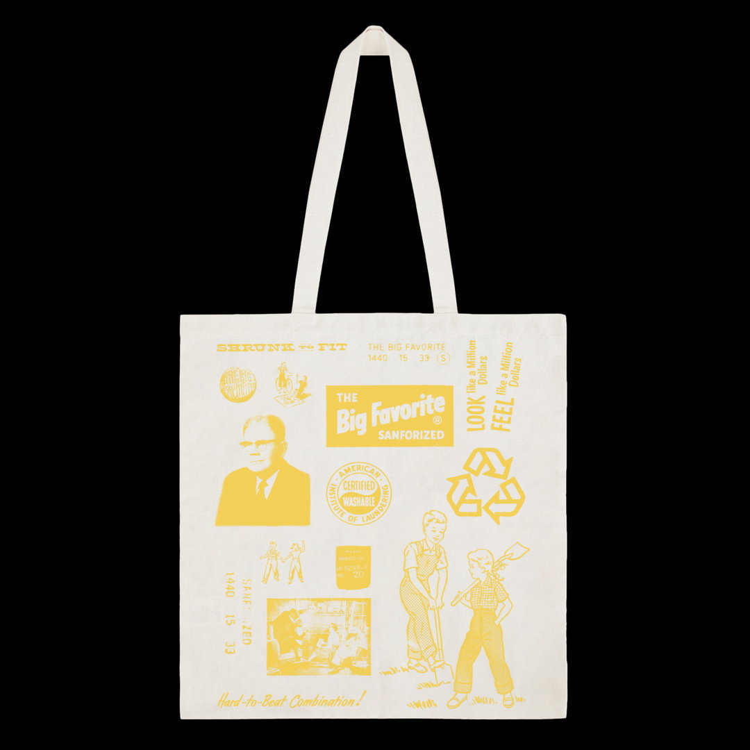
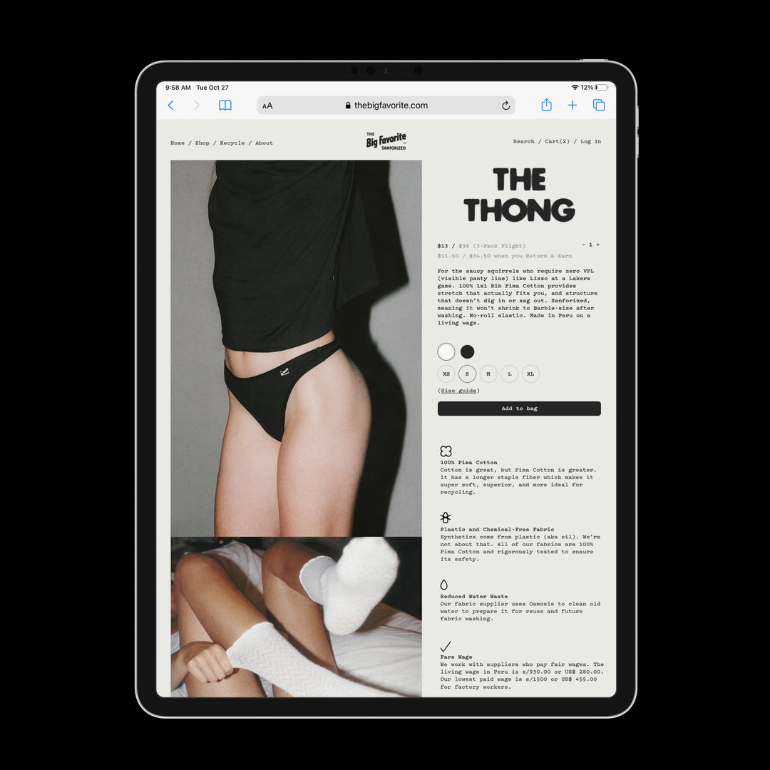
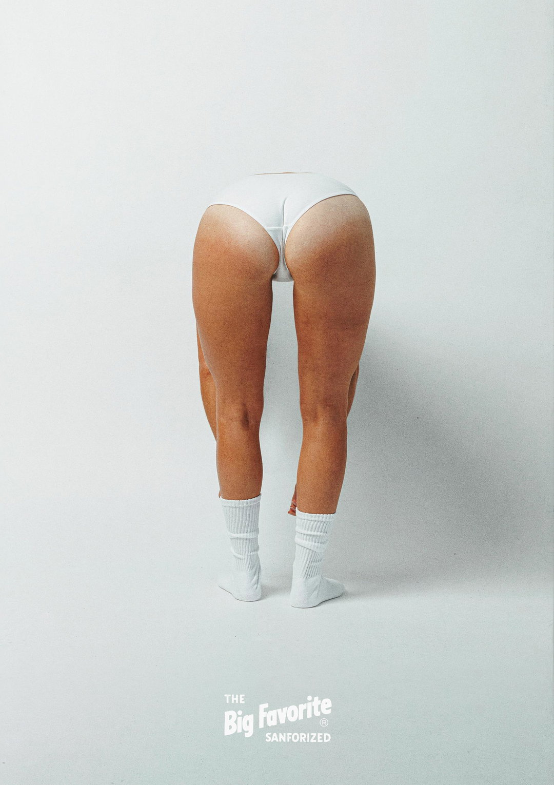
A bolder representation of Regrets Only’s design sensibilities can then be seen in the studio’s identity work for The Big Favourite. A family-owned underwear and undergarment brand founded in the 1930s, the studio’s brief featured several references from the current CEO’s great grandfather’s archives. Although this was originally just source material featured on a single slide in the deck for the brief, “it became immediately clear that that was the work,” says Caleb, “we just needed to find a way to bring it to life in a new way.”
The studio’s work then became to not fix what wasn’t broken, “and instead using the spirit and charm of that aesthetic to guide the rest of the work,” the creative director explains. Taking the concept of circularity as the lead for The Big Favourite’s relaunch, it became hugely important to re-use as much as possible from an identity perspective, “and not impose anything extraneous when we already had such a strong foundation of elements to build on.”
Comparing and contrasting these projects, while maybe “at opposite ends of the spectrum in terms of brand volume”, Caleb points out how both distill the truth of a brand. Once this is identified, it then becomes Regrets Only’s role to let “those truths guide how they should show up in the world without getting in the way too much, or imposing too much of our own ideals or aesthetics.”
It’s an ethos that links back to Caleb’s overall thoughts on design too, adding how methodical processes combining strategy and design actually allows for specialised flexibility, “almost like the studio is a vessel each project passes through to be clarified and distilled down.”
Regrets Only: Forage (Copyright © Regrets Only, 2021)
Regrets Only: Forage (Copyright © Regrets Only, 2021)
Regrets Only: Forage (Copyright © Regrets Only, 2021)
Regrets Only: Forage (Copyright © Regrets Only, 2021)
Regrets Only: Forage (Copyright © Regrets Only, 2021)
Regrets Only: Forage (Copyright © Regrets Only, 2021)

Regrets Only: The Big Favourite (Copyright © Regrets Only, 2021)
Regrets Only: The Big Favourite (Copyright © Regrets Only, 2021)
Regrets Only: The Big Favourite (Copyright © Regrets Only, 2021)
Regrets Only: The Big Favourite (Copyright © Regrets Only, 2021)
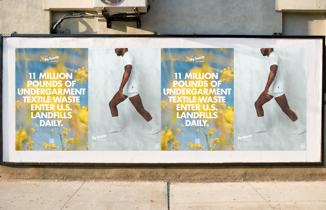
Regrets Only: The Big Favourite (Copyright © Regrets Only, 2021)
Become an Extra Nice Supporter
Unlock an inspiring new way to explore It’s Nice That, get your hands on exclusive perks, and help bring meaningful creative projects to life.
Hero Header
Regrets Only: The Big Favourite (Copyright © Regrets Only, 2021)
Share Article
Further Info
About the Author
—
Lucy (she/her) was part of the It’s Nice That team from 2016–2025, first joining as a staff writer after graduating from Chelsea College of Art with a degree in Graphic Design Communication, eventually becoming a senior editor on our editorial team, and most recently at Insights, a research-driven department with It’s Nice That.