The Ease type system can be as rounded as you please
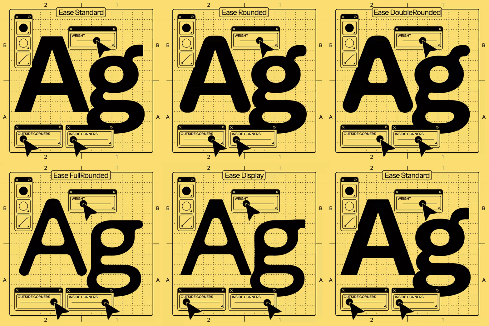
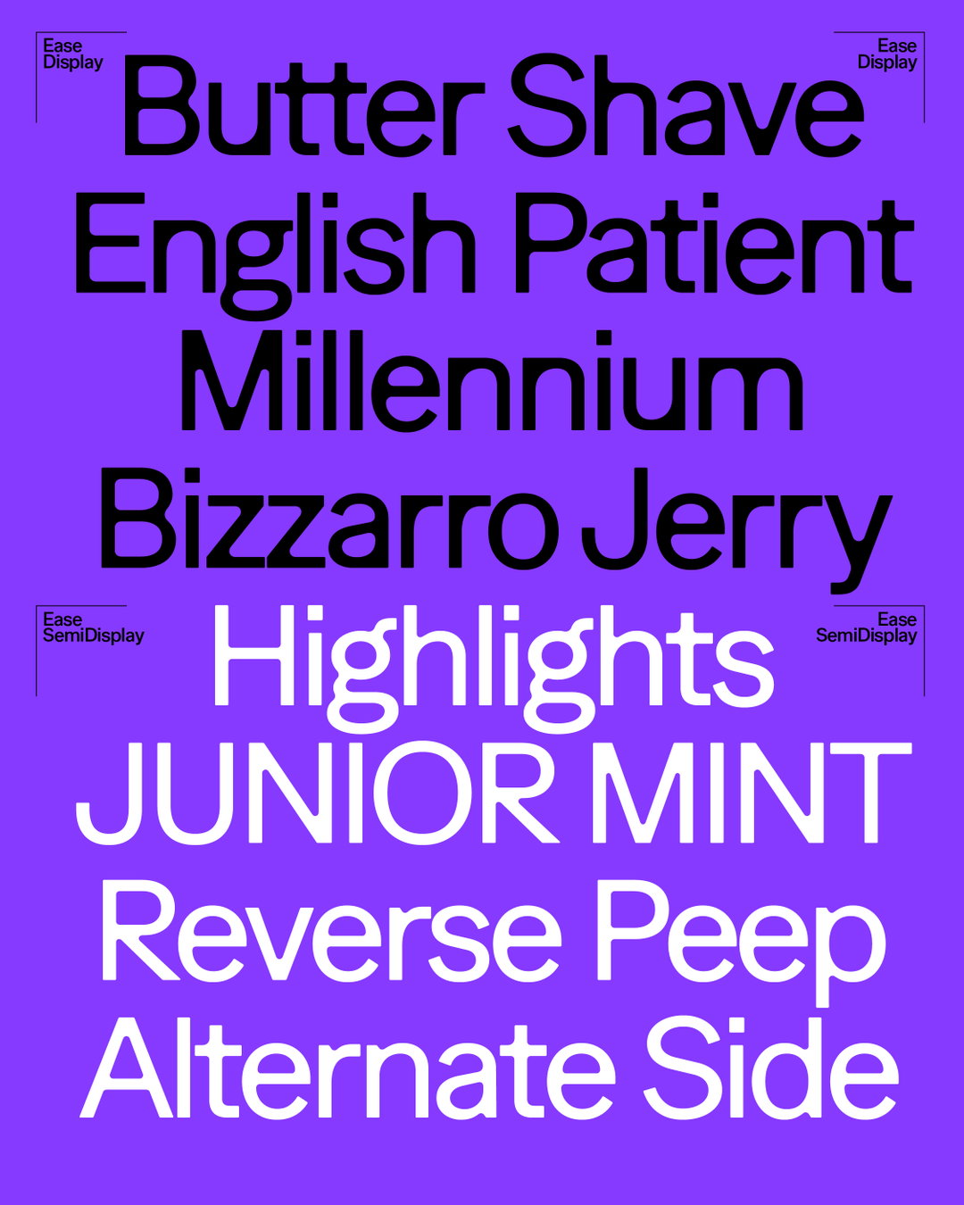
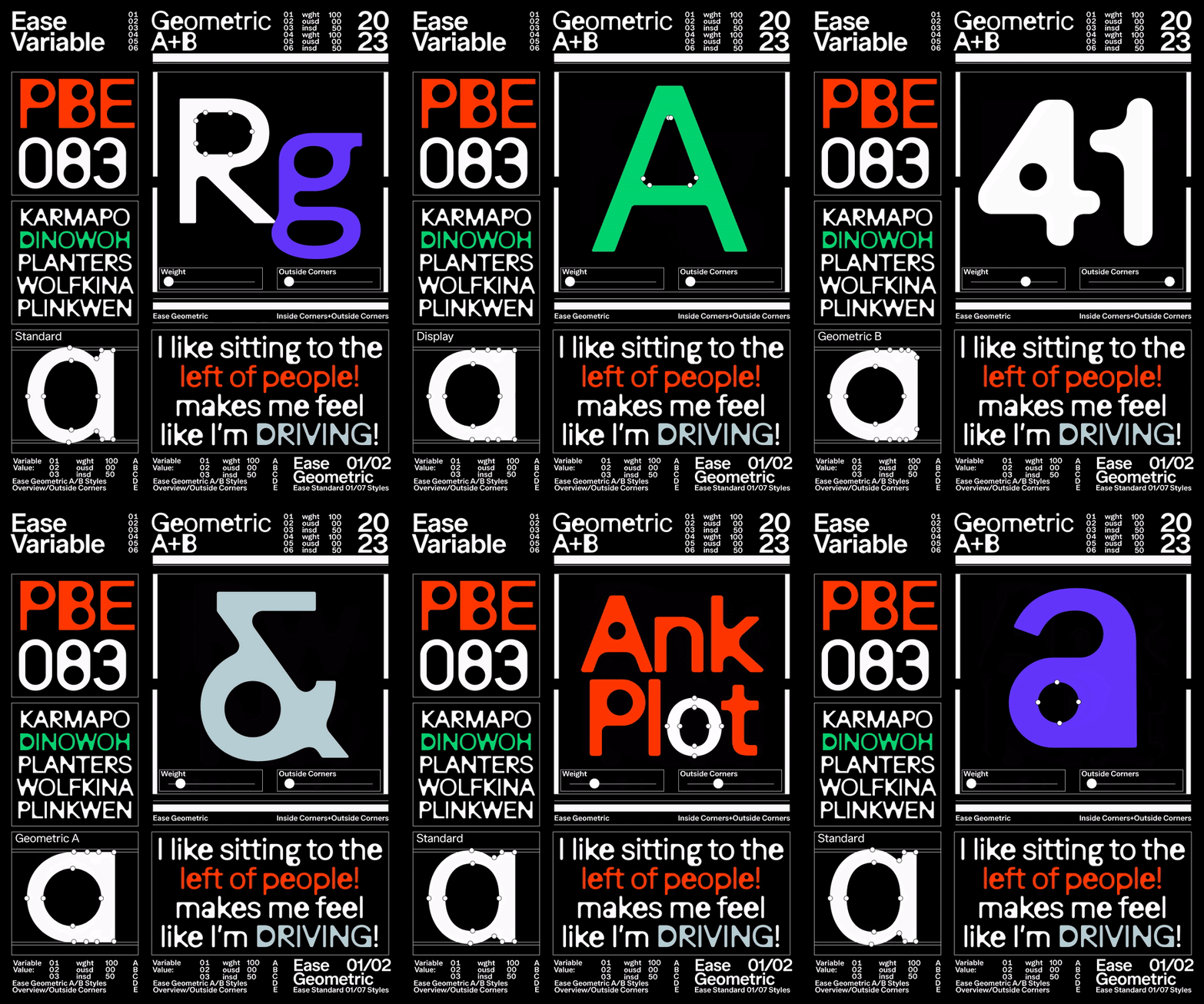
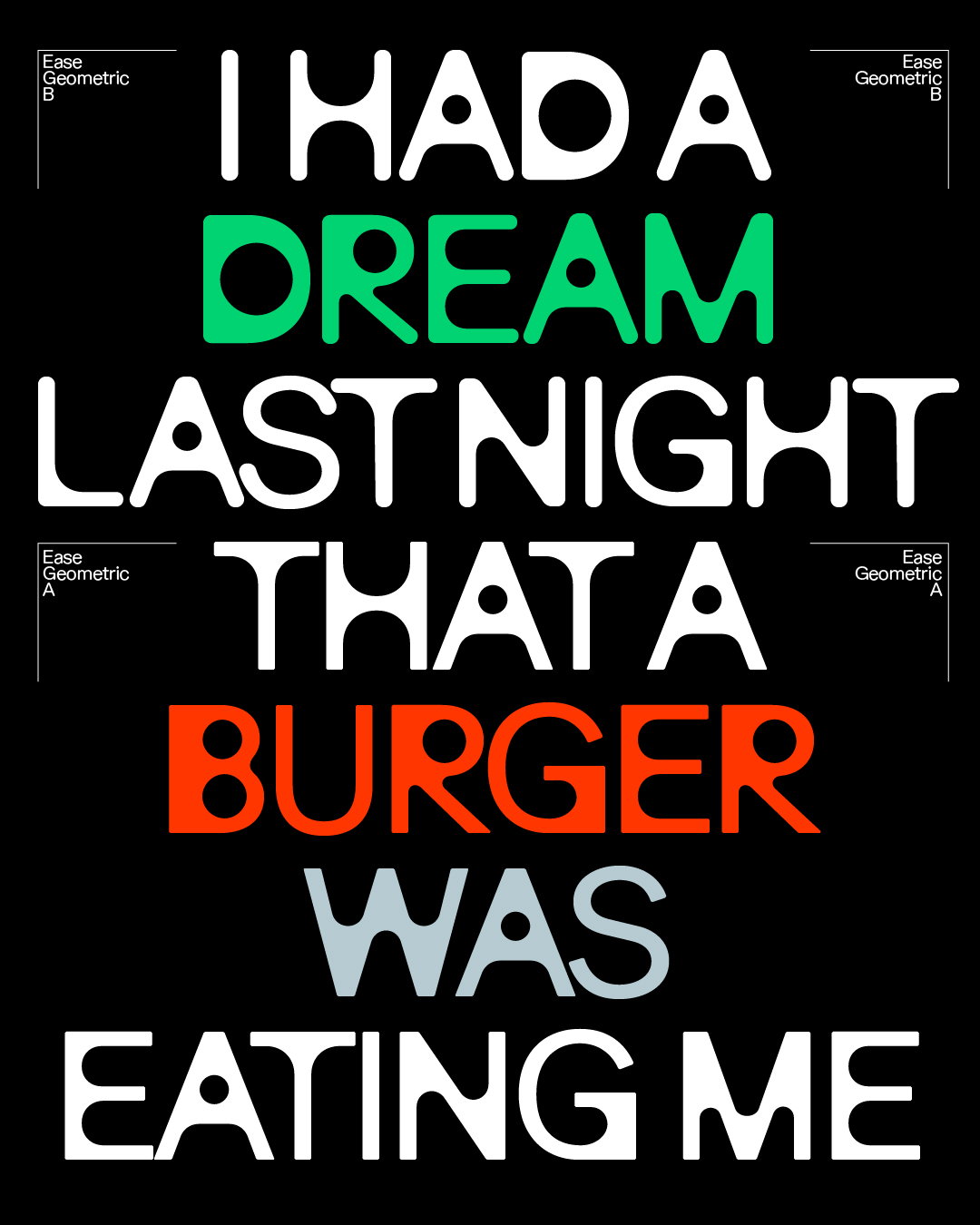
From Studio Feixen, Ease is a detailed variable type system that lets you round inner and outer corners, allowing for endless possibilities.
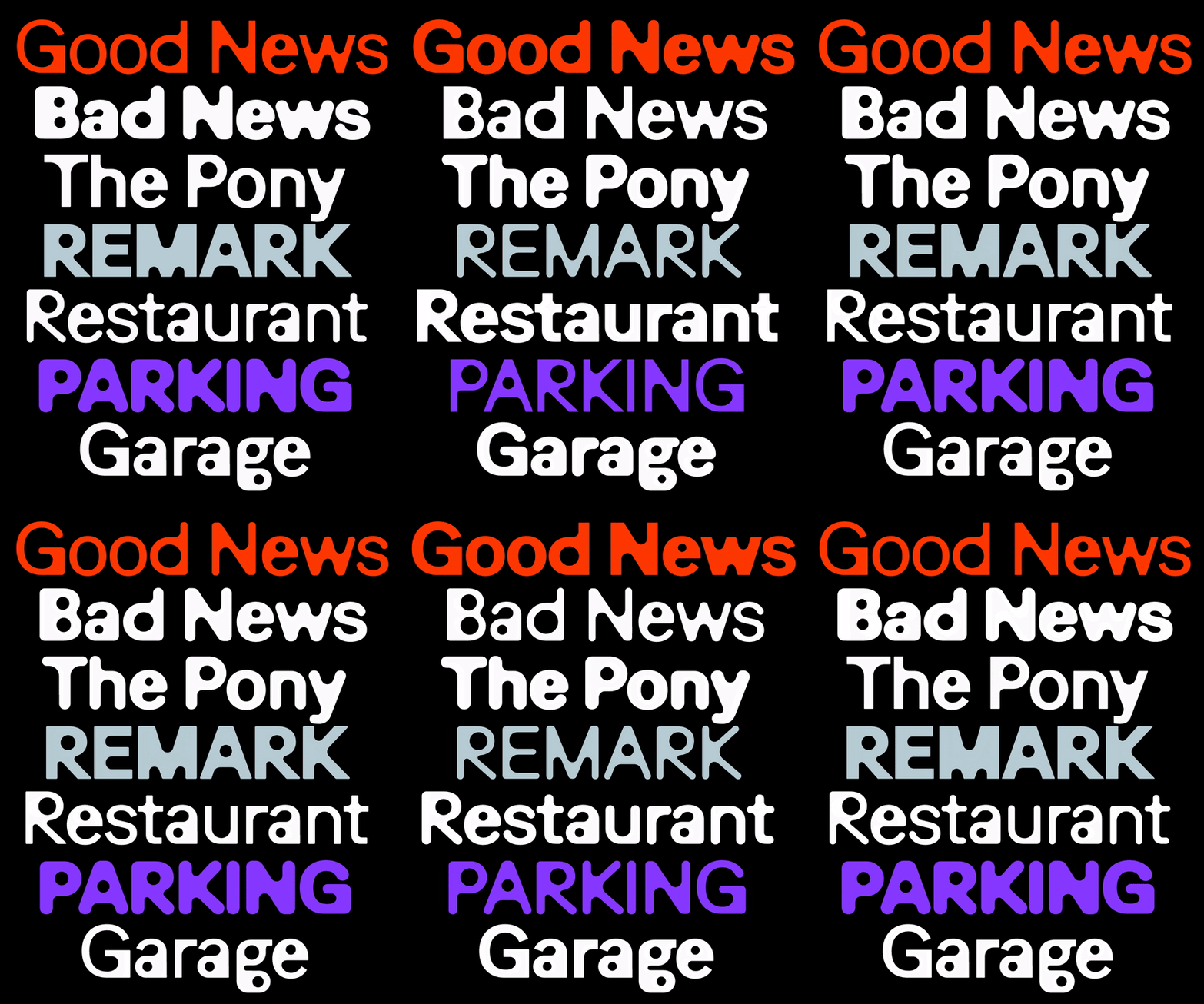
Variable typefaces have really changed the game; they’ve given designers greater scope for exploration and experimentation, and those who eventually use the designs more agency in how they apply them. Studio Feixen’s recently released Ease is a perfect example of just how vast a variable type system can be, giving its users the tools to make it as rounded (or not) as they please.
When we last caught up with Feixen in 2020, the type foundry was in its first five years and Robin was still interning, “and now we’re constantly working together”, says Felix. “I vividly remember telling Robin back then that it’s rare for designers to click so quickly and well. The past few years have confirmed that.” Now, the pair run the type foundry together, dedicating themselves to creating detailed typefaces and indulging in their perfectionism. Felix describes Ease, which is one and a half years in the making, as the “complete merging of our brains”.
Studio Feixen: Ease (Copyright © Studio Feixen, 2024)
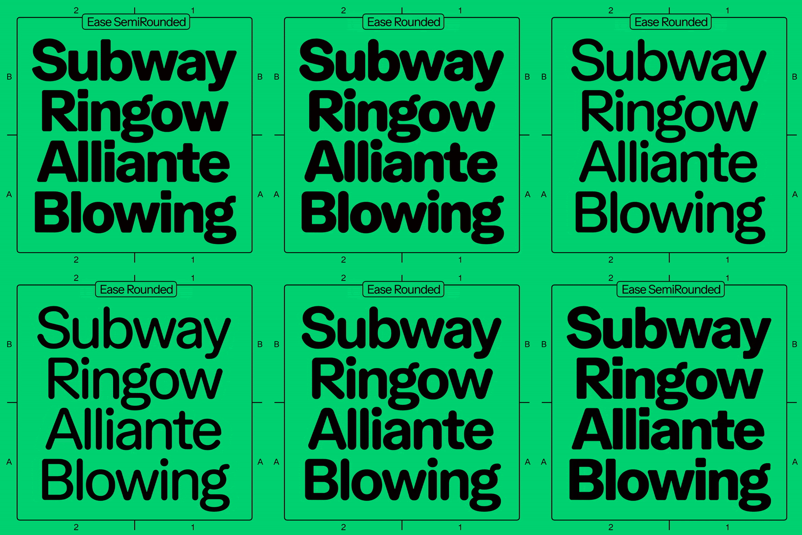
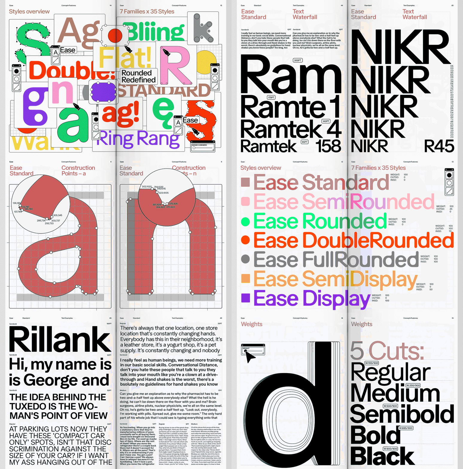
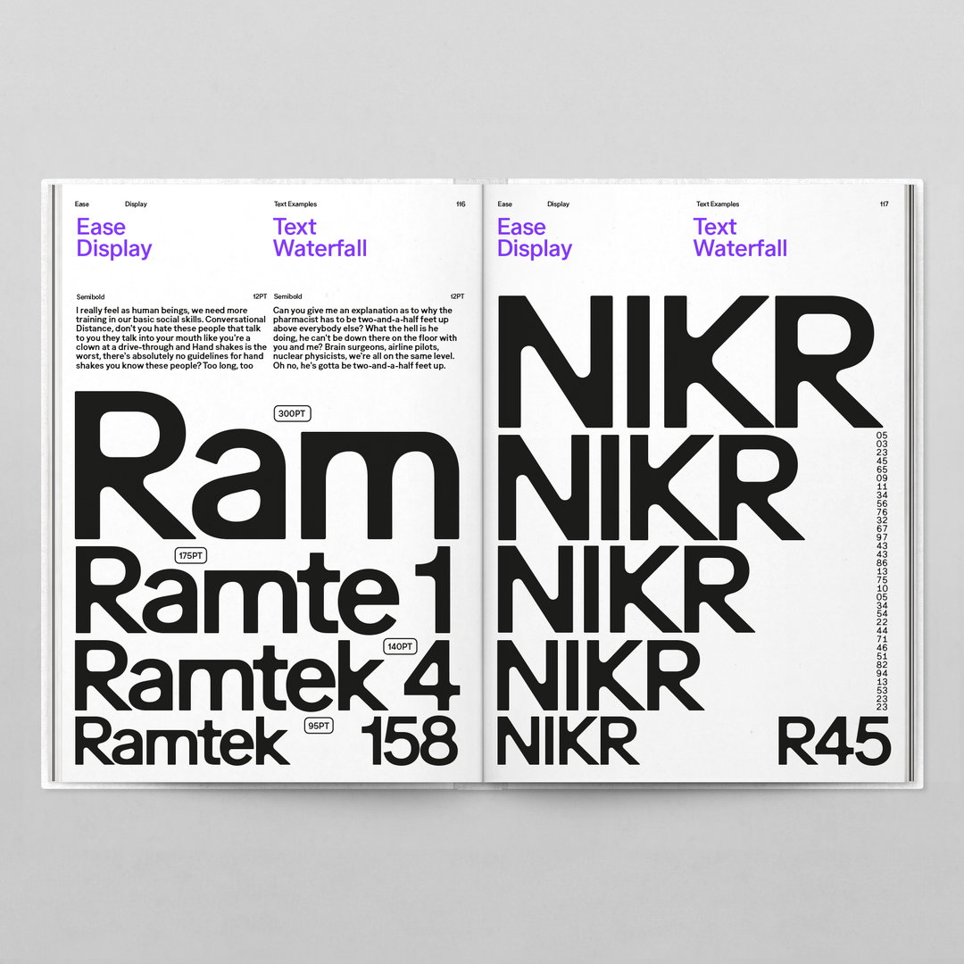
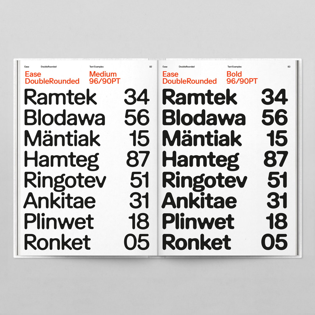
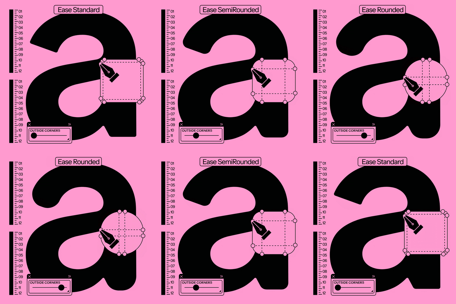
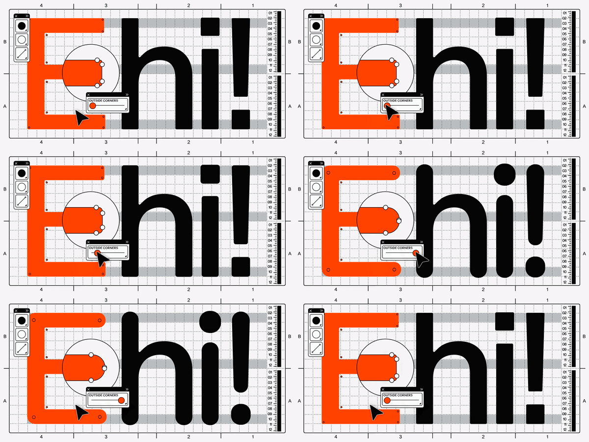
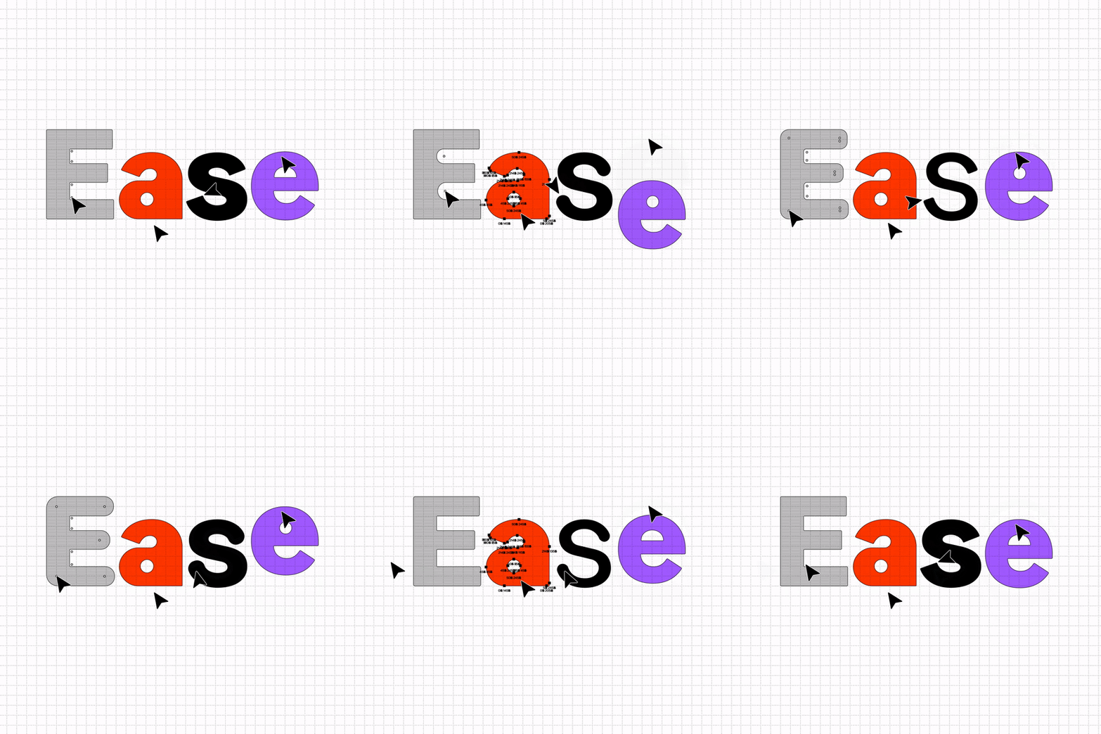
The core concept driving Ease was that it could be rounded “in any conceivable way”, says Felix. This means that both the outer and inner corners – or both – can be rounded. “This naturally results in very different typefaces and it’s this versatility that intrigued us.” While Felix is aware of many rounded typefaces – he cites FF Blur by Neville Brody as an important inspiration (despite its varying concept and analogue approach) – but what Felix sees as setting Ease apart is the many possibilities between its two extremes.
Though, as you might expect, creating such extremes wasn’t a simple task. While the typeface began with playful experimentation, executing it took some hard graft and patience. “We spent a solid four months just working with a handful of letters to figure out how to smoothly round them without any unsightly moments,” says Felix. At times, we were experimenting with just three or four points and their positions for weeks until it finally clicked.” But Felix is more than happy with the result, proven by just how good it feels to use and play around with.
For Felix, one of the biggest “delights” of being a type designer is seeing your designs in use and having the chance to check out how other creatives apply them. Recently, Hymn Design used Ease in its identity for Musée Suisse du Jeu, an application that Felix sees as “particularly beautiful”, and one that hopefully marks a bright future for the typeface. “It feels incredible, especially since we’ve just released the typeface, and already it’s part of a museum’s identity.”
GalleryStudio Feixen: Ease (Copyright © Studio Feixen, 2024)
Hero Header
Studio Feixen: Ease (Copyright © Studio Feixen, 2024)
Share Article
About the Author
—
Olivia (she/her) is associate editor of the website, overseeing the day-to-day editorial projects as well as Nicer Tuesdays events. She joined the It’s Nice That team in 2021. [email protected]
To submit your work to be featured on the site, see our Submissions Guide.