




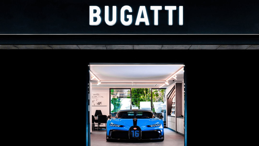
Bugatti’s new look is bolder, sleeker, and slightly sci-fi, thanks to Interbrand
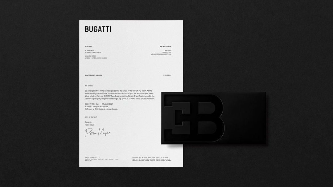
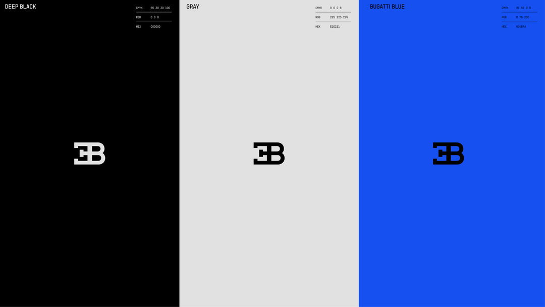
Referencing its French origins with a vibrant Bugatti Blue and a renewed focus on the classic EB logo, the rebrand signals an ambitious new aim for the car manufacturer.
Share
At over 110 years old, Bugatti has weathered near enough every shifting tide a brand can experience over its lifespan. Even only two decades ago, the brand was re-installed alongside the release of the Veyron in 2005. Now it launches another refresh, although the car manufacturer wants to make clear it’s debuting anything but a mere “new look and feel”. Instead, the rebrand, delivered by Interbrand, references not only Bugatti’s rich history but analyses how the world has changed since its last update. “Don’t forget, at the time the Veyron came out, the iPhone did not yet exist,” Bugatti’s Hendrik Malinowski says in a release.
The refresh also aims to signal a new direction for Bugatti to the world. The Molsheim-based brand is hoping to go beyond being an exclusive hyper sports car manufacturer to a luxury brand that stands up in a 2022 market. The key elements of the new look? “Bolder, more self-confident, more modern, more progressive”, the release states.
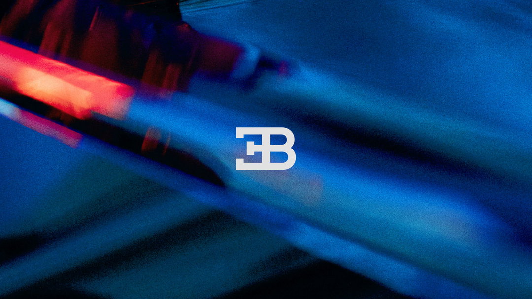
Interbrand: Bugatti (Copyright © Bugatti, 2022)
Interbrand, the design agency which previously conceived a whole country’s (El Salvador’s) brand, has been called in for the change. Its take on the Bugatti brand sees the iconic EB logo, originally created from Ettore Bugatti’s initials, unchanged. Head of strategy at Interbrand, Linda Marquardt, explains:
“Bugatti’s new corporate identity and corporate design encapsulates the iconic heritage of the brand, giving room to its unique elements, such as the EB logo while at the same time opening the brand for an entire new world of luxury experiences.”
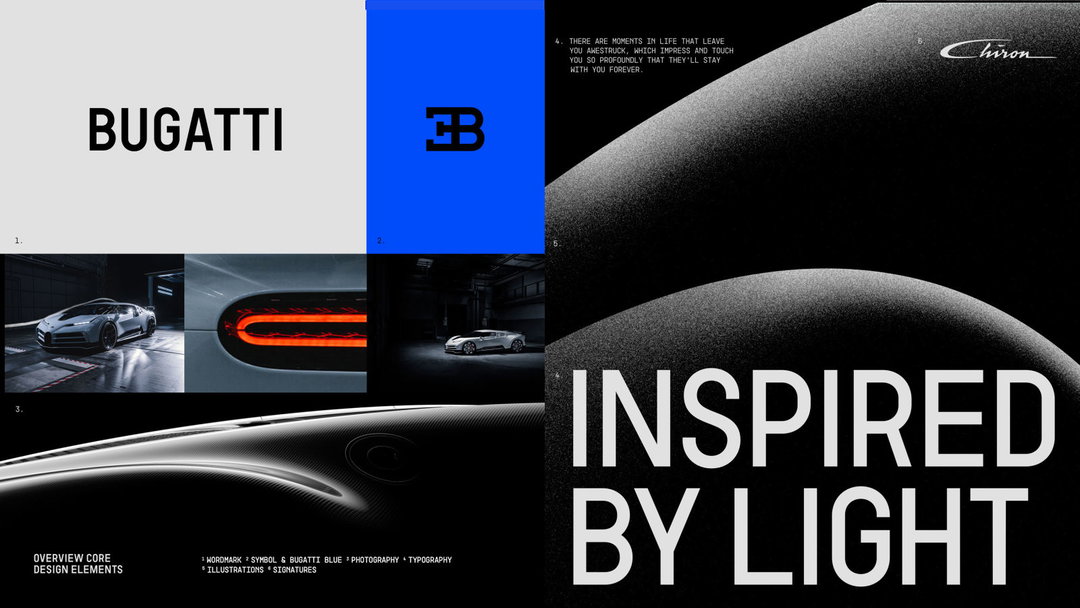
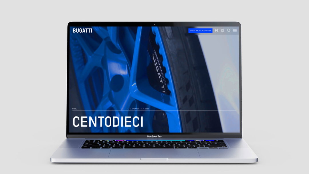
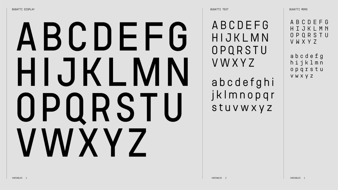
Typographically, the agency drew from vintage French street signs and Bugatti’s own photographic archive to formulate a new, far sleeker, custom typeface. The new design of the Bugatti Newsroom and the brand’s online site sees the text variable of the font rolled out in full. Meanwhile, a new Bugatti blue palette further references the brand’s French origins.
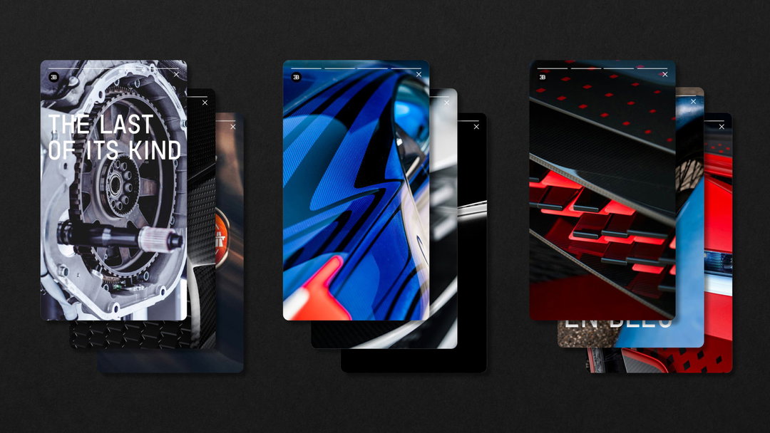
Bugatti’s new corporate look has already partly been debuted with Bugatti’s dealer partners and will gradually be launched in the public, starting with a change of logo on social media channels, stationery and a new event setup.
In the past two years, it seems the majority of car brands have invested hugely in rebranding (many of them simplifying and flattening their logos for digital application) and repositioning their strategy for a modern market, including Rolls-Royce by Pentagram’s Marina Willer, Cadillac by Mother Design, Toyota by The&Partnership, plus BMW, Nissan, Vauxhall, Kia and Renault. Last week it was revealed that Peter Saville had revamped the Aston Martin wings logo.
GalleryInterbrand: Bugatti (Copyright © Bugatti, 2022)


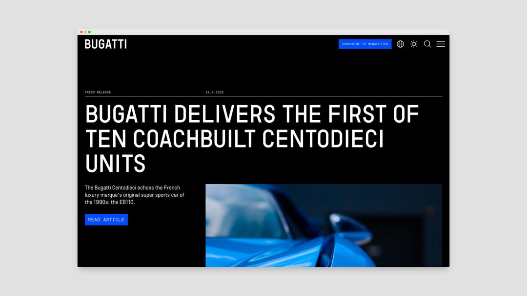
Hero Header
Interbrand: Bugatti (Copyright © Bugatti, 2022)
Share Article
Further Info
About the Author
—
Liz (she/they) is the senior editor at Insights, a research-driven department within It’s Nice That. They previously ran the news section of the website. Get in contact with them for potential Insights collaborations or to discuss Insights’ public-facing reports.





