Launch Recite Me assistive technology

DixonBaxi unveils brand identity for Eurosport’s Olympics coverage, based on the podium

—
Date
2 August 2017
An animation in which green and white geometric shapes assemble on a dark blue background. They form the Eurosport logo above the text “HOME OF THE OLYMPICS” and the Olympic rings.

Brand studio DixonBaxi has created the identity for channel Eurosport’s coverage of the Olympics for the next eight years. Using the winners’ podium as a icon and graphic device, the branding is based on a system of staggered rectangular blocks, combined with custom type and photography. Especially when animated, it aims to reflect runners’ “explosive” leap from the starting blocks.

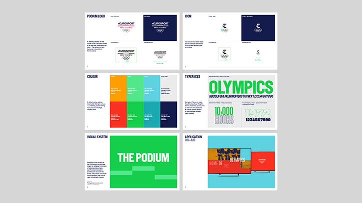
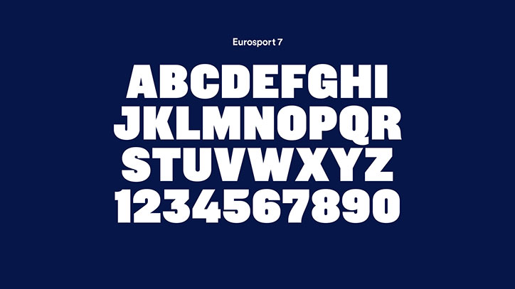
“‘The Podium’ is the foundation for the brand experience on every platform,” the studio explains. “[It] uses the iconic three tiers as a simple visual metaphor that can be used in hundreds of ways.” The design also uses layers of bright colour inspired by Olympic venues, the studio says, and an “expressive” bespoke typeface, together building a “flexible and distinctive graphic style” for the channel. The main logo combines three icons, Eurosport’s logo, the Olympic rings and the winners’ platform,

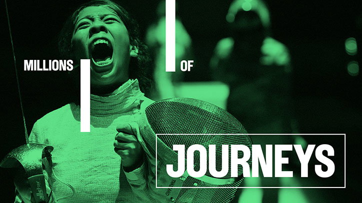
According to the design team, DixonBaxi wanted the branding to be confident, immediate, bold and purposeful, as well as smooth, flexible and energetic, which particularly comes across when the graphic system is animated for channel idents. The work for Eurosport launched with the campaign Millions of Journeys, One Destination by Iris Worldwide and is being rolled out across TV – the studio having designed the channel’s entire on-air style guide – and out-of-home advertising, as well as digital, print and merchandise.

DixonBaxi is also working on a new “event-focused” brand to be revealed in February 2018.
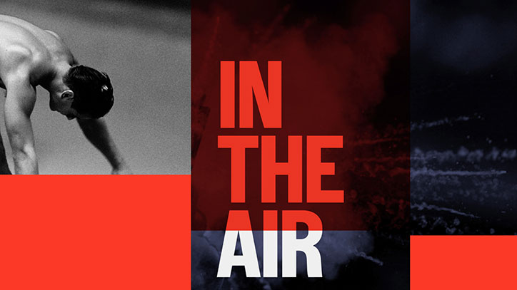
A collage featuring a black and white image of a person leaning forward. Bold red and white text in the centre reads “IN THE AIR”.
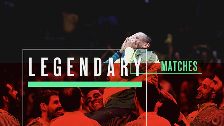
A person covers their face with their hands in distress, surrounded by a group of people. Bold white text across the centre reads “LEGENDARY MATCHES”, with the word “MATCHES” highlighted in a green box.
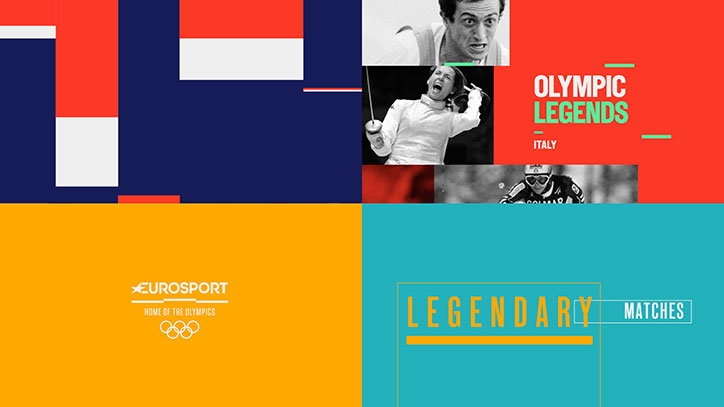
A graphic divided into four colourful quadrants of blue, red, yellow and teal. The top right section features black and white photos of athletes and the text “Olympic Legends Italy”. The bottom half contains the Eurosport logo and the words “Legendary Matches”.
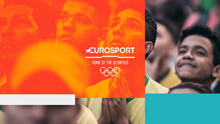
A group of people watch a sporting event with expressions of anticipation and joy. The left side of the image is overlaid with a red gradient and the Eurosport logo above the text “HOME OF THE OLYMPICS” and the Olympic rings.
The Eurosport logo in white appears against a dark blue background. Below it, the text reads “HOME OF THE OLYMPICS” above the Olympic rings.
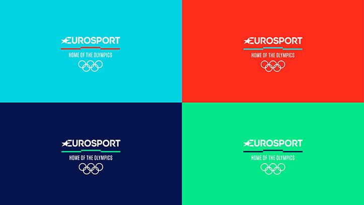
Four colour variations of a brand identity for Eurosport. Each features the Eurosport logo above the text “HOME OF THE OLYMPICS” and the Olympic rings, set against cyan, red, navy and green backgrounds.
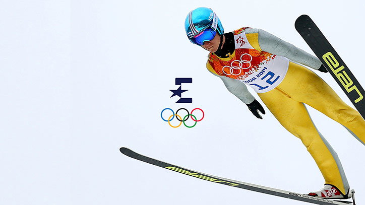
A ski jumper in a yellow and grey suit glides through the air against a plain white background. They wear a blue helmet and goggles, with the Olympic rings and a logo positioned beside them.
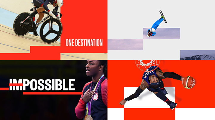
A four-panel collage of athletes in action. A cyclist and a skier appear in the top half, while a person wearing a medal and a basketball player appear below. Bold white text across the centre reads “IMPOSSIBLE ONE DESTINATION”.
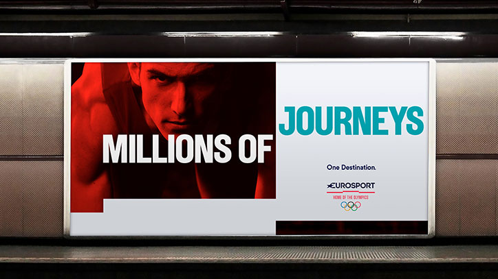
A backlit advertisement in a subway station features a close-up of a person’s face in red lighting. Bold text reads “MILLIONS OF JOURNEYS”, with the Eurosport logo and the Olympic rings below the phrase “One Destination.”
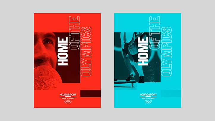
Two posters for Eurosport, one in red and one in cyan. Both feature a black and white photograph and bold vertical text that reads “HOME OF THE OLYMPICS”.
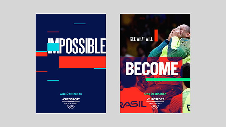
Two posters for Eurosport. The first has a dark blue background with the word “IMPOSSIBLE” in bold white type, partially obscured by red and blue blocks. The second shows a person covering their face in a blurred stadium setting, with the words “SEE WHAT WILL BECOME” laid over the image.
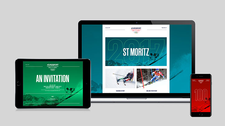
A digital invitation for Eurosport is displayed across a laptop, tablet and smartphone. The designs feature bold typography and images of skiers, with the laptop screen reading “St Moritz 2017”.
A brand guidelines presentation for the “Podium” visual identity. The pages detail the logo, colour palette, typefaces and on-air applications using a bold palette of red, green and blue.
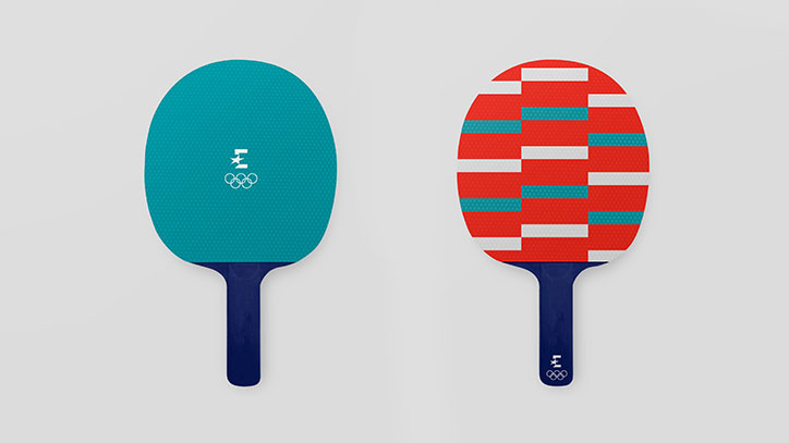
Two table tennis bats are shown against a plain grey background. One is teal with a white logo and the Olympic rings, while the other features a red, white and teal geometric pattern.
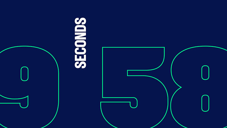
A graphic featuring large, green outlined numbers on a dark blue background. The numbers “9” and “58” are separated by the word “SECONDS” written vertically.
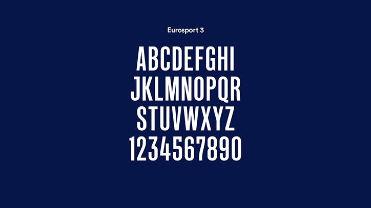
A white alphabet and number set in a bold, condensed typeface against a dark blue background. Small text at the top reads “Eurosport 3”.
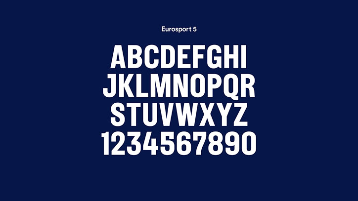
A bold, white sans-serif typeface is displayed against a dark blue background. The text reads “Eurosport 5” above a full alphabet and the numbers 0–9.
A white alphabet and number set in a bold, rounded typeface against a dark blue background. Small text at the top reads “Eurosport 7”.
A person shouts with an open mouth, holding a fencing mask and foil. The image is tinted green and features bold white text that reads “MILLIONS OF JOURNEYS”.

Share Article

Further Info

About the Author

Jenny Brewer

—

Jenny oversees editorial output across It’s Nice That. Get in touch with writing pitches for features or opinion pieces, big creative story tips, or questions about all things editorial. [email protected]

To submit your work to be featured on the site, please see our Submissions Guide.
It's Nice That Newsletters

Fancy a bit of It's Nice That in your inbox? Sign up to our newsletters and we'll keep you in the loop with everything good going on in the creative world.